EN
Odoo 18
Time Off
Odoo’s Time Off application serves as a centralized hub for all time-off-related information. This application manages requests, balances, allocations, approvals, and reports.
Users can request time off, and see an overview of their requests and time off balances. Managers can allocate time off to individuals, teams, or the whole company, and approve time off requests.
Detailed reports can be run to see how much time off (and what kinds of time off) are being used, accrual plans can be created, and public holidays can be set.
Note
Be advised, only users with specific access rights can see all aspects of the Time Off app.
All users can access the My Time Off and Overview sections of the Time Off app. All other sections require specific access rights.
To better understand how access rights affect the Time Off app, refer to the New employees document, specifically the section about configuring the work information tab.
Configuration
In order to allocate time off to employees, and for employees to request and use their time off, the various time off types must be configured first, then allocated to employees (if allocation is required).
Time off types
To view the currently configured time off types, navigate to Time Off app ‣ Configuration ‣ Time Off Types. The time off types are presented in a list view.
The Time Off app comes with four preconfigured time off types: Paid Time Off, Sick Time Off, Unpaid, and Compensatory Days. These can be modified to suit business needs, or used as-is.
Create time off type
To create a new time off type, navigate to Time Off app ‣ Configuration ‣ Time Off Types. From here, click the New button to reveal a blank time off type form.
Enter the name for the particular type of time off in the blank line at the top of the form, such as Sick Time or Vacation. Then, enter the following information on the form.
Note
The only required fields on the time off type form are the name of the Time Off Type, the Take Time Off In, and the Kind of Time Off. In addition, the Time Off Requests and Allocation Requests sections must be configured.
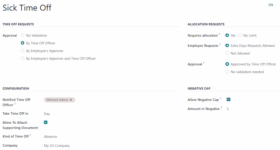
Time Off Requests section
- Approval: select what specific kind of approval is required for the time off type. The options are:
- No Validation: No approvals are required when requesting this type of time off. The time off request is automatically approved.
- By Time Off Officer: Only the specified Time Off Officer, set on this form in the Notified Time Off Officer field, is required to approve the time off request. This option is selected, by default.
- By Employee’s Approver: Only the employee’s specified approver for time off, which is set on the Work Information tab on the employee’s form, is required to approve the time off request.
- By Employee’s Approver and Time Off Officer: Both the employee’s specified time off approver and the Time Off Officer are required to approve the time off request.
Allocation Requests section
- Requires allocation: If the time off must be allocated to employees, select Yes. If the time off can be requested without time off being previously allocated, select No Limit. If No Limit is selected, the following options do not appear on the form.
- Employee Requests: Select Extra Days Requests Allowed if the employee is able to request more time off than was allocated.
If employees should not be able to make requests for more time off than what was allocated, select the Not Allowed option.
Example
Ten days are allocated to the employee for this particular type of time off, and the Extra Days Requests Allowed option is enabled. The employee wants to take a vacation for twelve days. They may submit a request for two additional days, since the Extra Days Requests Allowed option is enabled.
Important
It is important to note that requesting additional time off does not guarantee that time off is granted. - Approval: Select the type of approvals required for the allocation of this particular time off type.
- Approved by Time Off Officer indicates the Time Off Officer set on this form must approve the allocation.
- No validation needed indicates that no approvals are required.
Configuration section
- Notified Time Off Officer: Select the person who is notified and responsible for approving requests and allocations for this specific type of time off.
- Take Time Off in: Select the format the time off is requested in from the drop-down menu.
The options are:- Day: if time off can only be requested in full day increments (8 hours).
- Half Day: if time off can only be requested in half day increments (4 hours).
- Hours: if the time off can be taken in hourly increments.
- Deduct Extra Hours: Enable this option if the time off request should factor in any extra time accrued by the employee.
Example
If an employee works two extra hours for the week, and requests five hours of time off, the request would be for three hours, since the two extra worked hours are used first, and deducted from the request. - Allow To Attach Supporting Document: Enable this option to allow the employee to attach documents to the time off request. This is useful in situations where documentation is required, such as long-term medical leave.
- Kind of Time Off: From the drop-down menu, select the type of time off, either Worked Time or Absence. Worked Time indicates the time off taken counts toward worked time for any type of accrual the employee is working towards, whereas Absence does not count toward any type of accrual.
- Company: If multiple companies are created in the database, and this time off type only applies to one company, select the company from the drop-down menu. If this field is left blank, the time off type applies to all companies in the database. This field only appears in a multi-company database.
Negative Cap section
Enable the Allow Negative Cap option if employees are able to request more time off than they currently have, allowing a negative balance. If enabled, an Amount in Negative field appears. In this field, enter the maximum amount of negative time allowed, in days.
Example
Sara currently has three days of the time off type Vacation. She is planning a trip that requires five days of time off.
The Vacation time off type has the Allow Negative Cap option enabled, and the Amount in Negative is set to five.
These settings allow Sara to submit a request for five days of the Vacation time off type. If approved, her Vacation time off balance will be negative two (-2) days.
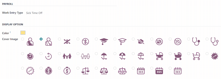
Payroll section
If the time off type should create Work entries in the Payroll app, select the Work Entry Type from the drop-down list.
Timesheets section
Note
The Timesheets section only appears if the user is in developer mode. Refer to the Developer mode (debug mode) document for details on how to access the developer mode.
When an employee takes time off, and is also using timesheets, Odoo creates entries in the Timesheets app for the time off. This section defines how they are entered.
- Project: Select the project the time off type entries appear in.
- Task: Select the task that appears in the timesheet for this time off type. The default options are: Time Off, Meeting, or Training.
Display Option section
- Color: Select a color to be used in the Time Off app dashboard.
- Cover Image: Select an icon to be used in the Time Off app dashboard.
Accrual plans
Some time off is earned through an accrual plan, meaning that for every specified amount of time an employee works (hour, day, week, etc), they earn or accrue a specified amount of time off.
Example
If an employee accrues a vacation day for every week they work, they would earn 0.2 vacation days for each hour they work. At the end of a forty hour work week, they would earn one whole vacation day (8 hours).
Create accrual plan
To create a new accrual plan, navigate to Time Off app ‣ Configuration ‣ Accrual Plans. Then, click the New button, which reveals a blank accrual plan form.
Enter the following information on the form:
- Name: Enter the accrual plan name.
- Accrued Gain Time: Select when the employee begins to accrue time off, either At the start of the accrual period or At the end of the accrual period.
- Carry-Over Time: Select when the employee received previously earned time. The options are:
- At the start of the year: Select this if the accrual rolls over on January 1 of the upcoming year.
- At the allocation date: Select this if the accrual rolls over as soon as time is allocated to the employee.
- Other: Select this option if neither of the other two options are applicable. When selected, a Carry-Over Date field appears. Select the date using the two drop-down menus, one for the day and one for the month.
- Based on worked time: Enable this option if time off accrual is determined by the employee’s worked hours. Days not considered as worked time do not contribute to the accrual plan in Odoo.
Example
An employee is granted time off from an accrual plan configured to accrue one day of vacation for every five days worked. The accrual plan is based on the employee’s worked time (the Based on worked time checkbox is ticked).
The employee works standard 40-hour weeks. According to the accrual plan, they should earn four vacation days per month.
The employee takes five days off. The time off type the employee has taken has the Kind of Time Off configured as an Absence.
Since the accrual plan only grants time off based on the worked time, the employee does not accrue a vacation day for the five days of time off that is considered an absence.
At the end of the month, the employee accrues only three days, instead of four. - Milestone Transition: This field is only visible after a minimum of two rules have been configured on the accrual plan. This selection determines when employees move up to a new milestone. If they qualify to change milestones in the middle of a pay period, decide whether the employee changes milestones Immediately or After this accrual’s period (after the current pay period).
- Company: This field only appears in a multi-company database. Using the drop-down menu, select the company the accrual plan applies to. If left blank, the accrual plan can be used for all companies.
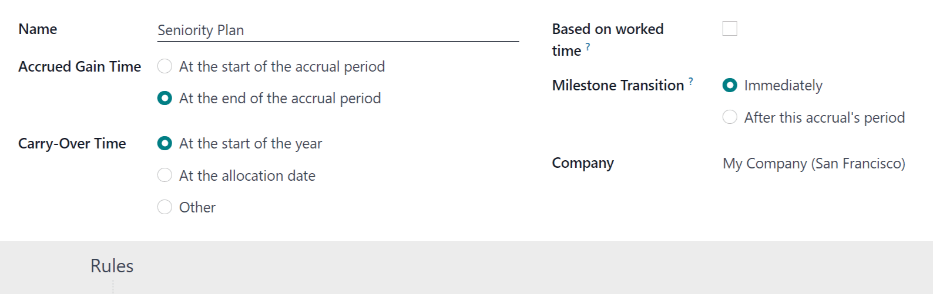
Rules
Rules must be created in order for employees to accrue time off from the accrual plan.
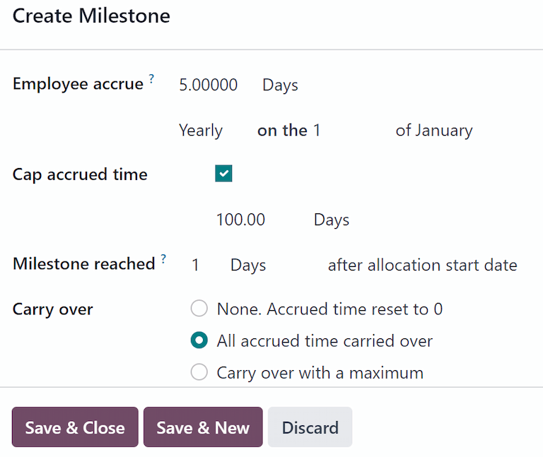
To create a new rule, click the New Milestone button in the gray Rules section, and a Create Milestone modal form appears.
Fill out the following fields on the form:
- Employee accrue: Select the parameters for earned time off in this section.
First, select either Days or Hours for the increment of accrued time using the drop-down menu.
Next, enter the numerical amount of the selected parameter that is accrued. The numerical format is X.XXXX, so that partial days or hours can also be configured.
Last, select how often the time is accrued using the drop-down menu. The default options are Hourly, Daily, Weekly, Twice a month, Monthly, Twice a year, and Yearly.
Depending on which option is selected, additional fields may appear. For example, if Twice a month is selected, two additional fields appear, to specify the two days of each month the milestone occurs. - Cap accrued time: If there is a maximum amount of days the employee can accrue with this plan, enable this option.
When enabled, two additional fields appear beneath it. Select the type of time period from the drop-down menu, either Days or Hours.
Then, enter a numerical value in the field to specify the maximum amount of time that can be accrued. - Milestone reached: Enter the number and value of the time period that must pass before the employee starts to accumulate time off. The first value is numerical; enter a number in the first field.
Then, select the type of time period using the drop-down menu in the second field. The options are: Days, Months, or Years. - Carry over: select how any unused time off is handled. The options are either:
- None. Accrued time reset to 0: Any unused time off is gone.
- All accrued time carried over: All unused time off is rolled over to the next calendar year.
- Carry over with a maximum: Unused time off is rolled over to the next calendar year, but there is a cap. An Up to field appears if this is selected. Enter the maximum number of Days that can roll over to the following year. Any time off beyond this parameter is lost.
Important
If the Carry over field is set to None. Accrued time reset to 0, that rule overrides the Carry-Over Time set on the accrual plan.
If a company creates an accrual plan, granting employees time off At the start of the accrual period (i.e., the beginning of the year), and sets the Carry-Over Time on the accrual plan to At the start of the year, it allows unused vacation time to rollover to the following year.
Then, the company adds rules to the accrual plan, allocating five days of vacation, annually, on the first of the year (one week of vacation allocated on January 1st).
If the Carry over field is set to None. Accrual time reset to 0 on the Create Milestone pop-up for, any unused vacation time does not carry over, even though on the Accrual Plan form, the Carry-Over Time is set to At the start of the year.
The carry over set on the rule takes precedence over the carry over set on the accrual plan form.
Once the form is completed, click Save & Close to save the Create Milestone form, and close the modal, or click Save & New to save the form and create another milestone. Add as many milestones as desired.
Public holidays
To observe public or national holidays, and provide extra days off as holidays to employees, configure the observed public holidays in Odoo.
It is important to configure these days in Odoo, so employees are aware of the days they have off, and do not request time off on days that are already set as a public holiday (non-working days).
Additionally, all public holidays configured in the Time Off app are also reflected in any app that uses working schedules, such as Calendar, Planning, Manufacturing, and more.
Due to Odoo’s integration with other apps that use working schedules, it is considered best practice to ensure all public holidays are configured.
Create public holiday
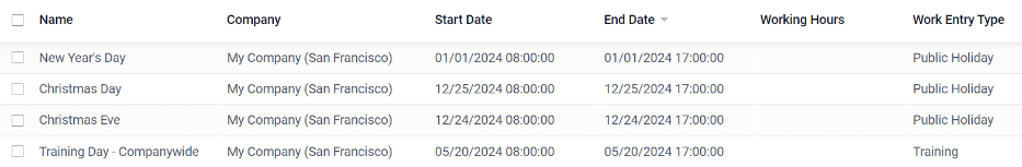
To create a public holiday, navigate to Time Off app ‣ Configuration ‣ Public Holidays.
All currently configured public holidays appear in a list view.
Click the New button, and a new line appears at the bottom of the list.
Enter the following information on that new line:
- Name: Enter the name of the holiday.
- Company: If in a multi-company database, the current company populates this field by default. It is not possible to edit this field.
Note
The Company field is hidden, by default. To view this field, click the (additional options) icon in the top-right corner of the list, to the far-right of the column titles, and activate the Company selection from the drop-down menu that appears. - Start Date: Using the date and time picker, select the date and time the holiday starts, then click Apply. By default, this field is configured for the current date. The start time is set according to the start time for the company (according to the working schedules). If the user’s computer is set to a different time zone, the start time is adjusted according, compared to the company’s time zone.
- End Date: Using the date and time picker, select the date and time the holiday ends, then click Apply. By default, this field is configured for the current date, and the time is set to the end time for the company (according to the working schedules). If the user’s computer is set to a different time zone, the start time is adjusted accordingly, compared to the company’s time zone.
Example
A company located in San Francisco operates from 9:00 AM - 6:00 PM, with an eight hour work day and one hour lunch break.
For a user in New York, with a computer time zone set to Eastern Standard Time, a created public holiday displays a start time of 12:00 PM - 9:00 PM, accounting for the three hour time zone difference.
Similarly, a user located in Los Angeles, with a computer time zone set to Pacific Standard Time, sees a public holiday time as 9:00 AM - 6:00 PM. - Working Hours: If the holiday should only apply to employees who have a specific set of working hours, select the working hours from the drop-down menu. If left blank, the holiday applies to all employees.
- Work Entry Type: If using the Payroll app, this field defines how the work entries for the holiday appear. Select the work entry type from the drop-down menu.
Mandatory days
Some companies have special days where specific departments, or the entire staff, is required to be present, and time off is not allowed on those specific days.
These types of days are called mandatory days in Odoo. These can be configured to be company-wide, or department specific. When configured, employees in the specified department or company are unable to submit time off requests for these mandatory days.
Create mandatory days
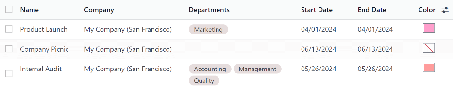
No mandatory days are configured in Odoo by default. To create a mandatory day, navigate to Time Off app ‣ Configuration ‣ Mandatory Days.
Click the New button in the top-left corner, and a blank line appears in the list.
Enter the following information on that new line:
- Name: Enter the name of the mandatory day.
- Company: If in a multi-company database, this field is visible, and the current company populates this field, by default. Using the drop-down menu, select the company the mandatory day is for.
- Departments: This column is hidden by default. First, click the (additional options) icon in the top-right corner, next to Color, and then tick the checkbox next to Departments to reveal that column.
Next, select the desired departments from the drop-down menu. Multiple departments can be selected, and there is no limit to the amount of departments that can be added.
If this field is left blank, the mandatory day applies to the entire company. - Start Date: Using the calendar picker, select the date the mandatory day starts.
- End Date: Using the calendar picker, select the date the mandatory day ends. If creating a single mandatory day, the end date should be the same as the start date.
- Color: If desired, select a color from the available presented options. If no color is desired, select the No color option, represented by a white box with a red line diagonally across it. The selected color appears on the main Time Off app dashboard, in both the calendar and in the legend.
Overview
To view a color-coded schedule of the user’s time off, and/or of the team managed by them, navigate to Time Off app ‣ Overview. This presents a calendar with the default filter of My Team, in a month view.
To change the time period displayed, click on the Month button to reveal a drop-down menu. Then, select either Day, Week, or Year to present the calendar in that corresponding view.
To navigate forward or backward in time, in the selected increment (Month, Week, etc.), click the ← (left arrow) or → (right arrow) to move either forward or backward in that specified amount of time.
For example, if Month is selected, the arrows adjust the view by one month.
To return to a view containing the current day, click the Today button at any time.
Team members are listed alphabetically on individual lines, and their requested time off, regardless of the status (validated or to approve), is visible on the calendar.
Each employee is color-coded. The employee’s color is selected at random, and does not correspond to the type of time off they requested.
The status of the time off is represented by the color detail of the request, either appearing solid (validated) or striped (to approve).
The number of days or hours requested is written on the request (if there is enough space).
At the bottom of the calendar, in the Total line, a bar graph shows how many people are projected to be out on any given day. The number on each individual bar represents the number of employees out for those highlighted days.
Click on a time off entry to view the details for the specific time off entry. The total number of hours or days are listed, along with the start and end time of the time off. To view the details of the time off request in a modal, click the View button.
Reporting
The reporting feature allows users to view time off for their team, either by employee or type of time off. This allows users to see which employees are taking time off, how much time off they are taking, and what time off types are being used.
Any report can be added to a spreadsheet, when in either the (Graph) or (Pivot) view, through the Insert in Spreadsheet button that appears in the top-left of the report.
Note
If the Documents app is installed, an option to add the report to a spreadsheet appears. If not, the report can be added to a Dashboard.
By employee
To view a report of employee time off requests, navigate to Time Off app ‣ Reporting ‣ by Employee.
The default report presents the current year’s data in a list view, displaying all the employees in alphabetical order. Each employee’s line is collapsed by default. To expand a line, click anywhere on the line.
The view expands, and has the time off requests organized by time off type. Click anywhere on a time off type line to expand it, and view all the individual time off requests that fall under that type.
The information shown in the list includes: the Employee name, Number of Days off requested, the Start Date, End Date, Status, and Description.
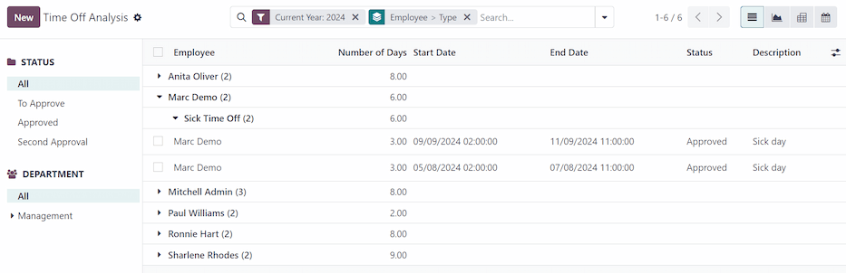
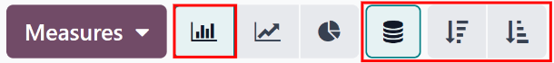
The report can be displayed in other ways, as well. Click the corresponding button option in the top-right corner of the page to view the data in that specific way. The various options are a (List), or default view, (Graph), (Pivot) table, or (Calendar) view.
When a selection has been made, additional options appear for that particular selection. For more detailed information on the reports and their various options, refer to the reporting documentation.
By type
To view a list of all time off, organized by time off type, navigate to Time Off app ‣ Reporting ‣ by Type. This shows all time off requests in a default bar chart.
Hover over a bar to view the Duration (Days) of that specific time off type.
Click on a bar to go to a detailed list view of all the time off requests for that time off type.
Each request is listed, with the following information displayed: the Employee, Number of Days, Request Type, Start Date, End Date, Status, and the Description.
The report can be displayed in other ways, as well. Click the corresponding button option in the top-right corner of the page to view the data in that way. The various options are a (Graph) (the default view), (List), or (Pivot) table.
When a selection has been made, additional options appear for that particular selection. For more detailed information on the reports, and their various options, refer to the reporting documentation.
See also
On this page
Get Help
Contact Support Ask the Odoo Community
EN
Odoo 18
Allocations
Once time off types and accrual plans have been configured, the next step is to allocate, or give, time off to employees.
The Allocations page of the Time Off app is only visible to users who have either Time Off Officer or Administrator access rights for the Time Off application. For more information on access rights, refer to the access rights documentation.
Allocate time off
To create a new allocation, navigate to Time Off app ‣ Management ‣ Allocations.
This presents a list of all current allocations, including their respective statuses.
Click New to allocate time off, and a blank Allocation form appears.
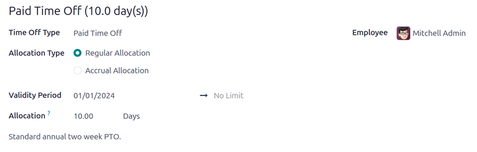
After entering a name for the allocation on the first blank field of the form, enter the following information:
- Time Off Type: Using the drop-down menu, select the type of time off that is being allocated to the employees.
- Allocation Type: Select either Regular Allocation or Accrual Allocation. If the allocation is not based on an accrual plan, select Regular Allocation.
- Accrual Plan: If Accrual Allocation is selected for the Allocation Type, the Accrual Plan field appears. Using the drop-down menu, select the accrual plan with which the allocation is associated. An accrual plan must be selected for an Accrual Allocation.
- Validity Period/Start Date: If Regular Allocation is selected for the Allocation Type, this field is labeled Validity Period. If Accrual Allocation is selected for the Allocation Type, this field is labeled Start Date.
The current date populates the first date field, by default. To select another date, click on the pre-populated date to reveal a popover calendar window. Navigate to the desired start date for the allocation, and click on the date to select it.
If the allocation expires, select the expiration date in the next date field. If the time off does not expire, leave the second date field blank. No Limit appears in the field if no date is selected.
If Accrual Allocation is selected for the Allocation Type, this second field is labeled Run until.
Important
If the Start Date entered is in the middle of a period of time, such as the middle of the month, Odoo applies the allocation to the beginning or end of the period, depending on the Accrued Gain Time entered on the accrual plan (either At the start of the accrual period, or At the end of the accrual period) instead of the specific date entered.
For example, an allocation is created, and references an accrual plan that grants time At the start of the accrual period, monthly, on the first of the month.
On the allocation form, the Allocation Type is set to Accrual Allocation, and the Start Date entered is 06/16/24.
Odoo’s Time Off app retroactively applies the allocation to the beginning of the time period entered in the Start Date.
Therefore, this allocation accrues time from 06/01/24, rather than 06/16/24.
Additionally, if on the accrual form, the allocation references an accrual plan that grants time `At the end of the accrual period, the allocation accrues time from 7/01/24 rather than 6/18/24. - Allocation: Enter the amount of time that is being allocated to the employees. This field displays the time in either Hours or Days, depending on how the selected Time Off Type is configured.
- Add a reason…: If any description or note is necessary to explain the time off allocation, enter it in this field at the bottom of the form.
Multiple Allocations
When allocating time off, it is common to allocate time to several employees at once. This is done using the Multiple Requests feature.
To allocate time to multiple employees in a single allocation, navigate to Time Off app ‣ Management ‣ Allocations. Then, click the (Actions) icon in the upper-left corner, then click Multiple Requests. This reveals a Multiple Requests pop-up window.
This form is identical to the Allocation form, with an additional Mode field. The Mode field determines how multiple employees are selected.
Using the drop-down menu, select one of the following Modes:
- By Employee: This option allows for the selection of multiple individual employees that are unrelated in terms of department, company, or tags. Selecting this reveals an Employees field. Select the employees to receive the allocation in the Employees field. There is no limit to the amount of employees that can be selected.
- By Company: This option allows for the selection of all employees within a specific company. Selecting this reveals a Company field. Select the Company to assign the allocation to. Only one company can be assigned in the Company field. When a company is selected, all employees within the company receive the allocation.
- By Department: This option allows for the selection of all employees within a specific department. Selecting this reveals a Department field. Select the Department to assign the allocation to. Only one department can be assigned in the Department field. When a department is selected, all employees within the department receive the allocation.
- By Employee Tag: This option allows for the selection of all employees with a specific tag. Selecting this reveals an Employee Tag field. Select the desired Employee Tag to select all employees with that tag. Only one tag can be assigned in the Employee Tag field. When a tag is selected, all employees with that tag receive the allocation.
Next, select the Time Off Type using the drop-down menu. Once a Time Off Type is selected, the placeholder name, ‘Allocation Request’, changes to the name of the selected Time Off Type, including the amount of days. Change the name of the allocation, if desired.
Fill out the remainder of the Multiple Requests form, then click Create Allocations when done.

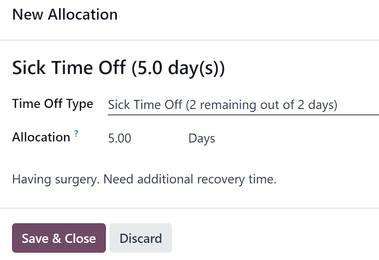
Request allocation
If an employee has used all their time off, or will run out of time off, they can request an allocation for additional time. Allocations can be requested in one of two ways, either from the Dashboard or the My Allocations view.
To create a new allocation request, click either the New Allocation Request button on the main Time Off dashboard, or the New button in the My Allocations list view. Both buttons open a new allocation request form.
Note
Both options open a new allocation request form, but when requested from the Dashboard, the form appears in a pop-up window, and the Validity Period field does not appear. When requested from the My Allocations list view, the screen navigates to a new allocation request page, instead of presenting a pop-up window.
Enter the following information on the new allocation request form:
- Time Off Type: Select the type of time off being requested for the allocation from the drop-down menu. After a selection is made, the title updates with the time off type.
- Validity Period: By default, the current date populates this field, and it is not able to be modified. This field only appears when requesting an allocation from the My Allocations view (Time Off ‣ My Time ‣ My Allocations).
- Allocation: Enter the amount of time being requested in this field. The format is presented in either Days or Hours, depending on how the Time Off Type is configured. Once this field is populated, the name of the allocation request is updated to include the amount of time being requested.
- Add a reason…: Enter a description for the allocation request in this field. This should include any details that approvers may need to approve the request.
If the request was created from the Dashboard, click the Save & Close button on the New Allocation pop-up window to save the information and submit the request.
If the form was completed from the My Allocations list view, the information is automatically saved as it is entered. However, the form can be saved manually at any time by clicking the (cloud upload) icon.
On this page
Get Help
Contact Support Ask the Odoo Community
EN
Odoo 18
Request time off
Once time off has been allocated to an employee, a request to use it can be submitted.
Time off can be requested in one of two ways: either from the main Time Off application Dashboard (Time Off app ‣ My Time ‣ Dashboard), or from the My Time Off dashboard view (Time Off app ‣ My Time ‣ My Time Off).
To create a new request for time off, click the New button on either the main Time Off Dashboard or the My Time Off dashboard, in the default list view.
Note
Both New buttons allow the user to request time off, but when requested from the Dashboard, a New Time Off request form appears in a pop-up window. When requested from the My Time Off list view, the screen navigates to a new time off request page, instead.
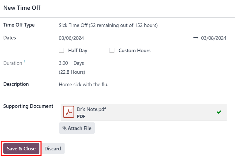
Enter the following information on the New Time Off request form:
- Time Off Type: select the type of time off being requested from the drop-down menu.
- Dates: enter the dates that the time off falls under. There are two fields to populate: the start and end dates. Click on either date field and a popover calendar appears.
Click on the start date, then click on the end date. The selected start and end dates are circled, and the dates between them are highlighted (if applicable).
If only requesting time off for a single day, click on the start date, then click the same date again for the end date.
When the correct dates are selected, click the Apply button.
The selected dates now populate the two portions of the Dates field.
If the selected Time Off Type is configured to have the time off taken in hours, the following two fields also appear:- Half Day: if the time off request is for a half day, tick this checkbox. When this is selected, the second date field disappears, and is replaced with a drop-down menu. From that drop-down menu, select either Morning or Afternoon to indicate which half of the day is being requested.
- Custom Hours: if the time off requested is not a whole or half day, tick this checkbox. If selected, a From and To field appears beneath this option. Using the drop-down menu, select the start and end time for the time off request.
- Duration: this field updates automatically once the Date section is completed. If the Date section is modified, this section automatically updates to reflect the total time off requested. This field is in either hours or days, depending on how the selected Time Off Type is configured.
- Description: enter a description for the time off request. This should include any details that managers and approvers may need to approve the request.
- Supporting Document: this field only appears if the Time Off Type selected allows for the attachment of documents. Click the Attach File button, and a file explorer window appears.
Navigate to the desired files that should be attached, select them, then click The Open button. The files then appear on the time off request form. Multiple documents can be attached, if necessary.
If the request was created from the Dashboard, click the Save & Close button to save the information, and submit the request.
If the form was completed from the My Time Off list view, the information is automatically saved as it is entered. However, the form can be saved manually at any time by clicking the (cloud upload) icon.
Get Help
Contact Support Ask the Odoo Community
EN
Odoo 18
Request time off
Once time off has been allocated to an employee, a request to use it can be submitted.
Time off can be requested in one of two ways: either from the main Time Off application Dashboard (Time Off app ‣ My Time ‣ Dashboard), or from the My Time Off dashboard view (Time Off app ‣ My Time ‣ My Time Off).
To create a new request for time off, click the New button on either the main Time Off Dashboard or the My Time Off dashboard, in the default list view.
Note
Both New buttons allow the user to request time off, but when requested from the Dashboard, a New Time Off request form appears in a pop-up window. When requested from the My Time Off list view, the screen navigates to a new time off request page, instead.
Enter the following information on the New Time Off request form:
- Time Off Type: select the type of time off being requested from the drop-down menu.
- Dates: enter the dates that the time off falls under. There are two fields to populate: the start and end dates. Click on either date field and a popover calendar appears.
Click on the start date, then click on the end date. The selected start and end dates are circled, and the dates between them are highlighted (if applicable).
If only requesting time off for a single day, click on the start date, then click the same date again for the end date.
When the correct dates are selected, click the Apply button.
The selected dates now populate the two portions of the Dates field.
If the selected Time Off Type is configured to have the time off taken in hours, the following two fields also appear:- Half Day: if the time off request is for a half day, tick this checkbox. When this is selected, the second date field disappears, and is replaced with a drop-down menu. From that drop-down menu, select either Morning or Afternoon to indicate which half of the day is being requested.
- Custom Hours: if the time off requested is not a whole or half day, tick this checkbox. If selected, a From and To field appears beneath this option. Using the drop-down menu, select the start and end time for the time off request.
- Duration: this field updates automatically once the Date section is completed. If the Date section is modified, this section automatically updates to reflect the total time off requested. This field is in either hours or days, depending on how the selected Time Off Type is configured.
- Description: enter a description for the time off request. This should include any details that managers and approvers may need to approve the request.
- Supporting Document: this field only appears if the Time Off Type selected allows for the attachment of documents. Click the Attach File button, and a file explorer window appears.
Navigate to the desired files that should be attached, select them, then click The Open button. The files then appear on the time off request form. Multiple documents can be attached, if necessary.
If the request was created from the Dashboard, click the Save & Close button to save the information, and submit the request.
If the form was completed from the My Time Off list view, the information is automatically saved as it is entered. However, the form can be saved manually at any time by clicking the (cloud upload) icon.
Get Help
Contact Support Ask the Odoo Community
EN
Odoo 18
Management
Time off and allocation requests undergo an approval process before being granted. Requests either need one or two approvals, if any, depending on how the specific type of time off is configured. All these configurations can be found under the Management section of the Time Off application.
Only people who can approve allocation and time off requests have the Management section visible in the Time Off application.
Manage time off
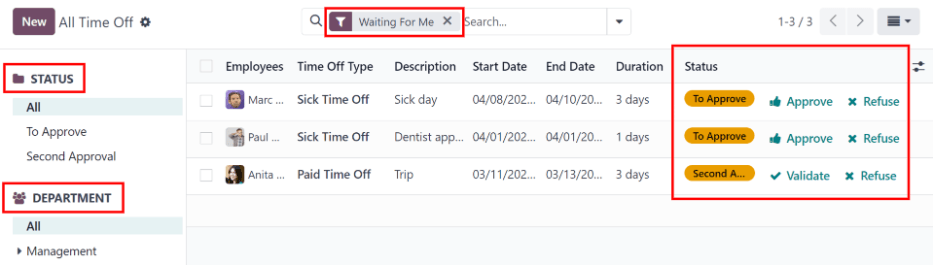
To view time off requests that need approval, navigate to Time Off app ‣ Management ‣ Time Off. Doing so reveals the All Time Off page.
The only time off requests that are visible on this page belong to employees the user either has Time Off Officer or Administrator access rights for in the Time Off application.
The default filter on the All Time Off page is Waiting For Me.
This filter only presents time off requests that need to be approved for current employees on the user’s team, with a status of either To Approve or Second Approval.
On the left side of the All Time Off page, there are various grouping options that can be used to narrow down the presented time off requests, located beneath the Status and Department headings.
Since only time off requests that need to be approved are shown, the only Status options are All, To Approve, and Second Approval.
The various departments the user is a member of, and manages employees under, also appear on the left side of the page, under Departments.
Note
If there are no requests that fall under one of the status options or departments, that status or department is not visible on the left-side menu.
To only display time off requests for specific departments, click on the Department on the left-hand side of the page. Only requests within the selected department are then presented.
The status column displays the status of each request, with the status highlighted in a specific color.
The To Approve and Second Approval requests are highlighted in yellow, and are the only ones that appear in the list by default.
If the Waiting For Me filter is removed, all statuses appear.
Approved requests are highlighted in green, To Submit (drafts) requests are highlighted in blue, and the Refused requests are highlighted in gray.
To approve a time off request, click the Approve button at the end of the line.
To validate a time off request that has already been approved, and is waiting on a second approval, click the Validate button at the end of the line.
To refuse a request, click the Refuse button at the far end of the line.
For more details, click anywhere on the time off request line (except for the Approve, Validate icon, and Refuse buttons). Doing so loads that specific time off request form. Depending on the rights of the user, changes can be made.
To modify the request, make any desired changes to the form. All changes are automatically saved.
It is also possible to approve, validate, or refuse the request from this form. Click the Approve button to approve, the Validate button to validate, or the Refuse button to refuse the request.
Manage allocations
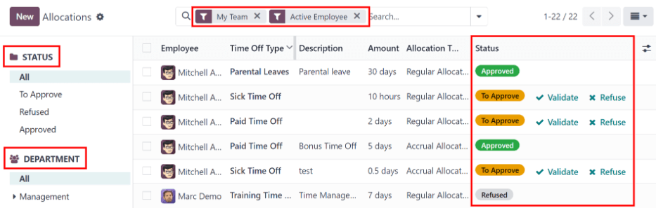
To view allocations that need approval, navigate to Time Off app ‣ Management ‣ Allocations. Doing so reveals the Allocations page.
The user is only presented with allocations for employees they have either Time Off Officer or Administrator access rights for in the Time Off application.
The default filters configured on the Allocations page are My Team and Active Employee. These default filters only present employees on the user’s team (who they manage) and active employees. Inactive records are not shown.
The left side of the Allocations page has various grouping options to narrow down the presented allocation requests.
The Status options are: All, To Approve, Refused, and Approved. Click on a specific Status to view only requests with that specific status.
To view all allocation requests, regardless of status, click All under the Status heading.
It is also possible to display allocation requests by department. Click on the desired Department on the left side of the Allocations page, to only present allocations for that specific department.
Note
The groupings on the left side only present allocation requests that fall under the default filters of My Team and Active Employee, if those default filters are not removed from the Search… bar. Only the statuses for allocation requests that fall under those filters are presented on the left side.
For example, if there are no requests with a status of To Submit, that status option does not appear in the left-hand side of the Allocations page.
All departments for the user’s employees appear in the list. If there are no allocation requests that fall under that department matching the preconfigured filters, the list is blank.
It is always possible to remove any of the preconfigured filters, by clicking the (remove) icon on the specific filter to remove it.
The status column displays the status of each request, with the status highlighted in a specific color.
The To Approve requests are highlighted in yellow, Approved requests are highlighted in green, and the Refused requests are highlighted in gray.
To approve an allocation request, click the Validate button at the end of the line. To refuse a request, click the Refuse button.
If more details are needed, click anywhere on the allocation request line (except for the Validate or Refuse buttons) to view the specific request in detail, via the allocation request form.
Depending on the rights of the user, changes can be made to the allocation request form that appears. To modify the request, make any desired changes to the form. All changes are automatically saved.
It is also possible to approve or refuse the request from this form. Click the Validate button to approve, or the Refuse button to refuse the request.
On this page
Get Help
Contact Support Ask the Odoo Community
- User Docs
- Database management
- Developer
- Contributing
EN
Odoo 18
Recruitment
Odoo keeps all job applicants organized with a pre-configured series of steps and stages that each applicant goes through. Each stage has a specific step(s) that should be performed. These range from scheduling a phone call, conducting an interview, or sending a job offer, for example. This process is referred to as the ‘applicant flow.’
When an applicant applies for a job position, an applicant card is automatically created in Odoo’s Recruitment app for that specific job position. As the applicant progresses through the recruitment pipeline, the recruitment team moves their card from one stage to the next.
Stages can be configured so that an email is automatically sent out using a set, pre-configured template as soon as an applicant’s card enters a stage. These automated emails are defined on each stage in the applicant flow.
The applicant flow explained in this document is the default flow in Odoo, and goes through the applicant flow when using the Recruitment application’s default configuration. The applicant flow is able to be modified to suit the specific recruitment flow for any business.
Note
The applicant flow with all its stages are universal and applies to all job positions, unless specified. A specific stage can be configured to be job-specific, meaning that specific stage is only visible for that specific job position. Otherwise, if a new stage is created, or an existing stage is modified, those changes are visible on all job positions.
Settings
Before creating a job position in Odoo, configure the necessary settings for the Recruitment app. To view and edit the settings, navigate to Recruitment app ‣ Configuration ‣ Settings. After any changes are made, click the Save button in the top-left corner to save all the changes.
Job posting
The Job Posting section of the Recruitment app settings has only one selection to make. If job positions are to be posted to the company’s website, enable the Online Posting option.
Note
The Online Posting is only available if the Website application is also installed.
Recruitment process
The Recruitment process section of the settings page specifies what the database can and cannot do during the recruitment process.
Send interview survey
Odoo is capable of having a survey sent to an applicant to gather more information about them. Surveys can be thought of as exams, or questionnaires, and can be customized in various ways to provide the recruitment team with valuable insights into the applicant
Enable the Send Interview Survey option to send surveys to applicants. Once enabled, an Interview Survey internal link appears. Click the Interview Survey link to navigate to a list of all created surveys.
This list includes all surveys that were created in the database, not just surveys used in the Recruitment app. If no surveys have been created, the surveys list displays a No Survey Found message, and presents options to create a survey from several pre-configured survey templates.
See also
For more detailed information about surveys, refer to the survey essentials documentation.
Note
Enabling the Send Interview Survey option will install the Surveys application once the settings are saved, if it is not installed already.
Send SMS
It is possible to send text messages to applicants directly through the Recruitment app. To do so, enable the Send SMS option. This option requires credits to use, which can be obtained by clicking the Buy credits internal link that emerges when the feature is enabled.
See also
For more information, refer to the SMS pricing and FAQs documentation.
CV display
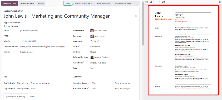
When applicants submit an application, one of the default required fields is a resumé, or CV. All resumés are stored in the Documents application, and are accessible on the applicant’s card.
A resumé has the option to appear on the applicant’s form, which can be viewed by clicking on the applicant’s card. The resumé appears on the right-side of the screen. If this is not enabled, the resumé is accessed via a link in the chatter, where it needs to be clicked to expand and view it, or downloaded.
Enable the CV Display option to show the resumé on the applicant’s card by default, and in addition to the document link. When enabled, the resumé appears on the right side of the applicant’s card.
Note
For the resumé to appear on the right-side, the browser window must be in full-screen mode (where the browser spans the entire screen).
If the browser window is set to a size smaller than the entire width of the screen (not full-screen), then the resumé does not appear on the right-side. Instead, the resumé appears in the Files section of the chatter, below the applicant’s card.
CV digitization (OCR)
When an application is submitted using any of the available methods, such as an online application submission, emailing a resume to the job position alias, or creating an applicant record directly from the database, it is possible to have Odoo extract the applicant’s name, phone number, and email address from the resumé and populate the applicant’s form. To do so, enable the CV Digitization (OCR) option.
When enabled, additional options appear. Click on the corresponding radio button to select one of the following options:
- Do not digitize: this option turns off resumé digitization.
- Digitize on demand only: this option only digitizes resumes when requested. A Digitize document buttons appears on applicant cards. When clicked, the resumé is scanned and the applicant’s card is updated.
- Digitize automatically: this option automatically digitizes all resumés when they are submitted.
Beneath these options are two additional links. Click the Buy credits button to purchase credits for CV digitization. Click the View My Services to view a list of all current services, and their remaining credit balances.
For more information on document digitization and IAP’s, refer to the In-app purchase (IAP) documentation.
Note
The Do not digitize option for CV digitization (OCR) at first may seem like a redundancy. It seems to be the same as disabling the CV digitization (OCR) option.
When the CV digitization (OCR) option is enabled, a module is installed so that resumés can be scanned. Disabling this option would uninstall the module.
If at some point, there is a desire to temporarily stop digitizing resumés, the Do not digitize option is selected. The reason this option is available is so that the module is not uninstalled, allowing for digitization to be enabled in the future by selecting one of the other two options.
Salary package configurator
When sending an offer to an applicant, an expiration date can be set on the offer. Enter the number of days an offer is valid for in the days field. After the set amount of days has passed, if the applicant has not accepted the offer, the offer is no longer available.
Kanban view
To access the Kanban view for a job position, navigate to the main Recruitment app dashboard, which is the default view when opening the application. All job positions appear on the main dashboard. Click the (#) New Applications smart button on a job position card to navigate to the Kanban view for all the applicants for that particular job position.
Inside the job application, the Kanban stages appear, with all the applicants populated in their respective columns, indicating what stage they are currently in. There are six default stages in Odoo:
The last column, Contract Signed, is folded by default. Folded columns appear gray, and the applicants in it are hidden from view. To expand the folded stage and view the applicant cards for that column, click anywhere on the thin gray column that says the stage name and the column expands, revealing the applicants.
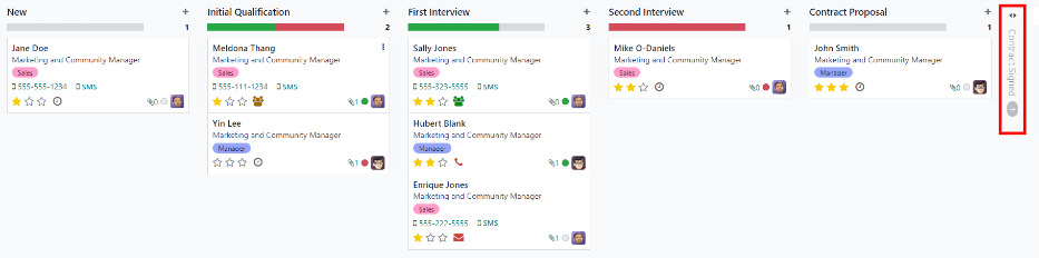
Each stage has a color-coded bar beneath the stage name, providing status information for the applicant’s in that specific stage. The status colors are:
- Green: the applicant is ready to move to the next stage.
- Red: the applicant is blocked from moving to the next stage.
- Gray: the applicant is still in progress in the current stage and is neither ready nor blocked from the next stage.
The status for each card is set manually. To set the status, click on the small circle in the lower-left of the applicant card. A status pop-up window appears. Click on the desired status for the applicant. The status dot on the applicant card as well as the status bar updates.
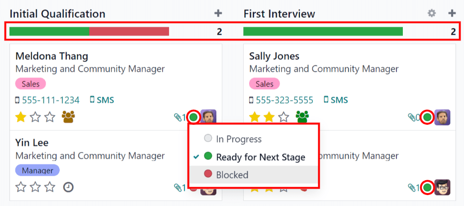
Tip
The names for the three status colors (In Progress, Blocked, and Ready for Next Stage) can be modified, if desired.
Customize stages
Stages can be modified, added, or deleted to best meet the needs of the particular hiring steps of a business.
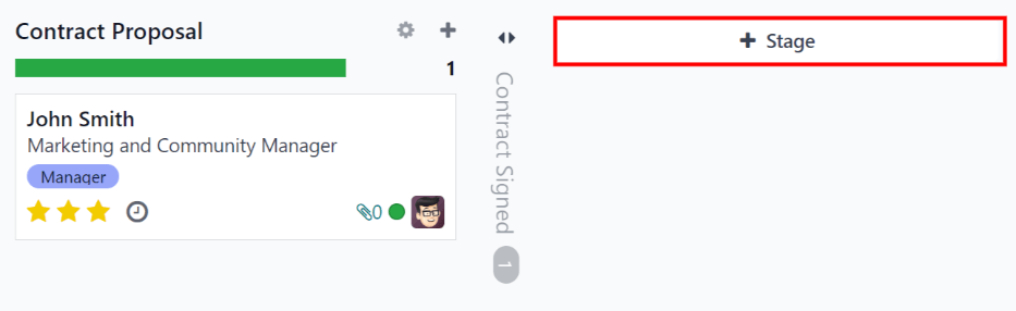
New stage
To create a new stage, click on Stage and a new column appears. Enter the title for the new stage in the Stage title field, then click Add. The new column appears, and another new stage is available to create. If no new stages are needed, click anywhere on the screen to exit the new stage creation.
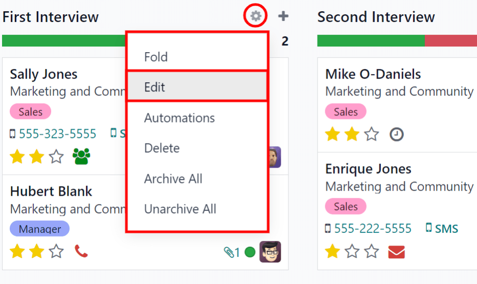
Modify stage
To modify the settings of a stage, hover over the name of the stage, and a (gear) icon appears in the upper right hand side of the stage. Click on the (gear) icon and a menu appears. Then click on the Edit option. An Edit: (Stage) form appears. Make any desired modifications to the form, then click Save & Close when done.
Edit stage form
The Edit: (Stage) form is where the stage’s settings are configured. The only required field is the Stage Name.
The fields to be populated or modified are:
- Stage Name: type in a name for the stage.
- Email Template: select an email template to be used from the drop-down menu. If a template is selected, when the applicant card enters the stage, an email is automatically sent to the applicant using the selected template.
- Folded in Kanban: check the box to have the stage appear folded (hidden) at all times in the default view.
- Hired Stage: check the box if this stage indicates that the applicant is hired. When an applicant’s card enters this stage, the card displays a Hired banner in the upper right corner. If this box is checked, this stage is used to determine the hire date of an applicant.
- Job Specific: if the stage only applies to specific job positions, select the job positions from the drop-down menu. Multiple job positions can be selected.
- Show in Referrals: check the box if this stage should be seen in the Referrals application, and allow the referrer to accrue points when a referral of theirs reaches this stage. If this is active, a Points field appears. Enter the amount of referral points the employee receives when an applicant enters this stage. The Referrals app must be installed in order to use this option.
- Tooltips section: there are three pre-configured status labels (colored circles) for each applicant’s card, indicating its status. These colors are displayed at the top of each stage to reflect the statuses of the applicants in the stage. The names for the label can be modified, but the label itself (the color) cannot. The default names and labels are: In Progress (gray), Blocked (red), and Ready for Next Stage (green).
- Requirements: enter any internal notes for this stage explaining any requirements of the stage.
Delete stage
If a stage is no longer needed, the stage can be deleted. To delete a stage, hover over the name of the stage, and a (gear) icon appears. First, click on the (gear) icon to reveal a drop-down menu, then click Delete. A Confirmation pop-up warning appears, asking Are you sure you want to delete this column? Click Delete to delete the column.
Important
If there are applicants currently in the stage being deleted, an error pops up when attempting to delete the stage. The records currently in the stage to need to be either deleted, archived, or moved to a different stage before the stage can be deleted.
Email templates
To communicate with the applicant, Odoo has several pre-configured email templates that can be used. The pre-configured email templates and when to use them are as follows:
- Recruitment: Applicant Acknowledgement: this template is used to let the applicant know that their application was received. This email is automatically sent out once the applicant is in the New stage.
- Recruitment: Interest: this template is used to let the applicant know that their application caught the recruiter’s attention, and they have been shortlisted for either a phone call or an interview.
- Recruitment: Schedule Interview: this template is used to let the applicant know that they have passed the Initial Qualification stage, and they will be contacted to set up an interview with the recruiter. This email is automatically sent out once the applicant is in the Initial Qualification stage.
- Recruitment: Not interested anymore: this template is used when an applicant communicates that they are no longer interested in the position, and thanks them for their time and consideration.
- Recruitment: Refuse: this template is used when an applicant is no longer being considered for the position.
Note
Email templates can be created, modified, and deleted to suit the needs of a business. For more information on email templates, refer to the Email templates document.
To manually send an email, click Send message in the chatter. A text box appears, as well as the applicant’s email address.
Click the (expand) full composer icon in the bottom right corner of the Send Message tab in the chatter. A Compose Email pop-up window loads, with the Recipients and Subject pre-populated. The applicant’s email address is entered in the Recipients line, and the Subject is (Job Position). The email body is empty by default.
To use a pre-configured email template, click the field next to Load template in the bottom section of the window. Select the email template to use from the drop-down menu.
Pre-configured email templates may contain dynamic placeholders so unique information can be populated in the email for a more personalized message to the applicant. There are several pre-configured email templates to choose from. Depending on the template selected, the email subject and/or body may change.
Note
Only the email templates that are configured for the model load. There are other email templates pre-configured in Odoo, but if they are not configured for the recruitment application, they do not appear in the list of available templates.
If any attachments are to be added, click the Attachments button in the lower left corner. Navigate to the file to be attached, then click Open to attach it. To delete an attachment, click the (delete) icon to the right of the attachment.
If any changes need to be made to the email, edit the body of the email. If the edits should be saved to be used in the future, the email can be saved as a new template. Click the Save Template button in the bottom. To send the email, click Send and the email is sent to the applicant. The email then appears in the chatter.

See also
- Job positions
- Add new applicants
- Schedule interviews
- Offer job positions
- Refuse applicants
- Source analysis reporting
- Recruitment analysis
- Time in stage analysis
- Team performance reporting
On this page
Get Help
Contact Support Ask the Odoo Community
- User Docs
- Database management
- Developer
- Contributing
EN
Odoo 18
Job positions
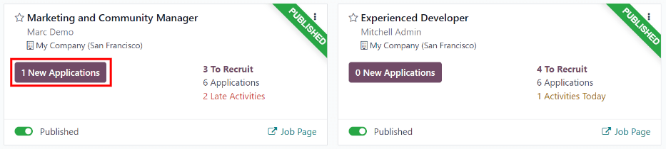
In Odoo Recruitment, all job positions are shown on the default dashboard in the Recruitment app. This includes positions that are being actively recruited for, as well as inactive positions.
Each job position is shown in an individual Kanban card. If the job position is active, and candidates can apply, a Published banner appears in the top-right corner of the card.
View submitted applications by clicking anywhere on a job position card.
Create a new job position
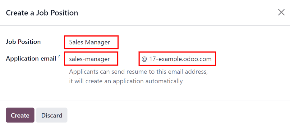
To create a new job position from the main dashboard in the Recruitment app, click the New button in the top-left corner, and a Create a Job Position modal appears.
First, enter the name of the Job Position (such as Sales Manager, Mechanical Engineer, etc.) in the field.
Next, enter an Application email by typing in the first half of the email address in the first field, then select the second half of the email using the drop-down menu in the second field. Applicants can send a resumé to this specific email address, and Odoo creates an application for them automatically.
When complete, click the Create button to save the entry, or the Discard button to delete it.
Once the job position has been created, it appears as a card in the Kanban view on the main Recruitment app dashboard.
Edit a new job position
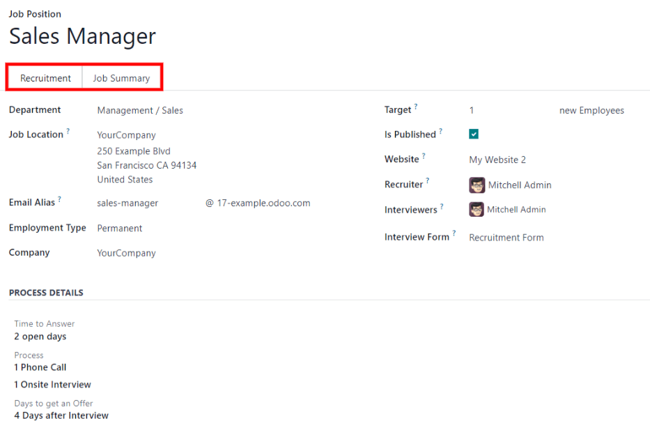
After the job position is created, it’s time to enter the details for the position. Click on the ⋮ (three dots) icon in the upper-right corner of the relevant card to reveal several options, and then click Configuration to edit the details.
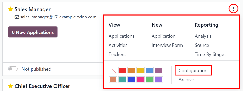
All the basic information about the job position is listed under the Recruitment tab.
None of the fields are required, but it is important to configure and populate the Department, Location, Employment Type, and Job Summary fields, as they are all visible to prospective applicants on the website.
The fields can be filled out as follows:
- Department: select the relevant department for the job position. This is visible on the website.
- Job Location: select the physical address for the job. If the job position is remote, leave this field blank. This is visible on the website.
- Email Alias: enter an email address to which applicants can send a resumé. Once emailed, Odoo automatically creates an application for them.
- Employment Type: select what type of position the job is, using the drop-down menu. The default options are Permanent, Temporary, Seasonal, Interim, Full-Time, and Part-Time. This is visible on the website.
- Company: select the company the job is for. This field only appears if using a multi-company database.
- Target: enter the number of employees to be hired for this position.
- Is Published: activate this option to publish the job online.
- Website: select the website the job is published on.
- Recruiter: select the person responsible for recruiting this role.
- Interviewers: select who should perform the interviews. Multiple people can be selected.
- Interview Form: select an Interview form that applicants fill out prior to their interview.
- Contract Template: select a contract template to be used when offering the job to a candidate.
- Process Details section: this section contains information that is displayed online for the job position. This informs the applicants of the timeline and steps for the recruitment process, so they know when to expect a reply.
- Time to Answer: enter the number of days before the applicant is contacted.
- Process: enter the various stages the candidate goes through during the recruitment process.
- Days to get an Offer: enter the number of days before the applicant should expect an offer after the recruitment process has ended.
Note
The Process Details section is a text field. All answers are typed in rather than selected from a drop-down menu. The text is displayed on the website exactly as it appears in this tab.
Finally, enter the job description in the Job Summary tab.
Create interview form
An Interview Form is used to determine if a candidate is a good fit for a job position. Interview forms can be as specific or general as desired, and can take the form of a certification, an exam, or a general questionnaire. Interview forms are determined by the recruitment team.
Before creating an interview form, ensure the proper settings are enabled. Navigate to Recruitment app ‣ Configuration ‣ Settings, and under the Recruitment Process section, ensure the Send Interview Survey option is enabled.
Since there are no pre-configured forms in Odoo, all interview forms must be created. To create an interview form, start from the Recruitment tab of the Job Position form. In the Interview Form field, enter a name for the new interview form. As the name is typed, several options populate beneath the entry: Create (interview form name), Search More…, and Create and edit…. Click Create and edit… and a Create Interview Form modal appears.
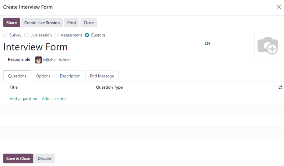
Note
The option Search More… only appears if there are any interview forms already created. If no interview forms exist, the only options available are Create (interview form name), and Create and edit….
Proceed to fill out the modal interview form as a typical survey. For specific directions on how to create a survey, refer to the survey essentials document, which provides step-by-step instructions on how to create and configure a survey.
On this page
Get Help
Contact Support Ask the Odoo Community
- User Docs
- Database management
- Developer
- Contributing
EN
Odoo 18
Recruitment flow
When a prospective employee applies for a job in Odoo, there is a preconfigured process from the initial inquiry to the creating of a new employee once hired. The following outlines the default recruitment process for Odoo’s Recruitment application.
Important
The following is based on Odoo’s default recruitment pipeline. Be advised that if modifications are made to the pipeline, the process differs.
New
At the start of the process, all applicants appear in the New stage on the Applications page, whether submitted online or if the applicant is manually entered by a recruiter.
When the applicant’s card is created, Odoo automatically populates the Subject/Application, the Applicant’s Name, Email, and Mobile number, on the applicant’s card. This information is required when applying for a job position, by default.
Note
If the website application form is modified, different fields may be populated, based on what information is requested on the website.
If the applicant entered any information in the Short Introduction section of the online application, it populates the Application Summary tab at the bottom of the applicant’s card.
Resumé
If a resumé was attached to the online application, it appears in the Files section of the chatter, and is also stored in the Documents application.
To find the recruitment documents, navigate to the main Documents app dashboard, and click the Recruitment folder on the left-hand side. All recruitment documents are stored within that folder.
If the CV Display option was enabled in the Settings of the Recruitment app, the resumé appears on the applicant’s card, on the right-hand side.
Note
Depending on the browser zoom level, or size of the browser screen, the resumé may appear below the main applicant card information as a PDF link.
Send interview
At any point in the hiring process, an interview can be sent to the applicant to obtain more information. These interviews are custom-made, and can be formatted in a variety of ways.
The Surveys application is required to send interviews to an applicant, so it must be installed.
Odoo uses the term interview, but these can be thought of as questionnaires, surveys, tests, certifications, etc. Custom interviews can be formatted to suit each individual job position’s needs. For more information on creating and editing interviews, refer to the Job positions documentation.
Example
A job position for a computer programmer could have an interview in the form of a programming quiz to determine the skill level of the applicant. A job position for a restaurant server could have a questionnaire inquiring about the applicant’s availability, if the desired applicant needs to be available on weekend evenings.
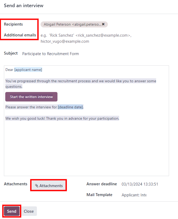
To send an interview to an applicant, first click the applicant’s card from the Applications page, to view the detailed applicant information. At the top-left of the applicant’s card, click the Send Interview button.
If the applicant’s card has an email address on file, a Send an interview pop-up window appears, with the Recipients, Subject, and email body populated.
Note
To send an email to an applicant, there must be an Email address on the applicant’s card.
If an email address is not entered on the applicant’s card, when the Send Interview button is clicked, an Edit: (Applicant’s Name) pop-up window appears, on top of the Send an interview pop-up window.
Enter the email address in the Email field, then click Save & Close.
Once the applicant’s information is saved, the Edit: (Applicant’s Name) pop-up window closes, and the Send an interview pop-up window remains.
Sometimes, preconfigured email templates in Odoo use dynamic placeholders, which are automatically filled with specific data when the email is sent. For example, if a placeholder for the applicant’s name is used, it is replaced with the actual name of the applicant in the email. For more detailed information on email templates, refer to the Email templates documentation.
Add the email addresses of any additional recipients for the survey in the Additional emails field, if more people should receive the email. If an email address is in the database as a contact, add that contact in the Recipients field. If an email should be sent to someone who is not in the database as a contact, and they should not be added as a contact, add their email address in the Additional emails field.
If any attachments need to be added, click the Attachments button, and a file explorer window appears. Navigate to the desired file, and click Open to attach it to the email. The attachment loads, and is listed above the Attachments button.
If the emailed interview must be completed by a specific date, enter that date in the Answer deadline field, located in the lower-right area of the pop-up window.
To do so, click the empty field next to Answer deadline, and a calendar selector appears. Use the (left) and (right) arrows, on either side of the month, to navigate to the desired month. Then, click on the desired day to select the date.
The Mail Template field is pre-populated, based on the configuration for the interview. A different template can be chosen from the drop-down menu, if desired. If a new template is selected, the new email template loads in the email body.
To send the email with the interview link to the applicant, click Send at the bottom of the email pop-up window.
Initial qualification
If an applicant seems to be a good potential candidate, they are moved to the Initial Qualification stage.
This stage exists to quickly sort candidates that have potential, from those that do not meet the requirements. No automatic actions, such as emails, are set for this stage. This stage simply informs the recruitment team to potentially set up a phone call or an interview with the candidate.
Note
In order to move an applicant’s card from one stage to another, the applicant’s card can either be dragged and dropped in the Kanban view of the Applications page to the desired stage, or the stage can be modified on the applicant’s card.
To change the stage on the applicant’s card, first click the desired applicant’s card from the Applications page. The current stage for the card is highlighted at the top on a status bar, above the card.
Click the desired stage for the card, and the stage changes. A log note indicating the stage change appears in the chatter, as well.
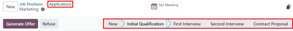
First interview
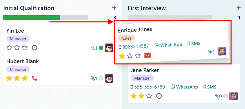
After an applicant has passed the Initial Qualification stage, they can be manually moved to the First Interview stage on the Applications page, while in Kanban view.
To move the applicant to the next stage, drag-and-drop the applicant’s card to the First Interview stage.
Alternatively, open the desired applicant’s card from the Applications page, and click the First Interview stage on the status bar at the top of the individual applicant’s card.
Tip
The First Interview stage can be modified, so when the applicant’s card moves to the First Interview stage, an email can be automatically sent to the applicant, stating an interview is requested. In this pre-configured email template, a link to the recruiting team’s calendar appears, allowing the applicant to schedule their interview.
Edit the First Interview stage, and select the Recruitment: Schedule Interview option in the Email Template field, to automate this action.
Second interview
After an applicant has passed the First Interview stage, they can be moved to the Second Interview stage. To move the applicant to the next stage, drag-and-drop the applicant’s card to the Second Interview stage from the Kanban view of the Applications page, or click on the Second Interview stage at the top of the individual applicant’s card.
When the applicant’s card moves to the Second Interview stage, there are no automatic activities or emails configured for this stage, by default. The recruiter can now schedule a second interview with the applicant, following the same process as the first interview.
Contract Proposal
After the applicant has completed the various interview processes, the next step is to send the job offer.
Once the offer has been sent, drag-and-drop the applicant’s card to the Contract Proposal stage from the Kanban view of the Applications page, or click on the Contract Proposal stage at the top of the individual applicant’s card.
Contract Signed
Once the contract has been signed, and the applicant has been hired, the applicant’s card moves to the Contract Signed stage.
Drag-and-drop the applicant’s card to the Contract Signed stage from the Kanban view of the Applications page, or click the (ellipsis) icon at the top of the individual applicant’s card, then click Contract Signed on the status bar.
Refuse applicant
At any point in the recruitment process, a candidate can be refused.
On this page
Get Help
Contact Support Ask the Odoo Community
- User Docs
- Database management
- Developer
- Contributing
EN
Odoo 18
Add new applicants
Once an applicant submits an application, either using the online application, or emailing a job position alias, an applicant card is automatically created in the Recruitment application.
However, in some instances, applicants may need to be created manually in the database. This could be necessary if, for example, a company accepts paper applications in the mail, or is meeting prospective applicants at an in-person job fair.
To view current applicants, navigate to the Recruitment app, then click the desired job position card. Doing so reveals the Applications page, which displays all applicants for that specific role, in a default Kanban view, organized by stage.
Add new applicants from a job position’s Applications page by using either: the New button or the quick add button.
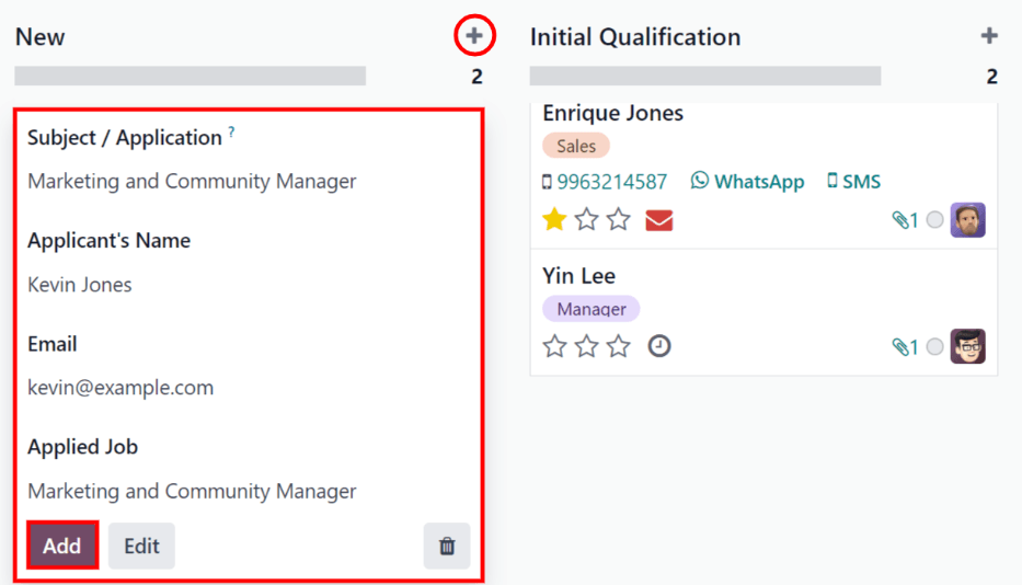
Quick add
On the Applications page, click the on the quick add button, represented by a small (plus) icon in the top-right corner of each stage to quickly add a new applicant to that stage.
Enter the following information on the card:
- Subject/Application: enter the title for the card. Typically, this is the applicant’s name, and job position being applied to. For example: Laura Smith - HR Manager. The text entered in this field is not visible in the Kanban view of the Applications page, unless the Applicant’s Name field is left blank.
- Applicant’s Name: enter the applicant’s name. Displays as the card title in the Kanban view of the Applications page.
- Email: enter the applicant’s email address.
- Applied Job: the current job position populates this field. If needed, the job position can be changed by selecting a different position from the drop-down menu. If a different job position is selected, after the card is created, the card appears on the Applications page for that newly-selected job position.
After the information is entered, click Add. The applicant appears in the list, and a new blank applicant card appears.
If preferred, after entering the Applicant’s Name in the Kanban card that appears, click Edit, and a detailed applicant form loads. Refer to the New applicant form section for details about filling out the form.
When doing a quick add, clicking away from an empty card, or clicking the (trash) icon, discards the applicant.
New applicant form
On the new applicant form, the Subject / Application field is populated with the pre-selected job position, by default. Certain fields on the applicant card may also be pre-populated, depending on how the job position is configured. Typically, the Job section, as well as the Recruiter field, are pre-populated.
Complete the fields in the following sections on the new applicant form.
Note
Depending on installed applications and configurations, some fields may not be displayed.
Applicant section
- Subject/Application Name: this is the only required field. Enter the title for the card in this field. Typically, this is the applicant’s name, and the job position being applied to. For example: John Smith - Experienced Developer. This field is not visible in the Kanban view of the Applications page, unless the Applicant’s Name is left blank.
- Applicant’s Name: enter the applicant’s name. This field is displayed as the card title in the Kanban view of the Applications page.
- Email: enter the applicant’s email address.
- Phone: enter the applicant’s phone number.
- Mobile: enter the applicant’s mobile number.
- LinkedIn Profile: enter the web address for the applicant’s personal profile on LinkedIn.
- Degree: select the applicant’s highest level of education from the drop-down menu. Options are: Graduate, Bachelor Degree, Master Degree, or Doctoral Degree. The Graduate option indicates the applicant graduated at the highest level of school before a Bachelor’s degree, such as a high school or secondary school diploma, depending on the country.
- Interviewers: using the drop-down menu, select the people to conduct the interviews. The selected people must have either recruiter or officer rights configured for the Recruitment application to appear in the drop-down list. Refer to the Access rights documentation for more information.
- Recruiter: select the user responsible for the entire recruitment process for the job position.
- Evaluation: represents a rating for the applicant: one star ( ) is Good, two stars ( ) is Very Good, and three stars ( )is Excellent.
- Source: using the drop-down menu, select where the applicant learned about the job position. The following options come pre-configured in Odoo: Search engine, Lead Recall, Newsletter, Facebook, Twitter, LinkedIn, Monster, Glassdoor, and Craigslist. To add a new Source, type in the source, then click Create “(new source)”.
- Medium: using the drop-down menu, specify how the job listing was found. The pre-configured options are: Banner, Direct, Email, Facebook, Google Adwords, LinkedIn, Phone, Television, Twitter (now known as “X”), or Website. To add a new Medium, type in the medium, then click Create “(new medium)”.
- Referred By User: if referral points are to be earned for this job position in the Referrals application, select the user who referred the applicant from the drop-down menu. The Referrals application must be installed for this field to appear.
- Availability: select the available start date for the applicant. To select a date, click on the field to reveal a popover calendar. Use the (left) and (right) arrows on either side of the month to navigate to the desired month, then click the desired date. Leaving this field blank indicates the applicant can start immediately.
- Tags: select as many tags as desired from the drop-down menu. To add a tag that does not exist, type in the tag name, then click Create “new tag” from the resulting drop-down menu.
Job section
The following fields are pre-populated when creating a new applicant, as long as these field are specified on the job position form. Editing the fields is possible, if desired.
- Applied Job: select the job position the applicant is applying to from the drop-down menu.
- Department: select the department the job position falls under from the drop-down menu.
- Company: select the company the job position is for using the drop-down menu. This field only appears when in a multi-company database.
Contract section
- Expected Salary: enter the amount the applicant is requesting in this field. The number should be in a XX,XXX.XX format. The currency is determined by the localization setting for the company.
- Extra advantages…: if any extra advantages are requested by the applicant, enter it in the Extra advantages… field to the right of the Expected Salary field. This should be short and descriptive, such as 1 week extra vacation or dental plan.
- Proposed Salary: enter the amount to be offered to the applicant for the role in this field. The number should be in a XX,XXX.XX format.
- Extra advantages…: if any extra advantages are offered to the applicant, enter it in the Extra advantages… field to the right of the Proposed Salary field. This should be short and descriptive, such as unlimited sick time or retirement plan.
Application Summary tab
Any additional details or notes that should be added to the applicant’s card can be typed into this field.
Skills tab
Skills can be added to the applicant’s card. For details on adding skills, refer to the Create new employees document.
On this page
Get Help
Contact Support Ask the Odoo Community
- User Docs
- Database management
- Developer
- Contributing
EN
Odoo 18
Schedule interviews
Schedule in-person, virtual, and phone interviews with Odoo through the Recruitment app.
An interview can be scheduled in one of two ways: either by the recruitment team, or by the applicant.
Recruitment team scheduled interviews
When an applicant reaches the interview stage, the recruitment team should schedule the interview, by first coordinating a suitable date and time with the applicant and interviewers.
To schedule the interview, navigate to the applicant’s card, by first going to the Recruitment app, and clicking the relevant job card. This opens the Applications page for that job position. Then, click the desired applicant’s card to view their detailed applicant form.
To schedule an phone, virtual, or in-person interview, click the No Meeting smart button at the top of the applicant’s record.
Note
The Meetings smart button displays No Meeting if no meetings are currently scheduled. For applicants who are new to the First Interview stage, this is the default.
If there is one meeting already scheduled, the smart button displays 1 Meeting, with the date of the upcoming meeting beneath it. If more than one meeting is scheduled, the button displays Next Meeting, with the date of the first upcoming meeting beneath it.
Clicking the Meetings smart button loads a calendar, showing the scheduled meetings and events for the currently signed-in user, as well as the employees who are listed under the Attendees section, located to the right of the calendar.
To change the currently loaded meetings and events being displayed, uncheck an attendee whose calendar events are to be hidden. Only the checked attendees are visible on the calendar.
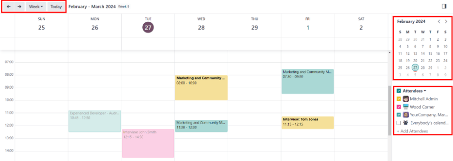
To add a meeting to the calendar when in the Day or Week view, click on the start time of the meeting and drag down to the end time. Doing so selects the date, time, and the length of the meeting.
A meeting can also be added in this view by clicking on the desired day and time slot.
Both methods cause a New Event pop-up window to appear.
New event pop-up window
Clicking a grid, corresponding with the time and date, opens the New Event pop-up window to schedule a meeting.
Enter the information on the form. The only required fields to enter are a title for the meeting, along with the Start (and end date/time) fields.
Once the card details are entered, click Save & Close to save the changes and create the interview.
After entering in a required name for the meeting, the fields available to modify on the New Event card are as follows:
- Meeting Title: enter the subject for the meeting. This should clearly indicate the purpose of the meeting. The default subject is the Subject/Application Name on the applicant’s card.
- Start: start and end date and times for the meeting. Clicking either of these fields opens a calendar pop-up window. Click Apply to close the window.
- All Day: tick the box to schedule an all-day interview. If this box is ticked, the Start field changes to Start Date.
- Attendees: select the people who should attend the meeting. The default employee listed is the person who created the meeting. Add as many other people as desired.
- Videocall URL: if the meeting is virtual, or if there is a virtual option available, click Odoo meeting, and a URL is automatically created for the meeting, which populates the field.
- Description: enter a brief description in this field. There is an option to enter formatted text, such as numbered lists, headings, tables, links, photos, and more. Use the powerbox feature, by typing a / to reveal a list of options.
Scroll through the options and click on the desired item. The item appears in the field, and can be modified. Each command presents a different pop-up window. Follow the instructions for each command to complete the entry.
More options
To add additional information to the meeting, click the More Options button in the lower-right corner of the New Event pop-up window. Enter any of the following additional fields:
- Duration: this field auto populates based on the Start (and end) date and time. If the meeting time is adjusted, this field automatically adjusts to the correct duration length. The default length of a meeting is one hour.
- Recurrent: if the meeting should repeat at a selected interval (not typical for a first interview), tick the checkbox next to Recurrent. Several additional fields appear when this is enabled:
- Timezone: using the drop-down menu, select the Timezone for the recurrent meetings.
- Repeat: choose Daily, Weekly, Monthly, Yearly, or Custom recurring meetings. If Custom is selected, a Repeat Every field appears beneath it, along with another time frequency parameter (Days, Weeks, Months, or Years). Enter a number in the blank field, then select the time period using the drop-down menu.
- Repeat on: enabled when the Weekly option is selected in the Repeat field. Choose the day the weekly meeting falls on.
- Day of Month: configure the two drop-down menu options to select a specific day of the month, irrespective of the date (e.g. the first Tuesday of every month). To set a specific calendar date, choose Date of Month and enter the calendar date in the field (e.g. 15 to set the meeting to occur on the fifteenth of every month).
- Until: using the drop-down menu, select when the meetings stop repeating. The available options are Number of repetitions, End date, and Forever. If Number of repetitions is selected, enter the number of total meetings to occur in the blank field to the right. If End date is selected, specify the date using the calendar pop-up window, or type in a date in a XX/XX/XXXX format. Forever schedules meetings indefinitely.
- Location: enter the location for the meeting.
- Tags: select any tags for the meeting using the drop-down menu, or add a new tag by typing in the tag and clicking Create “tag”. There is no limit to the number of tags that can be used.
- Appointment: if an appointment is associated with this meeting, select it from the drop-down menu, or create a new appointment by typing in the appointment name, then clicking Create & Edit… from the resulting drop-down men. A Create Appointment form loads. Enter the information on the form, then click Save & Close.
- Privacy: select if the organizer appears either Available or Busy for the duration of the meeting. Next, select the visibility of this meeting, using the drop-down menu to the right of the first selection. Options are Public, Private, and Only internal users. Public allows for everyone to see the meeting, Private allows only the attendees listed on the meeting to see the meeting, and Only internal users allows anyone logged into the company database to see the meeting.
- Organizer: the employee who created the meeting is populated in this field. Use the drop-down menu to change the selected employee.
- Reminders: select a reminder from the drop-down menu. Default options include Notification, Email, and SMS Text Message, each with a specific time period before the event (hours, days, etc). The chosen reminder chosen alerts the meeting participants of the meeting, via the selected option at the specified time. Multiple reminders can be selected in this field.
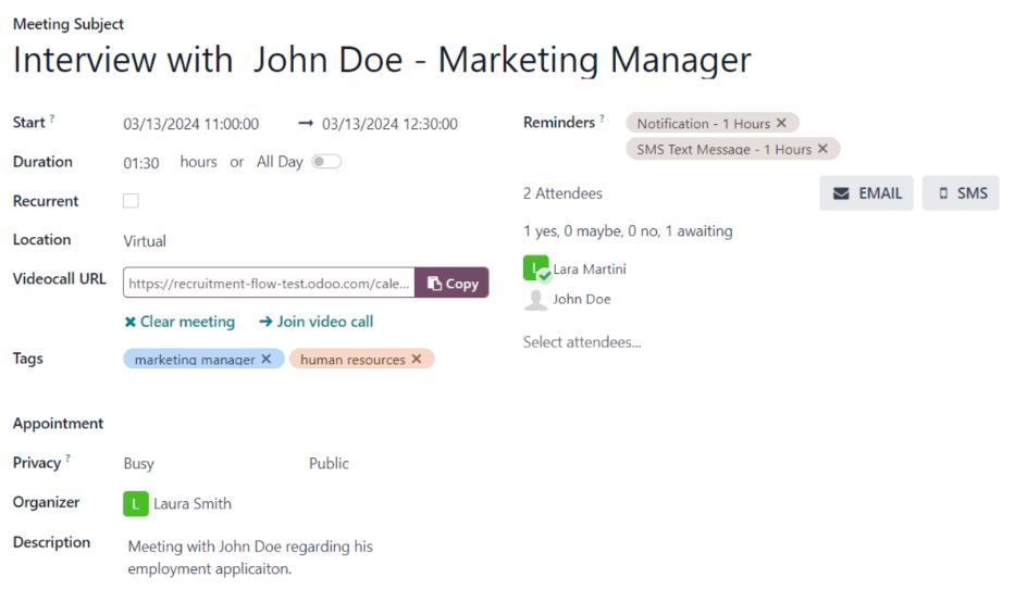
Send meeting to attendees
Once changes have been entered on the New Event pop-up window, and the meeting details are correct, the meeting can be sent to the attendees, via email or text message, from the expanded event form (what is seen when the More Options button is clicked on in the New Event pop-up window).
To send the meeting via email, click the Email button next to the Attendees field on the expanded meeting form.
A Contact Attendees email configurator pop-up window appears. A pre-formatted email, using the default Calendar: Event Update email template, populates the email body field.
The followers of the job application, as well as the user who created the meeting, are added as Recipients by default. If needed, add the applicant’s email address to the list to send the email to the applicant, as well. Make any other desired changes to the email. If an attachment is needed, click the Attachments button, navigate to the file, then click Open. Once the email is ready to be sent, click Send.
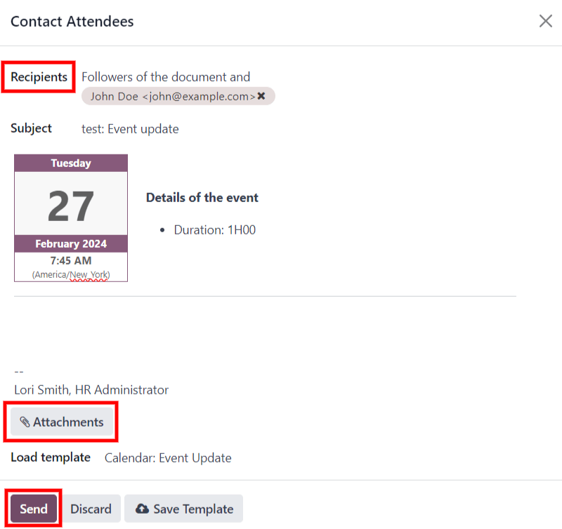
To send the meeting via text message, click the SMS button next to the Attendees field on the expanded meeting form. A Send SMS Text Message pop-up window appears.
At the top, a blue banner appears if any attendees do not have valid mobile numbers, and lists how many records are invalid. If a contact does not have a valid mobile number listed, click Close, and edit the attendee’s record, then redo these steps.
When no warning message appears, type in the message to be sent to the attendees in the Message field. To add any emojis to the message, click the (smile add) icon on the right-side of the pop-up window.
The number of characters, and amount of text messages required to send the message (according to GSM7 criteria) appears beneath the Message field. Click Put In Queue to have the text sent later, after any other messages are scheduled, or click Send Now to send the message immediately.
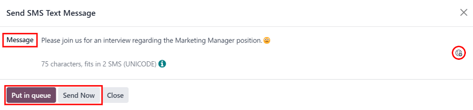
Note
Sending text messages is not a default capability with Odoo. To send text messages, credits are required, which need to be purchased. For more information on IAP credits and plans, refer to the In-app purchases (IAP) documentation.
Applicant scheduled interviews
By default, the recruitment interview stages are not set up for applicants to schedule their own interviews.
However, if the First Interview or Second Interview stages are modified to send the Recruitment: Schedule Interview email template when an applicant reaches that stage, the applicant receives a link to the recruitment team’s calendar, and can schedule the interview on their own. The recruitment team’s availability is reflected in the calendar.
In order for applicants to be able to schedule their own interviews, a stage must first be modified in the Recruitment app.
Modify stage
To modify either the First Interview or Second Interview stage, first navigate to the main Recruitment app dashboard. Next, click on the desired job card to navigate to the Applications page for that job position.
Hover over the name of the stage, and a (gear) icon appears in the upper-right hand side of the stage name. Click the (gear) icon, and a drop-down menu appears. Then, click on the Edit option, and an Edit: (Stage) form appears.
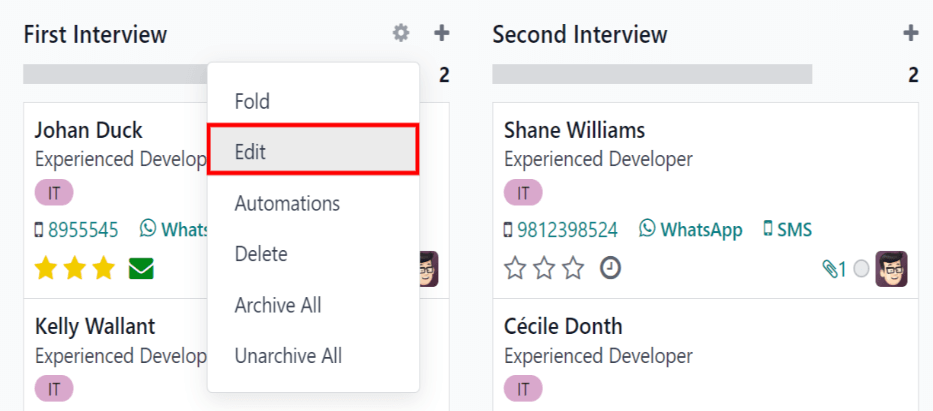
The Email Template field is blank, by default. Using the drop-down menu, select Recruitment: Schedule interview for the Email Template field, then click Save & Close when done.
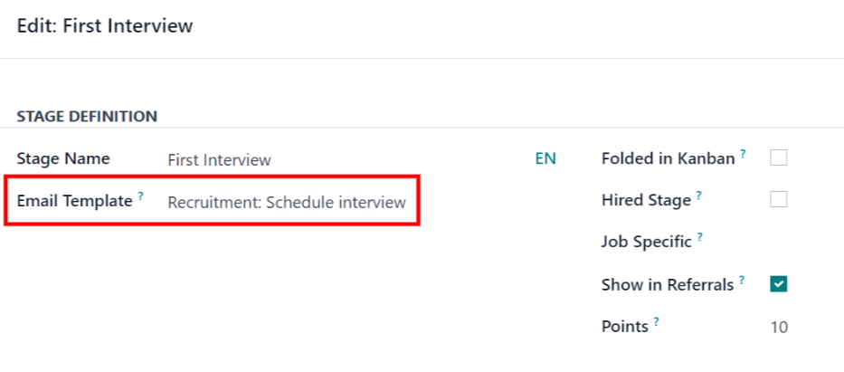
Send email
After either the First Interview or Second Interview stages are modified to send the Recruitment: Schedule interview email to the applicant upon moving their applicant card to one of those stages, the following email is received by the applicant:
Subject: Can we plan an interview together for your (Job Position) application?
Congratulations! Your application is really interesting and we'd like to plan an interview with you. Can you please use the button below to schedule it with one of our recruiters?
Plan my interview
Schedule interview
When the applicant received the email, they click the Plan my interview button at the bottom of the email. This navigates the applicant to a private online scheduling page, which is only accessible through the emailed link.
This page displays the MEETING DETAILS on the right side of the screen. This includes the format and length of the meeting. In this example. the interview is virtual ( Online) and the duration is a half hour ( 30 minutes).
First, if there is an option of who to meet with, the user selects who they are scheduling their meeting with, by clicking on their icon and name. If only one person is available to interview the applicant, this step is not available. If the applicant does not wish to chose an interviewer, they can just click See all availabilities .
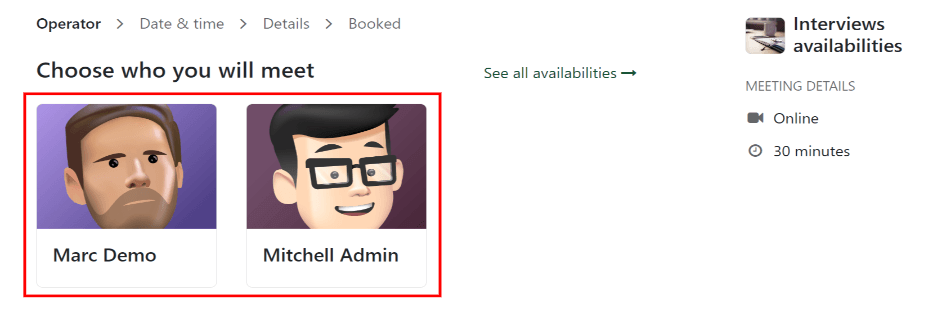
Note
If the applicant selects an interviewer, the applicant is shown a Select a date & time page, and only sees the dates and times that specific person is available. In addition, that interviewer’s information (name, email, and phone number) appears on the right-side of the screen, under the heading OPERATOR, located beneath the MEETING DETAILS.
If the applicant clicks See all availabilities instead, or if there are no interviewer options available, the user is navigated to the same Select a date & time page, but there is no OPERATOR section visible.
Then the applicant clicks on an available day on the calendar, signified by a square around the date. Once a day is selected, they click on one of the available times to select that date and time.
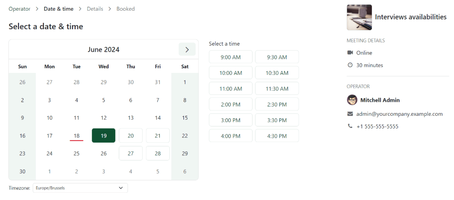
Tip
Be sure to check the Timezone field, beneath the calendar, to ensure it is set to the correct time zone. Changing the time zone may alter the available times presented.
Once the date and time are selected, the applicant is navigated to an Add more details about you page. This page asks the applicant to enter their Full name, Email, and Phone number. The contact information entered on this form is how the applicant is contacted to remind them about the scheduled interview.
When everything is entered on the Add more details about you page, the applicant clicks the Confirm Appointment button, and the interview is scheduled.
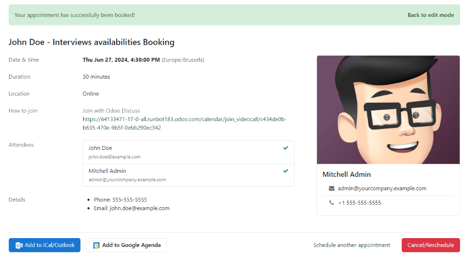
After confirming the interview, the applicant is taken to a confirmation page, where all the details of the interview are displayed. The option to add the meeting to the applicant’s personal calendars is available, through the Add to iCal/Outlook and Add to Google Agenda buttons, beneath the interview details.
The applicant is also able to cancel or reschedule the interview, if necessary, with the Cancel/Reschedule button.
On this page
Get Help
Contact Support Ask the Odoo Community
- User Docs
- Database management
- Developer
- Contributing
EN
Odoo 18
Offer job positions
Once an applicant has successfully passed the various interview stages, the recruitment team is ready to send an offer for employment. The next step is to send the applicant a contract.
See also
Refer to the recruitment documentation for details on the various stages of the recruitment process.
Contract proposal
When an offer is ready to be sent, first open the applicant’s card by navigating to the Recruitment app, and clicking on the desired job position card.
From the resulting Job Positions Kanban view, the corresponding applicant card can be dragged-and-dropped to the Contract Proposal stage. Or, click into the desired applicant’s card, and click the Contract Proposal stage, located in the status bar in the top-right of the applicant’s form.
The next step is to send an offer to the applicant. Start by selecting the desired applicant’s card to open their applicant form.
On the applicant’s form, click the Generate Offer button. A Generate a Simulation Link pop-up window appears.
Most fields are pre-populated with information from the job position. If any necessary fields are blank, or if any information needs to be updated, enter, or update, the relevant information in the corresponding fields.
Note
Depending on the localization setting for the company, and which applications are installed, some fields may not appear in the Generate a Simulation Link pop-up window.
For example, if the Fleet application is not installed, any fields related to vehicles do not appear.
Universal fields
The following fields appear in the Generate a Simulation Link pop-up window, regardless of the localization.
- Contract Template: the template currently being used to populate the Generate a Simulation Link pop-up window. Use the drop-down menu to select a different Contract Template, if desired.
Note
To modify the template, hover over the current template name, and click the Internal link icon that appears to the right of the field. Make any desired changes, then click Save & Close. - Job Position: the name of the Job Position being offered to the applicant. The selections available in the drop-down menu correspond to the job position configured on the main Recruitment dashboard.
- Job Title: the selected Job Position populates this field, by default. The title can be modified to suit the specific applicant’s position and provide more details.
Example
An applicant is offered a marketing manager job at a shoe company, specifically for the children’s line.
The Job Position selected from the drop-down menu is Marketing Manager, and the Job Title is modified for their specific responsibilities, Marketing Manager: Children's Shoes. - Department: the department the job position falls under.
- Contract Start Date: the date the contract takes effect. The default date is the current date. To modify the date, click on the displayed date to reveal a calendar popover window. Navigate to the desired month, then click the day to select the date.
- Yearly Cost: the annual salary being offered.
- Link Expiration Date: the number of days the job offer is valid. The default expiration date is 30 days. Modify the expiration date, if desired.
Send offer
Once the Generate a Simulation Link pop-up window is complete, click Send By Email to reveal an email pop-up window.
Important
If the applicant does not have an email address listed on their applicant card, a warning appears in a red box at the bottom of the Generate a Simulation Link pop-up window, stating: The applicant does not have a valid email set. The Offer Link won’t be able to be completed. Click Discard, then enter an email on the applicant’s card. Once an email is entered, click the Generate Offer button, and the email pop-up window loads again.
The default Recruitment: Your Salary Package email template is used (set in the Load template field), and the Recipients, Subject, and email body are pre-populated based on the email template.
If any attachments need to be added, click the Attachments button, and a file explorer window appears. Navigate to the desired file, then click Open to attach it to the email. The attachment loads, and is listed above the Attachments button.
Once the email is ready to send, click Send. The email pop-up window closes, and an Offers smart button appears at the top of the applicant’s card.
Note
To send an offer, ensure the Sign application is installed. This is necessary, so the offer can be sent to the applicant by the recruiter, and they can actually sign the offer. The applicant does not need any software installed to sign the offer.
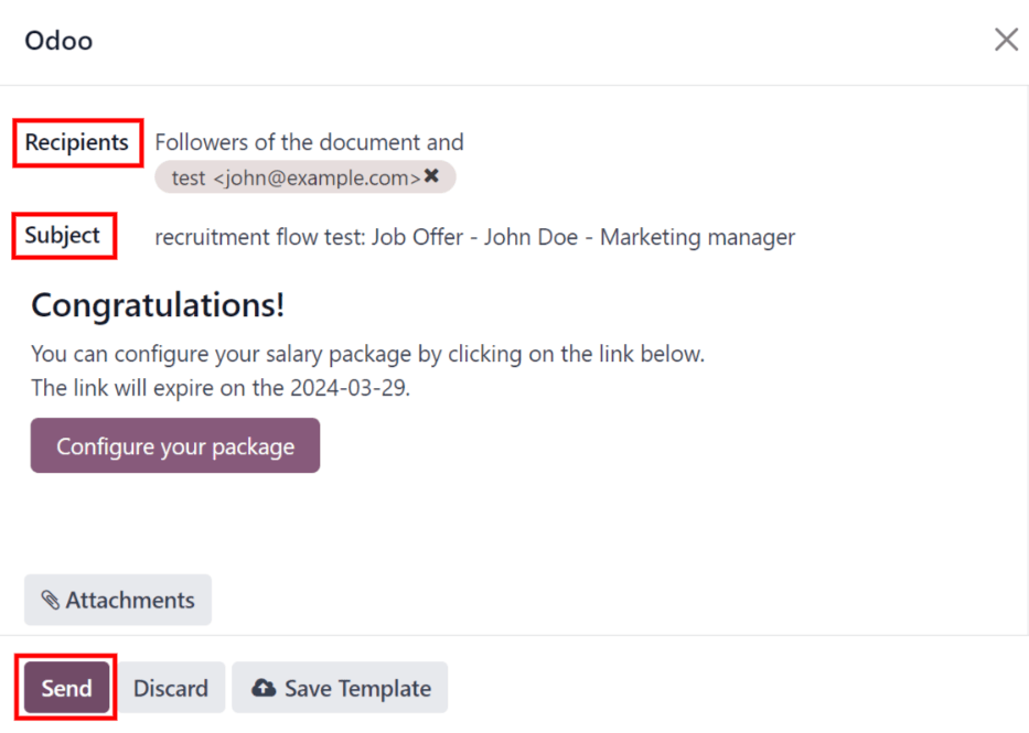
Configure your package
If applicable, the applicant can modify their salary package. This option is not available for all localizations. Depending on where the company is located, this option may not be available.
The email template includes a Configure your package button. This link takes the applicant to a webpage, where they can modify the proposed salary package, and enter their personal information.
Once the applicant is hired, the personal information entered on the webpage is imported to their employee record, when created.
Once all the information is completed, the applicant can then accept the offer by clicking the Review Contract & Sign button to accept the contract, and sign it using the Sign application.
Contract signed
Once the applicant has accepted the offer and signed the contract, the next step is to move the applicant to the Contract Signed stage. This stage is folded in the Kanban view, by default.
To move the applicant to that stage, drag-and-drop the applicant’s card to the Contract Signed stage. If the stage is not visible, click the (ellipsis) button to the right of Contract Proposal on the applicant’s form, and click Contract Signed from the resulting drop-down menu.
Once the applicant is moved to the Contract Signed stage, a green HIRED banner appears in the top-right of the applicant’s card and form.
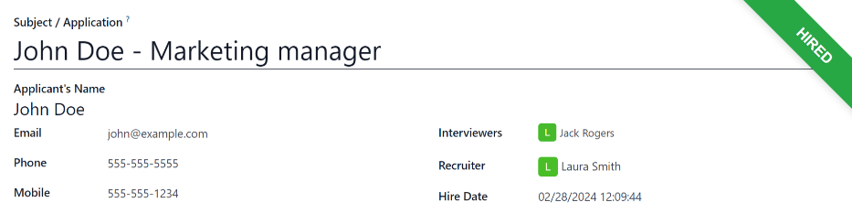
Create employee
Once the applicant has been hired, the next step is to create their employee record. Click the Create Employee button in the top-left corner of the hired applicant’s form.
An employee form appears, with information from the applicant’s card, and the employee contract.
Fill out the rest of the employee form. For detailed information on the fields, refer to the New employees documentation.
Once completed, the employee record is saved in the Employees app.
On this page
Get Help
Contact Support Ask the Odoo Community
- User Docs
- Database management
- Developer
- Contributing
EN
Odoo 18
Refuse applicants
At any point in the recruitment process, an applicant can be refused for a job position.
To refuse an applicant, start by navigating to the applicant’s card in the Recruitment app. This is done in one of two ways:
- Navigate to Recruitment app ‣ Applications ‣ All Applications. In the Applications list, click anywhere on the desired applicant’s line to open that specific applicant’s card.
- Navigate to the main ob Positions dashboard by navigating to Recruitment app ‣ Applications ‣ By Job Position. Next, click on the desired job position card, then click on the individual applicant card from the Applications page.
At the top of the applicant’s card, there are several buttons. Click the one labeled Refuse.
Refuse reasons
Refuse reasons allow recruiters to document why an applicant was not a good fit, and send specific refusal reason email templates to the applicant.
Clicking Refuse on an applicant’s form makes the Refuse Reason pop-up window appear.
The default refuse reasons in Odoo, and their corresponding email templates, are:
Email Template | Refusal Reason |
|---|---|
Recruitment: Refuse | Doesn’t fit the job requirements Language issues Role already fulfilled Duplicate Spam |
Recruitment: Not interested anymore | Refused by Applicant: don’t like job Refused by Applicant: better offer Refused by Applicant: salary |
Additional refusal reasons can be created, and existing ones can be modified (or deleted).
Select a refusal reason to send a refusal email.
Create or modify refuse reasons
To view and configure refuse reasons, navigate to Recruitment app ‣ Configuration ‣ Applications: Refuse Reasons. Doing so reveals the Refuse Reasons page, where all the existing refuse reasons are listed.
To create a new refuse reason from the Refuse Reasons page, click the New button in the top-left corner. A blank line appears at the bottom of the list, with an empty field present in the Description column.
Type in the new refuse reason in the field. It is recommended to enter a reason that is short and concise, such as Offer expired or Withdrew application.
Then, in the Email Template field, click on the field to reveal a drop-down menu. Select an Email Template from the list to be used when this refuse reason is selected.
If a new Email Template is desired, type in the name for the new template in the field. Then, click Create and edit…, and a Create Email Template form pop-up window appears.
In the Create Email Template pop-up window, enter a Name for the form, and an email Subject in the corresponding fields.
Enter the desired email content in the Content tab. Proceed to make any other modifications to the template in the Email Configuration and Settings tabs, then click Save & Close to save the template. Upon clicking that, Odoo returns to the Refuse Reasons list.
The new template appears in the new refuse reason Email Template field.
Note
Pre-configured recruitment refusal email templates in Odoo use dynamic placeholders, which are personalized placeholders that populate data from the applicant’s record in the email body.
For example, if the applicant’s name is a used in a dynamic placeholder, the applicant’s name appears anytime that dynamic placeholder appears on the email template.
For more detailed information on email templates, refer to the Email templates documentation.
Send refusal email
After clicking the Refuse button on an applicant form, a Refuse Reason can be selected from the refuse reason pop-up window. Then, two fields appear below the selected refusal reason: Send Email and Email Template.
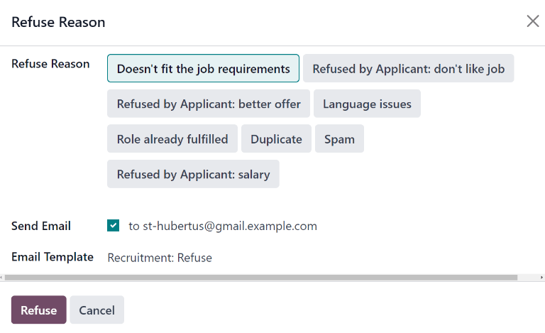
The applicant’s email address automatically populates the Send Email field; additional email recipients cannot be added.
If an email should not be sent to the applicant, uncheck the Send Email checkbox.
The email template associated with the refusal reason populates the Email Template field. If a different email template is desired, select a different template from the Email Template drop-down menu.
To send the refusal email to the applicant, ensure the Send Email checkbox is ticked, then click Refuse at the bottom of the Refuse Reason pop-up window. The refusal email is sent to the applicant, and a red Refused banner appears on the applicant’s card in the top-right corner.
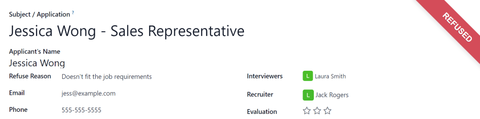
View refused applicants
After refusal, the applicant’s card is no longer visible in the job position’s Kanban view. However, it is still possible to view applicants who have been refused.
To view only the refused applicants, go to Recruitment app ‣ Applications ‣ By Job Positions, or Recruitment app ‣ Applications ‣ All Applications.
On the Applications page, click the (caret down) button in the Search… bar, then click Refused, located under the Filters section.
All applicants that have been refused for the job position appear on the Applications page for that position, organized by the stage they were in when they were refused.
On this page
Get Help
Contact Support Ask the Odoo Community
- User Docs
- Database management
- Developer
- Contributing
EN
Odoo 18
Source analysis reporting
Reporting is a critical tool used by recruiting departments to gain insights into the entire recruitment process.
Determining where applicants come from can provide information about which sources have the best results. This information is determined by the Source Analysis report. With this data, recruitment teams can better pivot their recruiting strategies to gain better applicants, in both quantity and quality.
Open report
To access the Source Analysis report, navigate to Recruitment app ‣ Reporting ‣ Source Analysis.
This presents the data for the Last 365 Days Applicant, in a default (Graph) view, showing the amount of applicants by Source, and further separated by stage (In Progress and Hired)
Hover the cursor over any column to view the specific numbers fort that column.
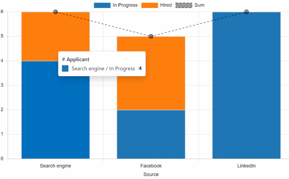
To view more details, view the Source Analysis report in a pivot table. To do so, click the (Pivot) icon in the top-right corner. The data is presented in a pivot table, with rows populated by job positions, and columns populated stages.
Source effectiveness report
To identify which sources (e.g., job boards, social media, employee referrals, company website) produce the most hires, the pivot table view of the Source Analysis report can be configured to display further details.
To expand this chart to show what specific sources the applicants came from, click the Total box above the columns, to reveal a drop-down menu, and click Source.
Each column is then grouped by the source, such as: Search engine, Facebook, Newsletter, etc. Each source displays a separate count for Applicant, Hired, and Refused.
This information, as presented, makes it difficult to view the specific numbers for each source. Click the (Flip axis) icon, to swap the information. After that, the rows represent the source, and the columns represent the job positions, further divided by stage.
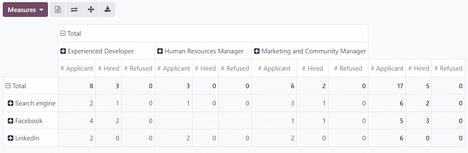
In this view, the total number of applicants, hired employees, and refused applicants, are displayed for each source, as well as for each stage by job position.
Medium
Viewing the medium for the applicants can be beneficial to see which specific medium is more successful.
Mediums are the specific methods the applicant used to discover and then apply for job positions, such as organic search, paid search, social media ad, email, etc.
To further group the results by medium, click into one of the [Source] rows. Click Medium in the resulting drop-down menu. The row presents the specific mediums, relevant to that specific source.
Once Medium is selected for one source, clicking into another row automatically reveals the specific metrics for the mediums for that source.
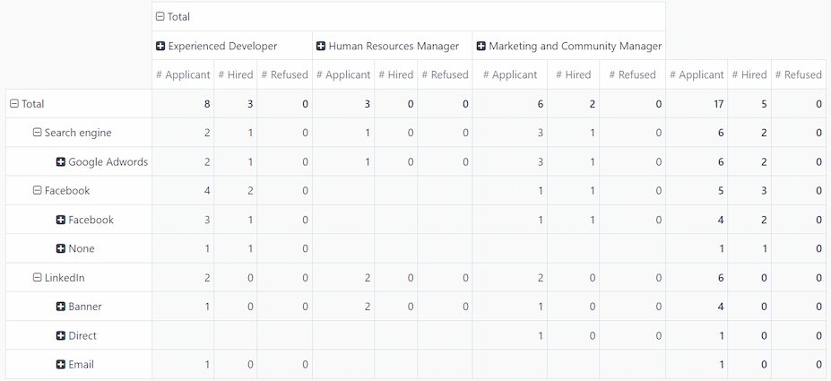
Note
The only mediums that appear for a source, are mediums that have been set on an applicant’s form. If a medium has not been set for any applicants, the medium does not appear in the drop-down rows beneath the source.
For example, if no applicants applied with the medium Google Adwords, that medium does not appear beneath the Search engine source row.
On this page
Get Help
Contact Support Ask the Odoo Community
- User Docs
- Database management
- Developer
- Contributing
EN
Odoo 18
Recruitment analysis
The Recruitment Analysis report allows recruiting departments to see which job positions have the most applicants, which have the most referrals, and how long it takes for applicants to move through the pipeline.
Knowing how many applicants each specific job position has, along with statistics about how many are hired and refused, can provide valuable insights. This information can assist the recruiting team to pivot their strategies to acquire the most desirable candidates.
Recruitment analysis report
Start by navigating to Recruitment app ‣ Reporting ‣ Recruitment Analysis. This presents a line chart of all applicants for the last year.
Three separate color-coded metrics are presented: In Progress, Hired, and Refused.
Hover the cursor over a month of the chart, and a pop-up window appears, displaying the specific numbers for that month.
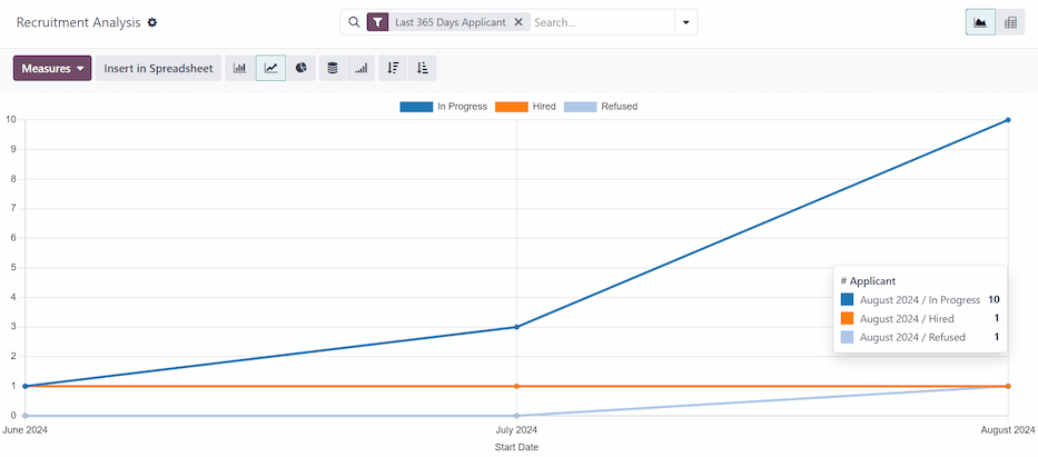
Pivot table view
For a more detailed view of the information in the Recruitment Analysis report, click the (Pivot) icon in the top-right corner. This displays all the information in a pivot table.
In this view, the job positions are displayed in the rows, and the columns display the total numbers of applicants, including how many of those applicants were hired or refused. The displayed information can be modified, if desired.
In this example, there are 17 total applicants. Out of that, three have been hired, and four refused. The Experienced Developer position has eight total applicants, two of which were hired, and two were refused.
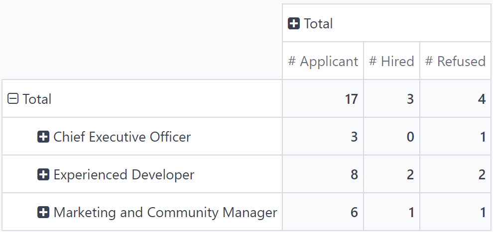
Use case: applicants with referrals
To get a better understanding of how effective the company’s referral program is, the Recruitment Analysis report can be modified to show how many applicants were referred by current employees.
From the (Pivot) view of the Recruitment Analysis report, first click the Measures button to reveal a drop-down menu of options.
Click both Has Referrer and Count, to activate those two measures. Then, click # Applicant, # Hired, and # Refused to deactivate those default measures.
Now, the column displays the number of applicants that came from a referral in the Has Referrer column, and the total number of applicants in the Count column.
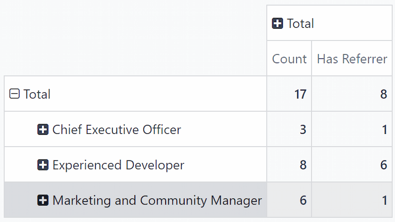
In this example, the Experienced Developer job position has the most applicants from referrals. Out of the eight applicants, six have applied through a referral from a current employee. Meanwhile, the Marketing and Community Manager job position has the least amount of referrals out of the total applicants, only one out of six.
Hired through referrals
It is possible to modify this report even further to see how many referred applicants end up being hired.
To view this data, click on a [job position] row, which reveals a drop-down menu. Then, click State to show the various states applicants are currently in.
Note
Only states that have applicants in them are shown for each job position. If a state does not have any applicants, it does not appear in the list.
To expand the other rows, and display the various states, click on the [job position] button.
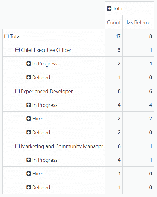
In this example, the Experienced Developer job position is the most successful in terms of referrals. Both of the hired employees came from internal referrals. Meanwhile, there have been no hired employees for the Chief Executive Officer position, and the only hired employee for the Marketing and Community Manager was not referred by an employee.
In this scenario, it is possible to determine that the current software developers are providing the most referrals, with the highest success rate.
On this page
Get Help
Contact Support Ask the Odoo Community
- User Docs
- Database management
- Developer
- Contributing
EN
Odoo 18
Time in stage analysis
The Time In Stage Analysis report provides information on how long applicants stay in each stage of the recruitment process. This is important, as every job position has specific process details that state the length of time applicants should expect to wait between specific stages.
Knowing how long applicants remain in each stage can help highlight possible bottlenecks. Analyzing this data allows the recruitment team to assess each stage, identify any issues, and pivot their strategies to move applicants through each stage, within the expected time interval.
Time in stage analysis report
To access the report, navigate to Recruitment app ‣ Reporting ‣ Time in Stage Analysis. By default, the report displays data from all job positions, with the stages populating the x-axis, and the number of days populating the y-axis, in a (Line Chart).
The default filter is Last 365 Days Applicant, showing information for the last 365 days.
Hover over a stage in the line chart to reveal a popover window listing all the job positions within it, and the average number of days each job position sits in each stage.
For a more visually digestible view of the information in the Time In Stage Analysis report, click the (Bar Chart) icon in the upper-left corner. This displays all the information in a bar chart.
In this view, it is easier to visualize the differences between the job positions, regarding how long applicants stay in each stage. From this view, recruiters can more easily determine which job positions have delays or bottlenecks at certain stages.
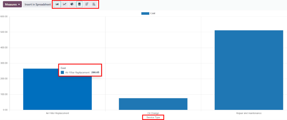
Use case: comparing times by month
With the Time In Stage Analysis report, it is possible to see if there are certain months where applicants take longer to be moved through the pipeline. To view this data, switch to the (Pivot) view in the upper-right corner.
This presents the data in a detailed pivot table, with the rows representing the different job positions, and the columns representing the stages. The average Days in Stage populates the various boxes.
Note
If a field is empty, it indicates no applicant has been in that stage. Instead, all applicants moved from a previous stage without being placed in the stage with an empty field.
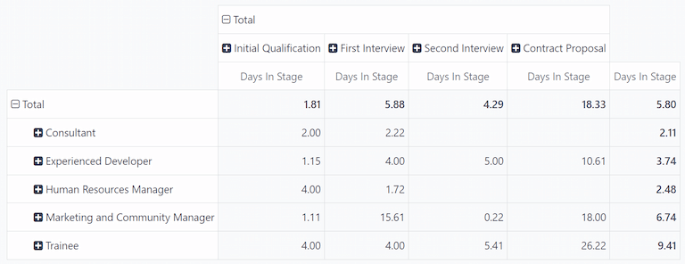
Click Total above the job position rows to collapse the information. Next, click Total again, revealing a drop-down menu. Click Add Custom Group at the bottom of the list, revealing further grouping options. Click Start Date from the expanded list.
After doing so, the data presented is grouped with the various months from the previous 365 days for the rows, leaving the Days In Stage as the columns.
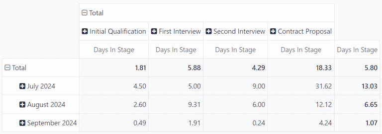
In this example, July 2024 had the longest time that applicants spent in each stage, on average. In addition, the Contract Proposal stage had the longest wait time in July, with an average of 31.62 days in that stage.
While this report does not display the reasons applicants stayed in the various stages for these lengths of time, it can be helpful to know when delays occur.
See also
Essentials reporting documentation
On this page
Get Help
Contact Support Ask the Odoo Community
- User Docs
- Database management
- Developer
- Contributing
EN
Odoo 18
Team performance reporting
The Team Performance report in the Recruitment app shows how many applicants each recruiter is managing.
This information is determined by the individuals populating the Recruiter field on each applicant form.
Open report
To access the Team Performance report, navigate to Recruitment app ‣ Reporting ‣ Team Performance.
The number of In Progress, Hired, and Refused applicants for each recruiter is displayed in the (Graph) view.
The information shown is for the Last 365 Days Applicant default filter, as displayed in the search bar.
Hover the cursor over any column to view a popover window, displaying the specific details for that column.
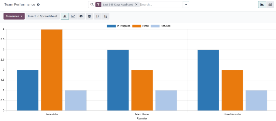
Pivot table view
For a more detailed view of the information in the Team Performance report, click the (Pivot) icon in the top-right corner. This displays all the information in a pivot table.
In this view, the job positions are displayed in the rows, while the columns display the total number of applicants. The applicants are further organized by # Applicant (in process), # Hired, and # Refused.
The displayed information can be modified, if desired.
In this example, there are 19 total applicants. Out of those 19, eight have been hired, and three refused.
From the data presented, the Experienced Developer job position is the most successful. This job position has the highest number of total applicants, as well as the most hires. In addition, the Experienced Developer has the least amount of refused applicants.
This pivot table also shows that the Chief Executive Officer position is the hardest to fill, as it has the fewest total applicants.
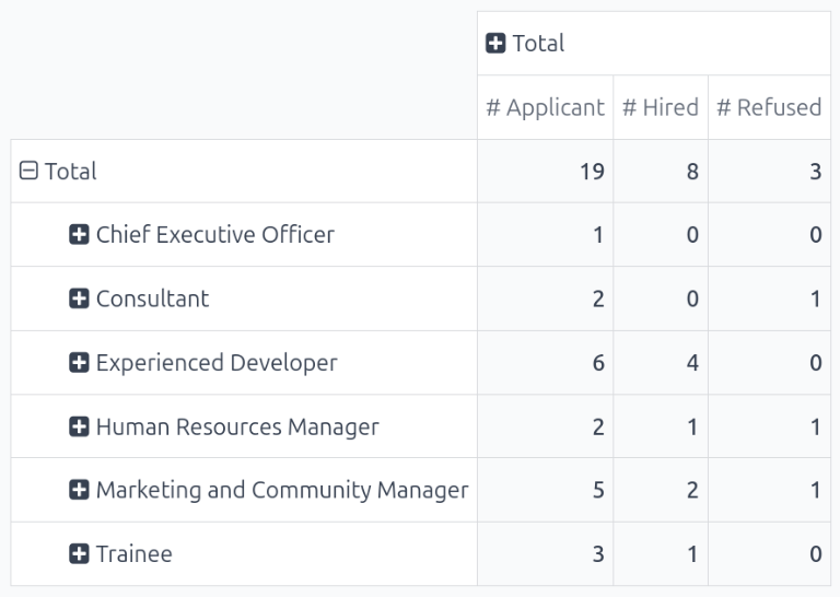
Use case: recruiter performance over time
One way to modify this report is to show how recruiters are performing over time. To show this information, begin with the Team Performance report in the (Pivot) view.
Next, click the (down arrow) in the search bar, revealing a drop-down menu. Click Add Custom Group at the bottom of the Group By column, then click Recruiter. Click away from the drop-down menu to close it. Now, each row on the table represents a recruiter.
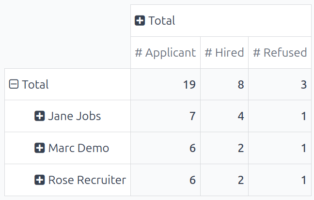
To compare the team’s performance over different time periods, click the (down arrow) in the search bar. Click Start Date in the Filters column, revealing various time periods to select.
In this example, the desired data is the comparison between the team’s performance in the third quarter (June - August) and the second quarter (April - July). To do so, click Q3. Once clicked, the current year is also ticked. In this example, it is 2024.
After making this selection, a Comparison column appears. Click Start Date: Previous Period to compare the third quarter with the second quarter, for the various recruiters.
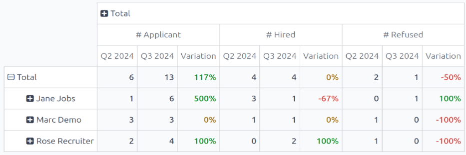
From this report, several things can be extrapolated: the total number of applicants increased, the number of hired applicants remained the same, while the number of refused applicants decreased.
Additionally, Jane Jobs had the highest increase in number of applicants during the third quarter, but her number of hired applicants went down 67%. The recruiter with the best overall numbers was Rose Recruiter, who had both their active applicants and hired applicants, increase in the third quarter, while their refused applicants went down.
On this page
Get Help
Contact Support Ask the Odoo Community
EN
Odoo 18
Referrals
Odoo’s Referrals application is a centralized place where all information regarding referrals is housed - from points earned, coworkers hired, and rewards selected. Users can recommend people they know for job positions, and then earn referral points as those people progress through the recruitment pipeline. Once enough referral points are earned, they can be exchanged for prizes. The Referrals application integrates with the Employees, Recruitment, and Website applications, all of which must be installed in order for the Referrals application to function.
The only configurations needed for the Referrals application after it has been installed, are related to the rewards; everything else is pre-configured when Odoo Referrals is installed.
Users with either Referral User, Officer, or Administrator access rights for the Recruitment application have access to the Referrals application. Only users with Administrator access rights for the Recruitment application have access to the reporting and configurations menus. For more information on users and access rights, refer to these documents: Users and Access rights.
Onboarding
When opening the Referrals application for the first time, a pre-configured onboarding script appears. This is in the form of four slides, each explaining the different parts of the Referrals application. At the top of the dashboard, the following message is displayed throughout all the onboarding slides: GATHER YOUR TEAM! Job Referral Program. Behind this main message is an image, and beneath it some more explanatory text.
Each of the onboarding slides has a corresponding image and message that is displayed. After reading each message, click the Next button to advance to the next slide.
The text that appears on each slide is as follows:
- Oh no! Villains are lurking the city! Help us recruit a team of superheroes to save the day!
- Browse through open job positions, promote them on social media, or refer friends.
- Collect points and exchange them for awesome gifts in the shop.
- Compete against your colleagues to build the best justice league!
Note
The onboarding slides will appear every time the Referrals application is opened, until all the slides have been viewed and the Start Now button has been clicked. If the onboarding is exited at any point, or if the Start Now button has not been clicked, the onboarding slides will begin again when the Referrals application is opened. Once the Start Now button has been clicked, the onboarding slides will not be seen again, and the main dashboard will load when the Referrals application is opened from that point on.
At any point during onboarding, the Skip button may be clicked. This exits the onboarding, and the main Referrals dashboard loads. If Skip is clicked, onboarding slides will not load anymore when opening the Referrals application.

Note
If there are any candidates hired that the user had referred prior to opening the Referrals app (meaning the onboarding slides have not appeared before), when Start Now is clicked at the end of onboarding, instead of going to the main dashboard, a hired screen appears instead.
Modifying onboarding slides
Onboarding slides can be modified if desired. Only users with Administrator rights for the Recruitment application can modify onboarding slides. To edit a slide, navigate to Referrals app ‣ Configuration ‣ Onboarding. Each line displays the text for the individual onboarding slide. To edit an onboarding slide, click on an individual slide line to open the slide’s onboarding form.
Make any changes to the message in the Text field. A Company may be selected, as well. However, if this field is populated, that slide is only displayed for that particular company.
Note
The Company field only appears when in a multi-company database.
The image can be modified, as well. Hover over the image thumbnail in the top-right corner of the form. A ✏️ (pencil) icon and 🗑️ (garbage can) icon appear. Click the ✏️ (pencil) icon to change the image. A file navigator window loads. Navigate to the desired image, select it, then click Open. The new image appears in the thumbnail. To delete an image, click the 🗑️ (garbage can) icon, then select a new image using the ✏️ (pencil) icon.

The sequence in which the slides appear can be changed from the Onboarding dashboard. Click the (six small gray boxes) icon to the left of the the slide text, and drag the slide to the desired position.

Hired referrals
When a candidate that has been referred by a user is hired, the user “grows their superhero team” and adds superhero avatars to their Referrals dashboard.
After a referral has been hired, when the user next opens the Referrals app, instead of the main dashboard, a hired page loads. The text (Referral Name) has been hired! Choose an avatar for your new friend! appears.
Below this message are five avatar thumbnails to choose from. If an avatar has already been assigned to a referral, the thumbnail is grayed out, and the name that the avatar has been chosen for appears beneath the avatar. Click on an available avatar to select it.
If more than one referral was hired since opening the Referrals application, after selecting the first avatar, the user is prompted to select another avatar for the subsequent hired referral. Once all avatars have been selected, the dashboard loads and all the avatars are now visible. Mouse over each avatar and their name is displayed above them.
Modify friends
Friend avatars are able to be modified in the same manner that levels are modified. Only users with Administrator rights for the Recruitment application can make modifications to friends. The pre-configured friends can be seen and modified by navigating to Referrals app ‣ Configuration ‣ Friends. Each friend avatar appears in the Dashboard Image column, and the corresponding name appears in the Friend Name column. The default images are a motley group of hero characters, ranging from robots to dogs.
To modify a friend’s dashboard image, thumbnail, name, or position, click on an individual friend to open the referral friend form. Click Edit to make modifications. Type the name in the Friend Name field. The name is solely to differentiate the friends in the configuration menu; the friend’s name is not visible anywhere else in the Referrals application.
The Position can be set to either Front or Back. This determines the position of the friend in relation to the user’s super hero avatar. Click the radio button next to the desired selection, and the friend will appear either in front of or behind the user’s avatar when activated.
If desired, both the thumbnail Image and the Dashboard Image can be modified. Hover over the image being replaced to reveal a ✏️ (pencil) icon and 🗑️ (garbage can) icon. Click the ✏️ (pencil) icon, and a file explorer window appears. Navigate to the desired image file, then click Open to select it.
The referral friend form automatically saves, but can be saved manually at any time by clicking the Save manually option, represented by a (cloud upload) icon, located in the top-left corner. To cancel any changes made, click the ✖️ (Discard all changes) icon to delete any changes, and revert to the original content.
Warning
It is not advised to edit the images. An image file must have a transparent background in order for it to render properly. Only users with knowledge about transparent images should attempt adjusting any images in the Referrals application.
Once an image is changed and the friend is saved, it is not possible to revert to the original image. To revert to the original image, the Referrals application must be uninstalled then reinstalled.
Levels
The Referrals application has pre-configured levels that are reflected in the user’s avatar on the Referrals dashboard. As a user refers potential employees and earns points, they can level up, much like in a video game.
Levels have no functional impact on the performance of the application. They are solely used for the purpose of adding achievement tiers for participants to aim for, gamifying referrals for the user.
The user’s current level is displayed at the top of the main Referrals application dashboard, directly beneath their photo, in a Level: X format. In addition, a colored ring appears around the user’s photo, indicating how many points the user currently has, and how many additional points they need to level up. The cyan colored portion of the ring represents points earned, while the white colored portion represents the points still needed before they can level up.
Modify levels
Only users with Administrator rights for the Recruitment application can modify levels. The pre-configured levels can be seen and modified by navigating to Referrals app ‣ Configuration ‣ Levels. Each avatar appears in the Image column, and the corresponding level number appears in the Level Name column. The default images are of Odoo superheroes, and each level adds an additional element to their avatar, such as capes and shields.
To modify a level’s image, name, or points required to reach the level, click on an individual level in the list to open the level form, then make modifications.
Type in the name (or number) of the level in the Level Name field. What is entered is displayed beneath the user’s photo on the main dashboard when they reach that level. Enter the number of referral points needed to reach that level in the Requirements field. The points needed to level up are the total accumulated points earned over the lifetime of the employee, not additional points from the previous level that must be earned.
If desired, the Image can also be modified. Hover over the image to reveal a ✏️ (pencil) icon and 🗑️ (garbage can) icon. Click the ✏️ (pencil) icon, and a file explorer window appears. Navigate to the desired image file, then click Open to select it.
The level form saves automatically, but can be saved manually at any time by clicking the save manually option, represented by a (cloud upload) icon, located in the top-left corner. To cancel any changes made, click the ✖️ (Discard all changes) icon to delete any changes, and revert to the original content.

Warning
It is not advised to edit the images. An image file must have a transparent background in order for it to render properly. Only users with knowledge about transparent images should attempt adjusting any images in the Referrals application.
Once an image is changed and the level is saved, it is not possible to revert to the original image. To revert to the original image, the Referrals application must be uninstalled then reinstalled.
Level up
Once enough points have been accumulated to level up, the circle around the user’s photo is completely filled in with a cyan color, a large image stating Level up! appears above the photo, and the phrase Click to level up! appears beneath the user’s photo and current level.
Click on either the LEVEL UP! graphic, the user’s photo, or the text Click to level up! beneath the user’s photo to level up the user. The user’s avatar changes to the current level, and the ring around the photo is updated to indicate the current amount of points.
Leveling up does not cost the user any points, the user simply needs to earn the specified amount of points required.

Note
Once a user has reached the highest configured level, they will continue to accrue points that can be redeemed for rewards, but they are no longer able to level up. The ring around their photo remains solid cyan.
See also
On this page
Get Help
Contact Support Ask the Odoo Community
EN
Odoo 18
Share job positions
In Odoo Referrals, users can earn referral points by sharing job positions with potential applicants. Job positions can be shared in several ways, through the View Jobs button and the Email A Friend button, located at the bottom of the Referrals app dashboard.
Note
Sharing jobs can only occur after onboarding slides have been viewed or skipped.
View Jobs
To see all job positions that are actively recruiting candidates, click the View Jobs button on the main Referrals dashboard. This presents all job positions, with each individual job presented with its own card.
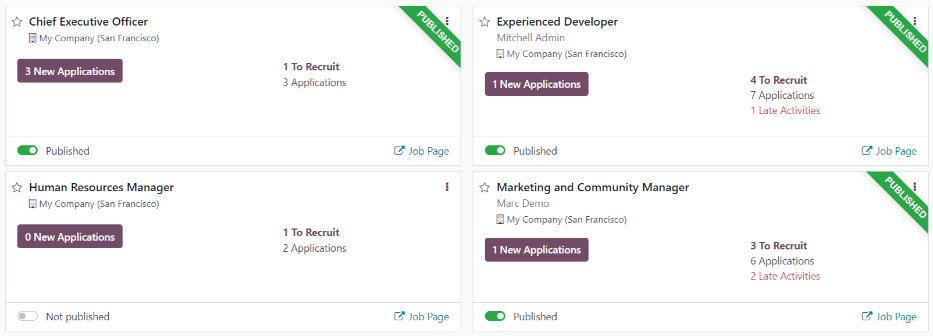
Each job position card contains the following information:
- The title of the job position. This information is taken from the Job Position field of the job form.
- The number of Open Positions being recruited. This information is taken from the Expected New Employees field of the Recruitment tab of the job form.
- The points a user earns when an applicant applies for the position.
- The job description detailing the job position. This information is taken from the Job Position tab of the job form.
To see all the details for a job position, click the More Info button on the specific card. This opens the job position webpage in a new browser tab. This is what an applicant sees before applying for a position.
Note
Only published job positions are visible in the Referrals app. To check which job positions are published or not, refer to the Job positions documentation.
Refer friends
To share a job position with someone, click the Refer Friend button on the specific job position card. A pre-configured Send Job Offer by Mail pop-up window appears. Enter the recipient’s email address in the Email field.
The Subject and Body are populated using a default template. The Subject Job for you is present, by default, but can be modified, if desired.
The specific title of the job position populates the Job Position placeholder in the email body. The See Job Offer text in the email body is an individualized tracking link to the specific job position listed on the website.
When the prospective employee receives the email, the link sends them to the job position page, where they can apply for the position, and the person who referred them is tracked in the Referrals application.
If desired, add any text or closing salutation to the email body. When all edits have been made, click Send Mail to send the email, or click Cancel to close the pop-up window.
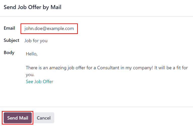
Share a job
Other than sending an email, job positions can be shared, via social media platforms, and by tracking links to the job position. At the bottom of each job position card are four icons, and corresponding tracking links, that can be used to share the job position, keeping track of applicants in the Referrals application.

Link
To share the job position with a customized tracking link, click the Share Now button with the (link) icon above it. A Link to Share pop-up window appears with the tracking link. Click Copy to copy the link. After the link is copied, click the Close button to close the pop-up window. Next, share the link with the prospective employee.
To share the job position using Facebook, click the Share Now button with the (Facebook) icon above it.
If the user is already logged into Facebook, when the the Share Now button is clicked, a Share on Facebook page loads in a new tab, with the link populated in the main body of the new post in a pop-up window. If the user is not already logged in, a log-in screen loads, instead, prompting the user to log-in to Facebook first.
Type in any additional information to add to the post, then share the job position using the available options in Facebook.
X (formerly Twitter)
A job position can also be shared on X. Click the Share Now button with the (X) icon above it.
If the user is already signed-in to X, when the Share Now button is clicked, an X page loads in a new tab with a pre-populated message ready to post, in a draft pop-up window. If the user is not already signed-in, a sign-in screen loads instead, prompting the user to first sign-in to X.
The default message is:
Amazing job offer for (Job Position)! Check it live: (link to Job Position)
Type in any additional information, or make any edits to the message, then share using the available options in X.
To share a job position on LinkedIn, click the Share Now button with the (LinkedIn) icon above it.
If the user is already logged into LinkedIn, when the Share Now button is clicked, a new tab loads in LinkedIn, with a link to the job position at the top. If the user is not already logged in, a log-in screen loads instead, prompting the user to log-in to LinkedIn first.
The job position can be shared either in a public post, or in a private message to an individual (or group of individuals).
Type in any additional information, or make any edits to the message or post, then share using the available options in LinkedIn.
Email a friend
Another way to share job opportunities is to share the entire current list of open job positions, instead of one job position at a time. To do this, navigate to the Referrals main dashboard. Click the Email a friend button at the bottom of the screen. A Send Job Offer by Mail pop-up window appears.
Enter the email address in the Email field. The email can be sent to multiple recipients by separating each email address with a comma followed by a single space. The Subject is pre-configured with Job for you, but can be edited.
The email Body is also populated with pre-configured text. The text that appears is:
Hello,
There are some amazing job offers in my company! Have a look, they can be interesting for you:
See Job Offers
The See Job Offers text is a tracking link to a complete list of all job positions currently being recruited for. Add any additional text and make any edits to the message body, if necessary. Then, click Send Mail to send the email. This sends the message, and closes the window.
On this page
Get Help
Contact Support Ask the Odoo Community
EN
Odoo 18
Referral points
The Referrals application allows employees to earn points that are then exchanged for rewards.
Current referral points can be viewed on the main Referrals app dashboard, which appears when the application is opened, after the onboarding slides have been viewed or skipped.
At the top, a summary of the user’s current points is displayed. The left side of the summary displays the Total points earned, and the right side displays the points that are available To Spend.
To view the various referral stages, and their respective earned points, click one of the referral statuses beneath the avatar. The options are: Referrals, Ongoing, and Successful.
The current number of referrals that are still active in the recruitment pipeline, but have not yet been hired or refused, appear above Ongoing. The number of referrals that have been hired, appear above Successful. The total number of referrals, both the ongoing and successful referrals combined, appears above Referrals.
My referrals
To see all the referrals, both ongoing and successful, click Referrals. The My Referral screen page displays all the referrals, with each individual referral housed in its own referral card.
A successful referral displays a white Hired badge in the top-right corner of the card, along with a vertical green stripe on the left-side of the card. Referrals that are in process have a purple In Progress badge in the top-right corner.
Each referral card lists the name of the applicant, the subject/application title as it appears on the applicant card in the Recruitment app, the name of the job position, the person responsible for filling the role (i.e. the recruiter), and the points earned.
For referrals that have been hired, the selected avatar also appears on the card.
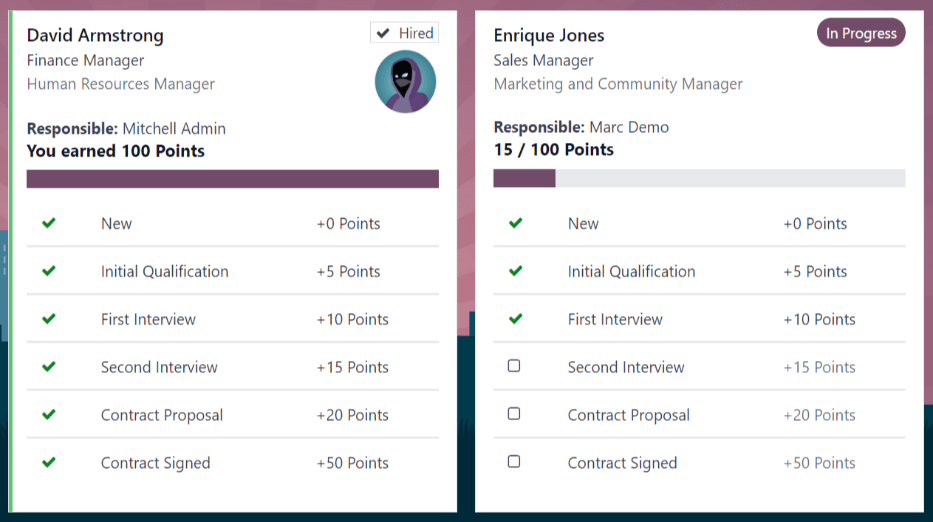
Points
The points that can be earned for a referral are the same across all job positions. Each stage of the recruitment process has corresponding points assigned to it. The stages listed correspond to the stages configured in the Recruitment application.
On each individual referral card, beneath the points earned, is a progress bar that displays how many points have been earned out of the total possible points that can be earned, if the applicant is hired.
Beneath the bar chart is a list of the various recruitment stages, and the points earned when the referral moves to that stage. If a stage has been achieved, and the points have been earned, a green (checkmark) appears next to the stage.
Note
The preconfigured point structure for referrals is as follows:
- Initial Qualification: 1 point
- First Interview: 20 points
- Second Interview: 9 points
- Contract Proposal: 5 points
- Contract Signed: 50 points
The default total points earned for a referral that is hired is 85 points. Modifications of the points earned for each stage are made in the Recruitment application. Refer to the Recruitment documentation to modify the points for each stage.
On this page
Get Help
Contact Support Ask the Odoo Community
EN
Odoo 18
Rewards
After employees have successfully earned referral points, they can exchange their points by purchasing rewards in Odoo’s Referrals application. Rewards must be created and configured before employees can redeem points for rewards.
Create rewards
Rewards are the only configurations needed when setting up the Referrals application.
Only users with Administrator rights for the Recruitment application can create or modify rewards.
To add rewards, navigate to Referrals app ‣ Configuration ‣ Rewards. Click New, and a reward form loads. Enter the following information on the form:
- Product Name: enter the name as it should appear for the reward. This field is required.
- Cost: enter the amount of points required to redeem the reward.
- Company: using the drop-down menu, select the company the reward is configured for. If a reward is available for multiple companies, each company must configure a reward for their specific company. This field only appears if in a multi-company environment; if this field appears, it is required.
Example
A corporation with three different companies offers a gift card as a reward. In the database, there are three separate rewards listed for a gift card, one for each of the three companies. - Gift Responsible: using the drop-down menu, select the person responsible for procuring and delivering the reward to the recipient. This person is alerted when the reward is bought in the Referrals application, so they know when to deliver the reward to the recipient.
- Photo: add a photo of the reward, which appears on the rewards page. Hover over the image box in the top-right corner (a square with a camera and plus sign inside it), and a (pencil) icon appears. Click the (pencil) icon to select and add a photo to the reward form. Once a photo is added, hovering over the image reveals two icons instead of one: a (pencil) icon and a (trash can) icon. Click the (trash can) icon to delete the currently selected image.
- Description tab: type in the description for the reward. This is visible on the reward card, beneath the title. This field is required.
Important
It is advised to enter a Cost and add a Photo. If a cost is not entered, the default cost is listed as zero, which would list the reward as free in the reward shop. If a photo is not selected, a placeholder icon is displayed on the rewards page.
Redeem rewards
In order to redeem a reward, points must be earned. These points can then be used to purchase a reward.
To purchase a reward, click the Rewards button on the main Referrals dashboard. All the configured rewards are listed in individual reward cards.
The required point amount needed to purchase a reward is listed in the top-right corner of the card.
If the user has enough points to purchase a reward, a Buy button appears at the bottom of the reward card. If they do not have enough points for a reward, the reward card displays You need another (x) points to buy this, instead of a Buy button.
Click the Buy button on a reward to purchase it. A Confirmation pop-up window appears, asking if the user is sure they want to purchase the reward. Click OK to purchase the item, or Cancel to close the window, and cancel the purchase.
After OK is clicked, the pop-up window closes, and the points used to purchase the reward are subtracted from the user’s available points. The rewards presented are now updated to reflect the user’s current available points.
On this page
Get Help
Contact Support Ask the Odoo Community
EN
Odoo 18
Alerts
In the Referrals application, it is possible to post a message, also referred to as an alert, at the top of the dashboard to share important information with users.
Alerts remain on the main Referrals dashboard for the specified amount of time configured on the individual alert.
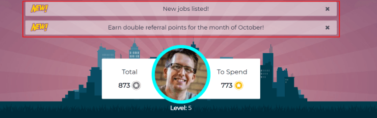
Create an alert
Only users with Administrator access rights for the Recruitment application can create alerts. To add a new alert, navigate to the Referrals app ‣ Configuration ‣ Alerts.
Click New to open a blank alert form. Enter the following information on the form:
- Date From: the date the alert starts. On this date, the alert is visible on the dashboard.
- Date To: the date the alert ends. After this date, the alert is hidden from view.
- Company: the current company populates this field, by default. To modify the company the alert should be displayed for, select the desired company from the drop-down menu in this field.
If this field remains blank, the alert is visible to everyone with access to the Referrals application.
If a company is specified, only users within that company (who also have access to the Referrals application) see the alert. This field only appears when in a multi-company database. - Alert: enter the text for the alert. This message appears inside the alert banner on the main Referrals dashboard.
- On Click: there are three options for the alert. Click the radio button next to the desired selection. The options are:
- Not Clickable: the alert only displays text, there is no link to click.
- Go to All Jobs: the alert contains a link that, when clicked, navigates to the website with all the job positions that are currently posted.
- Specify URL: the alert contains a link to a specific URL that, when clicked, navigates to that URL. When selected, a URL field appears below the On Click section. Enter the desired URL in that field.
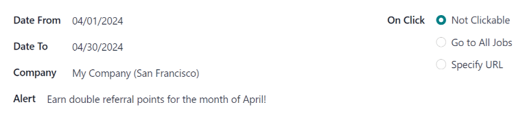
Dismiss an alert
It is possible to dismiss an alert, if a user does not wish to see a specific alert again.
To dismiss an alert, click the (remove) icon on the far-right side of the alert to remove the alert from the dashboard.
This prevents the alert from appearing again, even when opening the Referrals application for the first time in a new session.
On this page
Get Help
Contact Support Ask the Odoo Community
EN
Odoo 18
Reporting
The reporting function in the Referrals app helps recruiters and managers learn where applicants are applying from, when referred by a current employee. Additionally, the reporting feature shows the number of applicants hired, refused, and still in the recruitment pipeline, for each medium.
Important
Only users with Administrator rights for the Recruitment app have access to the reporting feature in the Referrals app.
Employees referral analysis report
To access the Employees Referral Analysis report, navigate to Referrals app ‣ Reporting. This loads the Employees Referral Analysis report, in a default Bar Chart.
The graph is presented in a Stacked view, with the number of referrals on the y-axis, and the source, referred to as the Medium, of the applicant (e.g.: Facebook, LinkedIn, Email, etc.) on the x-axis. If a medium does not appear on the report, that indicates there are no referrals from that particular medium.
Referral amounts for all stages are displayed, including Not Hired (refused), In Progress, and Hired. The default filter is set to the current month.
Hover over any bar to view a popover containing specific data for that particular bar.
In this view, it is easy to see which Medium is the most successful.
Example
In this example, both Email and LinkedIn are the mediums with the most referrals, but Email has the most referrals that were hired.
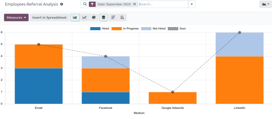
Use case: hired referrals
One way to use the reporting feature is to assess which employees are referring the highest quality applicants. This is done by examining how many of their referrals go on to become employees.
In this example, data is examined to determined which employee has the highest number of hired referrals for the current year.
To view this information, first click the (Pivot) icon in the upper-right corner. Next, remove the current filter in the search bar.
Click the (down arrow) in the search bar to reveal a drop-down menu. Click Date in the Filters column, revealing a drop-down menu of available time periods, and click the current year (in this example, 2024).
Next, click Measures , then deselect Earned Points and Employee Referral Refused to hide those metrics. Click anywhere on the screen to close the drop-down menu.
The information displayed shows how many total applicants each employee referred, and how many of those applicants were hired, for the current year.
In this example, it can be determined that Bob Wilson is the most successful referrer, with three hired referrals, and nine total referred applicants. Additionally, Mitchell Admin has the lowest performance in terms of referrals, as he has only one applicant, and no hires.
This information can be helpful to the recruitment team, so they can determine the most active referrers in the company, and who is the most successful in terms of hires.
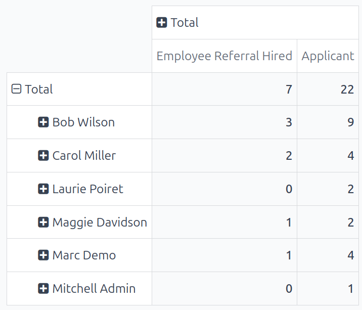
Tip
The pivot table can be inserted into a new or existing spreadsheet, if desired.
To do so, click the Insert in Spreadsheet button right above the chart. A pop-up window appears, asking which spreadsheet to insert the pivot chart into. Select the desired spreadsheet or dashboard from the presented options. Alternatively, select Blank Spreadsheet to create a new one.
Click Confirm, and the selected spreadsheet loads, with the new table in it.
The spreadsheet is stored in the Documents application. This application must be installed to use the Insert in Spreadsheet option.
On this page
Get Help
Contact Support Ask the Odoo Community
EN
Odoo 18
Lunch
The Lunch application in Odoo allows users a convenient way to order food and pay for their meal directly from the database.
Before employees can use the Lunch application, there are a number of configurations to consider: settings, vendors, locations, products, product categories, and alerts. Once these are created, employees can view offerings and order food.
Settings
Only two settings are needed to configure in the Lunch app: overdraft settings and notifications. To access the settings, navigate to Lunch app ‣ Configuration: Settings.
Configure the following:
- Lunch Overdraft: enter the maximum overdraft amount for employees. The currency format is determined by the localization setting of the company.
- Reception notification: set the message users receive via the Discuss app when their food has been delivered. The default message Your lunch has been delivered. Enjoy your meal! populates this field, but can be modified, if desired.
Tip
If in a database with multiple languages installed, many forms in the Lunch application have the option of entering translations for various fields.
If translations are available to be configured, a language code appears next to a translatable field on a form. To add translations for that field, click the two letter language code (for example, EN for English) and a translation pop-up window appears.
The following is an example for the Reception notification field in the settings menu:
Navigate to Lunch app ‣ Configuration: Settings. Click the EN In the top-right of the text box beneath the Reception notification section. A Translate: company_lunch_notify_message pop-up window loads with the option to enter a translation for the other languages used by the database.
The first column lists the different languages in alphabetical order, with the currently selected language in bold. The second column has the currently configured message in each column. The last column in the far-right provides a text box to type in a translation for each language.
Enter the text that should appear for each language, then click Save.
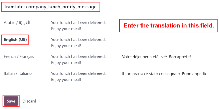
Locations
By default, Odoo creates an HQ Office location when the Lunch application is installed. If a company has more than one location, they must be configured.
To add a location, navigate to Lunch app ‣ Configuration: Locations. The currently configured locations appear in a list view. Click the New button in the top-left corner and a blank line appears beneath the last location in the list.
Enter the name of the location in the field. Next, click into the Address field to the right of the name, and enter the location’s address. It is possible to enter multiple lines in the address field.
Repeat this for all locations that need to be added.
Alerts
It is possible to set up alerts that can either be displayed in the Lunch app, or be sent to specific employees via the Discuss app.
No alerts are pre-configured by default. To set up an alert, navigate to Lunch app ‣ Configuration: Alerts. Click the New button in the top-left corner and a blank lunch alert form loads. Enter the following information on the form:
- Alert Name: enter a name for the alert. This should be short and descriptive, such as New Lunch Vendor or Order by 11. This field is required.
- Display: select whether the alert is visible in the Lunch app (Alert in app) or sent to employees via the Discuss app in a chat window (Chat notification).
- Recipients: this field only appears if Chat notification is selected for the Display option. Select who receives the chat alert. The options are: Everyone, Employee who ordered last week, Employee who ordered last month, or Employee who ordered last year.
- Location: select the locations the alert should appear for from the drop-down menu. Multiple locations can be selected. This field is required, therefore, if the alert applies to all locations, select all the locations from the drop-down menu.
- Show Until: if the alert should expire on a specific date, select the date from the calendar picker.
- Active: this option is on (appears green) by default. To turn off the alert, click the toggle so that it no longer appears green.
- Message: Enter the alert message in this field. This field is required.
- Notification Time: select the days of the week the alert should be sent. By default, all seven days are active. Click on a checkbox to change the setting from active to inactive.
If Chat notification was selected for the Display option, a Time field also appears. Enter the time the chat message should be sent. Next, select if the time is either AM or PM using the drop-down menu to the right of the Time field.
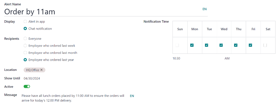
See also
On this page
Get Help
Contact Support Ask the Odoo Community
EN
Odoo 18
Vendors
Before products can be added to the Lunch app, the restaurants that provide the food must be configured.
To add a new vendor, first navigate to Lunch app ‣ Configuration ‣ Vendors. Here, all currently configured vendors for the Lunch app appear in a default Kanban view. To change to a list view, click the (list) icon in the top-right corner.
Note
No vendors are preconfigured in the Lunch app, so all vendors must be added to the database.
To add a new vendor, click the New button in the top-left corner, and a new lunch supplier form loads.
Fill out the following fields on the vendor form:
Vendor information
- Vendor: enter a name for the vendor.
- Vendor (beneath the line for vendor name): select the vendor from the drop-down menu. If the vendor has not already been entered in the system, type in the vendor name, and click either Create “new vendor name” to add them. Alternatively, click Create and edit… to create the vendor, and edit the vendor form. The vendor form allows for more detail, aside from the name, to be entered, such as contact information.
Note
If a selection is made to the drop-down Vendor field, the Vendor text field (above, for the vendor’s name) updates with the name of the vendor chosen from the drop-down menu.
The list of vendors that is presented in the drop-down menu is pulled from the Contacts application. - Address: enter the vendor’s address in the various fields.
- Email: enter the vendor’s email.
- Phone: enter the vendor’s phone number.
- Company: if this vendor is only available to a specific company, select the company from the drop-down menu. If this field is left blank, the vendor’s items are available to all companies.
Availability
The AVAILABILITY section presents a table with two rows. The days of the week populate the top row, and the bottom row has checkboxes. Tick the corresponding checkbox for each day of the week the vendor is available.
By default, Monday through Friday are ticked.
Orders
The ORDERS section of the vendor form details which locations the vendor is available for, in addition to how and when orders are placed and received.
- Delivery: using the drop-down menu, select Delivery if the vendor delivers to the office, or select No Delivery if orders must be picked up.
- Location: select which locations are able to order from this vendor. Multiple locations can be selected. If this field is left blank, all locations can order from the vendor.
Note
An HQ Office location is created by default when creating a database, and is available to select from the list. - Send Order By: click the radio button to select how orders are sent to the vendor. The available options are Phone or Email.
- Order Time: this field only appears if Email is selected in the Send Order By field. Enter the time that an order must be emailed for it to be accepted. Enter the time in the following format: HH:MM. Then select either AM or PM from the drop-down menu, next to the time field.
Extras
When ordering an item in the Lunch app, optional extra items, sometimes referred to as add-ons, can be shown. These can be configured in any manner that suits the products being offered.
By default, Odoo allows for three types of extra items, which can be thought of as categories. By default, the first type (or category) of add-ons is labeled Extras, the second is labeled Beverages, and the third is labeled Extra Label 3.
Important
When configuring the extras, it is important to keep in mind that all the extras configured appear for every item offered by the vendor. That means that only items which apply to all products from the vendor should be added.
Configure extras
Enter the following information for each of the three available extra sections:
- Extra (#) Label: enter a name for the type of extra, such as Toppings. This can be thought of as a category.
- Extra (#) Quantity: select how the extras are selected. The options are:
- None or More: select this if the user is not required to make a selection.
- One or More: select this to require the user to make at least one selection.
- Only One: select this to require the user to make only one selection.
Add extras
After the labels and quantities have been configured for an extra category, the individual extra items must be added for each category.
Click Add a line at the bottom of the list that appears on the right-hand side of the extra category. Enter the Name and Price for each item being added. The price can remain at $0.00 if there is no cost. This is common for items like disposable silverware or condiments.
Example
For a pizzeria that only offers personal pizzas, see their extras configured as follows:
The first extra is configured for the various toppings they offer. The Extra 1 Label is set to Toppings, and the Extra 1 Quantity is set to None or More. The various toppings are then added, with their corresponding costs.
The pizzeria also offers a free beverage with any purchase. To set this up, the Extra 2 Label is set to Beverages, and the Extra 1 Quantity is set to Only One. The various beverage choices are added, and the cost for each remains zero.
On this page
Get Help
Contact Support Ask the Odoo Community
EN
Odoo 18
Products
Odoo’s Lunch app does not come with any products preconfigured. The individual products being offered must first be configured before orders can be placed.
To add and configure products for the Lunch app, navigate to Lunch app ‣ Configuration ‣ Products. Next, click the New button in the top-left corner, and a blank product form loads.
Enter the following information on the form:
- Product Name: enter the name for the product. This field is required.
- Product Category: using the drop-down menu, select the category this product falls under. This field is required.
- Vendor: using the drop-down menu, select the vendor that supplies this product. This field is required.
- Price: enter the price for the product. The currency is determined by the company’s localization.
- Description: enter a description of the product in this field. This description appears beneath the product photo when users are viewing the day’s options.
- New Until: using the calendar popover, select the date on which the product is no longer labeled as new. Until this date, a green New tag appears on the product.
- Company: if the product should only be available to a specific company, select it from the drop-down menu. If this field is left blank, this product is available for all companies in the database.
- Image: hover over the image box in the top-right corner of the form, and click the (pencil) icon that appears. A file explorer pop-up window appears. Navigate to the image, then click Open.
Product categories
Product categories organize the offerings in the Lunch app, and allows users to quickly filter them when reviewing the menu for the day.
To add or modify categories, navigate to Lunch app ‣ Configuration: Product Categories. The available categories appear in a list view.
In the Lunch app, there are four default categories: Sandwich, Pizza, Burger, and Drinks.
To add a new category, click the New button in the top-left corner, and a blank category form loads.
Enter a name in the Product Category field. If the category is company-specific and should only appear for a certain company, select the Company from the drop-down menu.
If desired, add a photo for the category. Hover over the image box in the top-right, and click the (pencil) icon that appears. This opens a file explorer pop-up window. Navigate to the image, then click Open.
Get Help
Contact Support Ask the Odoo Community
EN
Odoo 18
Orders
When the Lunch application is opened, the Order Your Lunch dashboard loads. This view is also accessed by navigating to Lunch app ‣ My Lunch ‣ New Order.
The Order Your Lunch dashboard provides a summary of lunch offerings, the user’s account information, and the current day’s orders, along with their statuses.
Order Your Lunch
On the main Order Your Lunch dashboard, all the necessary information needed to place an order is visible. The default filter for the products is Available Today, which is present in the Search… bar. This filter shows only products that can be purchased that day, based on the vendor’s availability.
The left-side of the dashboard displays the various Categories of products available, along with the Vendors supplying the products. To the right of each line is a number, which indicates how many products are associated with that respective category or vendor.
To filter the products by categories or vendors, tick the checkbox next to the desired category or vendor to only view items related to those selections. Multiple selections can be made in each section.
Note
If multiple selections are made, only products that fall under all the selected options are shown.
The top portion of the dashboard, which serves as an order summary, displays the user’s account information, and the order details for today, if any orders have been placed.
The main section, beneath the user’s information, displays all the products in a default Kanban view. Each product card displays the name, cost, vendor, photo, and description of the product. If the product is configured as new, it also displays a New tag.
Note
Anywhere a vendor’s name is listed in the Lunch app, such as on Kanban product cards, their phone number is listed, as well.
The products can also be displayed in a list view, by clicking the ≣ (four parallel lines) icon in the top-right corner of the dashboard.
Placing orders
To place a lunch order, navigate to the main Order Your Lunch dashboard, by either opening the Lunch app, or by navigating to Lunch app ‣ My Lunch ‣ New Order.
Add products to an order
From the Order Your Lunch dashboard, click on a desired product to add to an order, and the product appears in a Configure Your Order pop-up window.
At the top of the pop-up window is the product image, name, and price. Beneath that, there is a potential Extras field, showcasing any extra items or options. Tick the checkbox next to any desired extras present in the Extras field to add them to the order.
Each extra option is organized by a category, complete with its name and price. As extras are selected, the displayed price at the top of the pop-up window updates to reflect all current selections.
Beneath the Extras field is the Description of the product, followed by a Notes field. The Notes field is used to enter any vital information, which is then sent to the vendor regarding the order, such as any special requests or food allergies.
When all selections for the product have been made, click the Add To Cart button in the lower-left of the pop-up window. To cancel the order, click the Discard button.
Errors
Depending on how the various extras are configured for a vendor, it is possible to receive an error when attempting to add products to the cart.
An error can occur when a configured product requires the user to select an option in the Extras field, but the user neglects to make one.
When this occurs, a Validation Error pop-up window appears. The error is briefly explained in the pop-up window. Click Close to close the window, and make any necessary changes to the Configure Your Order pop-up window.
Example
The vendor, The Pizza Palace, provides a free beverage with any purchase. Their products are configured so that a beverage selection is required in the Extras field before adding one of their products to the cart.
If a selection is not made, an error occurs. The message that appears is You have to order one and only one Free Beverage with Purchase.
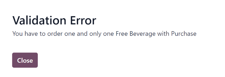
Your Order summary
When at least one item is added to an order, the items appear at the top of the dashboard in the Your Order summary. In addition to the products, users can view the account information, in addition to all the information related to orders placed during the current calendar day.
As products are added to an order, they appear at the top center of the summary box. Each product is listed beneath the words Your Order, with the product name, quantity, and a status tag.
The available tags that can be displayed for each item are:
- To Order: the product has been added to the cart, but has not been purchased yet by the user.
- Ordered: the product has been purchased by the user, and is waiting to be sent to the vendor by a Lunch app manager.
- Sent: the order for the product has been sent to the vendor by a Lunch app manager.
- Received: the product has been delivered by the vendor to the user’s location, and has been verified as received by a Lunch app manager.
Product quantities can be adjusted by clicking the ➕ (plus sign) or ➖ (minus sign) to the left of the listed product. The product price adjusts in real-time to display the cost for the currently selected quantity of the product.
The right side of the Your Order summary displays the purchasing information. The Total amount for the entire day’s lunch order is displayed. The Already Paid field indicates how much has been paid that day towards the Total amount. The To Pay field displays how much of the remaining Total amount must be paid, in order to place the currently configured order.
Tip
Users can place multiple orders throughout the day, and are not restricted to only placing one lunch order each day. Multiple orders might need to be placed, due to users forgetting to add items to an order, or if there are multiple meals that are available to be purchased for the office ()not just lunch), and so on.
Depending on the various vendors, and how the vendors and products are configured, it is possible to order breakfast, lunch, dinner, coffee, and/or snacks.
Submit an order
To place the order, click the Order Now button on the right-side of the Your Order summary. The user is charged the amount that is displayed in the To Pay field, and the cost is deducted from their Lunch account balance.
Once the order is placed, the tags for the items just purchased in the Your Order field change from orange To Order tags to red Ordered tags.
Track an order
When orders have been sent to the vendors, the tags for the items in the Your Order summary change from red Ordered tags to blue Sent tags.
Once orders have been received and verified, the tags change from blue Sent tags to green Received tags.
Receive an order
When orders are received at the delivery location, they are confirmed by a Lunch app manager, and a notification is sent to the employee who ordered the food.
My Orders
To view a full list of all orders placed in the Lunch app for the currently signed-in user, navigate to Lunch app ‣ My Lunch ‣ My Order History. This navigates to the My Orders dashboard. The data is filtered by My Orders and grouped by Order Date: Day, by default, both of which are located in the Search… bar.
All products appear in a list view, organized by date. The list displays the Order Date, Vendor, Product, Extras, Notes, User, Lunch Location, Price, and Status information. If in a multi-company database, a Company column also appears.
The total cost for each order is displayed on the line containing the order date. At the bottom of the list, beneath all the lines, the overall total amount paid for all the orders appears, under the Price column.
At the end of each product line with a status of Ordered or Sent, an X Cancel button appears. Click X Cancel to cancel that product order. Once a product order has been cancelled, the money paid for that product is refunded, and appears in the user’s account.
At the end of each product line with a status of Received, a Re-order button appears. Click Re-order to instantly reorder that same product, with the same extras, if applicable. The new order appears in the list, under the current date, and the product is paid for, with money deducted from the user’s account.
My Account
To view a summary of all transactions in the user’s account, navigate to Lunch app ‣ My Lunch ‣ My Account History. Doing so reveals the My Account dashboard.
The default presentation of the My Account dashboard displays all entries, from newest to oldest. The Date, Description, and Amount are the only fields displayed in the list.
Entries with a negative figure listed in the Amount column represent products purchased in the Lunch app. These appear in a $-XX.XX format.
Entries with a positive balance either represent funds added to the user’s lunch account, or cancelled orders that were eventually refunded to the user. These appear in a $XX.XX format.
On this page
Get Help
Contact Support Ask the Odoo Community
EN
Odoo 18
Manage user accounts
In Odoo’s Lunch application, users pay for products directly from their Lunch app account. For funds to appear in their account, a Lunch app manager must transfer funds into each user’s account.
Important
To add funds and manage user accounts, the user must have Administrator access rights set for the Lunch application. This is verified by navigating to Settings app ‣ → Manage Users. Then, click on a user to view their various settings and access rights.
For more information, refer to the Access rights documentation.
The Lunch application does not directly interface in any way with software or products linked to any monetary accounts or billing. Money cannot be transferred from users’ bank accounts, nor can users’ credit cards be charged.
Odoo’s Lunch application only allows for manual entries of cash exchanges that are handled by the Lunch app manager. It is up to each individual company to create the method with which lunch accounts are replenished.
Example
Some examples of how money can be organized and transferred within a company:
- Cash is handed to the Lunch app manager, who then updates the user’s account.
- Money is automatically deducted from the user’s paychecks, then the Lunch app manager updates the account when paychecks are issued. This requires adding a salary attachment for the user’s payslip in the Payroll app.
- Companies can sell “lunch tickets” at a set price (for example, one ticket costs $5.00). Users can purchase tickets from a Lunch app manager, who then updates the user’s account.
Cash Moves
To add funds to user accounts, each cash move must be individually logged. To view all cash move records, or create a new cash move, navigate to Lunch app ‣ Manager ‣ Cash Moves. Doing so reveals the Cash Moves dashboard.
On the Cash Moves dashboard, all cash moves are presented in a default list view, displaying each record’s Date, User, Description, and Amount. The total of all the cash moves is displayed at the bottom of the Amount column.
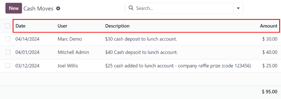
Add funds
To add funds to a lunch account, click the New button, located in the top-left corner of the Cash Moves dashboard.
A blank Cash Moves form loads. Enter the following information on the form:
- User: select the user depositing cash into their account from the drop-down menu. If the user is not in the database, they can be created by typing their name in the User field, and clicking either Create “user” or Create and edit… to create the user and edit the Create User form.
- Date: using the calendar popover, select the date the transaction occurred.
- Amount: enter the amount being added to the lunch account.
- Description: enter a brief description of the transaction.
Control Accounts
An overview of every transaction in the Lunch app, including all cash deposits and purchases, can be viewed on the main Control Accounts dashboard. To access this dashboard, navigate to Lunch app ‣ Manager ‣ Control Accounts.
All transactions are grouped By Employee, and listed alphabetically by the user’s first name. At the end of the user’s name, a number appears. This indicates the number of individual records logged for that user.
The default view is to have all individual transactions hidden. To view all transactions for a user, click the ▶ (triangle) icon to the left of the desired name to expand that specific group.
Each record includes the Date, User, Description, and Amount.
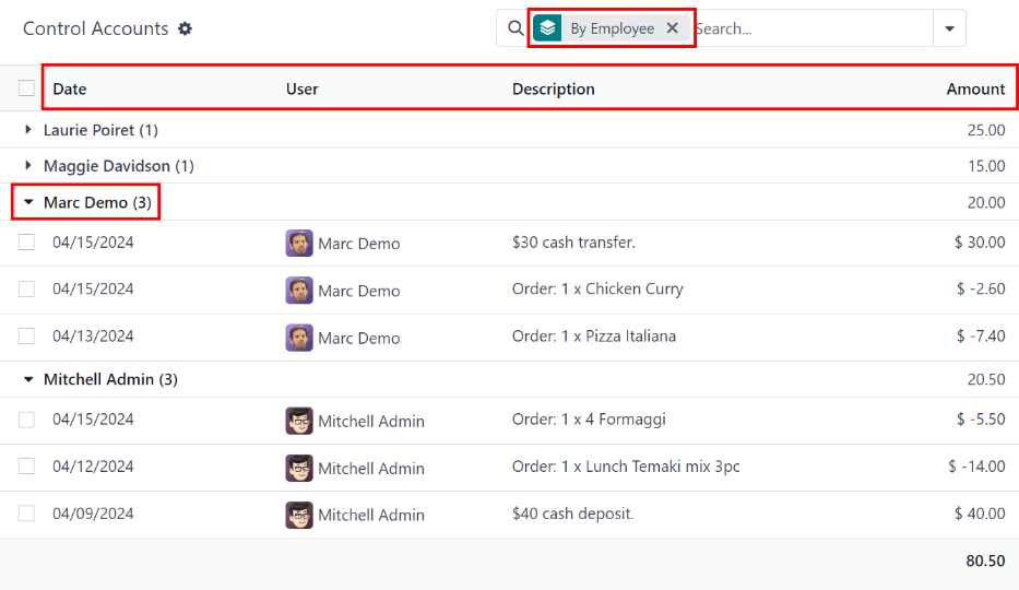
Important
This list only displays the various transactions within the Lunch app, and does not allow modifications to be made to any records listed.
Cash moves can be modified, but only from the Cash Moves dashboard, not from the Control Accounts dashboard.
It is not possible to modify any product-related records.
On this page
Get Help
Contact Support Ask the Odoo Community
EN
Odoo 18
Lunch management
In Odoo’s Lunch application, it is required to have someone manage the orders, vendors, and products. In addition, someone must be responsible for the orders, and notifying employees when their orders have arrived. This can be the same person.
Orders can be cancelled, sent to the vendor, confirmed upon arrival, and employees can be notified, either from the Today’s Orders dashboard, or the Control Vendors dashboard.
To manage the Lunch app, users need the appropriate Administrator rights. These can be set by navigating to the Settings app and selecting Manage Users. Then, click on the desired user to view their access rights.
For more information on access rights, refer to the Access rights documentation.
Note
Only users with administration rights are able to view the Manager and Configuration menus in the Lunch application.
Today’s Orders
To view and manage the orders for the day, navigate to Lunch app ‣ Manager ‣ Today’s Orders. All orders for the day are presented in a list view on the Today’s Orders dashboard, with a filter for Today, and grouped by Vendor, by default.
The following information appears in the list:
- Order Date: the date the order was placed.
- Vendor: the vendor the product is being ordered from.
- Product: the specific product ordered.
- Extras: any extras selected for the product.
- Notes: any information needed to be sent to the vendor.
- User: the user who ordered the product.
- Lunch Location: where the product is set to be delivered.
- Price: the total price for the product, including all extras.
- Status: the current status of the product.
- Company: the company under which the order was placed. This only appears in a multi-company database.
Cancel orders
All users can cancel an order, not just managers of the Lunch app.
To cancel an order from a vendor, individual products must be cancelled one at a time.
On the Today’s Orders dashboard, a ✖️ Cancel button is shown at the far-right of each product line that can be cancelled. Click the ✖️ Cancel button to cancel the order for that individual product.
Note
Only products with a red Status tag of Ordered can be cancelled.

Send orders
The first step in managing the Lunch app is to send the orders to the vendors.
When orders are ready to be sent, the manager responsible for sending orders must send the orders to the vendor, outside of the database (call, online order, etc.).
Once orders have been placed with the vendors, click the Send Orders button that appears next to each vendor’s name and phone number.
Once sent, the Send Orders button changes to a Confirm Orders button, and the Status column is updated from red Ordered tags to blue Sent tags, indicating the order has been sent to the vendor. Users who have placed orders in the Lunch app rely on the Status tags to track their orders.
Confirm orders
After orders have been sent to the vendor, the next step is to confirm the orders after they have been delivered.
On the Today’s Orders dashboard, click the Confirm Orders button that appears next to the vendor’s name and phone number.
Once confirmed, the Confirm Orders button disappears, and the Status column is updated from blue Sent tags to green Received tags, indicating the vendor has delivered the orders.
In addition, the ✖️ Cancel button at the end of each product line changes to a ✉️ Send Notification button.
If needed, instead of confirming all of the individual products from a vendor, individual products can be confirmed one at a time. To confirm an individual product, click the ✔️ Confirm button at the end of the individual product line. When confirming individual products with this method, the Confirm Orders button remains on the vendor line.
Example
A vendor receives an order for three pizzas, and an order of garlic knots. When the delivery is made to the company, the Lunch manager notices the garlic knots are missing.
The manager first marks the three pizzas as received, by individually confirming the products with the ✔️ Confirm button at the end of each product line.
Later, when the vendor delivers the garlic knots, the manager can either click the ✔️ Confirm button at the end of the line for the garlic knots, or click the Confirm Orders button that appears next to the vendor’s name and phone number.
Notify employees
After products are received, and the orders are confirmed, the employees must be informed that their orders have been delivered, and are ready to be picked up.
Unlike sending and confirming orders, notifications must be sent individually, and cannot be sent in a batch.
To notify the user their product has arrived, click the ✉️ Send Notification button at the end of each product line. An email is sent to the user informing them their products have been delivered.
Control Vendors
All orders for all vendors, both past and present, can be found in the Control Vendors dashboard. To access these records, navigate to Lunch app ‣ Manager ‣ Control Vendors.
All orders appear in a list view, grouped alphabetically by Vendor. The list loads with all vendors expanded to show all order lines for every vendor, by default.
The following information appears in the list:
- Order Date: the date the order was placed.
- Vendor: the vendor the product is being ordered from.
- Product: the specific product ordered.
- Extras: any extras selected for the product.
- Notes: any information needed to be sent to the vendor.
- User: the user who ordered the product.
- Lunch Location: where the product is set to be delivered.
- Price: the total price for the product, including all extras.
- Status: the current status of the product.
- Company: the company under which the order was placed. This only appears in a multi-company database.
Orders can be cancelled, sent to the vendor, confirmed upon arrival, and employees can be notified using the same method as on the Today’s Orders dashboard.
Note
The difference between the Today’s Orders dashboard and the Control Vendors dashboard is that the Today’s Orders dashboard only displays orders for the current day, while the Control Vendors dashboard displays all orders made in the Lunch app.
See also
On this page
Get Help
Contact Support Ask the Odoo Community
EN
Odoo 18
Email Marketing
The Odoo Email Marketing app provides drag-and-drop design tools, pre-built templates, and other interactive features to create engaging email campaigns. The Email Marketing app also provides detailed reporting metrics to track the campaigns’ overall effectiveness.
See also
Odoo Tutorial: Email Marketing
Mailing lists
Silo contacts into specific mailing lists.Manage unsubscriptions (Blacklist)
Allow recipients to unsubscribe and blacklist from future mailings.Lost leads reactivation email
Target lost leads with Email Marketing.Analyze Metrics
Analyzing campaign metrics.Email marketing dashboard
After installing the application, click the Email Marketing app icon from the main Odoo dashboard. Doing so reveals the main Mailings dashboard in the default list view.
In the search bar, the default filter of My Mailings is present to show all the mailings related to the current user. To remove that filter, click the ✖️ (remove) icon next to the filter in the search bar. Doing so reveals all the mailings in the database.
The information on the Mailings dashboard has four different view options, located in the upper-right corner as individual icons.
The view options, from left-to-right, are:
List view
The list view, represented by the ☰ (horizontal lines) icon in the upper-right corner, is the default view of the Mailings dashboard in the Email Marketing app.
While in list view, there are columns dedicated to different aspects of information related to the listed emails. Those columns are as follows:
- Date: the date the email was sent.
- Subject: the subject of the email.
- Responsible: the user who created the email, or the user who has been assigned to the email.
- Sent: how many times the email has been sent.
- Delivered (%): percentage of sent emails that have been successfully delivered.
- Opened (%): percentage of sent emails that have been opened by the recipients.
- Clicked (%): percentage of sent emails that have been clicked by the recipients.
- Replied (%): percentage of sent emails that have been replied to by the recipients.
- Status: the status of the email (Draft, In Queue, or Sent).
To add or remove columns, click the Additional Options (two horizontal lines with dots) icon, located to the far-right of the column titles in list view. Doing so reveals a drop-down menu of additional column options.
Kanban view
The Kanban view, represented by the (inverted bar graph) icon, can be accessed in the upper-right corner of the Mailings dashboard in the Email Marketing app.
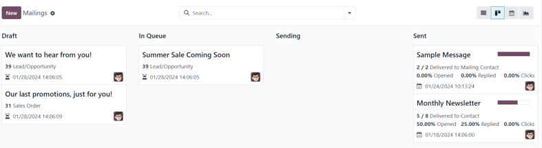
While in Kanban view, the email information is displayed in the various stages.
The stages are: Draft, In Queue, Sending, and Sent.
- Draft: the email is still being written/created.
- In Queue: the email is scheduled to be sent at a later date.
- Sending: the email is currently being sent to its recipients.
- Sent: the email has already been sent to its recipients.
In each stage, there are drag-and-drop cards representing the emails that have been created/sent, and the stage they are in represents the current status of that mailing.
Each card on the Mailings dashboard provides key information related to that specific email.
When the cursor hovers over the upper-right corner of an email campaign card, a ⋮ (three vertical dots) icon appears. When clicked, a mini drop-down menu reveals the option to color-code the email, Delete the email, or Archive the message for potential future use.
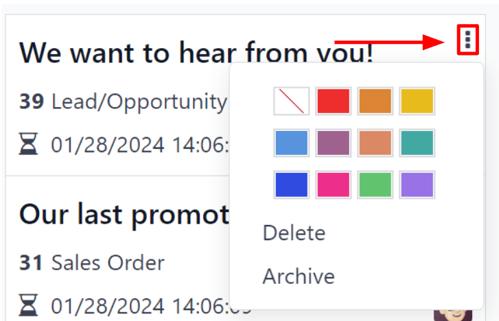
Calendar view
The calendar view, represented by a 📆 (calendar) icon, can be accessed in the upper-right corner of the Mailings dashboard in the Email Marketing app.
While in calendar view, a monthly calendar (by default), shows when the mailings have been sent or are scheduled to be sent.
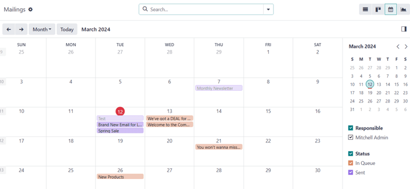
The current date is represented by a 🔴 (red circle) icon over the date on the calendar.
To the right of the calendar, the options to filter the results by Responsible and/or Status are available, via checkboxes.
Tip
To hide the right sidebar, click the (panel-right) icon, located above the sidebar.
In the top-left corner, above the calendar, the option to change the time period being displayed is available via a drop-down menu, which shows Month, by default. When clicked, the drop-down menu that appears reveals the options: Day, Week, Month (default), Year, and Show weekends (selected by default).
Clicking any of those options changes the calendar display to reflect that desired amount of time.
Clicking either ⬅️ (left arrow) icon or ➡️ (right arrow) icon changes the calendar to a previous or future time, depending on what is clicked, based on the chosen amount of time being represented.
To jump back to the current date, click the Today button.
Graph view
The graph view, represented by a (line graph) icon, can be accessed in the upper-right corner of the Mailings dashboard in the Email Marketing app.
While in graph view, the status of the emails on the Mailings page is represented in a bar graph, but other graph view options can be implemented, if needed.
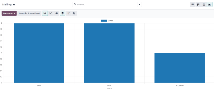
In the upper-left corner, above the graph, there is a Measures drop-down menu. When clicked, different filter options become available to further customize the graph views.
Those Measures options are: A/B Testing percentage and Count (default).
To the right of the Measures drop-down menu is an Insert in Spreadsheet button, if the Documents application is installed. When clicked, a pop-up window appears, in which the ability to add the graph to a spreadsheet or dashboard becomes available.
Beside the Measures drop-down menu and Insert in Spreadsheet button are different graph view options. From left-to-right, those graph view options are: (bar chart) (default), (line chart), and (pie chart).
Note
Each graph view option provides its own series of additional view options, which appear to the right of the selected graph view option.
Search options
Regardless of the view chosen for the Mailings dashboard in the Email Marketing app, the Filters, Group by, and Favorites options are always available to further customize the information being displayed.
To access those options, click the (downward arrow) icon, located to the right of the search bar. Doing so reveals a drop-down mega menu featuring those filtering and grouping options.
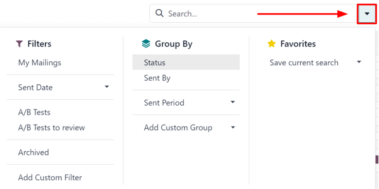
These options provide various ways to specify and organize the information seen on the Mailings dashboard.
FiltersGroup ByFavorites
This section of the drop-down mega menu provides different ways to filter email results being shown on the Mailings dashboard in the Email Marketing app.
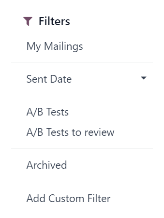
The options are: My Mailings, Sent Date, A/B Tests, A/B Tests to review, Archived, and Add Custom Filter.
If Add Custom Filter is selected, Odoo reveals a pop-up window, with three customizable fields to fill in, in order to create custom filter rules for Odoo to use to retrieve results that fit more specific criteria.
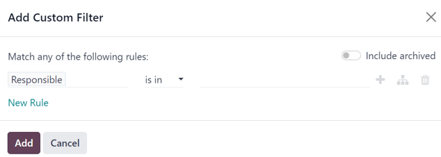
Settings
To view and modify the Email Marketing settings, navigate to Email Marketing app ‣ Configuration ‣ Settings.
On the Settings page, there are four features available.
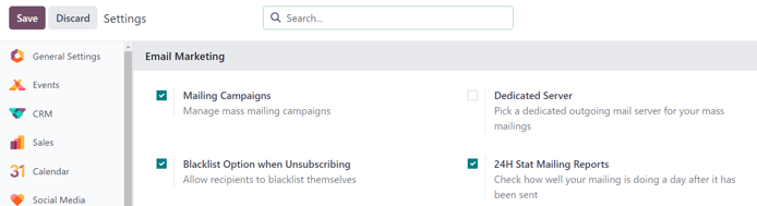
The features are:
- Mailing Campaigns: enables the option to manage mass mailing campaigns.
- Blacklist Option when Unsubscribing: allows recipients to blacklist themselves from future mailings during the unsubscribing process.
- Dedicated Server: provides the option to utilize a separate, dedicated server for mailings. When enabled, Odoo reveals a new field (and link), in which the specific server configurations must be entered, in order for it to connect properly to Odoo.
- 24H Stat Mailing Reports: allows users to check how well mailings have performed a day after it has been sent.
Create an email
To create an email, open the Email Marketing application, and click the New button in the upper-left corner of the Mailings dashboard page.
Clicking New reveals a blank email form.
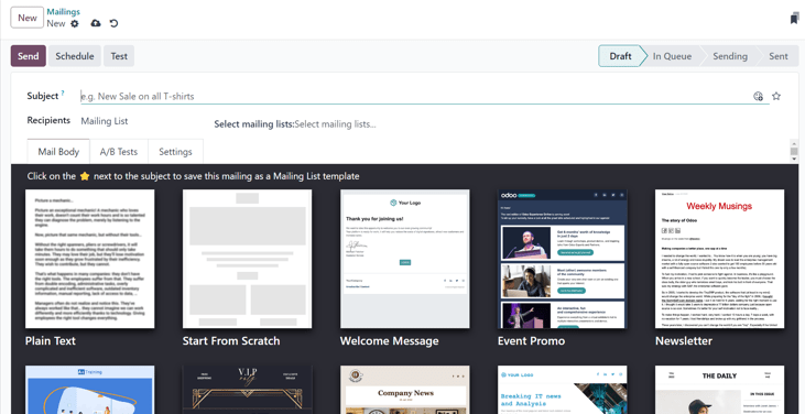
On the email form, there are fields for the Subject and Recipients of the email.
Beneath that, there are three tabs: Mail Body, A/B Tests, and Settings.
Subject
First, enter a Subject to the email. The Subject is visible in the recipients’ inbox, allowing them to quickly see what the message is about.
Note
The Subject field is mandatory. An email can not be sent without a Subject.
The (smiley face with a plus sign) icon at the end of the Subject field represents emojis that can be added to the Subject field. Clicking that icon reveals a pop-up menu of emojis that can be used.
Beside the (smiley face with a plus sign) icon at the end of the Subject field is an empty (star) icon. When clicked, the (star) icon turns gold, and the email is saved as a template in the Mail Body tab, which can be used again in the future.
Recipients
Beneath the Subject field on the email form is the Recipients field. In this field, select the recipients of the email. By default, the Mailing List option is selected, but clicking the field reveals a drop-down menu of other recipient options.
With the default Mailing List option selected, a specific mailing list must be chosen from the adjacent Select mailing lists field drop-down menu.
Tip
More than one mailing list can be chosen from the Select mailing lists field.
Odoo then sends the email to contacts on that specific mailing list(s).
See also
When the Recipients field is clicked, a drop-down menu of other options is revealed. Each option provides different ways Odoo can create a target audience for the email.
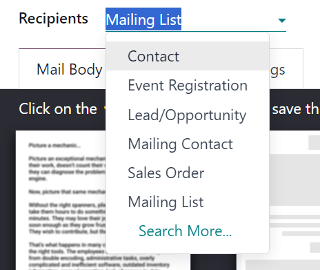
Those options (excluding the default Mailing List) provide the option to create a more specified recipient filter, in an equation-like format, which appears beneath the Recipients field.
The Recipients field options, other than the default Mailing List option, are as follows:
- Contact: ties specifically to the Contacts app, and includes all the contacts entered in the database.
- Event Registration: ties specifically to the Events app, and provides opportunities to interact with event registrants, in order to communicate important information about the event(s), or nurture other valuable actions, such as post-event surveys, purchases, etc.
- Lead/Opportunity: ties specifically to records in the CRM application, which opens up a number of opportunities to influence sales or purchase decisions.
- Mailing Contact: ties specifically to the Email Marketing app, and focuses on specific mailing contacts that have been entered in that specific application, and are related to a specific mailing list. These contacts are also unique because they do not have their own contact card in the Contacts application. This list can be accessed by navigating to Email Marketing app ‣ Mailing Lists ‣ Mailing List Contacts.
- Sales Order: ties specifically to the Sales app, and focuses on a specific sales orders in the database.
Add recipient filter
To add a more specific recipient filter to any Recipient option, select any recipient option (other than Mailing List), and click the Modify filter (right-facing arrow) icon beneath the Recipient field to reveal three subsequent filter rule fields, formatted like an equation.
It is highly recommended that users implement detailed targeting criteria for the Recipients field. Typically, a single line of targeting logic is not sufficient enough for an email campaign.
While the Mailing List option is adequate for the Recipients field, the Lead/Opportunity and Event Registration options provide far more detailed targeting criteria, which can be added on top of those seed sources.
Example
For example, with the Lead/Opportunity option chosen in the Recipients field, users can add various custom criteria related to Created on dates, Stages, Tags, Lost Reasons, Sales Teams, Active statuses, Country, and so much more.
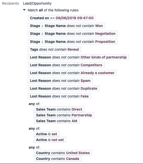
To reveal the sub-menu options within the filter rule fields, click each field, and make the desired selections, until the preferred configuration has been achieved.
The number of records in the database that match the configured rule(s) are indicated beneath the configured filter rule(s), in green.
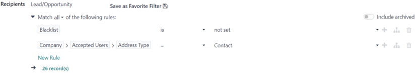
Note
Some sub-menu options in the first rule field allow for a second choice to provide even more specificity.
To the right of each rule, there are three additional options, represented by ➕ (plus sign), (sitemap), and 🗑️ (trash) icons.
- The ➕ (plus sign) icon adds a new node (line) to the overall targeting logic.
- The (sitemap) icon adds a branch to the node. A branch contains two additional, indented sub-nodes that are related to that specific rule, providing even more specificity to the parent line above it.
- The 🗑️ (trash) icon deletes a specific node (line) in the array of logic.
Mail Body tab
In the Mail Body tab, there are a number of pre-configured message templates to choose from.
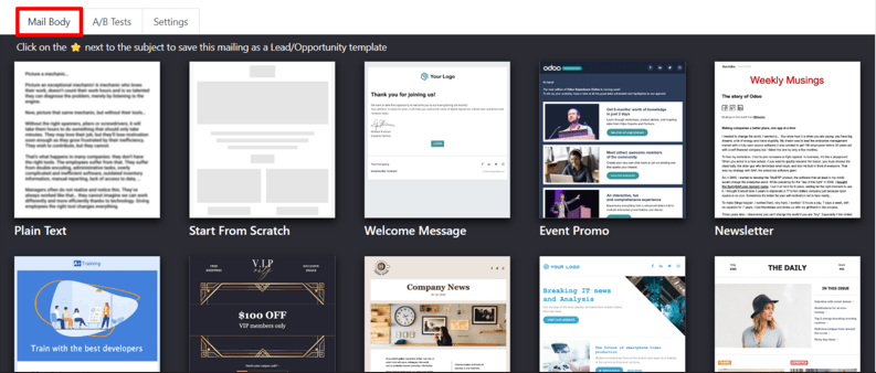
Select the desired template, and proceed to modify every element of its design details with Odoo’s drag-and-drop building blocks, which appear on the right sidebar when a template is chosen.

The features on the sidebar used to create and customize emails are separated into three sections: Blocks, Customize, and Design.
Each building block provides unique features and professional design elements. To use a building block, drag-and-drop the desired block element onto the body of the email being built. Once dropped, various aspects of the building block can be customized.
Tip
To build an email from the ground up, without any building block elements, select the Plain Text template. When selected, Odoo provides a completely blank email canvas, which can be customized in a number of way using the front-end rich text editor that accepts forward slash / commands.
When / is typed into the blank body of the email, while using a Plain Text template, a drop-down menu of various design elements appears, which can be used to create the desired email design.
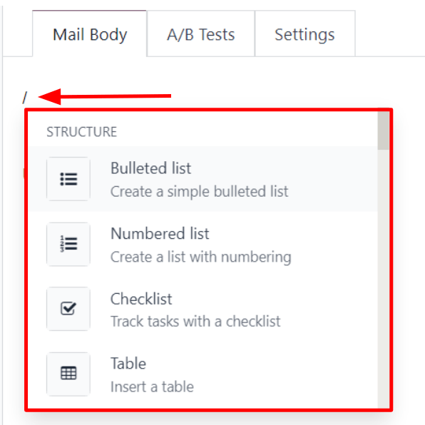
A/B Tests tab
Initially, when the A/B Tests tab is opened on an email form, the only option available is Allow A/B Testing. This is not a required option.
If this option is enabled, recipients are only mailed once for the entirety of the campaign.
This allows the user to send different versions of the same mailing to randomly selected recipients to gauge the effectiveness of various designs, formats, layouts, content, and so on – without any duplicate messages being sent.
When the checkbox beside Allow A/B Testing is ticked, an on (%) field appears, in which the user determines the percentage of the pre-configured recipients that are going to be sent this current version of the mailing as part of the test.
Note
The default figure in the on (%) field is 10, but that figure can be changed at any time.
Beneath that, two additional fields appear:
The Winner Selection field provides a drop-down menu of options, wherein the user decides what criteria should be used to determine the “winning” version of the email tests that are sent.
The options in the Winner Selection field are as follows:
- Manual: allows the user to determine the “winning” version of the mailing. This option removes the Send Final On field.
- Highest Open Rate (default): the mailing with the highest open rate is determined to be the “winning” version.
- Highest Click Rate: the mailing with the highest click rate is determined to be the “winning” version.
- Highest Reply Rate: the mailing with the highest reply rate is determined to be the “winning” version.
- Leads: the mailing with the most leads generated is determined to be the “winning” version.
- Quotations: the mailing with the most quotations generated is determined to be the “winning” version.
- Revenues: the mailing with the most revenue generated is determined to be the “winning” version.
The Send Final On field allows users to choose a date that is used to know when Odoo should determine the “winning” email, and subsequently, send that version of the email to the remaining recipients.
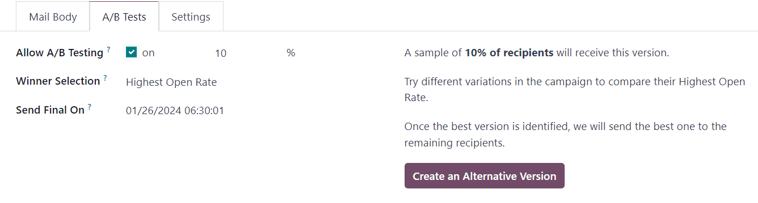
To the right of those fields is a Create an Alternative Version button. When clicked, Odoo presents a new Mail Body tab for the user to create an alternate version of the email to test.
Settings tab
The options present in the Settings tab of the mail form are divided into two sections: Email Content and Tracking.
Note
The options available in the Settings tab vary depending on if the Mailing Campaigns feature is activated in Email Marketing ‣ Configuration ‣ Settings. See Mailing campaigns for more information.
Without the Mailing Campaigns feature activated, the Settings tab on the email form only contains the Preview Text, Send From, Reply To, Attachments, and Responsible fields.
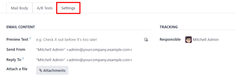
Email content
- Preview Text: allows the user to enter a preview sentence to encourage recipients to open the email. In most inboxes, this is displayed next to the subject. If left empty, the first characters of the email content appear, instead. The ability to add an emoji in this field is available, as well, via the (smiley face with a plus sign) icon.
- Send From: designate an email alias that displays as the sender of this particular email.
- Reply To: designate an email alias to whom all the replies of this particular email are sent.
- Attach a file: if any specific files are required (or helpful) for this email, click the Attachments button, and upload the desired file(s) to the email.
Tracking
- Responsible: designate a user in the database to be responsible for this particular email.
Note
If the Mailing Campaign feature is activated, an additional Campaign field appears in the Tracking section of the Settings tab.
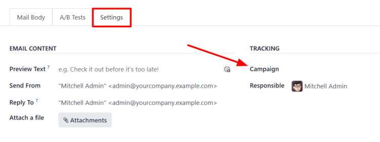
The additional Campaign field allows users to attach this particular email to a mailing campaign, if desired.
If the desired campaign is not available in the initial drop-down menu, select Search More to reveal a complete list of all mailing campaigns in the database.
Or, type the name of the desired mailing campaign in the Campaign field, until Odoo reveals the desired campaign in the drop-down menu. Then, select the desired campaign.
Send, schedule, test
Once the mailing is finalized, the following options can be utilized, via buttons located in the upper-left corner of the email form: Send, Schedule, and Test.
Send
The Send button reveals a Ready to unleash emails? pop-up window.
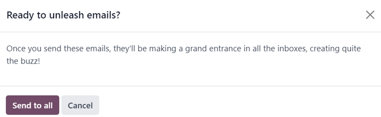
When the Send to all button is clicked, Odoo sends the email to the desired recipients. Once Odoo has sent the mailing, the status changes to Sent.
Schedule
The Schedule button reveals a When do you want to send your mailing? pop-up window.
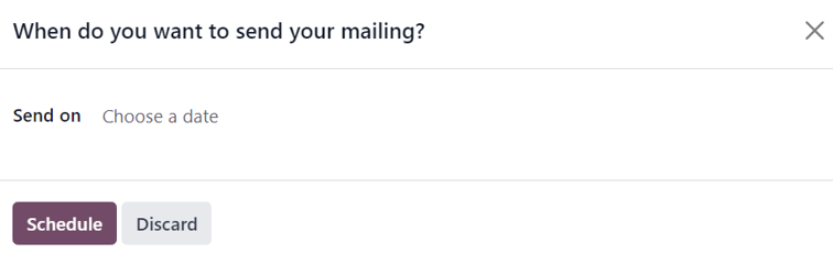
In this pop-up window, click the Send on field to reveal a calendar pop-up window.
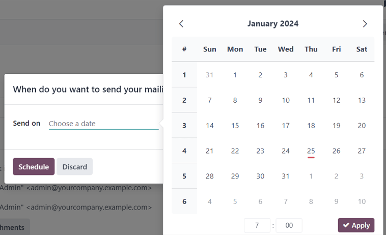
From the calendar pop-up window, select the future date and time for Odoo to send this email. Then, click ✔️ Apply. When a date and time are chosen, click the Schedule button, and the status of the mailing changes to In Queue.
Test
The Test button reveals a Test Mailing pop-up window.
From this pop-up window, enter the email addresses of the contacts to whom Odoo should send this test email in the Recipients field. Multiple contacts can be added in this field, if desired.
Once all the desired email addresses have been entered in the Recipients field, click the Send Test button.
Warning
By default, there’s a daily limit applied for all emails sent throughout all applications. So, if there are remaining emails to be sent after a limit has been reached, those mailings are not sent automatically the next day. The sending needs to be forced, by opening the email and clicking Retry.
Mailing campaigns
The Email Marketing application provides users with the ability to build mailing campaigns.
In order to create and customize mailing campaigns, the Mailing Campaigns feature must be activated in the Settings page of the Email Marketing application. To do that, navigate to Email Marketing app ‣ Configuration ‣ Settings, tick the box beside Mailing Campaigns, and click the Save button.
Once the Mailing Campaigns feature is activated, a new Campaigns menu option appears in the header.
When that is clicked, Odoo reveals a separate Campaigns page, displaying all the mailing campaigns in the database, and the current stage they are in, showcased in a default Kanban view.
Note
This information can also be viewed in a list, by clicking the ☰ (horizontal lines) icon in the upper-right corner.
Clicking any campaign from the Campaigns page reveals that campaign’s form.
There are two different ways to create and customize campaigns in the Email Marketing application, either directly from the Campaigns page or through the Settings tab on an email form.
Create mailing campaign (from campaigns page)
When the Mailing Campaigns feature is activated, a new Campaigns option appears in the header of the Email Marketing application. Campaigns can be created directly on the Campaigns page in the Email Marketing app.
To do that, navigate to Email Marketing app ‣ Campaigns ‣ New.
Kanban view
When the New button is clicked in the default Kanban view on the Campaigns page, a Kanban card appears in the New stage.
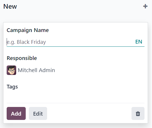
New campaign cards can also be made by clicking the ➕ (plus sign) at the top of any Kanban stage on the Campaigns page.
When the new campaign Kanban card appears, the options to enter a Campaign Name, a Responsible, and Tags become readily available.
To add the campaign to the Kanban stage, click the Add button.
To delete the campaign, click the 🗑️ (trash can) icon.
To further customize the campaign, click the Edit button, which reveals the campaign form for additional modifications.
Note
A Campaign Name must be entered in the Kanban card, in order for the Edit button to reveal the campaign form for further modifications.
List view
To enter the list view on the Campaigns page, click the ☰ (horizontal lines) icon in the upper-right corner. Doing so reveals all campaign information in a list format.
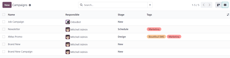
To create a campaign from the Campaigns page while in list view, click the New button. Doing so reveals a blank campaign form.
From this campaign form, a Campaign Name, a Responsible, and Tags can be added.
At the top of the form, various metric-related smart buttons can be seen that showcase specific analytics related to the campaign. Those smart buttons are: Revenues, Quotations, Opportunities, and Clicks.
Note
Once a Campaign Name is entered and saved, additional buttons appear at the top of the campaign form.
Those additional buttons are: Send Mailing and Send SMS.
Campaign form
On the campaign form (after clicking Edit from the Kanban card, or selecting an existing campaign from the Campaigns page) there are additional options and metrics available.
At the top of the form, various smart buttons can be seen that showcase specific analytics related to the campaign. Those smart buttons are: Revenues, Quotations, Opportunities, and Clicks.
There are also buttons to Send Mailing, Send SMS, Add Post, and Add Push (push notification).
Note
If the Send Mailing and Send SMS buttons are not readily available, enter a Campaign Name, then save (either manually or automatically). Doing so reveals those buttons.
The status of the campaign can be viewed in the upper-right corner of the campaign form, as well.
Create mailing campaign (from settings tab)
To create a new campaign from the Settings tab of a mailing form, click the Campaign field, and start typing the name of the new campaign. Then, select either Create “[Campaign Name]” or Create and edit… from the drop-down menu that appears.
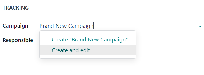
Select Create to add this new mailing campaign to the database, and modify its settings in the future.
Select Create and Edit… to add this new mailing campaign to the database, and reveal a Create Campaign pop-up window.
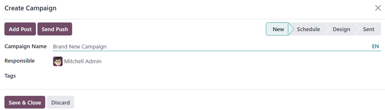
Here, the new mailing campaign can be further customized. Users can adjust the Campaign Name, assign a Responsible, and add Tags.
Buttons to Add Post or Send Push (push notifications) are also available.
There is also a status located in the upper-right corner of the Create Campaign pop-up window.
When all modifications are ready to be finalized, click Save & Close. To delete the entire campaign, click Discard.
See also
On this page
Get Help
Contact Support Ask the Odoo Community
EN
Odoo 18
Mailing lists
Mailing lists in Odoo are used for both pre and post sales communications in the Email Marketing application. They provide sales teams with qualified lead lists, focus group participants, or current customers that fulfill specific criteria.
Mailing lists can be generated in Odoo, and exported as a downloadable file, or into the Knowledge, Dashboards, or Spreadsheets applications, or imported via copy/paste or file upload.
Create mailing lists
To create a mailing list in the Email Marketing application, navigate to Email Marketing app ‣ Mailing Lists ‣ Mailing Lists ‣ New.
Clicking New reveals a blank mailing list form.
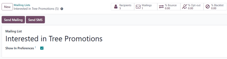
On the form, type a name in the Mailing List field at the top.
If the mailing list should be accessible by recipients from the subscription management page, allowing them to update their preferences, tick the box next to Show In Preferences.
In the upper-left corner of the mailing list form, there are two buttons: Send Mailing and Send SMS.
Important
The Send SMS button only appears if the SMS Marketing application is installed.
Clicking Send Mailing reveals a separate page with a blank email template form, which can be filled out by following steps explained in the Email Marketing doc.
Clicking Send SMS reveals a separate page with a blank SMS template form, which can be filled out by following steps explained in the SMS Marketing doc.
At the top of the mailing list form is a series of smart buttons that display a variety of metrics related to the specific mailing list. When any of the smart buttons are clicked, a separate page is revealed, showcasing detailed analytics related to that particular statistic.
The smart buttons available on a mailing list form are:
- Recipients: how many people are subscribed to the mailing list
- Mailings: how many mailings have been sent using this mailing list
- % Bounce: percentage of mailings related to this mailing list that have been bounced back
- % Opt-out: percentage of recipients that have opted-out of mailings from this mailing list
- % Blacklist: percentage of recipients that have blacklisted themselves from the mailing list altogether
Once all the configurations on the mailing list form are complete, Odoo automatically adds the new mailing list to the Mailing List page in the Email Marketing app (Email Marketing app ‣ Mailing Lists ‣ Mailing Lists).
Add contacts to mailing list
In Odoo Email Marketing, there are a few different ways to add contacts to a mailing list.
From the Mailing Lists page (Email Marketing ‣ Mailing Lists ‣ Mailing Lists), click the Total Contacts link on the line of the desired mailing list to which contacts should be added.
Doing so reveals a separate Mailing List Contacts page for that specific mailing list, where contacts can be created or imported, and then added to the specific mailing list.
This same page can also be accessed by clicking the desired mailing list from the Mailing Lists page, and then clicking the Recipients smart button on the mailing list form.
Doing so also reveals a separate Mailing List Contacts page for that specific mailing list, where contacts can be created or imported, and then added to the specific mailing list.
Contacts can also be directly imported to a specific mailing list from the Mailing Lists page, by clicking Import Contacts to the far-right of the desired mailing list.
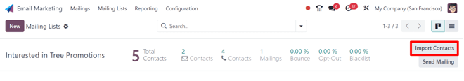
Doing so reveals an Import Mailing Contacts pop-up form.
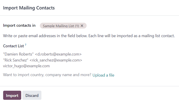
Here, the desired mailing list is auto-populated in the Import contacts in field. Beneath that, write or paste email addresses in the Contact List field.
The option to import a country, company name, and more is available, via the Upload a file link at the bottom of the pop-up form.
When all contacts and configurations are complete, click Import.
To add contacts to a specific mailing list from a master list of all mailing list contacts in the database, navigate to Email Marketing app ‣ Mailing Lists ‣ Mailing List Contacts. Doing so reveals the Mailing List Contacts page, featuring a list of all contacts associated with every mailing list.
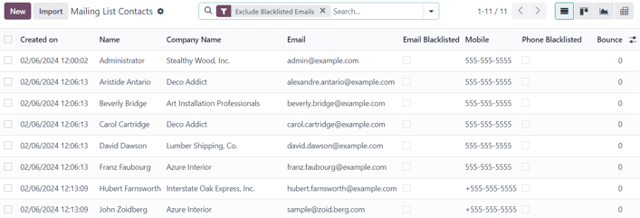
The default Exclude Blacklisted Emails filter appears in the search bar.
From the Mailing List Contacts page, contacts can be created and/or imported, and then added to a mailing list.
To add an existing contact to a mailing list, select the desired contact from the list on the Mailing List Contacts page to reveal their contact form.
At the bottom of their contact form, click Add a line under the Mailing List column, locate the desired mailing list from the drop-down menu, and select it.
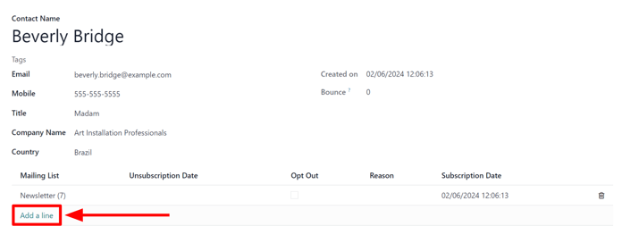
Tip
A mailing list can be created directly from a contact form, by typing the name of the new mailing list in the Mailing List field. Then, after a new mailing list name has been entered, two options appear on the drop-down menu beneath the new mailing list name.
From this drop-down menu, select Create to create the mailing list and edit it later, or select Create and edit… to create and edit the new mailing list right away.
To remove a contact from a mailing list that the contact has been added to, enable the Opt Out checkbox. If the Opt Out checkbox is ticked, the ability to add a Reason why the contact opted-out is also available.
When/if a contact has opted-out of a mailing list, the date they activated their opt-out appears in the Unsubscription Date column on their contact form.
Lastly, the initial Subscription Date can be seen, as well. This field is auto-populated with the date and time their subscription to the mailing list has been saved.
Multiple mailing lists can be added to a single contact form.
To delete any mailing list from a contact form, simply click the 🗑️ (trash can) icon.
Link mailing list to website
When a mailing list is created in the database, Odoo provides the option to directly link the mailing list to the Odoo-built website (created via the Odoo Website application).
To link a mailing list to a website, navigate to the front-end of the website, which can be accomplished in a variety of ways throughout the database. The most direct way to get to the front-end of the website is to simply open the Website application from the main Odoo dashboard.
Doing so reveals the designated homepage of the Odoo-built website for the database.
From the front-end of the website, click the Edit button in the upper-right corner. When clicked, Odoo reveals a right-sidebar, filled with drag-and-drop building blocks, packed with various features, options, and design elements.
Next, in the search bar of the right-sidebar, search for Newsletter. The Newsletter selection of building blocks is used to add subscription fields for any mailing list onto the website.

Doing so reveals the following building block options: Newsletter Block, Newsletter Popup, and Newsletter. Any of these options can be used to add subscription fields for a mailing list onto the website.
The Newsletter Block option places a customizable block onto the body of the website where a visitor to enter their email and click a button to subscribe to a designated mailing list.
The Newsletter Popup option reveals a customizable pop-up window that appears when a visitor scrolls to the specific section of the webpage on which the building block is placed. When the visitor reaches the designated section, a pop-up window appears, in which a visitor can enter their email address, click a button, and subscribe to that predetermined mailing list.
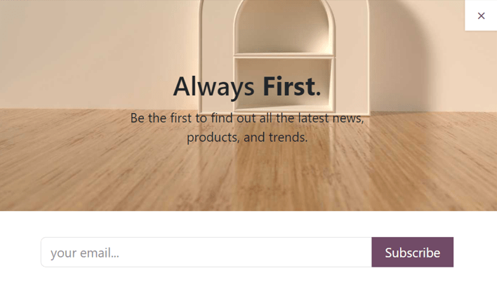
The Newsletter option provides the same functionality as the other options. However, it only consists of a field for the visitor to enter their email address, and a button to subscribe to the mailing list.
It is covertly designed in this fashion to be cleanly implemented into the content of the webpage and/or footer.
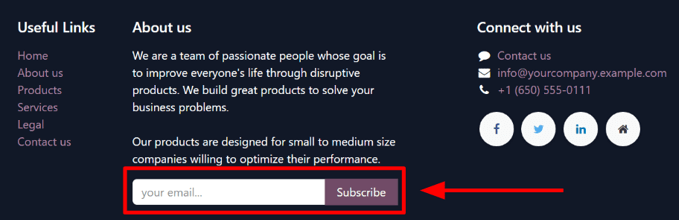
Once the desired newsletter building block is chosen, drag-and-drop it onto the body of the website. Then, select the newly-placed newsletter building block to reveal its configuration options on the right-sidebar.
From there, open the Newsletter drop-down menu, and select the specific mailing list that should be applied to the block.
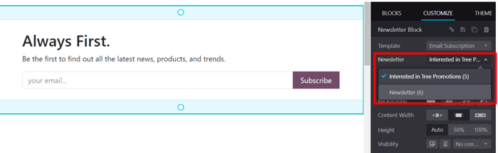
Once the desired configurations and customizations are complete, be sure to click the Save button in the upper-right corner.
Now, when a visitor enters their email address, and clicks the button to subscribe, they are instantly subscribed to that pre-configured mailing list. They are also added as a contact for that mailing list in Odoo Email Marketing.
See also
On this page
Get Help
Contact Support Ask the Odoo Community
EN
Odoo 18
Manage unsubscriptions (blacklist)
Providing recipients with the power to unsubscribe from mailing lists is not only a smart business practice, it’s often a legal requirement. Allowing recipients to unsubscribe from a mailing list establishes a sense of trust and control with an audience. It also helps companies appear more genuine, and less spammy.
Unsubscribe and blacklist
In addition to having the option to unsubscribe from specific mailing lists, the recipient can also blacklist themselves during the unsubscription process, meaning they will not receive any more marketing emails from the Odoo database.
In order to provide recipients with the ability to blacklist themselves, a specific feature must be enabled in the Email Marketing application.
Navigate to Email Marketing app ‣ Configuration ‣ Settings, and tick the checkbox next to the Blacklist Option when Unsubscribing feature. Then, click Save in the upper-left corner of the Settings page.
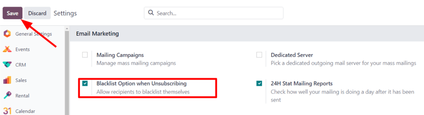
Unsubscribe
By default, an Unsubscribe link appears at the bottom of all mailing templates.
Warning
The Unsubscribe link does not appear by default if the Start From Scratch template is used to create a mailing. The user must manually add the specific unsubscribe link /unsubscribe_from_list in the body of the email, or use a block from the Footers section of the email builder, which includes the unsubscribe link.
If a recipient clicks the Unsubscribe link in a mailing, Odoo instantly unsubscribes them from the mailing list, presents them with a Mailing Subscriptions page where they can directly manage their subscriptions, and informs them that they’ve been Successfully Unsubscribed.
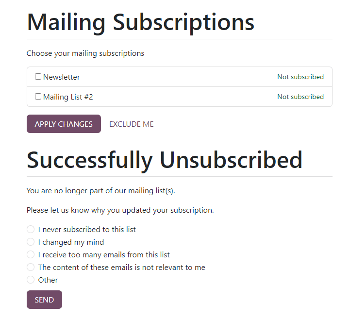
Beneath that, Odoo asks the former subscriber to Please let us know why you updated your subscription, and the user can proceed to choose the appropriate opt-out reason from a series of options presented to them.
Note
The opt-out answer options can be created and modified by navigating to Email Marketing app ‣ Configuration ‣ Optout Reasons.
Once they’ve chosen the appropriate opt-out reason from the options presented to them, they can click the Send button. Odoo then logs their reasoning for unsubscribing in the Email Marketing app for future analysis.
Blacklist
For a recipient to remove (i.e. blacklist) themselves from all marketing emails during the unsubscription process, on the Mailing Subscriptions page, they must click Exclude Me.
Upon clicking Exclude Me, Odoo informs the recipient they have been successfully blacklisted, with a message reading: ✔️ Email added to our blocklist.
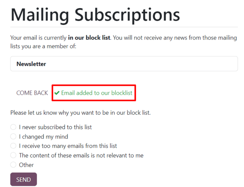
Beneath that, Odoo asks the former subscriber to Please let us know why you want to be added to our blocklist, and the user can proceed to choose the appropriate reason from a series of options presented to them.
Once they’ve chosen the appropriate reason from the options presented to them, they can click the Send button. Odoo then logs their reasoning for blacklisting themselves in the Email Marketing app for future analysis.
Blacklisted email addresses
To view a complete list of all blacklisted email addresses, navigate to Email Marketing app ‣ Configuration ‣ Blacklisted Email Addresses.
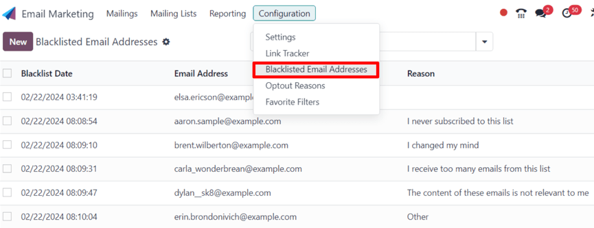
When a blacklisted record is selected from this list, Odoo reveals a separate page with the recipient’s contact information, along with the provided Reason why they chose to blacklist themselves.
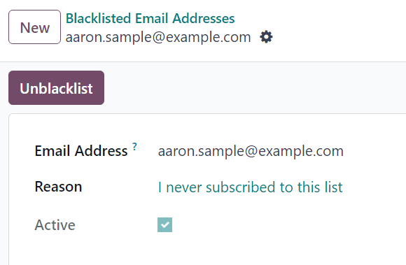
In the chatter of the blacklisted record page, there’s a time-stamped message, informing the user when the recipient blacklisted themselves (via a Mail Blacklist created log note).
Note
Blacklisted emails are excluded from all marketing mailings, however, these emails can still receive transactional emails, such as order confirmations, shipping notifications, etc.
Unblacklist contacts
To Unblacklist contacts, click the Unblacklist button in the upper-left corner of a blacklisted record’s page to remove the contact from the blacklist, allowing them to receive mailings once again.
When Unblacklist is clicked, an Are you sure you want to unblacklist this Email Address? pop-up window appears.
In this pop-up window, the email address of the selected blacklisted record is shown, and there’s a Reason field, in which a reason can be entered, explaining why this particular contact was removed from the blacklist.
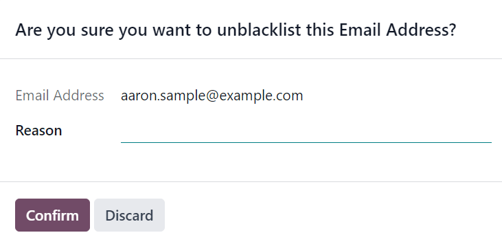
After filling in the fields, click Confirm to officially remove that particular contact from the blacklist.
See also
On this page
Get Help
Contact Support Ask the Odoo Community
EN
Odoo 18
Lost leads reactivation email
In Odoo, lost leads are removed from the active CRM pipeline, but can still be targeted with the Email Marketing application for strategic campaign purposes, such as lost leads reactivation.
A lost leads reactivation email looks at the leads that were lost during a specific period of time, and uses custom filters and lost reasons to exclude undesirable leads from the mailing list.
Once a lost leads reactivation email is complete, it can be sent as is, modified and sent to different groups for A/B testing, or saved as a template for later.
Example
A warehouse has leftover merchandise from a limited run of items from last year. To help clear out the excess inventory, the warehouse manager creates a lost leads email to reach out to old opportunities that were lost, and inform them that the limited merchandise is back in stock.
The warehouse manager uses the following filters for a lost leads email:
- Blacklist is not set
- Created on >= 01/01/2024 00:00:01
- Stage is not in New, Qualified, or Won
- Lost Reason is in Not enough stock
- and either Active is set or not set
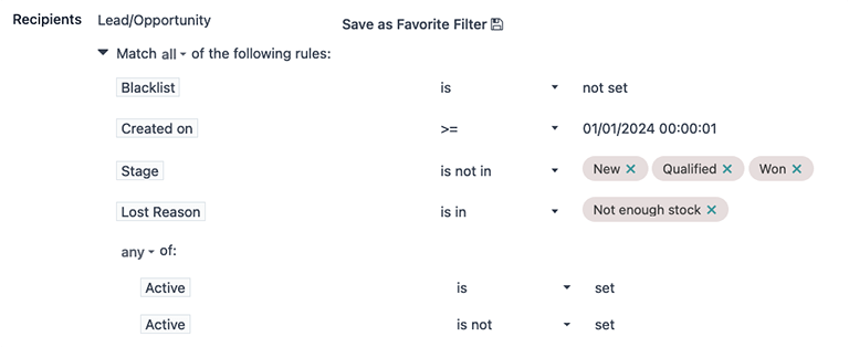
Tip
As filters are added and removed, pay attention to the # record(s) value below the filtering section. This value indicates the total number of records that match the current criteria.
To view a list of all matching records, click the # record(s) text.
Minimum requirements
In order to create and deliver a lost leads reactivation email campaign, the CRM and Email Marketing applications must be installed and configured.
Here are the minimum necessary filters that pertain to a lost leads reactivation mailing campaign:
- The Recipients field must be set to the Lead/Opportunity model.
- A Blacklist filter to exclude unsubscribed recipients.
- A Created on to target leads that were lost during a specific period of time.
- Stage filter(s) to exclude leads that were already won, or are still active in new stages of the sales pipeline (i.e. New, Qualified, etc.). These values will be different per organization; however, it’s minimally viable to exclude all the leads in the Won stage.
- One or more Lost Reason filters to exclude undesired leads, such as duplicate, spam, or irrelevant records.
- A pair of Active filters to target both active and inactive leads.
Add the necessary filters
First, navigate to the Email Marketing app, and on the Mailings page, click the New button in the top-left corner.
On the new Mailings form, enter an appropriate Subject line for the email in the corresponding field. Then, in the Recipients field, choose the Lead/Opportunity model from the drop-down menu.
In the rules section, located beneath the Recipients field, click the modify filter (▶ (triangle pointing right)) icon to expand the filter rules. Leave the default Blacklist rule in place.
Created on
Begin by clicking New Rule beneath the default Blacklist rule. Then, click the first field of the new rule that appears, and select the Created on parameter from the drop-down menu. With that in place, a specific time period during which the targeted leads were lost can be designated (e.g. 30 days prior, 90 days prior, previous year, etc.).
Then, in the second field, select <= (less than or equal to), >= (greater than or equal to), or is between as a date operator, in order to frame the time selection chosen in the third field.
In the third field, use the calendar popover window to select dates, and click Apply to lock in the time range.

Important
When there is more than one rule applied, make sure the statement at the top of the Recipients filter list reads: Match all of the following rules. If it does not, click on the statement, and select all from the drop-down menu (as opposed to any).
Stage
Now, add the Stage filter to exclude leads that are in the New, Qualified, and Won stages of the sales pipeline.
Note
This step assumes that the New, Qualified, and Won stages exist in the CRM pipeline; however, stage names may differ from business to business. Refer to the database’s actual stage names in the CRM app’s pipeline to complete this step, accordingly.
Begin again by clicking New Rule and select Stage from the first field’s drop-down menu. In the second field, select the is not in operator, and in the third field, select the New, Qualified and Won stages to define the rule’s parameters.
When the rule is added in this way, the logic in the third field renders as OR (|) statements.

Tip
Another way to add Stage rules, is to do so on a one-rule-per-row basis using the contains or does not contain operators, and manually typing out the defining characters in each stage name. This method, however, only allows for one selection at a time, which can be useful for quickly turning on/off filters in the Search… bar.
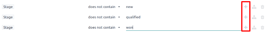
Lost Reason
Next, add one or more Lost Reason rules to exclude leads that should not be targeted for specific lost reasons.
To do that, create another New Rule, once again. Then, in the rule’s first field, select Lost Reason from the drop-down menu. For the operator, choose either is not in or does not contain from the drop-down menu. With either selection, use the third field to enter a lost reason (or multiple lost reasons, depending on your operator choice) to include in the rule.
If choosing the does not contain operator, then repeat the preceding steps to add more lost reasons, as needed, where each lost reason occupies one rule row at a time.
For more information, refer to the section below outlining how to select appropriate lost reasons.

Active
Finally, add a pair of Active filters to include both active and inactive leads for the campaign.
Important
Adding both active and inactive lead records is necessary to capture the full scope of lost leads in the database. Doing one without the other greatly impacts the number of targetable records for the email campaign, and does not include a complete or accurate lost leads audience.
First, click the (Add Branch) icon on the most recently created rule (e.g. Lost Reason), which is the middle of three icons located to the right of the rule row. Doing so adds a pair of any of rules. Then, in the top rule’s first field of the newly-created branch, select the Active parameter from the drop-down menu. The rule then automatically fills out to read: Active is set.
For the first field of the bottom rule of the branch, select Active from the drop-down menu again. However, this time, select is not from the operator drop-down menu in the second field. The rule should then read: Active is not set.
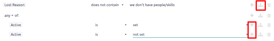
Add body content
Now, with the domain section of the email campaign complete, create the body content of the email using any of the premade stylized templates, or choose between the Plain Text or Start From Scratch options for more granular control. For more information, refer to the Email Marketing documentation on how to create an email.
Tip
To save the set of filters for later use, click Save as Favorite Filter 💾 (floppy disk), enter a name (such as Lost Leads), and click Add.
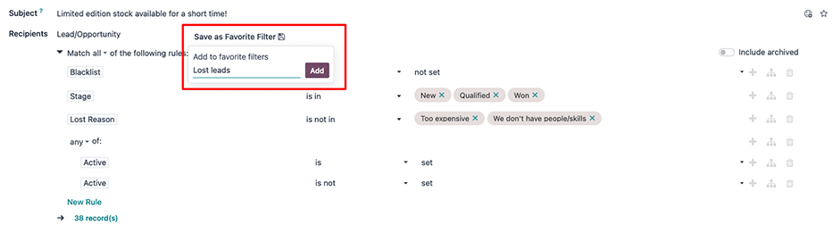
Send or schedule
Once all the components of the email campaign are complete, either:
- click the purple Send button at the top-left of the form to immediately send the email; or
- click the gray Schedule button, located to the right of the Send button, to send the email at a future date and time.
Tip
Consider using A/B Testing to send an alternate version of the email to a percentage of the target leads. This can help determine what subject lines and body content produce the best click-through rates, before sending a final version to the remaining leads.
To do so, open the A/B Tests tab on the mailing form and check the box next to Allow A/B Testing. Then, adjust the parameters as needed, and click Create an Alternative Version.
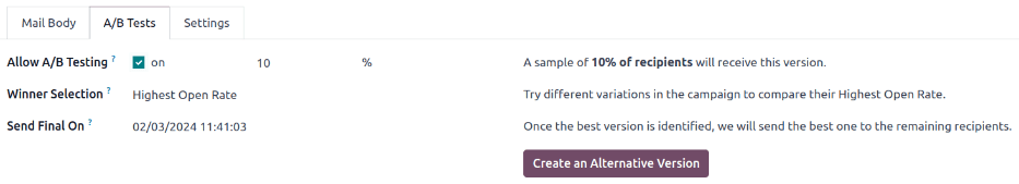
Select appropriate lost reasons
When a lead is marked as lost, Odoo recommends selecting a Lost Reason to indicate why the opportunity did not result in a sale. Doing so keeps the pipeline organized and reporting data accurate, and generates potential to follow up with the lead in the future.
If an existing Lost Reason is not applicable, users with the necessary permissions can create new ones, which means the lost reasons in a database can vary from organization to organization, and from pipeline to pipeline.
For more information on Lost Reasons, including the creation of them, refer to Lost opportunities.
By default, Odoo includes a few common Lost Reasons, such as:
- Too expensive
- We don’t have people/skills
- Not enough stock
When determining which reasons to include in a lost leads reactivation email, consider what the email is advertising, in order pinpoint one or more relevant lost reasons. Then, add a rule stating, Lost Reason does not contain _____ for every reason in the database, except for the relevant one(s).
Example
If the email advertises a selection of previously-limited merchandise that is now back in stock, it makes sense to target leads with the lost reason: not enough stock.

If the email advertises a price reduction, it makes sense to target leads with the lost reason: too expensive.

Analyze the results
After sending a lost leads reactivation email, marketing teams can use the smart buttons along the top of the email to analyze the results, and determine follow-up actions.
Clicking on any of the smart buttons opens a list of records matching that button’s specific criteria.
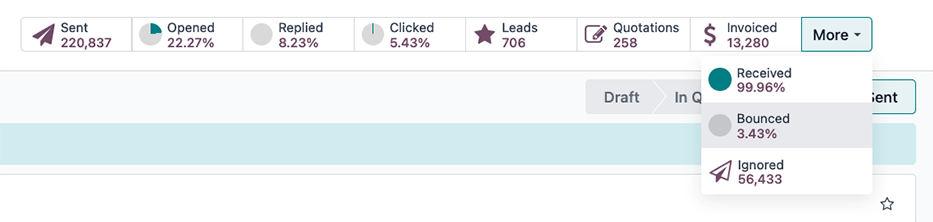
The smart buttons include:
- Sent: total number of emails sent.
- Opened: percentage of recipients that opened the email.
- Replied: percentage of recipients that replied to the email.
- Clicked: click-through rate (%) of recipients that clicked on a link in the email.
- Leads/Opportunities: number of leads (or opportunities) that have been created in the CRM pipeline, as a result of the email campaign.
- Quotations: number of quotations that have been created in the Sales application, as a result of the email.
- Invoiced: total revenues generated, as a result of the email campaign, via invoices sent to, and paid by, customers. These values are recorded in either the Invoicing or Accounting application, depending on which app is installed in the database.
- Received: percentage of recipients that received the email.
- Bounced: percentage of emails that bounced (not delivered).
- Ignored: the number of recipients that received the email, but have not interacted with it in a meaningful way (i.e. opened, clicked, etc.).
Email nurturing
Email nurturing (sometimes referred to as lead nurturing) is the process of sending a series of timely and relevant “nudge” emails to connect with a lead, build a deeper relationship, and ultimately convert the lead into a sale.
The point of nurturing is to keep the email campaign “visible” or at the top of a lead’s inbox, until they are ready to buy.
There are many approaches to effective lead nurturing, but they often involve:
- Sending an initial email (such as, a lost leads reactivation email).
- Sending a follow-up email each week (or according to specific triggers) for the duration of the campaign.
- Continuously analyzing results to learn what approaches have resulted in sales.
- Continuously adjusting the approach to remain “visible” at the top of the lead’s inbox, and hopefully, get a meaningful response from the lead.
As a campaign progresses, a marketing team may send different follow-up emails depending on how a lead responded the previous week.
Example
A marketing team wants to advertise a restocking of limited-run merchandise to all leads with a lost reason of not enough stock. They develop the following three-week long lead nurturing campaign.
- Week 1: the marketing team sends an initial email, with the subject line: “Limited run merchandise is back in stock! Act now!”
- Week 2: the marketing team sends two different emails, depending on how a lead responded.
- If a lead ignored the Week 1 email: “Stock is almost out, did you get yours?”
- If a lead clicked on the Week 1 email: “You still have time to add this to your collection”
- Week 3: the marketing team sends a final email to all leads who have not been converted stating: “20% off, don’t miss your last chance to get these items before they’re gone!”
Throughout the campaign, the marketing team continuously refers to the smart buttons along the top of the mailing page to see what percentages of leads are opening, clicking on, or ignoring the emails. They also regularly analyze reports on how many opportunities, quotations, and invoices have been generated by the campaign.
See also
On this page
Get Help
Contact Support Ask the Odoo Community
EN
Odoo 18
Analyze metrics
In order to properly understand the success or failure of an email marketing campaign, it is necessary to monitor several key metrics. The insights gained from these metrics can then be used to optimize future campaigns. Odoo’s Email Marketing application tracks several key metrics, that can be interpreted through reports to improve future campaigns.
View metrics
After a mass mail has been sent, the results for that particular mailing are displayed in multiple locations.
To access the metrics for an individual mailing, navigate to Email Marketing app ‣ Mailings. Locate the specific mailing in the list view, and use the column headings to view the results for that mailing. Click on one of the mailings in the list to open the record.
At the top of the record, detailed metrics are displayed as smart buttons.

Opened rate
The percentage of emails opened by recipients, against the total number of sent emails.
In cases where a reply is expected, such as cold outreach emails, high open rate may indicate the subject line was timely, compelling, and successfully prompted the recipients to view the message.
In cases where a reply is not expected, such as promotional emails, it may indicate an issue with the email, such as incorrect product links or coupon codes.
In cases where a reply is expected, a low open rate may indicate the subject line failed to capture the recipients’ interest or the message ended up in a spam or junk folder. It could also indicate the email ended up in a spam or junk folder.
Note
Emails that consistently land in recipient spam folders could be due to having a poor sender reputation (i.e. high unsubscribe rate, high percentage of past emails marked as spam, etc.), or failing to configure the proper DNS records.
Replied rate
The percentage of recipients who responded to the email, against the total number of sent emails.
A high replied rate may indicate the email resonated with recipients, prompting them to take action or provide feedback.
A low replied rate may suggest the message lacked relevance or did not contain a clear call-to-action.
Clicked rate
This represents the Clicked through rate (CTR), which measures the percentage of recipients who clicked on a link within the email, against the total number of sent emails.
A high CTR may indicate the email content was relevant and appropriately targeted. Recipients were motivated to click the links provided, and likely found the content engaging.
A low CTR may indicate issues with either the targeting, or the content itself. Recipients may have been unmotivated by the calls-to-action, if there were any, or the message itself may have been directed toward the wrong audience.
Received rate
This rate measures the percentage of emails that were successfully delivered, against the total number of sent emails.
A high received rate can indicate the mailing list used is up-to-date, and the sender authentication is trusted by email providers.
A low received rate may indicate issues, either with the mailing list used for the mailing, or with the sender authentication. View the Mass mailing analysis section for more information.
Bounced rate
This rate measures the percentage of emails that were unsuccessfully delivered, and did not enter a recipient’s inbox, against the total number of sent emails.
A high bounce rate could indicate issues, either with the mailing list used for the mailing, or with the sender authentication.
A low bounce rate may indicate that the mailing list used is up-to-date, and the sender authentication is trusted by email providers. View the Mass mailing analysis section for more information.
Tip
Click on the respective smart buttons to see all the corresponding recipient records that are attributed to each metric. When these filtered records are in view, multiple types of reports can be run for further analysis.
Create metrics reports
Individual metrics can be analyzed by creating a report. To begin, click on the smart button of the desired metric.
Next, click the (down arrow) to the right of the search bar to see a drop-down menu of filtering and grouping parameters.
Filters, located in the left column of the search options, can be used to keep only the results that fit the filter. For example, selecting the Bounced filter only shows emails that could not be delivered.
Group By, found in the middle column, is used to organize the results into groups, and can be used with or without filters.
Note
Setting multiple Group By options creates nested groups, according to which option is selected first. For example, selecting Sent Period, followed by Add Custom Group –> Responsible, in the Group By column, sorts all results first by the sent period, then by the team member responsible. This is a useful metric for analyzing who on the team is sending in volume or quantity over a set time period.
This can be verified by looking at the direction, and order, of the selections in the group tile that appears in the search bar after the selections are made.
Example
A monthly newsletter has been sent out, and 6.9% of the sent emails were bounced.

To see what these bounced recipients have in common, the records are grouped using a custom group targeting Mailing Lists, which groups all records by the mailing lists they are on. The records are then filtered using a custom filter with the rule Created on >= 07/01/2024 00:00:00, to filter by when the mailing list was last checked. This filter only includes recipients that have been created on, or after, July 1st, 2024, in the report.

Using these configurations, it is evident that all the recipients with bounced emails were added after the list was last checked. Looking closer at the domains, it is evident that each recipient has a malformed email domain (i.e: @yaoo.com instead of @yahoo.com), likely due to a manual entry error while updating the database.

See also
View Search, filter, and group records for more information about making custom groups and filters.
Mass mailing analysis
It is also possible to analyze the success between mailing campaigns by creating a Mass Mailing Analysis report. To begin, navigate to Email Marketing app ‣ Reporting ‣ Mass Mailing Analysis.
A dashboard appears displaying a bar chart containing each mailing campaign. By default, Sent is selected, displaying the number of sent records on the y-axis. To change the measure, click the Measures button, and select the desired measure from the drop-down menu.
Example
The following chart displays the number of opened emails from two different mass mailings.
In this view, it can be seen that the first mass mailing led to a higher opened rate than the second. Because a lower opened rate can sometimes be attributed to a subject line that failed to capture readers’ attention, the subject line of each mass mailing can be a good place to begin looking.

Comparing the two subject lines, it is clear the newsletter’s subject line was less engaging, which may have led to the lower opened rate, when compared to the other mass mailing.

Deliverability issues
The following define possible reasons for a high bounce rate or low received rate:
- Using a mailing list that contains outdated contact information, or malformed email addresses are likely to result in a high bounce rate and/or a low received rate.
- Mailings sent using a From email address that differs from the sender’s domain are likely to bounce with certain email providers due to failing DMARC authentication.
- Failing to configure the proper DNS records can also result in a high bounce rate.
See also
On this page
Get Help
Contact Support Ask the Odoo Community
EN
Odoo 18
Marketing Automation
Use the Odoo Marketing Automation application to create dynamic campaigns with actions that automatically occur within a defined duration, such as sending a series of timed mass emails or engaging with leads based on their interactions with marketing campaigns.
While the application is designed to be user-friendly for creating, launching, and reviewing marketing campaigns, it also provides advanced features to automate repetitive tasks throughout the database.
Get started by creating a new campaign from scratch or start with a campaign template.
See also
Audience targeting
Configure the target audience for a campaign.Workflow activities
Define the activities that occur within a campaign.Testing/running campaigns
Launch a test or run a campaign.Campaign metrics
Review the metrics of a campaign.Configuration
To begin, make sure the Marketing Automation application is installed.
Important
Installing the Marketing Automation application also installs the Email Marketing app, as most features of Odoo Marketing Automation are dependent on that specific application.
Additionally, install the CRM and SMS Marketing applications to access all of the features available in Marketing Automation.
The following documentation assumes that all three of these dependent applications are installed on the database.
Campaigns
A campaign refers to a workflow of activities that are automatically executed to a target audience, based on predefined filters, triggers, and durations of activities.
A new campaign can be created from scratch or from a template.
To create a campaign, navigate to the Marketing Automation application and click the New button to reveal a new campaign form.
Campaign templates
Odoo provides six campaign templates to help users get started. The campaign template cards only display when there are no existing campaigns in the database. Once a campaign has been created, the template cards on the Campaigns dashboard are replaced with a Kanban view of the existing campaigns.
To get started with a template, navigate to the Marketing Automation application, from the main Odoo dashboard, to open the Campaigns dashboard, which displays six campaign template cards:
- Tag Hot Contacts
Send a welcome email to contacts and tag them if they click it. - Welcome Flow
Send a welcome email to new subscribers, remove the address that bounced. - Double Opt-inSend an email to new recipients to confirm their consent.
- Commercial prospection
Send a free catalog and follow-up according to reactions. - Schedule Calls
If a lead is created for existing contact, schedule a call with their salesperson. - Prioritize Hot leads
Send an email to new leads and assign them a high priority if they open it.
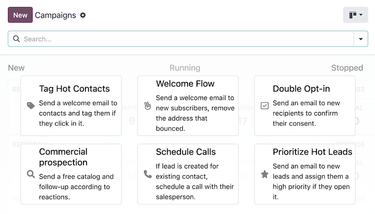
These templates are designed to be used as starting points for creating new campaigns. Click one of the template cards to open the campaign form.
Tip
To display the campaign template cards again after a campaign has been created, type the name of a campaign that does not exist in the database into the search bar, then press Enter.
For example, searching for empty displays the campaign template cards again, as long as there is not a campaign with the name “empty” in the database.
Targets and filters
On the campaign form, the Target and Filter section, also referred to as the domain, contains the fields used to define the target audience for the campaign’s reach (i.e., the unique contact records in the database).
The target audience specifies the type of records available for use in the campaign, such as Lead/Opportunity, Event Registration, Contact, and more.
Records
The contacts in the system that fit the specified criteria for a campaign are referred to as records.
The number of records that are displayed next to the campaign Filter represent the total number of records the campaign is targeting.
Participants
The records that are engaged by the campaign are referred to as participants.
The number of participants engaged in a test run are shown in the Tests smart button, which displays on the top of the campaign form after a test has been run.
The number of participants engaged in a running, or stopped, campaign are shown in the Participants smart button at the top of the campaign form.
See also
Workflow
A workflow consists of an activity, many activities, or a sequence of activities organized in a campaign. A campaign’s workflow is defined in the Workflow section of the campaign form.
Activities
Activities are the methods of communication or server actions, organized in a workflow, that are executed within a campaign. Once running, each activity displays the number of participants that are engaged by the activity as Success and Rejected counts.
To create one of the following activities, click Add new activity in the Workflow section of the campaign form:
- Email: an email that is sent to the target audience.
- Server action: an internal action within the database that is executed.
- SMS: a text message that is sent to the target audience.
See also
Testing and running
Once a campaign has been created, it can be tested to ensure the workflow is functioning as expected, to check for errors, and correct any mistakes before it reaches its target audience.
After testing, the campaign can be launched to start engaging the target audience. The campaign can also be launched without testing, if the user is confident in the workflow.
See also
Reporting
A range of reporting metrics are available to measure the success of each campaign. Navigate to Marketing Automation app ‣ Reporting to access the following menu options:
- Link Tracker: displays the metrics of links to track the number of clicks.
- Traces: displays the results of all activities from all campaigns.
- Participants: displays an overview of the participants of all campaigns.
Additionally, each activity within the workflow of a campaign displays its engagement metrics.
See also
On this page
Get Help
Contact Support Ask the Odoo Community
EN
Odoo 18
Audience targeting
The Target and Filter fields on the campaign form, also referred to as the domain, contain the parameters used to define the target audience for the campaign’s reach (i.e., the unique contact records in the database, and imported list, etc.).
- Target: specifies the type of records available for use in the campaign, such as Lead/Opportunity, Event Registration, Contact, The assigned records model determines the fields that are available throughout the campaign, including the fields available in the Filter section, and in dynamic placeholders.
- Save as Favorite Filter: saves the current Filter for future use with the current Target model, and can be managed from the Marketing Automation app ‣ Configuration ‣ Favorite Filters menu.
- Unicity based on: specifies the Target model field where duplicates should be avoided. Traditionally, the Email field is used, but any available field can be used.
- Filter: contains an interactive form with configurable logic to further refine the targeting parameters under the chosen Target model. See more details in the Defining filters section.
- Include archived: allows or disallows the inclusion of archived records in the target audience.
Tip
A Responsible user can be assigned to the campaign by activating Developer mode (debug mode).
Note
Each activity in a campaign’s workflow can target a subset of the target audience; see the Campaign workflow activities documentation for more information.
Defining filters
The default campaign Filter configuration is set to Match all records, indicating that the campaign is targeting all records of the Target model.
To refine the Filter rules of a campaign, click the ➕ Add condition button to reveal a new row with configurable rule parameters. See the Search, filter, and group records documentation for more information on how to create filter rules.
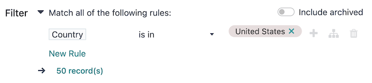
At the bottom of the filter rules is a # record(s) button, which indicates the total number of records targeted by this domain. Select the # record(s) button to open a Selected records pop-up window, in which the targeted records can be viewed.
Tip
Activate Developer mode (debug mode) to reveal each field’s technical name and data type, as well as the # Code editor text area below the filter rules, to view and edit the domain manually.
Example
To target all leads and opportunities from the CRM app that are in the New stage, and have an expected revenue greater than $1,000, the following should be entered:
- Target: Lead/Opportunity
- Unicity based on: Email (Lead/Opportunity)
- Filter: Match all 🔽 (down arrow) of the following rules:
- Stage is in New
- Expected Revenue > 1,000
- any 🔽 (down arrow) of:
- Type = Lead
- Type = Opportunity
With the above configuration, the campaign targets 157 record(s).
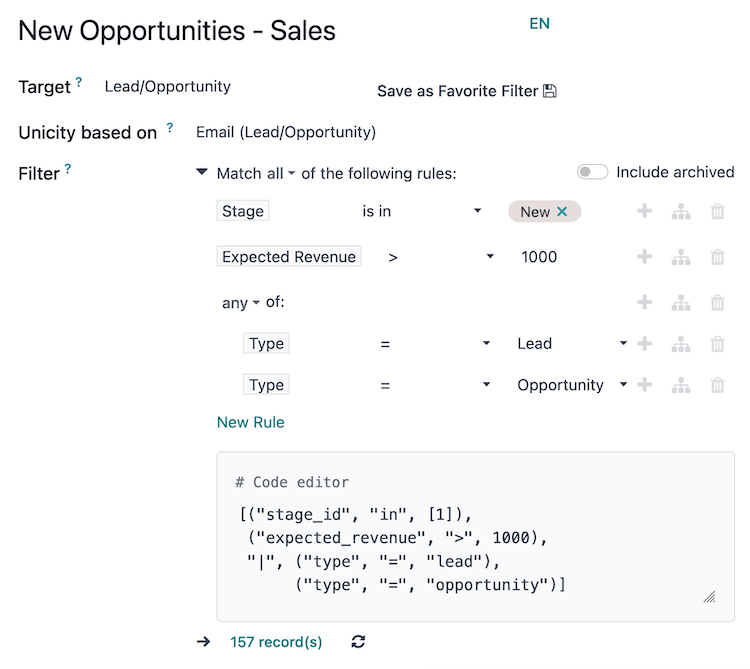
See also
Get Help
Contact Support Ask the Odoo Community
EN
Odoo 18
Campaign workflow activities
A workflow is the overall activity structure of a marketing automation campaign. There can only be a single workflow in each campaign. However, a workflow can be made up of any number of activities to meet the needs of the campaign.
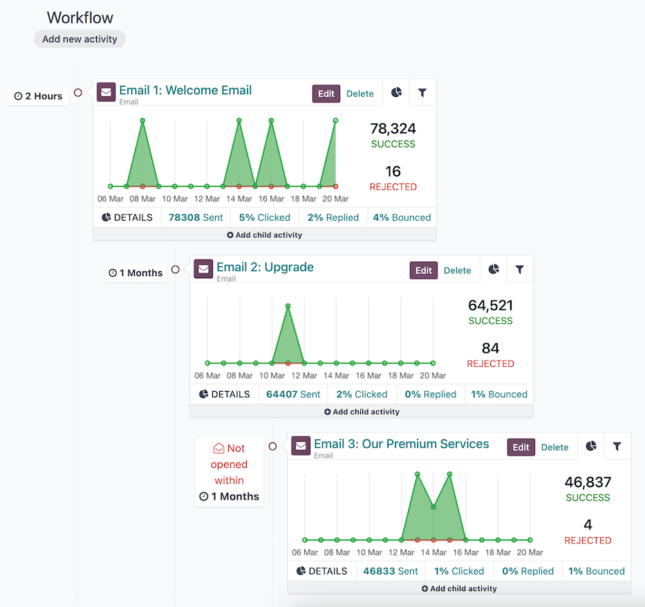
Workflow sequence of three activities; the last child activity has a trigger type of Mail: not opened.
Activities
Activities are the methods of communication or server actions, organized in a workflow, that are executed within a campaign; they are the building blocks of the campaign’s workflow.
A new activity can be added to the workflow on a campaign form by selecting an existing campaign or creating a new campaign from the Marketing Automation app ‣ Campaigns dashboard, then clicking the Add new activity button in the Workflow section. Doing so opens the Create Activities pop-up window.
First, define the name of the activity in the Activity Name field, and select the type of activity to be executed from the Activity Type field.
Then, configure the activity’s Trigger, and optionally, the Expiry Duration and the DOMAIN of the activity.
Once the activity is fully configured, click Save & Close to add it to the campaign’s workflow, or click Save & New to add the activity to the workflow and open a new Create Activities pop-up window to add another activity. Clicking Discard closes the pop-up window without saving the activity.
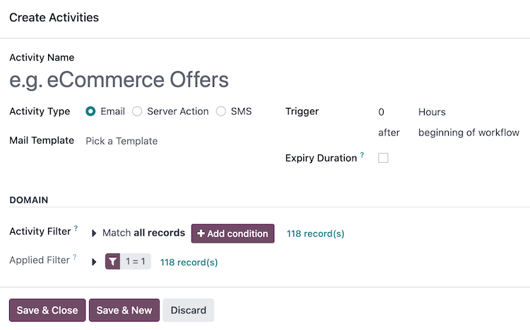
Activity types
There are three different types of activities available in the Marketing Automation app:
- Email: an email that is sent to the target audience.
- Server action: an internal action within the database that is executed.
- SMS: a text message that is sent to the target audience.
If Email is selected as the Activity Type, the option to Pick a Template in the Mail Template field is available.
To create a new template directly from the Mail Template field, start typing the title of the new template, then select Create and edit… to reveal a Create Marketing Template pop-up window. Proceed to create and configure the new email template.
Once the email template is configured, click Save & Close to save the activity, and return to the Create Activities pop-up window, in order to continue to configure the trigger.
Note
The title used for the Mail Template must be unique from any other mail template titles in the campaign, and it also serves as the subject of the email.
See also
Creating and configuring email templates
Server action
If Server Action is selected as the Activity Type, the option to Pick a Server Action in the Server Action field is available. This field is a drop-down menu containing all the pre-configured server actions for the campaign’s Target model. Optionally, create a new server action.
After selecting a pre-configured server action, no other activity type configuration is needed. Click Save & Close to save the activity, and return to the Create Activities pop-up window, in order to configure the trigger.
Tip
To view all server actions in the database, activate Developer mode (debug mode), and navigate to Settings app ‣ Technical ‣ Actions ‣ Server Actions dashboard.
Create a new server action
The option to create a new server action is also available. To do so, type in the Server Action field a title for the new action, then click Create and edit…. Doing so reveals a blank Create Server Action pop-up window, wherein a custom server action can be created and configured.
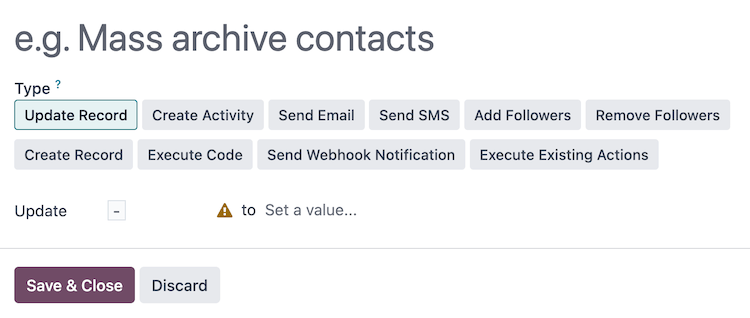
On the Create Server Action pop-up window, select the Type of server action. The configuration fields change, depending on the selected Type:
- Update Record: update the values of a record.
- Create Activity: create an activity with the Discuss app.
- Send Email: post a message, a note, or send an email with the Discuss app.
- Send SMS: send an SMS, and log them on documents, with the SMS app.
- Add Followers or Remove Followers: add or remove followers on a record with the Discuss app.
- Create Record: create a new record with new values.
- Execute Code: execute a block of Python code.
- Send Webhook Notification: send a POST request to an external system.
- Execute Existing Actions: define an action that triggers several other server actions.
Once the server action is configured, click Save & Close to save the activity, and return to the Create Activities pop-up window, in order to configure the trigger.
Tip
Some of the server action types have advanced configurations available when Developer mode (debug mode) is activated, such as specifying the Allowed Groups that can execute this server action.
SMS
If SMS is selected as the Activity Type, the option to Pick a Template in the SMS Template field is available.
To create a new template directly from the SMS Template field, start typing the title of the new template, and select Create and edit… to reveal a Create Marketing Template pop-up window. Proceed to create and configure the new SMS template.
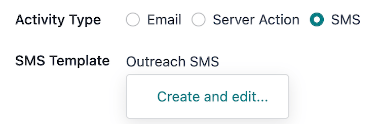
Once the SMS template is configured, click Save & Close to save the activity, and return to the Create Activities pop-up window, in order to configure the trigger.
See also
Creating and configuring SMS templates
Trigger
Once an activity type is configured, the next step in the Create Activities pop-up window is to define when the activity should be executed. This is done in the Trigger field group.
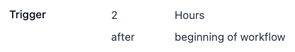
To set an execution delay for the activity from when the trigger type occurs, type a whole number in the interval number input (e.g. 2 is valid, 0 is also valid, and 1.5 is not).
Next, select the unit of time for the interval number in the interval type drop-down menu, the options are: Hours, Days, Weeks, and Months.
Example
If the interval number is set to 0 and the interval type is set to Hours, the activity will be executed immediately after the trigger type occurs (at the next scheduled run of the Mail: Email Queue Manager cron).
Trigger type
To define the event occurrence that sets the activity into motion, select a trigger type from the drop-down menu:
- beginning of workflow: the activity is executed when the campaign is started.
All other trigger types reveal a drop-down menu Activity field containing all of the other activities in the campaign. Selecting one of these types converts this activity into a child activity to be executed directly after the selected Activity:
- another activity: to be executed after another activity in the campaign.
- Mail: opened: the activity’s email was opened by the participant.
- Mail: not opened: the activity’s email was not opened by the participant.
- Mail: replied: the activity’s email was replied to by the participant.
- Mail: not replied: the activity’s email was not replied to by the participant.
- Mail: clicked: a link in the activity’s email was clicked by the participant.
- Mail: not clicked: a link in the activity’s email was not clicked by the participant.
- Mail: bounced: the activity’s email has bounced.
- SMS: clicked: a link in the activity’s SMS was clicked by the participant.
- SMS: not clicked: a link in the activity’s SMS was not clicked by the participant.
- SMS: bounced: the activity’s SMS has bounced.
Example
If the trigger type is set to Mail: clicked, this activity is converted to a child activity and will execute after a participant clicks on a link from the parent activity defined in the Activity field.
Expiry duration
Optionally, an Expiry Duration can be defined in the Create Activities pop-up window to cancel the execution of this activity after a specific amount of time. Selecting this checkbox reveals the Cancel after field with interval and interval type inputs.
Type a whole number in the interval number input (e.g. 2 is valid, 0 is also valid, and 1.5 is not). Then, select the unit of time for the interval number in the interval type drop-down menu, the options are: Hours, Days, Weeks, and Months.
Example
If the interval number is set to 2 and the interval type is set to Days, the activity will be cancelled if it has not been executed within 2 days of the trigger type.
Activity domain
The DOMAIN section of the Create Activities pop-up window contains fields to further filter the target audience of the activity.
The Activity Filter field focuses this activity, and its child activities, even further on a specific group of the campaign’s filter. The process is the same as defining filters for the campaign, and the fields that are available to filter are also specific to the Target of the campaign.
The # record(s) beside the Activity Filter field indicates how many records are currently being targeted by this Activity Filter.
The Applied Filter displays the combined filters from the Activity Filter and the inherited campaign Filter. This field is read-only.
The # record(s) beside the Applied Filter field indicates how many records, in total, are currently being targeted by the activity.
Child activities
Activities that are connected to, and triggered by, another activity are known as, child activities.
The activity that triggers a child activity is known as its parent activity.
A child activity can be added to a campaign’s workflow by hovering over the ➕ Add child activity button, located beneath the desired parent activity.
The child activity’s trigger types are specific to the parent activity type (Email, SMS, or Server Action), and are as follows:
EmailServer ActionSMS
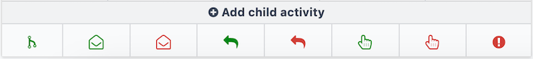
Each trigger the child activity on the following conditions of the parent activity:
- Add Another Activity: to be executed after the parent activity.
- Opened: the email was opened by the participant.
- Not Opened: the email was not opened by the participant.
- Replied: the email was replied to by the participant.
- Not Replied: the email was not replied to by the participant.
- Clicked: a link in the email was clicked by the participant.
- Not Clicked: a link in the email was not clicked by the participant.
- Bounced: the email has bounced.
Once a trigger type is selected, the Create Activities pop-up window opens to configure the child activity. The process is the same as creating a new activity, with the exception that the Trigger field is pre-filled with the selected trigger type, and the Activity field has the parent activity selected.
See also
On this page
Get Help
Contact Support Ask the Odoo Community
EN
Odoo 18
Testing/running campaigns
The Odoo Marketing Automation app allows users to test marketing campaigns (and mailings) before officially running them to check for errors and correct any mistakes before it reaches its target audience.
Test campaigns
To test a marketing campaign, open the Marketing Automation app, and select the desired campaign to test, which reveals the campaign’s detail form.
On the campaign detail form, make sure the campaign already has activities configured in the workflow (or build a campaign by following the directions on Campaign workflow activities documentation).
Note
Testing marketing automation campaigns is meant to be performed in the production version of the database. Duplicate (or trial) databases have limited email sending capabilities.
To start a test, click the Launch a Test button at the top of the campaign form, to the right of the Start button.
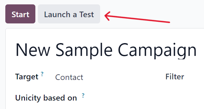
When clicked, a Launch a test pop-up window appears.
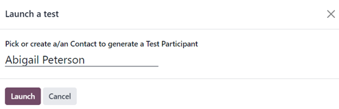
In the Launch a test pop-up window, click the Pick or create a/an Contact to generate a Test Participant field to reveal a drop-down menu of contacts. From this drop-down menu, select an existing contact (or create a new one) to run the test on.
Note
Only one contact can be selected from the Launch a test pop-up window.
To create a new contact directly from the Launch a test pop-up window, start typing the name of the new contact in the blank field, and click Create and edit….
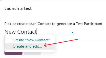
Doing so reveals a blank Create Record pop-up form, in which the necessary contact information (Email, Mobile, etc.) must be entered, in order for the test to work. When the necessary information is entered, click Save & Close.
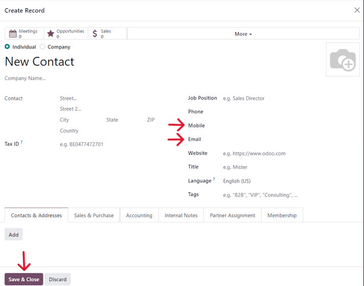
When all the necessary fields have been entered, click Save & Close to return to the Launch a test pop-up window.
Once a contact is selected, click Launch to reveal the campaign test page.
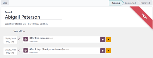
On the campaign test page, the name of the Record being tested is visible, along with the precise time this test workflow was started in the Workflow Started On field. Beneath that, in the Workflow section is the first activity (or activities) in the workflow that’s being tested.
To start a test, click the Run button, represented by a ▶️ (play button) icon beside the first activity in the workflow. When clicked, the page reloads, and Odoo shows the various results (and analytics) connected to that specific activity as they occur, in real-time.
Note
If a child activity is scheduled beneath a parent activity, that child activity will be revealed slightly indented in the workflow, once that parent activity has been run, via the ▶️ (play button) icon.
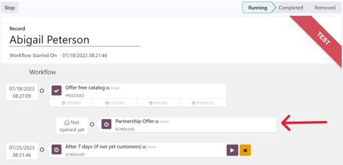
Once all the workflow activities are completed, the test ends, and the status bar (in the upper-right corner) moves to the Completed stage.
To stop a test before all the workflow activities are completed, click the Stop button in the upper-left corner of the campaign test page.
Run campaigns
To run a campaign, navigate to Marketing Automation app, and select the desired campaign to run.
On the campaign detail form, with all the desired activities ready in the Workflow section, click Start in the upper-left corner to officially run the campaign to the configured target audience specified on the campaign detail form.
Clicking Start launches the campaign, and the status bar of the campaign switches to Running, which is located in the upper-right corner of the campaign detail form.
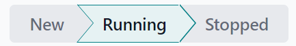
Note
If some participants are already running on a campaign, and was stopped for any reason, clicking the Start button again prompts a pop-up warning. This warning advises the user to click an Update button to apply any modifications made to the campaign.
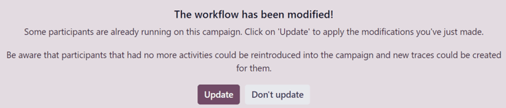
Be aware that participants that had already gone through an entire campaign in its original state can be reintroduced into the newly-modified campaign, and new traces could be created for them.
Then, as the mailings and actions are triggered in the Workflow, the various stats and data related to each activity appear in each activity block. There is also a series of stat-related smart buttons that appear at the top of the campaign detail form, as well.
These analytical smart buttons will also populate with real-time data as the campaign progresses: Templates, Clicks, Tests, Participants.

Stop campaigns
To stop a campaign that’s currently running, navigate to the Marketing Automation app, and select the desired campaign to stop. On the campaign detail form, click the Stop button in the upper-left corner.
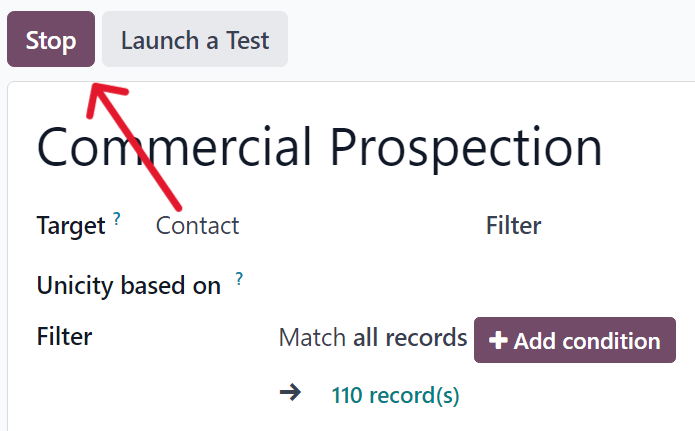
When clicked, the campaign is officially stopped, and the status changes to Stopped in the upper-right corner of the campaign detail form.
See also
On this page
Get Help
Contact Support Ask the Odoo Community
EN
Odoo 18
Campaign metrics
Campaign metrics are detailed statistics and analytics within a marketing campaign, measuring its success and effectiveness. Triggered marketing activities populate relevant activity blocks with real-time metrics, in the campaign detail form.
Activity analytics
In the Workflow section of a campaign detail form in the Marketing Automation app, where the various campaign activities are located, a collection of useful data can be found on every individual activity block, like number of communications Sent, percentage of messages that have been Clicked, and more.
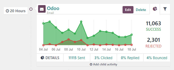
To the left of the activity block, the configured trigger time is displayed as a duration (either Hours, Days, Weeks, or Months) if it corresponds to period after the workflow begins.
Note
If the trigger time is dependent on another activity or triggering action (e.g. Mail: Replied, etc.) the time is displayed, along with the necessary action for that activity to be activated (e.g. Replied after 2 Hours).
In the activity block, an icon represents each activity type. An ✉️ (envelope) icon means the activity is an email. Three tiny, interlocking ⚙️ (gear) icons means the activity is an internal action. And, a small, basic 📱 (mobile) icon means the activity is an SMS.
Tip
The activity type name is also displayed in smaller font below the activity title.
Beside the activity icon, at the top of the activity block, is the title of the activity. To the right of the activity title, there are Edit and Delete buttons.
Click Edit to open the Open: Activities pop-up form for that specific activity, in which that activity can be modified. Click the Delete button to completely delete that specific activity from the workflow.
See also
Activity graph tab
In every activity block, the Graph (pie chart icon) tab is open by default, displaying related metrics as a simple line graph. The success metrics are represented in green and the rejected metrics are represented in red.
Numerical representations of both Success and Rejected activities are shown to the right of the line graph.
Tip
Hovering over any point in the line graph of the activity block reveals a notated breakdown of data for that specific date.
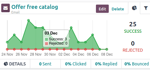
Beneath the graph in the activity block, for Email or SMS activity types, a line of accessible data figures provide a bird’s eye view of the campaign activity, including: Sent (numerical), Clicked (percentage), Replied (percentage), and Bounced (percentage).
Tip
Clicking any of those stats on the DETAILS line, beneath the line graph, reveals a separate page containing every specific record for that particular data point.
Activity filter tab
Next to the Graph tab on the activity block, there’s the option to open a Filter tab (represented by a filter/funnel icon).
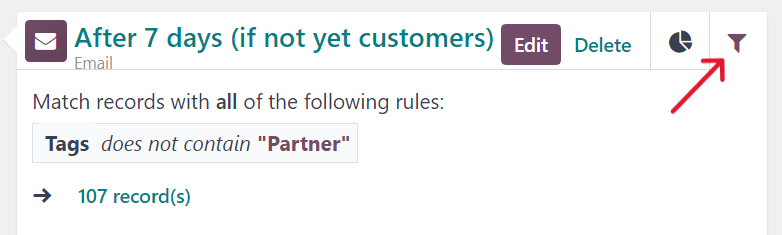
Clicking the Filter tab on an activity block, reveals what the specific filters are for that particular campaign activity, and how many records in the database match that specific criteria.
Tip
Clicking the records link beneath the displayed filter reveals a separate pop-up window containing a list of all the records that match that specific campaign activity rule(s).
Link tracker
Odoo tracks all URLs used in marketing campaigns. To access and analyze those URLs, navigate to Marketing Automation app ‣ Reporting ‣ Link Tracker. Doing so reveals a Link Statistics page, wherein all campaign-related URLs can be analyzed.
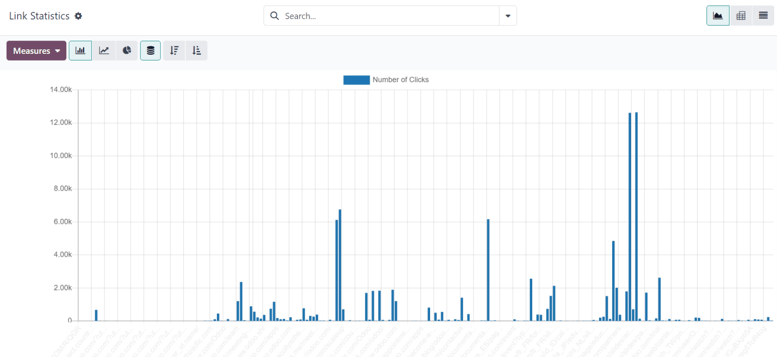
The default view on the Link Statistics page is the Bar Chart view, but there are different view options available in the upper-left corner. There is the option to view the statistics as a Line Chart or Pie Chart.
Beside that, there is also the option to view the statistics as Stacked, and the data can be put into Descending or Ascending order.
To the far-left of the view options, there is the Measures drop-down menu. When clicked, the options to view the Number of Clicks or total Count are available. And, to the right of the Measures drop-down menu, there’s the ability to add any data to a spreadsheet by clicking the Insert in Spreadsheet button.
Also, in the upper-right corner of the Link Statistics page, to the far-right of the search bar, there are additional view options to choose from: the default Graph view, the Pivot table view, and the List view.
Traces
Odoo tracks all activities used in every marketing campaign. The data related to these activities can be accessed and analyzed in the Traces page, which can be found by navigating to Marketing Automation app ‣ Reporting ‣ Traces.
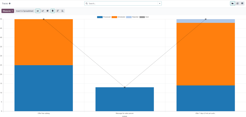
The default view on the Traces page is the Bar Chart view, but there are different view options available in the upper-left corner. There is the option to view the statistics as a Line Chart or Pie Chart.
At the top of the graph, there’s a color key, informing the user which activities have been Processed, Scheduled, and Rejected. There’s also an outline indicator to inform users of the Sum of certain activities, as well.
Beside the various view option in the upper-left corner of the Traces page, there is also the option to view the statistics as Stacked, and the data can be put into Descending or Ascending order.
To the far-left of the view options, there is the Measures drop-down menu. When clicked, the options to view the Document ID or total Count are available. And, to the right of the Measures drop-down menu, there’s the ability to add any data to a spreadsheet by clicking the Insert in Spreadsheet button.
Also, in the upper-right corner of the Link Statistics page, to the far-right of the search bar, there are additional view options to choose from: the default Graph view, the Pivot table view, and the List view.
Participants
Odoo tracks all participants related to every marketing campaign. The data related to these participants can be accessed and analyzed in the Participants page, which can be found by navigating to Marketing Automation app ‣ Reporting ‣ Participants.
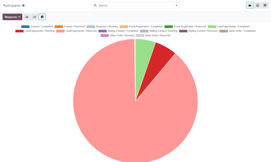
The default view on the Participants page is the Pie Chart view, but there are different view options available in the upper-left corner. There is the option to view the statistics as a Line Chart or Bar Chart.
At the top of the graph, there’s a color key that describes the type of participants found in the graph.
To the far-left of the view options, there is the Measures drop-down menu. When clicked, the options to view the Record ID or total Count are available. And, to the right of the Measures drop-down menu, there’s the ability to add any data to a spreadsheet by clicking the Insert in Spreadsheet button.
Also, in the upper-right corner of the Link Statistics page, to the far-right of the search bar, there are additional view options to choose from: the default Graph view, the Pivot table view, and the List view.
On this page
Get Help
Contact Support Ask the Odoo Community
- User Docs
- Database management
- Developer
- Contributing
EN
Odoo 18
Double Opt-in
A double opt-in, also referred to as a confirmed opt-in, may be required in some countries for marketing communications, due to anti-SPAM laws. Confirming consent has several other benefits, as well: it validates email addresses, avoids spam/robo subscribers, keeps mailing lists clean, and only includes engaged contacts in the mailing list.
When the Double Opt-in campaign template is used, a new mailing list titled, Confirmed contacts is created in the Email Marketing app, and any new mailing list contacts that are added to the default Newsletter mailing list are sent a confirmation email to double opt-in. The contacts that click on the confirmation link in the email are automatically added to the Confirmed contacts mailing list in Odoo.
Important
When using the Double Opt-in campaign template, only the contacts in the Confirmed contacts mailing list are considered to have confirmed their consent.
Use the Double Opt-in campaign template
Open the Marketing Automation app, and select the Double Opt-in campaign template to create a new campaign for confirming consent.
Tip
The campaign templates do not display, by default, when there are existing Marketing Automation campaigns. To display the campaign templates, type the name of a campaign (that does not exist in the database) into the Search… bar, then press Enter.
For example, searching for empty displays the campaign template cards again, as long as there is not a campaign with the name “empty” in the database.
Campaign configuration
Upon creation of the campaign, the campaign form loads with a new preconfigured campaign.
The Target and Filter configurations of the campaign are as follows:
- Name: Double Opt-in
- Responsible*: The user who created the campaign.
- Target: Mailing Contact
- Unicity based on: Email (Mailing Contact)
- Filter:
- Email is set
- Blacklist is not set
- Mailing lists contains Newsletter
* The Responsible field is only visible with Developer mode (debug mode) activated.
Important
The Target model of the campaign should not be modified. Changing the Target model with activities in the Workflow invalidates the existing activities in the Workflow.
The Double Opt-in campaign template is intended to only use the Mailing Contact model.
The campaign loads two activities in the Workflow section of the campaign: an email activity, with a child server action activity that triggers on click.
By default, the Confirmation email activity is set to trigger 1 Hours after the beginning of the workflow. In other words, the email is sent 1 hour after a new contact is added to the Newsletter mailing list.
The email activity uses the preconfigured Confirmation email template, which contains a button for the contact to click to confirm their consent.
To modify the email template, select the Templates smart button at the top of the campaign form. Then, in the list of templates, select the Confirmation email template.
Be sure to personalize the contents of the email template; however, it is recommended to keep the contents of double opt-in confirmation emails short and to-the-point.
The default confirmation button, in the body of the template, links directly to the database’s website homepage. Click on the button to edit the button text and URL.
Tip
To provide a streamlined experience for the contact, consider creating a page on the website that expresses gratitude to the contact for confirming their subscription to the mailing list. Add the link to that page in the URL of the confirmation button.
Important
The email template should only include a single call-to-action link for confirmation, other than an unsubscribe link.
Any click on a link (or button) included in the confirmation email, besides the unsubscribe button, triggers the Add to list server action.
The child activity Add to list server action’s On click trigger cannot differentiate between multiple URLs in an email, besides the /unsubscribe_from_list unsubscribe button that is included in any one of the footer blocks.
The Add to list server action activity triggers immediately after a click in the parent Confirmation email activity is detected.
When triggered, the Add to list activity executes the Add To Confirmed List server action, automatically adding the contact to the Confirmed contacts mailing list, if they are not already in the mailing list.
To modify the server action, select the title of the activity to open the Open: Activities pop-up window and edit the server action activities configuration.
Tip
Consider setting an Expiry Duration to prevent executing the activity after a specific amount of time.
Important
It is not recommended to modify the preconfigured Python code in the Add To Confirmed List server action, as doing so may trigger a change in the database’s pricing plan.
Once the campaign configuration is complete, consider launching a test to verify the campaign executes as expected. If the campaign testing is successful, Start the campaign to begin sending double opt-in confirmation emails to Newsletter mailing list contacts, and fill the Confirmed contacts mailing list with engaged contacts.
Double Opt-in use-case
Example
To prepare for sending newsletter marketing emails on an Odoo database, a mailing contact list must be procured. One way of collecting subscribers is through a sign-up form on the website that adds contacts to the Newsletter mailing list on the form submission.
Before sending any marketing emails, use the Double Opt-in campaign template in the Marketing Automation app to confirm marketing email consent from the contacts in the Newsletter mailing list.
After launching the Double Opt-in campaign, view the contacts that have double opt-in in the Confirmed contacts mailing list (Email Marketing app ‣ Mailing Lists ‣ Mailing Lists).
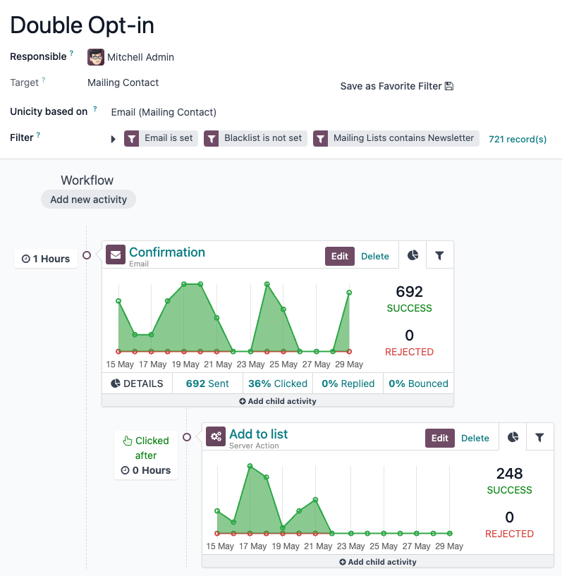
Now, the Confirmed contacts mailing list is ready to be used for sending newsletter marketing emails from an Odoo database.
See also
On this page
Get Help
Contact Support Ask the Odoo Community
- User Docs
- Database management
- Developer
- Contributing
EN
Odoo 18
Events
Explore the various aspects of the Odoo Events detailed dashboard, and useful settings, that can be utilized to generate and gather valuable data about events (and their attendees), which can then be used to improve decision-making and event-planning.
See also
Create events
Discover how to create events with Odoo.Sell event tickets
Learn how to create, configure, and sell event tickets.Track and manage talks
See how to create, track, and manage event tracks with Odoo.Event templates
Expedite the event-creation process with event templates.Event tracks
Learn how to create, track, and manage event tracks with Odoo.Event booths
Create, manage, and sell event booths.Registration Desk
Instantly grant access to event attendees with Odoo’s Registration Desk feature.Revenues report
Analyze the financial success of events with Odoo.Events dashboard
When the Events application is opened, Odoo reveals the main Events dashboard, which can be viewed in a number of different ways. Those different view options are accessible from the Events dashboard in the upper-right corner, via a series of view-related icon buttons.
By default, the Events dashboard is displayed in the Kanban view, which is populated with a variety of pipeline stages.
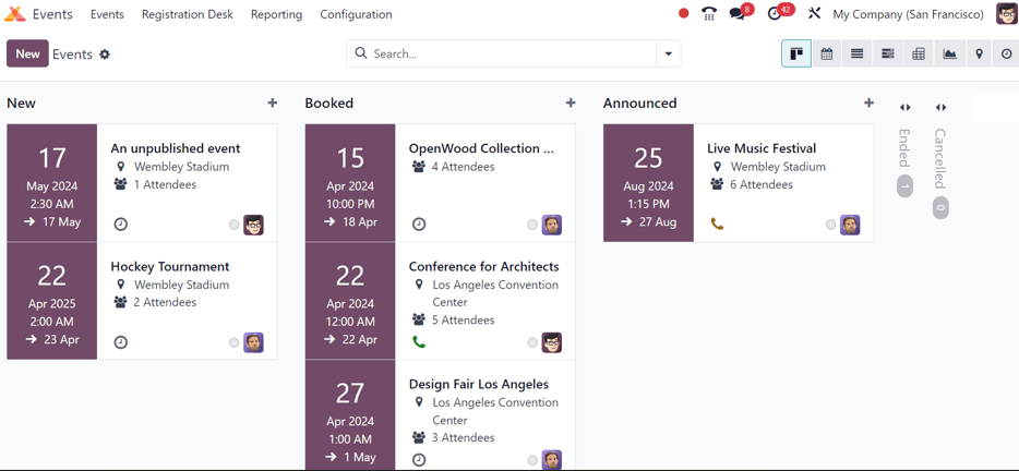
This view showcases all the events in the database in their respective stages. By default, the stages are: New, Booked, Announced, Ended, and Cancelled.
Note
The Ended and Cancelled stages are folded, by default, and located to the right of the other stages.
On each event card, find the scheduled date of the event, the name of the event, the location, the number of expected Attendees, any scheduled activities related to the event, the status of the event, and the person responsible for the event.
To quickly add a new event to a pipeline, click the (plus) icon at the top of the stage to which the event should be added to reveal a blank Kanban card to fill out.
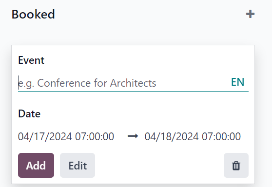
In this blank Kanban card, enter the name of Event, along with the start and end Date and time.
Then, either click Add to add it to the stage and edit it later, or click Edit to add the event to stage and edit its configurations on a separate page.
Each event card can be dragged-and-dropped into any stage on the Kanban pipeline, providing easy organizational access.
Settings
To access the event settings and feature options in Odoo Events, navigate to Events app ‣ Configuration ‣ Settings. From here, tick the checkboxes beside the desired settings and/or features, and click Save to activate them.
Events section
In the Events section of the Settings page, there are selectable features that can be enabled to add various elements to events created with the Odoo Events application.
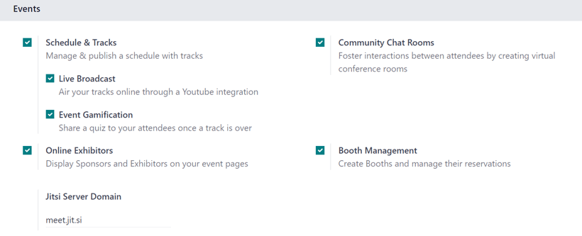
The Schedule & Tracks feature allows users to manage and publish a schedule with tracks for events. Tracks is a catch-all term that refers to talks, lectures, demonstrations, presentations, and other similar elements that users may choose to include as part of an event.
When the Schedule & Tracks feature is enabled, two additional fields appear beneath it: Live Broadcast and Event Gamification.
The Live Broadcast feature lets users air tracks online, via a YouTube integration.
The Event Gamification feature lets users share a quiz after any event track, in order for attendees to gauge how much they learned from the track they just saw/heard. Companies can also benefit from this feature, in that the subsequent responses and results of the quizzes can help determine where a company’s strengths and weaknesses are, when it comes to their presentations.
Next, is the Online Exhibitors feature. This feature allows users to display sponsors and exhibitors on event pages, which can serve as a valuable incentive to encourage partners and businesses to participate in the event.
The Jitsi Server Domain field represents an external conferencing service that is integrated with Odoo. It is what is used to create and host virtual conferences, community rooms, and other similar elements for events.
The Community Chat Rooms feature allows users to create virtual conference rooms for event attendees, providing them with a centralized place to meet and discuss anything related to the event.
Lastly, there is the Booth Management feature. This feature provides users with the ability to create and manage event booths and booth reservations. When enabled, users can create different booth tiers, with individual price points, and sell them to interested parties.
Registration section
The Registration section of the Settings page provides selectable settings that are directly related to event registration.
The Tickets setting allows users to sell event tickets, via standard sales orders.
The Online Ticketing setting creates a selectable Event Ticket product type on product forms, which provides users with the ability to sell event tickets online, via their website/eCommerce store.
Attendance section
In the Attendance section of the Settings page, there is a selectable setting that is directly related to how attendees can attend/enter the event.
The Use Event Barcode setting, when activated, enables barcode (and QR code) scanning for attendees to enter the event. This provides attendees with quick access, and helps Odoo users easily track, manage, and analyze all event attendees.
The Barcode Nomenclature field, beneath the Use Event Barcode setting, is set to Default Nomenclature, by default, but can be changed at any time.
Create events
With Odoo Events, events can be manually created from scratch or built off of pre-made templates.
Once launched, the Events application then integrates with the Website app for the front-end promotion and registration of the event for attendees, the Sales app for the purchasing ability of paid tickets, and the CRM application through customizable lead generation rules.
See also
Sell event tickets
Create custom ticket tiers (with various price points) for potential event attendees to choose from, directly on the event template form, under the Tickets tab.
Odoo simplifies the ticket-purchasing process by providing plenty of payment method options, as well.
See also
Track and manage talks
Discover how to access various event tracks (talks, presentations, etc.), view entire agendas, and learn how attendees can propose talks for the event.
See also
Event templates
Learn the process to customize and configure event templates, which can be used to expedite the event-creation process.
See also
Event booths
Explore the various ways to create, manage, and sell event booths with the Odoo Events application.
See also
Event tracks
Find out how to create, manage, and schedule different experiences (aka Tracks) for events with Odoo.
See also
Registration desk
Grant access to event attendees quickly and easily with the Odoo Events Registration Desk feature.
See also
Revenues report
Gain invaluable insight into event-related revenues with customizable reports and metrics.
See also
On this page
Get Help
Contact Support Ask the Odoo Community
- User Docs
- Database management
- Developer
- Contributing
EN
Odoo 18
Create events
With the Events application, event organizers can create and configure in-person or online-only events in Odoo. Each new event contains a number of customizable options that are geared around specific event logistics, as needed per event, such as ticket sales and registration desk, booths, tracks, sponsors, rooms, and more.
Events can be manually created from scratch or built off of pre-made templates. Once launched, the Events application then integrates with the Website app for the front-end promotion and registration of the event for attendees, the Sales app for the purchasing ability of paid tickets, as well the CRM application through customizable lead generation rules.
New event
To create a new event, begin by navigating to the Events app to land on the default Events dashboard, in the Kanban view. From there, or alternatively from the List or Gantt views, click the New button in the upper-left corner of the dashboard to open up a new event form.
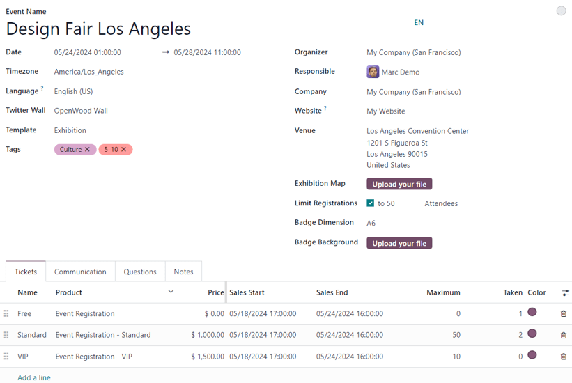
Note
If certain fields do not readily appear on the event form, that means an additional application needs to be installed, or the database is not operating in a multi-company environment.
For example, the Twitter Wall field only appears if the Social Marketing app is installed, and the Company field only appears if the database is working in a multi-company environment.
These are just additional elements that can be used for an event. They are not required to create, host, and manage an event with Odoo Events.
Event form
At the top of the event form are a series of smart buttons related to various event metrics, which will autopopulate with pertinent data once attendees begin to register, booths and sponsors sign on for the event, the event takes place, and so on.
Primarily, these smart buttons are used as logistical portals to perform specific actions for the event. The numeric displays are primarily for quick reference points.
While those visual metrics are useful, they can still be clicked, and used to navigate to specific event-related pages to modify and/or perform any desired actions.
Beneath the smart buttons is the event form, which contains various fields and clickable tabs that serve to configure the initial, necessary details of the event.
The following are fields found on an event form:
- Event Name: the title of the event. This field is required.
Note
To the right of the entered Event Name, there is a language tooltip, represented by an abbreviated language indicator (e.g. EN). When clicked, a Translate: name pop-up window appears, displaying various pre-configured language translation options available in the database. - Date: when the event is scheduled to take place (expressed in your local timezone). This field is auto-populated, but modifiable, and is required.
- Display Timezone: the timezone in which the event dates/times will be displayed on the website. This field is auto-populated, but modifiable, and is required.
- Language: designate a specific language for all event communications to be translated into, if necessary. This field is blank, by default, so if event-related communications are being sent to recipients who speak a different language, be sure to configure this field properly.
- Twitter Wall: creates a separate page on the event website to feature specific social posts on X (formerly Twitter) that contain pre-determined desired elements.
Tip
To create and customize a Twitter Wall, type the name of the desired wall into the field, and select Create and edit… from the resulting drop-down menu.
Doing so reveals Create Twitter Wall pop-up window.
From this window, enter a Wall Name. Then, select a certain word or hashtag for Odoo to search for on X, like #WoodWorkingExpo24, for example.
Next, determine the Type of tweets Odoo should showcase with that predetermined criteria. The choices in this field are: Recent, Popular, or Mixed.
Users also have the option to add a brief Description to the wall, as well.
Lastly, the greyed-out, non-modifiable Website URL field will autopopulate with the full URL needed to access the document through the event website.
An image can also be added to the wall by clicking the (pencil) icon that appears when the cursor hovers over the (camera) placeholder image in the upper-right corner of the pop-up window.
Then, from the resulting file explorer window, select the desired image to be added to the wall.
This Twitter Wall field only appears on the event form if the Social Marketing app is installed, and an X account has been added as a stream on the application. To learn more, check out the Social Marketing documentation. - Template: choose a pre-configured event template from the resulting drop-down menu.
Or, create a new one directly from this field, by typing in the name of the new template, and selecting either:- Create (which creates the template, and can be edited later) or
- Create and edit… (which creates the template, and reveals a separate template page to configure the template in greater detail).
- Tags: add any corresponding tags to briefly describe the event (e.g. Online, Conference, etc.). Multiple tags can be added per event.
Tip
Tags can be displayed on events that are listed on the website by enabling the Show on Website checkbox from Events app ‣ Configuration ‣ Event Tag Categories. - Organizer: designate the organizer of the event (a company, contact, or employee).
- Responsible: designate a user in the database to be responsible for this event.
- Company: designate which company in the database to which this event is related. This field only appears if working in a multi-company environment. This field is auto-populated, but modifiable, and is required.
- Website: choose to restrict the publishing of this event to a specific website created in Odoo. If this field is left blank, the event can be published on all websites in the database. To learn more, refer to the Multiple websites documentation.
- Venue: enter event venue details. This field pulls pertinent information from the Contacts application. Alternatively, Venue information can be manually added in this field, as well. At the very least, there must be a venue name, address, city, zip code/region, and country entered.
- Exhibition Map: if desired, click the Upload your file button to upload an image of the event venue map.
- Limit Registrations: if this checkbox is ticked, a limit to the amount of registrations is added to the event, and that desired limit amount must be entered in the blank field before Attendees.
- Badge Dimension: select a desired paper format dimension for event badges. The options are: A4 foldable, A6, or 4 per sheet.
- Badge Background: if desired, click the Upload your file button to upload a custom background image for event badges.
When the above fields in the event form have been adequately filled in, move on to the four tabs at the bottom of the event form for further customization.
Those tabs are: Tickets, Communication, Questions, and Notes.
Tickets tab
Create custom tickets (and ticket tiers) for events in the Tickets tab of an event form.
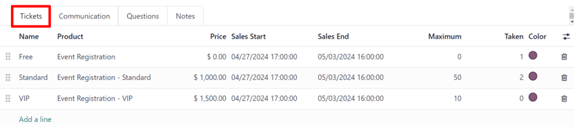
To create a ticket, click Add a line in the Tickets tab. Then, enter a name for the ticket (e.g. Basic Ticket or VIP) in the Name field.
In the Product field, either select the pre-configured Event Registration product, or create a new one by typing in the name of the new event registration product, and then select either Create or Create and edit… from the resulting drop-down menu.
Important
Upon installing Odoo Events, a new product type, Event Ticket, becomes available on product forms (Sales ‣ Products ‣ Products). In order for an event registration product to be selectable in the Tickets tab, the event registration Product Type must be set to Event Ticket.
Tip
Existing event registration products can be modified directly from this field, as well, by clicking the (right arrow) icon, located beside the event registration product. Doing so reveals that product’s form. If the Inventory application is installed, additional choices are available to customize for the product.
Next, set the registration cost of the ticket in the Price field.
Note
The Sales Price defined on the event registration product’s product form sets the default cost of a ticket. Modifying the Price of a ticket in the Tickets tab, sets a new registration cost of the ticket for that event.
Next, determine a Sales Start and Sales End date in their respective fields. To do that, click into the blank field to reveal a calendar popover. From there, select the desired date and time, then click Apply.
Then, if desired, designate a Maximum amount of that specific ticket that can be sold.
The Taken column populates with the number of tickets that are sold.
Optionally, in the Color column, add a custom color to differentiate ticket badges. The selected color displays on ticket badges when printed.
To delete any tickets from the Tickets tab, click the (trash can) icon on the corresponding line for the ticket that should be deleted.
Tip
To add an optional Description column to the Tickets tab, click the (additional options) drop-down menu, located to the far-right of the column titles.
Then, tick the checkbox beside Description from the resulting drop-down menu.
When added, the option to add brief descriptions for each event ticket appears, which can be used to inform attendees of any perks or amenities that may coincide with specific ticket purchases.
Communication tab
In the Communication tab of an event form, create various marketing communications that can be scheduled to be sent at specific intervals leading up to, and following, the event.
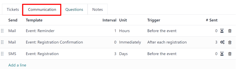
Note
By default, Odoo provides three separate pre-configured communications on every new event form. One is an email sent after each registration to confirm the purchase with the attendee. The other two are email event reminders that are scheduled to be sent at different time intervals leading up to the event to remind the recipient of the upcoming event.
To add a communication in the Communication tab, click Add a line. Then, select the desired type of communication in the Send field. The options are: Mail, SMS, Social Post, or WhatsApp.
There is no limit to the number of communications that can be added in the Communication tab of an event form.
To delete a communication from the Communication tab, click the (trash can) icon on the corresponding communication line. Doing so removes the communication from the event entirely.
Important
The Social Post option only appears if the Social Marketing application is installed. The WhatsApp option only appears if the WhatsApp Integration module is installed.
WhatsApp templates cannot be edited during active configuration. A separate approval from Meta is required.
Select an existing email template from the Template drop-down menu.
Next, define the Interval, Unit, and Trigger from their respective drop-down fields, letting Odoo know when the communication should be sent.
The Unit options are: Immediately, Hours, Days, Weeks, and Months.
Then, select an option from the Trigger drop-down menu. The options are: After each registration, Before the event, and After the event.
The Sent column populates with the number of sent communications. And, beside the number are different icons that appear, depending on the status of that particular communication.
The status of Running is represented by a (three gears) icon. The status of Sent is represented by a (checkmark) icon. And, the status of Scheduled is represented by an (hourglass) icon.
Example
To send a confirmation email an hour after an attendee registers for an event, configure the following communication:
- Interval: 1
- Unit: Hours
- Trigger: After each registration
Note
Existing email templates can be modified directly from the Template drop-down menu, if necessary, by clicking the (right arrow) icon next to the template name. Doing so reveals a separate page where users can edit the Content, Email Configuration, and Settings of that particular email template.
To view and manage all email templates, activate Developer mode (debug mode) and navigate to Settings ‣ Technical ‣ Email: Email Templates. Modify with caution as email templates effect all communications where the template is used.
Questions tab
In the Questions tab of an event form, users can create brief questionnaires for registrants to interact with, and respond to, after they register for the event.
These questions can be focused on gathering basic information about the attendee, learning about their preferences, expectations, and other things of that nature. This information can also be used to create more detailed reporting metrics, in addition to being utilized to create specific lead generation rules.
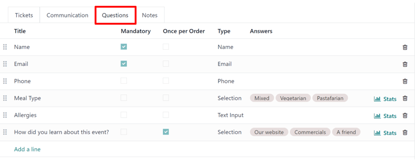
Note
By default, Odoo provides three questions in the Questions tab for every event form. The default questions require the registrant(s) to provide their Name and Email, and make it optional to include their Phone number, as well.
The information gathered from the Questions tab can be found on the Attendees dashboard, accessible via the Attendees smart button. Odoo populates individual records that contain basic information about the registrant(s), as well as their preferences.
To add a question in the Questions tab, click Add a line. Doing so reveals a Create Question pop-up window. From here, users can create and configure their question.
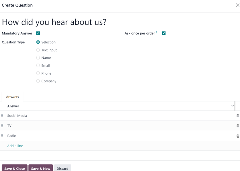
First, enter the question in the field at the top of the form. Then, decide if the question should require a Mandatory Answer and/or if Odoo should Ask once per order, by ticking their respective boxes, if desired.
If the Ask once per order checkbox is ticked, the question will only be asked once, and its value is propogated to every attendee in the order (if multiple tickets are purchased at once). If the checkbox is not ticked for this setting, Odoo will present the question for every attendee that is connected to that registration.
Next, select a Question Type option:
- Selection: provide answer options to the question for registrants to choose from. Selectable answer options can be managed in the Answers column at the bottom of the pop-up window.
- Text Input: lets the users enter a custom response to the question in a text field.
- Name: provides registrants with a field for them to enter their name.
- Email: provides registrants with a field for them to enter their email address.
- Phone: provides registrants with a field for them to enter their phone number.
- Company: provides registrants with a field for them to enter a company they are associated with.
Once all the desired configurations have been entered, either click Save & Close to save the question, and return to the Questions tab on the event form, or click Save & New to save the question and immediately create a new question on a new Create Question pop-up window.
As questions are added to the Questions tab, the informative columns showcase the configurations of each question.
The informative columns are the following:
- Title
- Mandatory
- Once per Order
- Type
- Answers (if applicable)
For Selection and Text Input types, a Stats button appears on the right side of the question line. When clicked, Odoo reveals a separate page, showcasing the response metrics to that specific question.
To delete any question from the Questions tab, click the (trash can) icon on the corresponding question line.
There is no limit to the number of questions that can be added in the Questions tab of an event form.
Notes tab
In the Notes tab of an event form, users can leave detailed internal notes and/or event-related instructions/information for attendees.
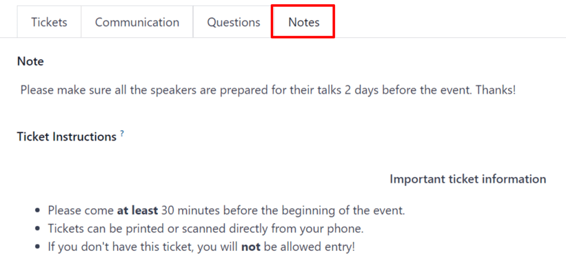
In the Note field of the Notes tab, users can leave internal notes for other event employees, like “to-do” lists, contact information, instructions, and so on.
In the Ticket Instructions field of the Notes tab, users can leave specific instructions for people attending the event that appear on the attendees ticket.
Publish events
Once all configurations and modifications are complete on the event form, it is time to publish the event on the website. Doing so makes the event visible to website visitors, and makes it possible for people to register for the event.
To publish an event after all the customizations are complete, click the Go to Website smart button at the top of the event form. Doing so reveals the event’s web page, which can be customized like any other web page on the site, via the Edit button.
To learn more about website design functionality and options, consult the Building block documentation.
Once the event website is ready to be shared, click the red Unpublished toggle switch in the header menu, changing it to a green Published switch. At this point, the event web page is published, and viewable/accessible by all website visitors.
Send event invites
To send event invites to potential attendees, navigate to the desired event form, via Events app ‣ Events, and click into the desired event. Following this, click the Invite button in the upper-left corner of the event form.
Doing so reveals a blank email form to fill out, as desired. To learn more about how to create and customize emails like this, refer to the Create an email documentation.
Proceed to create and customize an email message to send as an invite to potential attendees. Remember to include a link to the registration page on the event website, allowing interested recipients to quickly register.
Tip
Sending emails from Odoo is subject to a daily limit, which, by default, is 200. To learn more about daily limits, visit the Daily limit reached documentation.
See also
On this page
Get Help
Contact Support Ask the Odoo Community
- User Docs
- Database management
- Developer
- Contributing
EN
Odoo 18
Sell event tickets
Odoo Events provides users with the ability to create custom event tickets (and ticket tiers), with various price points.
It also allows them to sell event tickets in two different ways: via standard sales orders, and online through an integrated website.
Odoo also simplifies the ticket-purchasing process by providing plenty of payment method options.
Tip
To learn more about how to create custom tickets (and ticket tiers) for events, check out the Create events documentation.
Configuration
In order to sell event tickets in Odoo, some settings must first be enabled.
First, navigate to Events app ‣ Configuration ‣ Settings. In the Registration section, there are two different settings: Tickets and Online Ticketing.
The Tickets setting allows users to sell event tickets with standard sales orders.
The Online Ticketing setting allows users to sell event tickets online through their integrated Odoo website.
To activate a setting, tick the checkbox beside the desired feature’s label, and click Save to finish enabling it.
Note
If these options are not enabled, a default Register button becomes available for visitors to interact with and procure free registrations to the event.
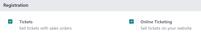
With those settings enabled, Odoo automatically creates a new Product Type called, Event Ticket, which is accessible on every product form. Odoo also creates three event registration products (with the Product Type set to Event Ticket) that can be used or modified for event tickets.
Important
When creating a new event registration product, the Product Type must be set to Event Ticket on the product form, in order for it to be selected in the Product column under the Tickets tab on an event form.
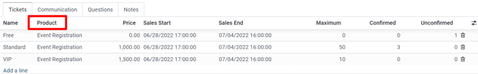
Note
Any event with paid tickets sold, features a Sales smart button at the top of the event form, where the respective sales orders attributed to those ticket sales become available.
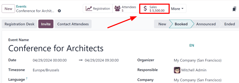
Clicking the Sales smart button reveals a separate page, showcasing all the sales orders (standard and/or online) related to tickets that have been sold for that specific event.
Sell event tickets with the Sales app
To sell event tickets with sales orders, start by navigating to the Sales app. Then, click New to open a new quotation form.
After filling out the top portion of the form with the appropriate customer information, click Add a product in the Order Lines tab. Then, in the Product column, select (or create) an event registration product configured with its Product Type set to Event Ticket on its product form.
Once an event registration product is selected, a Configure an event pop-up window appears.
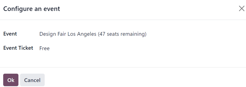
From the Configure an event pop-up window, select to which event this ticket purchase is related to in the Event field drop-down menu. Then, in the Event Ticket drop-down menu, select which ticket tier the customer wishes to purchase, if there are multiple tiers configured for that event.
When all the desired configurations are complete, click Ok. Doing so returns the user to the sales order, with the event registration ticket product now present in the Order Lines tab. The user can proceed to confirm and close the sale, per the usual process.
Tip
To re-open the Configure an event pop-up window, hover over the event registration product name in the Order Lines tab, and click on the (pencil) icon.
Sell event tickets through the Website app
When a visitor arrives on the register page of the event website, they can click the Register button to purchase a ticket to the event.
Note
If the visitor is not already on the register page of the event website, clicking Register on the event website’s submenu redirects them to the proper register page. From there, they can click the Register button to begin the ticket purchasing process.
If different ticket tiers are configured for the event, the visitor is presented with a Tickets pop-up window.
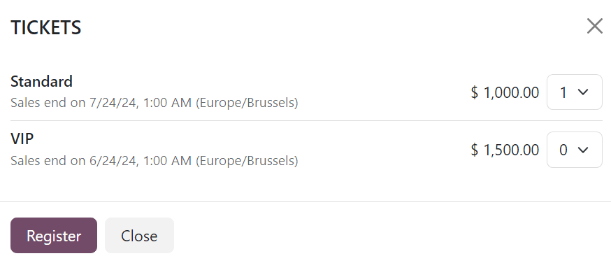
From here, visitors select which ticket tier they would like to purchase, along with a quantity, using the numerical drop-down menu available to the right of their desired ticket. Once the desired selections have been entered, the visitor then clicks the Register button.
Then, an Attendees pop-up window appears, containing all the questions that have been configured in the Questions tab of the event form for this particular event.
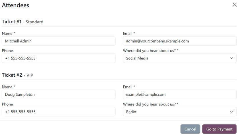
If multiple tickets are being purchased at once, there are numbered sections for each individual ticket registrant, each containing the same questions. However, if any question has been configured with the Ask once per order setting, that question is only asked once – and not for every attendee making the reservation in the order.
With all necessary information entered, the visitor can then click the Go to Payment button. Doing so first takes the visitor to a Billing confirmation page, followed by a Payment confirmation page, where they can utilize any configured payment method set up in the database to complete the order.
Then, once the purchase is complete on the front-end of the website, the subsequent sales order is instantly accessible in the back-end of the database.
See also
On this page
Get Help
Contact Support Ask the Odoo Community
- User Docs
- Database management
- Developer
- Contributing
EN
Odoo 18
Talks, proposals, and agenda
With Odoo Events, users can utilize a fully-integrated event website, where attendees can quickly access various tracks (talks, presentations, etc.), view entire agendas, and propose talks for the event.
Event website
To access an event website, navigate to the specific event form in the Odoo Events app, and click the Go to Website smart button. Or, while on the Odoo-built website for the company, click the Events header option, and select the desired event to view that event’s website.
On the event website, there is an event-specific subheader menu with different options to choose from.
With the Schedule & Tracks setting enabled in the Odoo Events app, the following links are automatically added to the subheader menu, located on the event website: Talks, Talk Proposals, and Agenda.
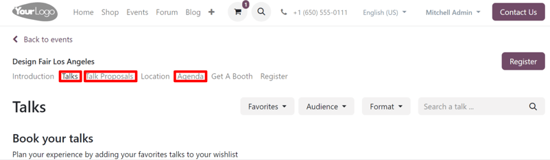
To enable the Schedule & Tracks setting, navigate to Events app ‣ Configuration ‣ Settings, tick the checkbox beside Schedule & Tracks, and click Save.
Talks page
The Talks link takes the attendee to a page filled with all the planned tracks for the event.
At the top of Talks page, there are drop-down filter menus beside a Search a talk… search bar.
The first drop-down filter menu (with the starting title: Favorites) is the only drop-down filter menu that appears by default. When clicked, the resulting menu presents two options: Favorites and All Talks.
Selecting Favorites shows only the tracks that have been favorited by the attendee.
Note
If no tracks have been favorited, and the Favorites filter is selected, Odoo presents all the event tracks.
Selecting All Talks shows all the tracks, regardless if they have been favorited or not.
The other drop-down filter menus that appear on this page are related to any configured tags (and tag categories) created for event tracks in the backend.
Tip
To add tags and tag categories to track forms, open a desired event track form, and start typing a new tag in the Tags field. Then, click Create and edit… from the resulting drop-down menu.
Doing so reveals a Create Tags pop-up form.
From here, users see the recently added tag in the Tag Name field. Beneath that, there is an option to add a specific Color Index to the tag for added organization.
Lastly, there is the Category field, where users can either select a pre-existing category for this new tag, or create a new one.
All options in the Category field for tags appear as their own drop-down filter menu on the Talks page, located on the event website.
Beneath the drop-down filter menus at the top of the Talks page, there is a list of planned tracks for the specific event, organized by day.
If an attendee wishes to favorite a track, they can click the (empty bell) icon, located to the right of the track title. Attendees will know a track has been favorited when they notice the icon has been changed to (filled bell) icon.
Favoriting a track this way places it on the list of Favorites, which is accessible from the default drop-down filter menu, located at the top of the Talks page.
Talk Proposals page
The Talk Proposals link takes attendees to a page on the event website, wherein they can formerly submit a proposal for a talk (track) for the event, via a custom online form.
In addition to the form, an introduction to the page, along with any other pertinent information related to the types of talks the event will feature can be added, if needed.
The talk proposal form can be modified in a number of different ways, via the web builder tools, accessible by clicking Edit while on the specific page.
Then, proceed to edit any of the default fields, or add new forms with the Form building block (located in the Blocks section of the web builder tools sidebar).
Once all the necessary information is entered into the form, the attendees just need to click the Submit Proposal button.
Then, that talk, and all the information entered on the form, can be accessed on the Event Tracks page for that specific event in the Proposal stage, which is accessible via the Tracks smart button on the event form.
At that point, an internal user can review the proposed talk, and choose to accept or deny the proposal.
If accepted, the internal user can then move the track to the next appropriate stage in the Kanban pipeline on the Event Tracks page for the event. Then, they can open that track form, and click the Go to Website smart button to reveal that track’s page on the event website.
From there, they can toggle the Unpublished switch in the header to Published, which allows all event attendees to view and access the talk.
Agenda page
The Agenda link takes attendees to a page on the event website, showcasing an event calendar, depicting when (and where) events are taking place for that specific event.
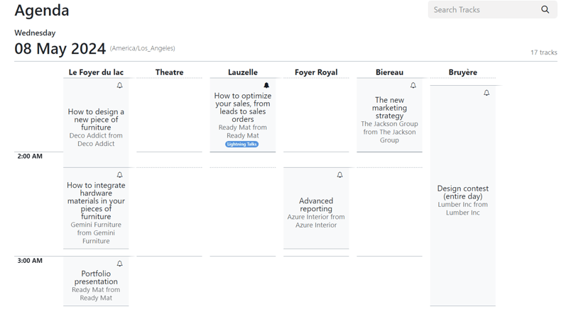
Clicking any track on the calendar takes the attendee to that specific track’s detail page on the event website.
If an attendee wishes to favorite a track, they can click the (empty bell) icon, located to the right of the track title. Attendees will know a track has been favorited when they notice the icon has been changed to (filled bell) icon.
On this page
Get Help
Contact Support Ask the Odoo Community
- User Docs
- Database management
- Developer
- Contributing
EN
Odoo 18
Event templates
The Odoo Events application provides the ability to customize and configure event templates, which can be used to expedite the event-creation process.
These templates can be created and personalized in the application, and then selected from an event form, in order to quickly apply a series of settings and elements to the new event, all of which can be further modified, if needed.
Event templates page
In the Odoo Events application, event templates can quickly be created and modified.
To begin, navigate to Events app ‣ Configuration ‣ Event Templates. Doing so reveals the Event Templates page. Here, find all the existing event templates in the database.
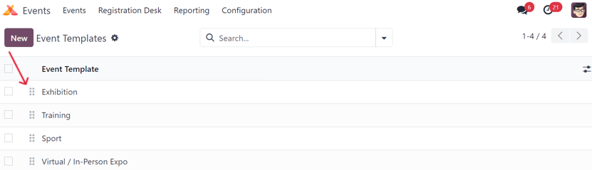
By default, Odoo provides three pre-configured event templates: Exhibition, Training, and Sport, which all have their own unique customizations applied to them.
To change how these event templates appear on the Template drop-down field on an event form, drag-and-drop them into any desired order, using the (draggable) icon, located to the left of each event template line on the Event Templates page.
See also
To learn more about event forms, refer to the Create events documentation.
Create event template
There are two ways to create and configure an event template in Odoo Events.
- On the dashboard, by navigating to Events app ‣ Configuration ‣ Event Templates and clicking the New button in the upper-left corner. Doing so reveals a blank event template form that can be customized in a number of different ways.
- On an event form itself. Start by typing the name of a new event template in the Template field, and click Create and edit… from the resulting drop-down menu. Doing so reveals a Create Template pop-up window, featuring all the same configurable fields and elements found on a standard event template form.
Note
Clicking Create “[template name]” from the resulting drop-down menu, via the Template field on an event form creates the event template in the database, but does not present the user with the Create Template pop-up window.
The event template would have to be modified, by selecting it on the Event Templates page (Events app ‣ Configuration ‣ Event Templates).
Event template form
All the fields on a standard Event Template form are also on the Create Template pop-up window, accessible via the Template field on an event form.
Start by providing the event template with a name in the Event Template field, located at the top of the form.
Beneath that field, there is a series of selectable checkboxes, all of which are related to how the event menu will be displayed on the event web page.
- Website Submenu: enables a submenu on the event’s website. When this checkbox is ticked, every other checkbox in this series is automatically ticked, as well. Then, choose to untick (deselect) any of the checkbox options, as desired.
- Tracks Menu Item: adds a submenu item to navigate to a page displaying all planned tracks for the event.
- Track Proposals Menu Item: adds a submenu item to navigate to a page, in which visitors can fill out a form to propose a track (talk, lecture, presentation, etc.) to happen during the event.
- Booth Menu Item: adds a submenu item that takes visitors to a separate page, where an event booth can be purchased. Event booths can be customized and configured in the Booths tab of the event template form, from the Booth Categories page (Events app ‣ Configuration ‣ Booth Categories).
Important
First, users must create a booth product with the required Event Booth option set as the Product Type on the product form. - Exhibitors Menu Item: adds a submenu item that takes visitors to a separate page, showcasing all the exhibitors related to that specific event. Icons representing those exhibitors are also found on the footer of every event-specific web page, as well.
- Community: adds a submenu item allowing attendees to access pre-configured virtual community rooms to meet with other attendees, and discuss various topics related to the event. When this checkbox is ticked, the Allow Room Creation feature becomes available.
- Allow Room Creation: allow visitors to create community rooms of their own.
- Register Button: adds a button at the end of the event submenu that takes visitors to the event-specific registration page when clicked.
Once the desired checkboxes have been ticked, select an appropriate Timezone for the event from the available drop-down menu.
Then, for organizational purposes, there is the option to add Tags to this event template.
There is also the option to Limit Registrations to this specific event template by ticking that checkbox. If ticked, proceed to enter the number of Attendees this template should be limited to.
Beneath those general information fields at the top of the event template form, there are five tabs:
Booths tab
The Booths tab on an event template form is the only tab that differentiates itself from a standard event form, where the other tabs (Tickets, Communication, Questions, and Notes) are present and configured using the same process. For more information about those tabs, refer to the Create events documentation.
Important
To create a booth or booth category, an event booth product must be created in the database first, with the Product Type set to Event Booth. Only products with that specific configuration can be selected in the required Product field of a booth or booth category form.
Note
Event booths can be created and customized in two ways in the Odoo Events application. Either in the Booths tab of an event template form, or by navigating to Events app ‣ Configuration ‣ Booth Categories, and click New.
To add a booth from the Booths tab of an event template form, click Add a line. Doing so reveals a blank Create Booths pop-up window.
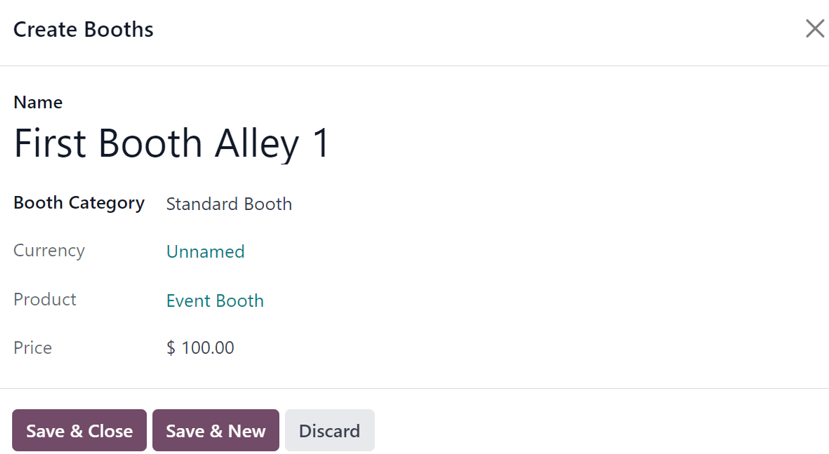
Start by providing a Name for this booth in the corresponding field at the top of the pop-up window.
Then, select an appropriate Booth Category from the drop-down field below. Booth categories can be created and modified from the Booth Categories page in the Events application, which is accessible by navigating to Events app ‣ Configuration ‣ Booth Categories.
Tip
A Booth Category can be created directly from this field on the Create Booths pop-up window. To accomplish that, type the name of the new booth category in the Booth Category field, and select either Create or Create and edit… from the resulting drop-down menu.
Clicking Create merely creates the category, which can (and should be) customized at a later date. Clicking Create and edit… reveals a new Create Booth Category pop-up window, from which the category can be configured in a number of different ways.
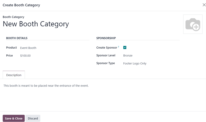
From this pop-up window, proceed to name the Booth Category, modify its Booth Details settings, configure its Sponsorship options (if applicable), and leave an optional Description to explain any pertinent details related to this specific category of booths.
There is also the option to add a photo/visual representation of the booth category, via the (camera) icon in the upper-right corner.
When all desired configurations are complete, click the Save & Close button.
The same configurations and options are available by navigating to Events app ‣ Configuration ‣ Booth Categories, and clicking New.
Once the desired Booth Category is selected, the remaining fields on the Create Booths pop-up window (Currency, Product, and Price) autopopulate, based on information configured for that selected Booth Category.
Note
These fields cannot be modified from the Create Booths pop-up window. They can only be modified from the specific booth category form page.
When all desired configurations are complete, click Save & Close to save the booth, and return to the event template form. Or, click Save & New to save the booth, and start creating another booth on a fresh Create Booths pop-up window. Click Discard to remove all changes, and return to the event template form.
Once the booth has been saved, it appears in the Booths tab on the event template form.
Use event templates
Once an event template is complete, it is accessible on all event forms in the Odoo Events application.
To use an event template, navigate to the Events app and click New to open a new event form.
From the event form, click the Template field to reveal all the existing event templates in the database. They appear in the same order as they are listed in on the Event Templates page (Events app ‣ Configuration ‣ Event Templates).
Select the desired event template from the Template drop-down field on the event form. Pre-configured settings automatically populate the event form, saving time during the event creation process.
Any of these pre-configured settings related to the selected event template chosen in the Template field on an event form can be modified, as desired.
See also
On this page
Get Help
Contact Support Ask the Odoo Community
- User Docs
- Database management
- Developer
- Contributing
EN
Odoo 18
Event booths
The Odoo Events application provides users with the ability to create event booths, sell their availability, and manage their reservations.
Configuration
In order to create, sell, and manage booths for events, the Booth Management feature must be activated.
To do that, navigate to Events app ‣ Configuration ‣ Settings, and tick the Booth Management checkbox. Then, click Save.
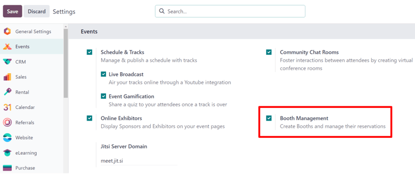
Important
When the Booth Management setting is activated, a new Product Type becomes available on all product forms: Event Booth.
This is important because every created booth must be assigned a Booth Category on their respective booth form, and every booth category must have an Event Booth product assigned to it.
Booth categories
With the Booth Management setting activated in the Events app, the Booth Categories option appears in the Configuration menu.
To access the Booth Category dashboard, go to Events app ‣ Configuration ‣ Booth Categories, which reveals a list of all created booth categories.
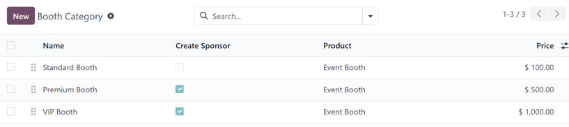
On the Booth Category page, the following information for each booth category is listed:
- Name: the name of the booth category.
- Create Sponsor: if checked, booking this booth category creates a sponsor for the user.
- Product: the Event Booth product associated with that specific booth category.
- Price: the price of a booth in that booth category.
When the (settings) icon, located to the far-right of the column titles, is clicked, a drop-down menu of additional column options appears. From the resulting drop-down menu, tick the checkbox beside Sponsor Level and/or Sponsor Type to reveal those columns on the Booth Category page.
To edit an existing booth category, select it from the list, and proceed to make any desired modifications from the event category form.
Create booth category
To create a booth category from the Booth Category page, click the New button in the upper-left corner to reveal a blank booth category form.
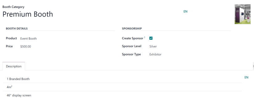
Start by entering a name for the booth category in the top Booth Category field. This is a requried field.
To add a corresponding image to the booth category (e.g. a sample photo of how the booth looks), click the (pencil) icon that appears when the cursor hovers over the camera placeholder in the upper-right corner of the booth category form. When clicked, proceed to upload the desired image to the booth category form, if needed.
In the Booth Details section, users must assign a Product to the category, and it must have Event Booth set as the Product Type on the product form.
And, regardless of the listed price on the Event Booth product chosen, the user can input a custom Price to be applied for this booth category in the field below.
In the Sponsorship section, there is a Create Sponsor checkbox option. With that checkbox ticked, whenever a booth belonging to this category is booked, the user is created as an official Sponsor of the event.
When the Create Sponsor checkbox is ticked, two additional fields appear beneath it: Sponsor Level and Sponsor Type.
Note
Sponsor Level and Sponsor Type are purely to distinguish different distinctions of sponsors. For example, if a sponsor has been attached to a company for multiple years, they would be granted a higher level (e.g. Gold level), which provides them with immediate credability and status. Whereas, conversely, a relatively new sponsor would be granted a lower level (e.g. Bronze level), which coincides with its own credability and status.
Select a desired level of sponsorship from the Sponsor Level drop-down field.
Tip
To modify any existing Sponsor Level, select it from the drop-down field, then click the (right arrow) that appears at the end of the line. Doing so opens a separate page, wherein the Sponsor Level name and Ribbon Style can be changed, if necessary.
Users can also create a new Sponsor Level, by typing in the name of the new level, and clicking Create and edit… from the resulting drop-down menu.
Note
Clicking Create from the resulting drop-down menu in this instance creates the sponsor level, but doesn’t immediately prompt the user to further configure it, via a Create Sponsor Level pop-up window.
Doing so reveals a Create Sponsor Level pop-up window.
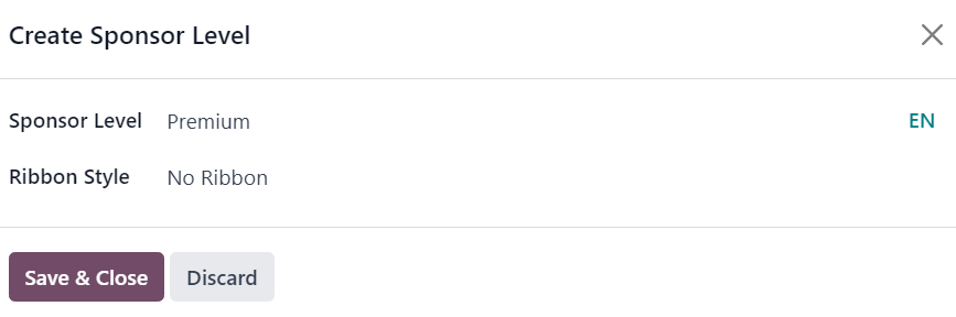
From this pop-up window, confirm the newly-created Sponsor Level, and decide what kind of Ribbon Style should be applied, if any. The Ribbon Style options available in that drop-down field are: No Ribbon, Gold, Silver, and Bronze.
If one is selected, that Ribbon Style appears with the sponsor’s name on the event website.
On the booth category form, beneath those sections (Booth Details and Sponsorship), there is the Description tab. In this tab, proceed to enter any vital information related to the booth category that would be important for any potential booth-buyer to know about (e.g., the square footage, any amenities, size of display screen, etc.).
Add booth to an event
In order to add a booth to an event, navigate to an existing event form, via Events app ‣ Events, and select the desired event from the Events dashboard. Or, click New to open a blank event form.
From the event form, to access the Booths for that specific event, click the Booths smart button at the top of the page.
The Booths page is displayed in a Kanban view, by default, with two different stages: Available and Unavailable.
Note
The Booths page of an event is also viewable in a List view, Graph view, and Pivot view. All of which are accessible, via their icons, in the upper-right corner of the Booths page.
The booths present in the Available stage are still available for people to purchase for the event. The booths present in the Unavailable stage have already been purchased, and are no longer available.
To modify any existing booth, simply click the desired booth from the Booths page, and proceed to make any necessary changes from the booth form. Or, create a new one, by clicking the New button in the upper-left corner to reveal a blank booth form.
Booth form
The booth form in Odoo Events lets users customize and configure event booths in a number of different ways.
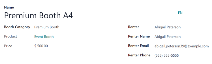
Start by typing in a Name for the booth. This is a required field.
Then, apply a Booth Category to the booth. This is a required field.
Tip
A new Booth Category can be created from this field, by typing in the name of the new category, and clicking Create and edit… from the resulting drop-down menu. Doing so reveals a Create Booth Category pop-up window, with all the standard fields found on a common booth category form.
Simply clicking Create from the resulting drop-down menu creates the category, but does not reveal the Create Booth Category pop-up window. The category would have to be modified later, via the Booth Categories page (Events app ‣ Configuration ‣ Booth Categories).
Upon selecting a pre-existing Booth Category, two additional, non-modifiable fields appear: Product and Price. Both fields represent their respective selections for that specific booth category.
When a person purchases a booth rental through the event website, the subsequent renter-related fields on the form auto-populate, based on the information provided by the purchaser during the online transaction. The booth also automatically changes its status from Available to Unavailable.
However, if the rental of a booth is conducted in any other way (e.g., in person, via sales order, etc.), the Renter, Renter Name, Renter Email, and Renter Phone fields can be entered in manually.
The status of the booth (Available or Unavailable) can also be changed manually, either by clicking the appropriate status from the status bar present on the booth form, or by dragging-and-dropping the desired booth into the appropriate stage, via the Booths page Kanban view.
Sell event booths
With event booths configured on the event form, via the event-specific Booths pages, Odoo presents them on the event website, via the Get A Booth event subheader link.
To access the Get A Booth page on the event website, open the Events app, and select the desired event from the Events dashboard. From the event form, click the Go to Website smart button to be taken to the Odoo-built event website.
If the event subheader menu (with the Get A Booth option) is not showing up on the event website, there are two ways to make it appear.
While on the event website, enter the edit mode by clicking the Edit button in the upper-right corner. Then, click into the Customize tab of the resulting sidebar of web design tools.
In the Customize tab, click the toggle switch for Sub-Menu (Specific), and click Save. Doing so reveals the event subheader menu with various options.
Alternatively, enter Debug mode, and open the specific event form in the the Events application.
On the event form, with Debug mode on, an array of subheader menu options appears. Tick the checkbox for Website Submenu, in order for the submenu to appear on the event website. Doing so also ticks every other submenu-related checkbox automatically.
At this point, proceed to choose which options to keep on the event subheader menu. In this case, make sure the Booth Register checkbox is ticked.
From there, click the Get A Booth event subheader menu option. Doing so reveals the Get A Booth page, showcasing all the configured event booths that were created on the event form.
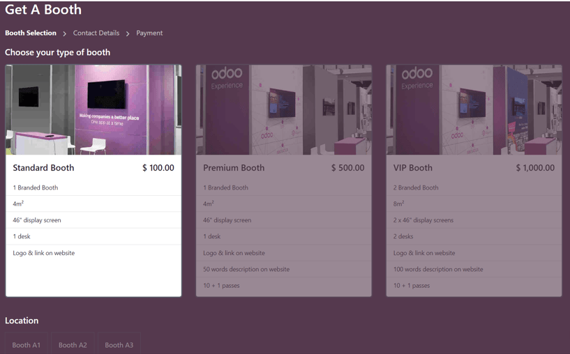
From here, the visitor can select their desired booth option, then Location. Next, they would click the Book my Booth(s) button, located at the bottom of the Get A Booth page.
Doing so reveals a Contact Details page, wherein they fill out either Contact Details or Sponsor Details, depending on how the booth was configured on the event form. The fields present on this form vary, depending on whether its meant for a basic contact or an event sponsor.
Note
If the selected booth has the Create Sponsor checkbox ticked, this page reads as Sponsor Details.
The information provided on this details page is used to auto-populate the renter-related information on the booth form on the event form in the Events application.
Once the necessary information has been entered, the visitor then clicks the Go to Payment at the bottom of the page, and proceeds to complete the typical checkout process.
Upon a successful payment confirmation, that selected booth automatically moves to the Unavailable stage on the event-specific Booths page in the Events application (accessible via the Booths smart button on the event form).
Also, the provided Sponsor information (if applicable) and Sales Order information are accessible from the specific event form, via their respective smart buttons that appear at the top of the form.
Note
Click the Sponsors smart button to modify any information about the sponsor, if necessary.
See also
On this page
Get Help
Contact Support Ask the Odoo Community
- User Docs
- Database management
- Developer
- Contributing
EN
Odoo 18
Event tracks
Odoo Events provides the ability to create, schedule, and manage talks, lectures, demonstrations, presentations, etc., which known as Tracks in Odoo.
The Odoo Events application also has an option to allow event attendees to propose talks (tracks) for an event, which can then be approved (or disapproved).
Configuration
First, there are some settings that need to be enabled, in order to get the most out of event tracks.
To do that, navigate to Events app ‣ Configuration ‣ Settings, and tick the checkbox beside the Schedule & Tracks setting. Doing so provides the ability to manage and publish an event schedule with various tracks.
Also, when that setting checkbox is ticked, two additional setting options appear beneath it: Live Broadcast and Event Gamification.
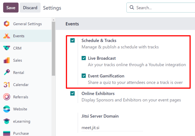
The Live Broadcast option provides the ability to air tracks online through a YouTube integration.
The Event Gamification options provides the ability to share a quiz with track attendees once the track is over, in order to test how much they learned.
Note
With the Event Gamification setting enabled, an Add Quiz button appears on track forms, providing the ability to quickly create a quiz specific to the topic related to that particular track.
Once all desired settings have been enabled, be sure to click the Save button in the upper-left corner of the Settings page.
Event Tracks page
To access, modify, and/or create tracks for an event, first navigate to a preconfigured event, or create a new one from the Events application.
To do that, navigate to Events app, and either select a pre-existing event from the Events dashboard, or create a new one by clicking New.
Once on the desired event form, click into the Tracks smart button at the top of the form.
Tip
If the Tracks smart button is not readily available, click the More drop-down menu to reveal hidden smart buttons. Then, click Tracks from the resulting drop-down menu.
Clicking the Tracks smart button reveals the Event Tracks page for that particular event, which presents all the tracks (both scheduled and proposed) for the event, if there are any.
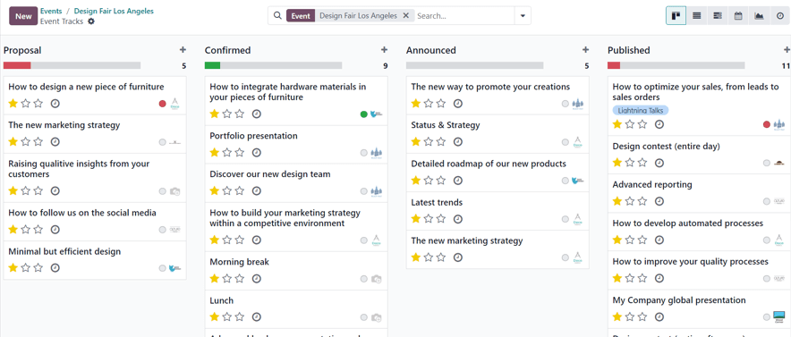
The tracks are presented in a default (Kanban) view, but there is also the option to view these tracks in a (List), (Gantt) chart, (Calendar), (Graph), or (Activity) view. All of which are accessible in the upper-right corner of the Tracks page.
In the default (Kanban) view, the tracks are categorized into different stages. The default stages are: Proposal, Confirmed, Announced, Published, Refused (collapsed stage), and Cancelled (collapsed stage). All of which can be edited, if needed.
Tip
To edit a stage, hover over the stage name, click the (Settings) icon, and select Edit from the resulting drop-down menu.
Clicking into a track from the Event Tracks page reveals the track form for that particular track.
Create event track
From the Event Tracks page, click New in the upper-left corner to reveal a blank event track form to create an event track.
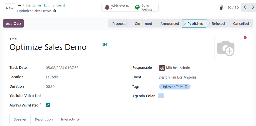
Start by giving this track a Title. This field is required by Odoo.
Then, if desired, add an accompanying image to the track via the (pencil) icon that appears when the cursor hovers over the (camera) icon in the upper-right corner of the form. When clicked, proceed to upload the desired image for the track. This image appears on the front-end of the event website, on this specific tracks webpage.
Next, enter a Track Date and time for the track, and designate a Location where the talk is planning to be held.
Tip
To access a complete list of locations for event tracks, which can be modified (and added to) at any time, navigate to Events app ‣ Configuration ‣ Track Locations.
Then, add a Duration to the track (in minutes).
If the Live Broadcast setting has been enabled in the Events app settings, the option to add a corresponding link in the YouTube Video Link field is available.
If the Always Wishlisted checkbox is ticked, the talk is automatically set as a favorite for each registered event attendee.
Assign someone to be in charge of managing this track in the Responsible field. By default, the person who initially created the track is assigned.
Then, ensure the track is applied to the correct event in the Event field. By default, this field is auto-populated with the event related to the Event Tracks page the track was originally created from.
Next, choose to add existing tags, or create new ones, to further organize the track. These tags, and their corresponding tag categories are utilized on the event specific website - mainly on the Talks web page on the event website, via the drop-down filter menus.
Beneath that general information section, there are three tabs: Speaker, Description, and Interactivity.
Speaker tab
The Speaker tab on an event track form is filled with various fields related to the specific speaker who is planning to conduct/host the track.
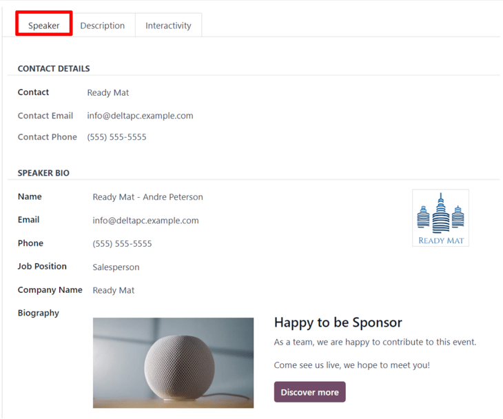
Contact Details section
In the Contact Details section, proceed to use the Contact drop-down field to select an existing contact from the database as the main point of contact for the talk.
If this contact is not yet in the database, type in the name of the contact, and click Create to create and edit the contact form later, or click Create and edit… to be taken to that new contact’s contact form, where the rest of their pertinent information can be entered.
The Contact Email and Contact Phone fields are greyed-out and populated with the information found on that chosen contact’s contact form. These fields are not modifiable once the Contact field is selected.
Speaker Bio section
In the Speaker Bio section, proceed to enter information related to the specific speaker scheduled to conduct/host the track. This section may auto-populate based on the Contact selected in the Contact Details section. If not, enter information in the necessary fields.
Note
This information appears on the front-end of the event website, on the specific track webpage, providing more information about the speaker to the track attendees.
Start by entering a Name, Email, and Phone number for the speaker.
Next, if desired, add an image to appear alongside the speaker biogrpahy on the event website, via the (pencil) icon that appears when the cursor hovers over the (camera) icon. When clicked, proceed to upload the desired image for the speaker.
Then, enter a Job Position for the designated speaker, followed by the Company Name associated with the speaker.
In the Biography field, proceed to enter in a custom biography with any speaker-related information.
Description tab
The Description tab of an event track form is a blank text field, in which a description of the track can be entered. The information entered here appears on the specific track page on the event website.
Interactivity tab
The Interactivity tab on an event track form features a single option at first: Magic Button.
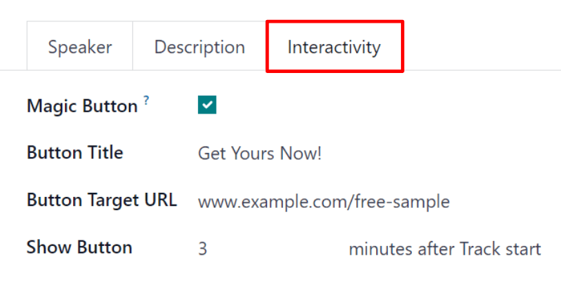
When the checkbox beside Magic Button is ticked, Odoo displays a call to action button to attendees on the track sidebar, while the track is taking place.
With that checkbox ticked, three more options appear, all of which are related to the Magic Button:
- Button Title: enter a title to appear on the button for attendees.
- Button Target URL: enter a URL that leads attendees, who click the button, to a specific page.
- Show Button: enter a number in the field, and the button will appear that number of minutes after Track start.
Note
The magic button only appears if there is more than one published track.
Add Quiz button
The Add Quiz button only appears on event track forms if the Event Gamification setting is enabled in the Odoo Events settings.
To add a quiz to the event track, click the Add Quiz button. Doing so reveals a separate page where an event track quiz can be created and configured.

Start by entering a title for the quiz in the blank field at the top of the page. Then, if participants should be allowed to try the quiz multiple times, tick the checkbox beside Allow multiple tries.
The Event and Event Track fields are non-modifiable, and show the corresponding event and track this quiz is associated with.
To add questions to the quiz, click Add a line beneath the Question column. Doing so reveals a Create Questions pop-up window.
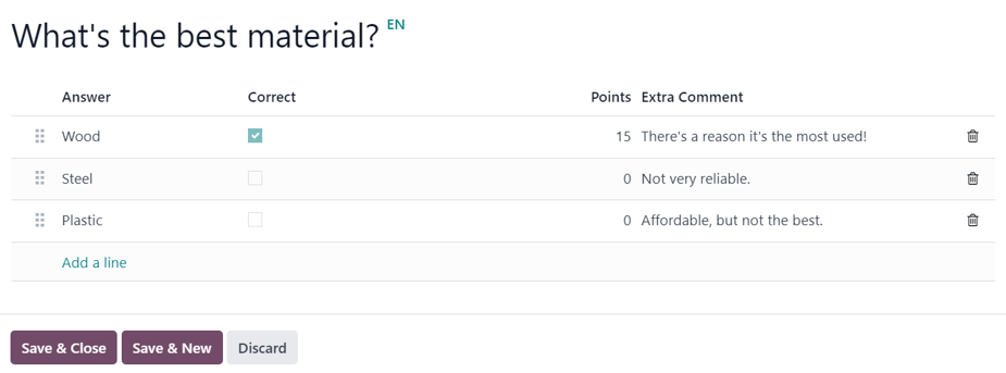
Note
All track quiz questions are multiple choice.
From the pop-up window, enter the question in the blank field at the top. Then, click Add a line to add answer options. Upon clicking Add a line, a new line appears, in which an answer option can be entered.
Once an answer option has been entered, proceed to designate whether it is the Correct response, by ticking the checkbox in the Correct column.
Then, there is the option to add a point value in the Points column.
And, if there are any additional comments that should accompany an answer option, type them into the Extra Comment field.
Note
The Correct, Points, and Extra Comment fields are all optional.
Repeat this process for all the answer options.
To remove an answer option, click the (trash can) icon on the far-right.
Once all desired answer options (and their configurations) are complete, click Save & Close to save the question, close the pop-up window, and return to the track quiz form. Or, click Save & New to save this question, and instantly start creating another question on a new Create Questions pop-up form.
To remove any question from the quiz, click the (trash can) icon on the far-right of the question line.
Publish event track
Once all the desired configurations are complete on an event track form, click the desired stage it should be in from the status bar in the upper-right corner (e.g. Confirmed, Announced, etc.).
Note
The stage of a track can also be changed from the Event Tracks page, where the desired track card can be dragged-and-dropped into the appropriate Kanban stage.
If an event track has not been published yet, and it is moved to the Published stage, Odoo automatically publishes the track on the event website.
An event track can also be published by opening the desired event track form, and clicking the Go to Website smart button. Then, in order for the track page to be viewable (and accessible) for event attendees, toggle the Unpublished switch at the top of the page to Published; thus turning it from red to green, and making it accessible for attendees.
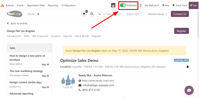
See also
On this page
Get Help
Contact Support Ask the Odoo Community
- User Docs
- Database management
- Developer
- Contributing
EN
Odoo 18
Registration Desk
Use the Registration Desk feature in Odoo Events to grant access to registered event attendees as they arrive, and store attendee-related data in the reporting metrics.
Registration Desk page
On a mobile device (on the Odoo app or in a browser), open the Events app, and click the Registration Desk to view the Registration Desk page.
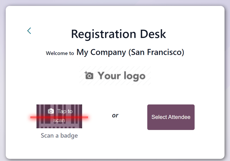
At the bottom of the Registration Desk box, there are options to either Scan a badge or Select Attendee.
Scan a badge
Scan the codes present on event attendee badges, by navigating to Events app ‣ Registration Desk, and selecting the Scan a badge option.
Important
Odoo must be granted access to the camera being used for the Scan a badge option to work.
Once Odoo has access to the camera, a Barcode Scanner pop-up window appears, showing the camera’s point-of-view. There is also a specified view finder box present, whose size can be manually modified, accordingly, using the (crop) icon.
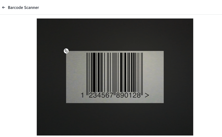
When the badge code is in the middle of the view finder box, the code is scanned, the Barcode Scanner pop-up window disappears, and the attendee is granted access to the event. Once the code is scanned, their attendance is logged in the Odoo Events app.
If the barcode being scanned is invalid, an error pop-up message appears in the upper-right corner.
Select attendee
Manually grant access to event attendees, by navigating to Events app ‣ Registration Desk, and selecting the Select Attendee option.
Odoo reveals an Attendees page, with all the attendees for every event in the database, in a default Kanban view.
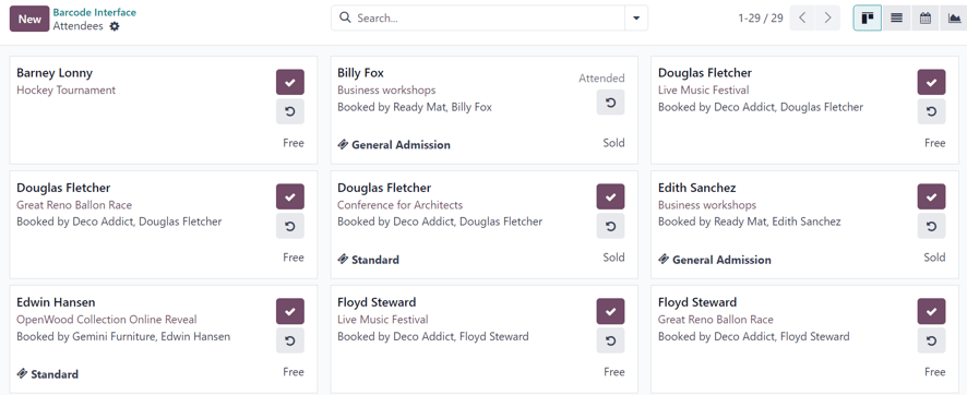
On the Attendees page, each attendee card displays that person’s name, which event they are registered to attend, their associated company (if applicable), what ticket tier they purchased (if applicable), along with two buttons: a (checkmark) and (counter-clockwise arrow).
To grant access to a person, marking them as attended, click the (checkmark) button on that attendee’s card.
Click the (counter-clockwise arrow) button on an attendee’s card to undo the previous action.
Tip
It is recommended to use an event-specific filter on the Attendees page, via the search bar drop-down menu.
To do that, click the (down arrow) beside the seach bar to reveal a drop-down menu with Filters, Group By, and Favorites options.
For example, click the Event option, in the Group By column. Then, click away to remove the drop-down menu. Odoo reveals the Attendees page with event-specific columns, allowing users to locate specific event attendees.
See also
Search, filter, and group records
On this page
Get Help
Contact Support Ask the Odoo Community
- User Docs
- Database management
- Developer
- Contributing
EN
Odoo 18
Revenues report
The Odoo Events application creates custom reports, based on event-related data and analytics. These reports can either be focused on Attendees or Revenues.
The following documentation focuses on the reporting options related to event Revenues.
Revenues reporting page
To access the Attendees reporting page, navigate to Events app ‣ Reporting ‣ Revenues.
By default, the Revenues reporting page appears as a graph (a (Line Chart) with (Stacked) data). The default filters, Non-free tickets and Event Start Date: (current year), are present in the search bar.
Tip
To learn more about the various graph views (and graph view options), refer to the Graph views documentation.
The Revenues reporting page can also be viewed as a pivot table, by clicking the (Pivot) icon in the upper-right corner.
Measures
Choosing specific Measures is a quick way to customize reporting pages.
Regardless of the chosen view, the measures on the Revenues reporting page are as follows: Revenues, Untaxed Revenues, and Count.
Note
In the default graph view of the Revenues reporting page, only the Revenues option is set in the Measures drop-down menu.
In graph view, only one of the Measures can be selected at a time.
When the pivot option is selected, all Measures options are selected, by default.
- Revenues: shows the revenues generated from events.
- Untaxed Revenues: shows the untaxed revenues generated from events.
- Count: shows the total amount of registrants who attended events.
Filters and grouping options
To reveal a drop-down menu of filter and grouping options to create custom reports, click the (down arrow) to the right of the search bar.
Doing so opens a drop-down mega menu of options organized into columns: Filters, Group By, and Favorites.
Note
If a time-related option has been selected from the Filters column (e.g. the default Event Start Date: (year) filter), a Comparison column appears, with comparison options for the corresponding time-related filter option selected.
Only one selection can be made from the Comparison column at a time.
See also
Search, filter, and group records
Filter options
In the Filters column of the drop-down mega menu, there are various event-related options that can be utilized to create custom reports, based on a number of specific criteria.
Multiple options in the Filters column can be selected at once.
The Filters column has the following options:
- Non-free tickets: event tickets/registrations that were not free.
- Free: event tickets/registrations that were free.
- Pending payment: event tickets/registrations that were purchased, but still have payment pending.
- Sold: event tickets/registrations that have been successfully sold (and paid for).
- Registration Date: Click the (down arrow) icon to reveal a list of month, quarter, and year options. Select any number of these options to view a specific periods of time and see how many registrations happened during that time.
- Upcoming/Running: include revenue-related information for events that are either currently running or are going to happen in the future.
- Past Events: include revenue-related information for events that have already taken place.
- Event Start Date: Click the (down arrow) icon to reveal a list of month, quarter, and year options. Select any number of these options to designate event start dates to use as filters for revenue-related event data.
- Event End Date: Click the (down arrow) icon to reveal a list of month, quarter, and year options. Select any number of these options to designate event end dates to use as filters for revenue-related event data.
- Published Events: Select this option to show revenue-related data for published events.
- Add Custom Filter: Create a custom filter to analyze event-related revenue data. To learn more, refer to the documentation on custom filters.
Group By options
In the Group By column of the drop-down mega menu, there are various event-related options to create custom groupings of data.
Multiple Group By options can be selected at once.
The Group By column has the following options:
- Event Type: Group data based on the type of event.
- Event: Organize data into individual groups, separated by events.
- Product: Group data based on the event registration product.
- Ticket: Group data based on the type of event ticket purchased by attendees.
- Registration Status: Group data based on the status of registrations.
- Sale Order Status: Group data based on the status of event-related sales orders.
- Customer: Group data based on customer records.
- Add Custom Group: Click the (down arrow) icon to reveal a drop-down of grouping options. To select one, click on the desired option, and Odoo adds it to the Group By column. Multiple selections can be made.
Sample report: event ticket analysis (graph)
The following is an example of how various filters and grouping options can create a useful analytic graph report related to event revenues. In this case, the configurations present data about sold or free tickets to published events, with the metrics separated by ticket type and event.
To create such a report, navigate to Events app ‣ Reporting ‣ Revenues. Stay in the default graph view, but remove the default filters from the search bar.
Then, click the (down arrow) to the right of the search bar, to reveal the drop-down mega menu of filter and grouping options.
From here, select Free and Sold from the Filters column.
Then, since it is desired to only view data related to already published events, select the Published Events option in the Filters column, as well.
Next, in the Group By column, select the Event and Ticket options, in that sequential order. Doing so first groups the data by event, then by ticket type, which provides a more useful array of data to analyze.
Important
The order in which the options are selected in the Group By column directly affects how the data is presented on the report.
From there, additional configurations can be added for more detailed data, if desired.
If no additional filters or groupings are added, Odoo presents a graphical representation of data related to all free or sold tickets for published events, grouped by event, and organized by ticket type.
Sample report: event type analysis (pivot table)
The following is an example of how various filters and grouping options can create a useful analytic pivot table report related to event revenues. In this case, the configurations present data about how much revenue different event types have generated, in order to gauge which events are the most profitable.
First, navigate to Events app ‣ Reporting ‣ Revenues, and switch to the pivot table view, by clicking the (Pivot) icon in the upper-right corner.
Keep the default filters (Non-free tickets and Event Start Date: (year)) in the search bar.
Next, open the Measures drop-down menu, and deselect the option for Count, because this report is only going to focus on revenues.
Then, click Total above the column titles, and select Event Type from the resulting drop-down menu.
With these configurations in place, all the revenues generated from the events (and their corresponding registrations) are displayed, organized by the event type (presented as expandable columns).
On this page
Get Help
Contact Support Ask the Odoo Community
EN
Odoo 18
Surveys
Companies gather valuable insights from customers and employees through surveys, aiding informed decision-making.
With Odoo Surveys, users create various surveys, questionnaires, certifications, assessments, and so much more. These can be used to collect feedback, evaluate the success of a recent event, and measure the satisfaction of customers and/or employees. This process yields valuable insights into shifting market trends.
See also
Create surveys
Discover how to create surveys with Odoo.Scoring surveys
Learn how to create and analyze survey scores with Odoo.Create questions
See how to create, configure, and customize all types of survey questions with Odoo.Live Session surveys
Find out everything there is to know about Odoo’s unique Live Session surveys.Survey analysis
Explore the various ways to analyze surveys using Odoo’s in-depth reporting pages.Dashboard
Upon opening the Surveys application, Odoo presents the main dashboard of the Surveys application, otherwise known as the Surveys page.
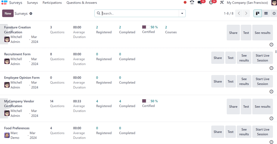
Tip
The Surveys dashboard can be accessed at any time throughout the application by clicking Surveys from the header menu.
In the upper-left corner, there is a New button. When clicked, Odoo presents a blank survey form that can be used to create a survey.
On the dashboard, all the surveys that have been created in the database are displayed in a default Kanban view.
From left-to-right, after the survey name, the user who is responsible for it, and the month it was created, each line on the Surveys dashboard shows the following:
- Number of Questions in that particular survey
- Average Duration of the survey (how long it typically takes a participant to complete)
- Number of Registered participants for the survey
- Number of times that particular survey has been Completed
- Percentage and data bar showcasing how many people have Passed or become Certified
Note
The Passed percentage and bar only appears when a Required Score has been configured for that particular survey.
The Certified percentage and bar only appears if that particular survey has the Is a Certification option enabled on the survey form.
If neither Passed nor Certified appear on the line, that indicates the survey is without a Required Score and was not enabled with the Is a Certification option. - Number of Courses related to that survey, which only appears if more than one course has been created and attached to a single survey
Note
A half-trophy background image behind the survey name indicates that the survey is a Certification.
To the far-right of those data points on the survey lines, located on the Surveys application dashboard, are a collection of buttons.
Those buttons are as follows:
- Share: click to reveal a Share a Survey pop-up form that can be used to invite potential participants to the survey - complete with a Survey Link that can be copied and sent to potential participants, and a Send by Email toggle switch.
When the Send by Email toggle is active (green switch), additional fields appear, in which Recipients, Additional Emails, and a Subject can be added to the email.
Below that, a dynamic email template, complete with a Start Certification button appears, which can be modified, as well, if needed.
Attachments can be added to the email, as well as an Answer deadline can be set, if needed.
Once modifications are complete, click Send to send that email invite to all the email addresses/contacts listed in the Recipients field.
Tip
The default Mail Template for survey invites can be edited by navigating to Settings ‣ Technical ‣ Email Templates and searching for Survey: Invite.
Note
The Send by Email toggle switch is not present when the survey line has zero questions.
The Survey Link only appears when the survey’s Access Mode is set to Anyone with the link.
The Additional Emails field only appears when the survey’s Require Login field is not active. - Test: click to take a test version of the survey in a new tab, from the point-of-view of a survey participant, in order to check for any errors or inconsistencies.
- See results: click to reveal a new tab showcasing detailed metrics and graphical representations of all survey participants, questions, and responses for deeper analysis.
- Start Live Session: click to initiate a Live session survey, and reveal a session manager window in a new tab. This button is not present for surveys that have enabled the Is a Certification option on the survey form.
- End Live Session: click to end a Live session survey that has been officially started. This button option only appears on survey lines that have previously initiated a live session.
Above the buttons that are located to the far-right of the survey lines, a ⋮ (three dots) icon appears when the cursor hovers over that particular line. When the ⋮ (three dots) icon is clicked, a drop-down menu with some configuration-related options appear:
The options are:
- Edit Survey: when clicked, Odoo reveals the survey form for that particular survey, which can then be modified in a number of different ways.
- Share: when clicked, Odoo reveals the Share a Survey pop-up form that can be used to invite potential participants to the survey.
- Delete: when clicked, Odoo presents a pop-up window, wherein the user must confirm they want to delete the survey entirely, which they can do by clicking the Delete button at the bottom of the pop-up window.
- Color: users can opt to choose a color to add to the survey line on the dashboard for added organizational purposes, if needed.
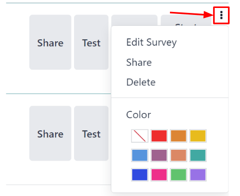
Beneath the buttons that are located to the far-right of the survey lines, there is an Activities button, represented by a 🕘 (clock) icon. When clicked, a mini pop-up window appears, from which activities related to that particular survey can be scheduled and customized.
List view
The Surveys dashboard is shown in the Kanban view, by default, but there is also a list view option available in the upper-right corner, represented by a ≣ (bars) icon.
When the ≣ (bars) icon is clicked, the survey related data is displayed in a list view.
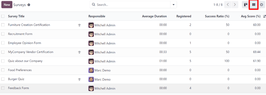
The columns shown on the Surveys app dashboard, while in list view, are as follows:
- Survey Title
- Responsible
- Average Duration
- Registered
- Success Ratio (%)
- Avg Score (%)
Tip
Additional columns can be added to the Surveys application dashboard, while in list view, by clicking the additional options drop-down menu, located to the far-right of the column titles, represented by a (slider with two dots) icon.
Activities view
To have the Surveys application dashboard display nothing but the activities associated to the surveys in the database, click the 🕘 (clock) icon to the far-right of the other view options, located in the upper-right corner.
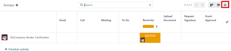
Doing so reveals a table with rows and columns. The rows show the different surveys in the database, and the columns depict the various activity types.
Note
A new survey cannot be created in this view, as it is solely for the purpose of creating and viewing scheduled activities.
Create surveys
Learn about all the different options and configurations that can be utilized when creating a survey in Odoo.
See also
Scoring surveys
Discover how to measure a survey participant’s performance, or overall satisfaction, with Odoo’s detailed (and fully customizable) survey scoring options.
See also
Create questions
With Odoo Surveys, there are many question types and options to choose from, providing the ability to create any kind of unique survey, questionnarire, and/or certification.
See also
Live Session surveys
The Live Session survey option available in Odoo can enhance in-person demonstrations and presentations, where participants’ real-time responses can be used to dictate where the conversation goes next.
See also
Survey analysis
Once the surveys start to come in, it is time to analyze the responses from your participants. Fortuantely, the in-depth reporting pages and options available in Odoo Surveys provide countless ways to examine everything related to surveys, and their submitted responses.
See also
On this page
Get Help
Contact Support Ask the Odoo Community
EN
Odoo 18
Create surveys
To create a survey in the Odoo Surveys application, navigate to Surveys app ‣ New to reveal a blank survey form.
Note
The New button is not present on the Surveys dashboard if in the Activities view.
Survey form
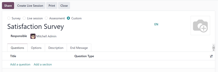
At the top of the survey form are four radio buttons, each representing a survey style. The radio button options are:
- Survey
- Live Session
- Assessment
- Custom (selected by default)
These options are here to streamline the survey-making process, by providing users with automated settings and options that are ideally specific to those types of surveys. Each of those survey type options comes equipped with its own specific selection of options.
The Custom option, selected by default, offers all the options from every potential survey type (located in the Options tab).
Beneath those radio survey type options is a blank field in which a name for the survey must be entered.
Below the survey name field, is the Responsible field. Choose a user from the drop-down menu to be in charge of the survey. By default, the user who initially created the survey is selected as the default Responsible.
To the right of those fields, and above the tabs, is the option to add a background image, represented by a 📷 (camera) icon. When clicked, the option to upload an image becomes available. This image would be used as the background image for the entire survey. This is not a required option.
Below those fields and options are four tabs: Questions, Options, Description, and End Message.
Questions tab
View, access, add, and/or delete questions and sections to the survey in the Questions tab.
By default, two columns are present in the Questions tab: Title (i.e. the question) and Question Type.
If the Randomized per Section option is enabled in the Options tab of the survey form, a column titled, # Questions Randomly Picked appears in the Questions tab.
Indicate whether questions require a mandatory answer by clicking the (optional columns) icon to the far-right of the column titles. Then, select Mandatory Answer from the drop-down menu to reveal the Mandatory Answer column in the Questions tab.
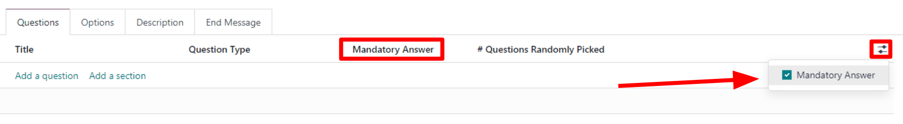
Add a question
To add a question to a survey, click Add a question in the Questions tab, and proceed to fill out the Create Sections and Questions pop-up window that appears.
To learn how to create and customize questions, refer to the create questions documentation.
Important
There must be a survey title entered in order for the Create Sections and Questions pop-up window to appear. If no title is entered for the survey, an error pop-up message appears in the upper-right corner, instructing the user to enter a survey title.
Add a section
A section divides the survey into organized parts, in order to visually group similar questions together. To make a section, click Add a section at the bottom of the Questions tab, proceed to type in a desired name for the section, then either press Enter or click away.
The section line appears in dark gray in the Questions tab.
Then, drag-and-drop desired questions beneath a section, or drag-and-drop a section title on top of (i.e. before) the desired question(s) in the survey. Doing so populates the section with questions that align with its theme.
If the Randomized per Section option is enabled in the Options tab of the survey form, the number 1 appears, by default, on the section line, beneath the # Questions Randomly Picked column.
This indicates that 1 question from that section will be picked at random for each participant taking the survey, bypassing every other, non-chosen question from that section. To change that number, select that figure, and type in the desired number in its place. Then, either press Enter, or click away.
Options tab
In the Options tab of the survey form, there are many options to choose from, separated in four different sections: Questions, Time & Scoring, Participants, and Live Session.
The options available in this tab vary on the survey type chosen, via the radio buttons at the top of the survey form: Survey, Live Session, Assessment, or Custom.
The Custom survey type showcases all the possible options in the Options tab. So, if any of the following options do not appear in the Options tab, it is likely because the selected survey type does not offer it.
Questions section
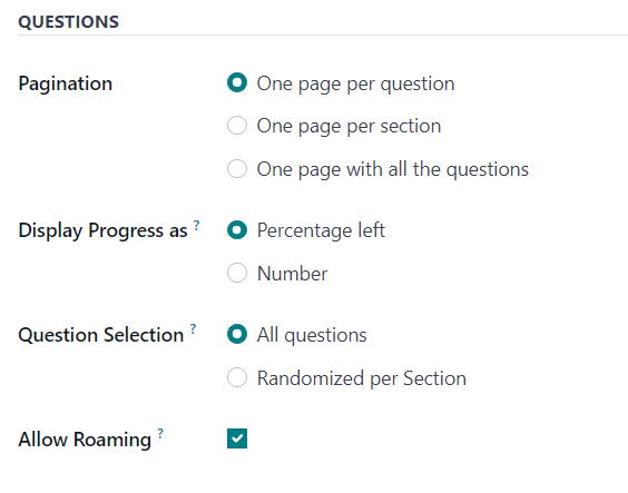
The first field in the Questions section revolves around the Pagination, or overall layout, of the survey.
Choose between One page per question, One page per section, or One page with all the questions in the Pagination field.
Note
If One page with all the questions is selected, all the remaining options in the Questions field, apart from Question Selection is removed, as they are no longer needed.
Next, select one of the following options in the Display Progress as field:
- Percentage left: displays the percentage of the survey remaining to participants.
- Number: display the number of questions answered along with the total number of questions to answer.
In the Question Selection field choose to have the survey show All questions or Randomized per Section. If Randomized per Section a new column appears in the Questions tab, titled: # Questions Randomly Picked.
In the # Questions Randomly Picked column, designate how many questions, in that particular section, should be chosen at random to the participant.
Lastly, there is the Allow Roaming option. When enabled, participants are able to navigate back to previous pages in the survey.
Time & Scoring section
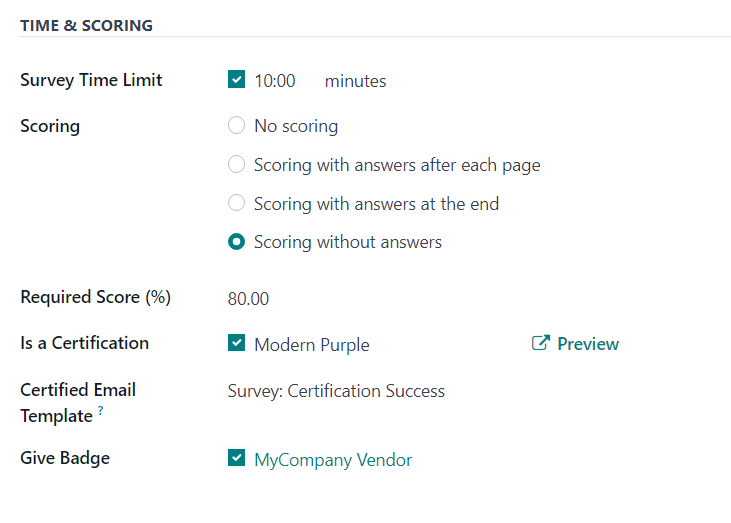
The first option in the Time & Scoring section is the Survey Time Limit option. If enabled, proceed to enter in an amount of time (in minutes) to be set as the time limit for the survey.
Next, in the Scoring section, determine whether there should be: No scoring, Scoring with answers after each page, Scoring with answers at the end, or Scoring without answers.
If the No scoring option is selected, no other options are available in this section. However, if any other Scoring option is selected, two additional fields appear: Required Score (%) and Is a Certification.
In the Required Score (%) field, enter the minimum percentage participants must earn in order to pass the survey. Scores below this threshold are considered fails. This figure is also used to determine if a participant is ‘certified’ or not, if the Is a Certification option is enabled.
If the Is a Certification option is enabled, that makes the survey a Certification, which is represented on the main Surveys app dashboard via a half-tropy image behind the survey title, while in the default Kanban view. Or, via a full-trophy icon, while in list view.
When the Is a Certification option is enabled, three additional fields appear – one beside the option, and two below.
In the field that appears beside the option, users can select (and Preview) a certification template.
Beneath that, in the Certified Email Template field, users can select a preconfigured email template, or create one on-the-fly, to be sent to certified participants of the survey upon completion.
Lastly, if the Give Badge field is enabled, a preconfigured badge is then displayed on the contact page for that certified survey participant.
Participants section
The first available option in the Participants section is the Access Mode field. This is where users can determine who has access to the survey. Users can select either: Anyone with the link or Invited people only.
Next, there is the option to Require Login. Enabling this feature means users must login before being able to take the survey, even if they have a valid token.
Lastly, in there is the Limit Attempts field. If enabled, an additional field appears beside it, in which users can determine how many times users can attempt this survey.
Live Session section
Note
The Live Session section in the Options tab of the survey form only pertains to Live Session surveys.
The first option in the Live Session section is the Session Code field. In this field, enter a custom code, consisting of letters, numbers, and/or symbols, to be used by participants in order to access the live session survey.
Next, is the Session Link field, which cannot be customized, but it can be sent out to potential participants.
Note
If a Session Code has been entered, the URL in the Session Link field ends with that specific Session Code.
If that complete Session Link (ending in the custom Session Code) is used by participants to access the live session survey, that link would already be entered for them. At that point, they’d simply have to wait until the host of the live session begins the survey, and then they’d be able to enter.
If the Session Link (ending in the custom Session Code) is sent without including the Session Code ending, participants trying to access the live session, via that link, will need to enter the custom Session Code to gain access.
If the Session Code field is empty, a slightly longer, more complicated URL populates the Session Link field. When participants attempt to access the live session via that link (without a configured Session Code), all they have to do is wait for the host of the live session to begin the survey, and they’d be able to participate.
Lastly, in the Live Session section, there is the option to Reward quick answers. If that option is enabled, participants who submit their answer quickly receive more points.
See also
Description tab
In this non-required tab, users can enter a custom description about the survey, along with any explanations or guidance that a survey participant may need in order to properly participate (and complete) the survey.
End Message tab
In this non-required tab, users can enter a custom message that participants see upon completing the survey.
Survey form buttons
Once the survey has been configured properly, and questions have been added, the user can utilize any of the available buttons in the upper-left corner of the survey form.

Those buttons are the following:
- Share: click to reveal a Share a Survey pop-up form that can be used to invite potential participants to the survey — complete with a Survey Link that can be copied and sent to potential participants, and a Send by Email toggle switch.

When the Send by Email toggle is in the ‘on’ position, indicated by a green switch, additional fields appear, in which Recipients and a Subject can be added to the email. Below that, a dynamic email template, complete with a Start Certification button appears, which can also be modified.
Once modifications are complete, click Send to send that email invite to all the email addresses/contacts listed in the Recipients field. - See results: this button only appears if there has been at least one participant who has completed the survey. Clicking See results reveals a separate tab containing a visual analysis of the survey questions and responses. For more information, check out the scoring surveys documentation.
- Create Live Session: clicking this button opens the Session Manager in a separate tab. It also allows participants to access the live session, but the actual survey does not begin until the user hosting the live session survey clicks the Start button on the Session Manager window.
Additionally, when Create Live Session has been clicked, and the Session Manager tab has been opened, the Create Live Session button on the survey form is replaced with two new buttons: Open Session Manager and Close Live Session.
Clicking Open Session Manager opens another separate tab to the Session Manager, and clicking Close Live Session closes, and subsequently ends, the live session. - Test: clicking this button opens a new tab to a test version of the survey, in order for the user to check for errors or inconsistencies, from the point-of-view of a participant. Users can tell if they are in a test version of the survey if there is a blue banner at the top of the screen, reading: This is a Test Survey --> Edit Survey.
If the link in the blue banner is clicked, Odoo returns the user to the survey form. - Print: clicking this button opens a new tab to a printable version of the survey that the user can proceed to print for their records.
- Close: clicking this button closes the survey (i.e. archives it), which is represented by a red Archived banner across the top-right corner of the survey form.
When this button is clicked, and the survey is closed, a single button appears in the upper-right corner of the survey form, titled: Reopen. When Reopen is clicked the survey is reopened (i.e. unarchived), and the Archived banner is removed from the survey form.
See also
On this page
Get Help
Contact Support Ask the Odoo Community
EN
Odoo 18
Scoring surveys
To measure a survey participant’s performance, knowledge, or overall satisfaction, Odoo ascribes points to survey answers. At the end of the survey, these points are summed up, resulting in the participant’s final score.
To add points to questions, open the Surveys application, choose the desired survey form, and then click on the Options tab. Under the :guilabel;`Scoring` section, choose between Scoring with answers at the end or Scoring without answers at the end.
- Scoring with answers at the end shows the survey participant their answers after completing the survey, and displays which questions they got right or wrong. On questions where there was an incorrect answer, the correct answer will be highlighted.
- Scoring without answers at the end does not show the survey participant their answer choices after completing the survey, only their final score.
To indicate correct answers, click on the Questions tab and choose a question. In the question form, check the Is a correct answer box for the choice that is the correct answer and attach a score value.
Back on the Options tab of the survey, set the Success %. The percentage entered determines what percentage of correct answers is needed to pass the survey.
Further on the Options tab of the survey, survey administrators can also choose to make the survey a certification. A certification indicates that the survey asks questions to test the participants’ knowledge level on a subject.
When enabling the Is a certification option, choose a Certification email template. The certification will automatically be emailed using this email template to users who pass the survey with a final score that is greater than or equal to the set Success %.
In the Candidates section, participants can be required to log in to take the survey. If the Login Required setting is enabled, two new options appear: the Attempts Limit checkbox, which limits the number of times a participant can attempt the survey, and the option to Give Badge, located beneath the Certification options in the Scoring section.
Badges are displayed on the eLearning portion of a given user’s portal, and are a way to set milestones and reward participants for passing surveys or gaining points. Besides the awardee, website visitors who access the Courses page will also be able to see the granted badges.
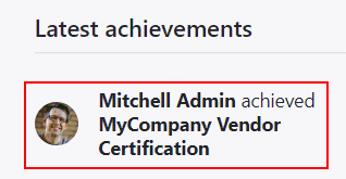
See also
Get Help
Contact Support Ask the Odoo Community
EN
Odoo 18
Create questions
In Odoo Surveys, crafting and tailoring survey questions is crucial for creating and customizing surveys.
Fortunately, Odoo provides numerous ways to configure tailored questions for any kind of survey.
To access a list of all the questions that have been created in the database, navigate to Surveys app ‣ Questions & Answers ‣ Questions. There, users can view and modify any question from any survey.
However, there is only one place in the Odoo Surveys application where survey questions can be created. To do that, navigate to a survey form, by going to Surveys app ‣ New, or by selecting any pre-existing survey from the Surveys page (Surveys app ‣ Surveys).
Questions tab
On a survey form, users can view, access, add, and/or delete questions (and sections) in the Questions tab.
By default, two columns are present in the Questions tab: Title (i.e. the question) and Question Type.
If the Randomized per Section option is enabled in the Options tab of the survey form, a column titled, # Questions Randomly Picked appears in the Questions tab.
To reveal the Mandatory Answer column on the Questions tab, which indicates if questions require a mandatory answer or not, click the (optional columns) icon located to the far-right of the column titles.
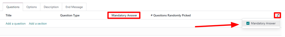
Create sections
A section divides the survey into organized parts, in order to visually group similar questions together. To make a section, click Add a section at the bottom of the Questions tab, proceed to type in a desired name for the section, then either press Enter or click away.
The section line appears in dark gray in the Questions tab.
Then, drag-and-drop desired questions beneath a section, or drag-and-drop a section title on top of (i.e. before) the desired question(s) in the survey, in order to populate the section with specific questions that fit the theme of the section.
If the Randomized per Section option is enabled in the Options tab of the survey form, the number 1 appears, by default, on the section line, beneath the # Questions Randomly Picked column.
This indicates that 1 question from that section will be picked at random for each participant taking the survey, bypassing every other, non-chosen question from that section. To change that number, select that figure, and type in the desired number in its place. Then, either press Enter, or click away.
Create questions
To create questions for the survey, click Add a question in the Questions tab.
Clicking Add a question opens the Create Sections and Questions pop-up window, in which a survey question can be created.
Important
There must be a survey title entered in order for the Create Sections and Questions pop-up window to appear. If no title is entered for the survey, an error pop-up message appears in the upper-right corner, instructing the user to enter a survey title.
When all desired configurations are complete click either Save & Close to save the question and return to the survey form, or Save & New to save the question and create a new one right away in a fresh Create Sections and Questions pop-up window.
Click Discard to discard the question entirely.
Create Sections and Questions pop-up window
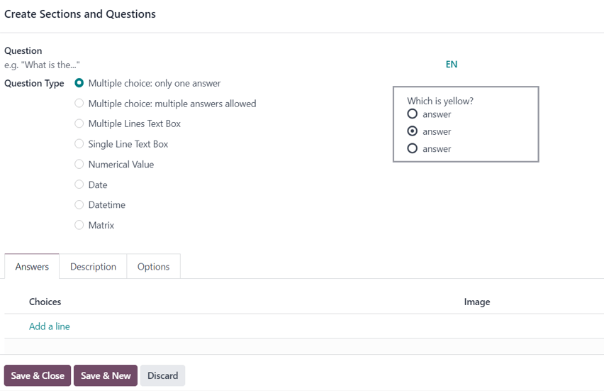
In the Create Sections and Questions pop-up window, start by typing the question into the Question field, located at the top of the pop-up window.
Then, choose the desired Question Type. A preview of each Question Type is to the right of the Question Type field, when a Question Type is selected.
Choose from the following Question Types:
- Multiple choice: only one answer: a multiple choice question, where only one answer is permitted.
- Multiple choice: multiple answers allowed: a multiple choice question, where more than answer is permitted.
- Multiple Lines Text Box: an open-ended question, where participants can type in a multiple line response.
- Single Line Text Box: an open-ended question, where participants can type in a single line response.
- Numerical Value: a number-based question, where participants must enter a number as a response.
- Date: a date-based question, where participants must enter a date (year-month-day) as a response.
- Datetime: a date-based question, where participants must enter a date and time (year-month-day, hour-minute-second) as a response.
- Matrix: a multiple-choice, multiple question, in a table/chart layout, where participants are presented with different questions on each row, and different answer options on each column.
Note
Different features appear in the Answers and Options tabs, depending on the chosen Question Type.
However, the Description tab always remains the same, regardless of the question type chosen.
Once a Question Type has been selected, there are three possible tabs where information can be customized for the question. These include the Answers tab (if applicable for the chosen Question Type), the Description tab, and the Options tab.
Each tab offers a variety of different features, depending on what Question Type was chosen.
Answers tab
The Answers tab only appears if the selected Question Type provides answer options to the participant.
However, if a custom response is required to answer the selected Question Type, like a Multiple Lines Text Box, for example. Or, if the answer to the Question Type is a number, date, or datetime, the Answers tab disappears completely.
If the Single Line Text Box is selected as the Question Type, the Answers tab remains, although it only provides two checkbox options: Input must be an email and Save as user nickname.
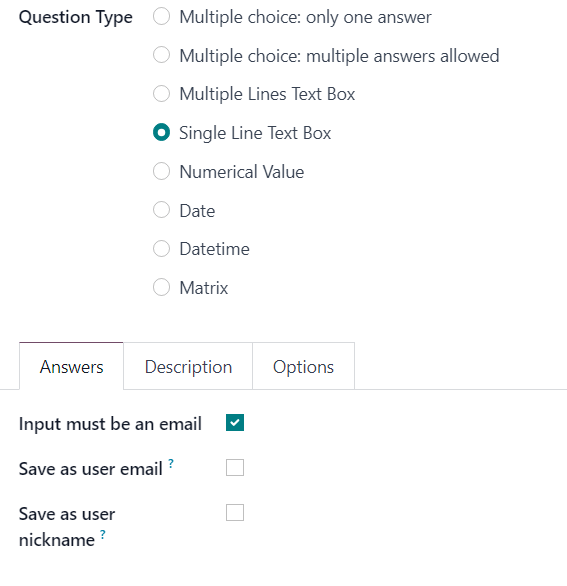
If the Input must be an email option is enabled, a new field, Save as user email appears. If that box is ticked, Odoo saves the participant’s answer to that specific question as their email address.
If the Save as user nickname option is enabled, Odoo saves the participant’s answer as its nickname.
For all other applicable Question Type options that provide answer options to the participant, the Answers tab appears the same.
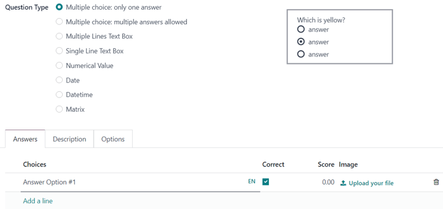
From here, users can add answer options by clicking Add a line, and typing in the various answer options for that question. Then, either press Enter to lock in that answer option and immediately add another one. Or, click away to simply lock in that answer option.
The entered answer options appear in the Choices column of the Answers tab.
If any Scoring option is enabled in the Options tab of the survey form, the Correct and Score columns appear to the right of the Choices column.
To mark an answer option as correct, tick the box beneath the Correct column for the respective question. If Multiple choice: multiple answers allowed is set as the Question Type, multiple answers in the Choices column can be marked as Correct.
In the Score column, designate how many points (if any) should be rewarded to the participant for entering that specific answer. It is possible to enter a negative amount as the Score to take points away for an incorrect response.
The option to upload a corresponding image to accompany the answer options is available on the question line, beneath the Image column, by clicking Upload your file, and uploading the desired image.
To delete any answer option, click the 🗑️ (trash can) icon to the far-right of the question line.
An exception to that is if the Matrix option is selected as the Question Type. If that’s chosen, the Answers tab remains, but below the typical Choices section, there is a Rows section. That’s because the Matrix option provides an answer table for participants to fill out.
Description tab
In the Description tab of the Create Sections and Questions pop-up window is used to provide any kind of guidelines, instructions, or any other type of supplemental material deemed necessary to help participants answer/understand the question.
Entering a description is not required.
Options tab
In the Options tab of the Create Sections and Questions pop-up window, there are four available sections: Answers, Constraints, Conditional Display, and Live Sessions.
Answers section
Note
Fields in the Answers section in the Options tab of the Create Sections and Questions pop-up window vary, depending on the selected Question Type and overall Options configured on the survey form.
Multiple Choice question types
If the selected Question Type is either Multiple choice: only one answer or Multiple choice: multiple answers allowed, there is a Show Comments Field present in the Answers section.
When enabled, two additional fields appear: Comment Message and Comment is an answer.
In the Comment Message field, type in a guiding message to help participants know what is expected of them (e.g. If other, please specify).
If the Comment is an answer option is enabled, Odoo takes the participant’s commented response as an answer, and not just commentary on the question. This is best utilized in surveys where there is no scoring option enabled.
Multiple Lines Text Box question type
If the selected Question Type is Multiple Lines Text Box, a Placeholder field appears in the Answers section of the Options tab.
In the Placeholder field, enter a guiding direction to help participants know what they should write in the Multiple Lines Text Box presented to them.
Single Line Text Box, Numerical Value, Date, Datetime question types
If the selected Question Type is Single Line Text Box, Numerical Value, Date, or Datetime, two options appear in the Answers section of the Options tab: Validate Entry and Placeholder.
If the Validate Entry option is enabled, two additional fields appear beneath: Min/Max Limits and Validation Error.
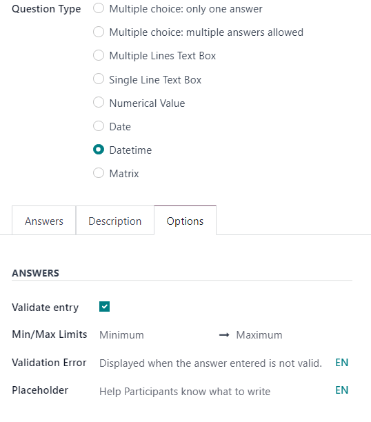
In the Min/Max Limits field, designate the minimum and maximum allowed quantities for that specific question.
In the Validation Error field, enter a custom message that Odoo displays when an answer is not valid.
In the Placeholder field, enter a guiding direction to help participants know what they should write in the Multiple Lines Text Box presented to them.
Constraints section
The Constraints section in the Options tab is the same, regardless of the selected Question Type.
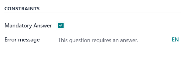
In the Constraints section, there is one option available: Mandatory Answer.
When Mandatory Answer is enabled, that means that specific question requires an answer from the participant before they can move on. Also, when Mandatory Answer is enabled, that reveals an additional field: Error Message.
In the Error Message field, enter a custom error message prompting the participant to provide an answer for this question.
Conditional Display section
Conditional Display means the question is only displayed if a specified conditional answer(s) (i.e. Triggering Answers) has been selected in a previous question(s).
Note
The Conditional Display section of the Options tab is not available when questions are randomly picked.
There is only one field in the Conditional Display section: Triggering Answers.
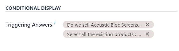
In the Triggering Answers field, select specific responses from previous questions that would trigger this question. More than one answer can be selected. Leave the field empty if the question should always be displayed.
Live Sessions section
The option in the Live Sessions section of the Options tab are only supported by Live Session surveys.
There is only one option available in the Live Sessions section: Question Time Limit.
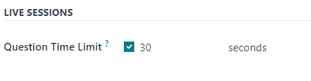
When the Question Time Limit option is enabled, designate how much time (in seconds) participants have to answer the question during a Live Session survey.
Note
Survey text colors are directly linked to the colors used for the website theme.
On this page
Get Help
Contact Support Ask the Odoo Community
EN
Odoo 18
Live Session surveys
With the Odoo Surveys application, users can enhance in-person demonstrations and presentations with the Live Session feature.
Live Session surveys function the same way as a normal survey, but with a host or moderator, who presents the questions to participants, reveals their responses in real-time, and controls the tempo of the survey.
In Live Session surveys, participants access the survey experience via a custom URL, and sign in with an optional access code. When the survey has begun, the host presents one question at a time.
Then, the audience of participants submit their answer, either via their computer or mobile device, and once the responses have been gathered, the host reveals all the participant’s responses, in real time, with each answer’s results displayed as a bar graph.
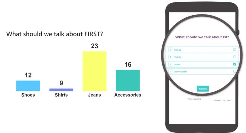
Create Live Session survey
To create a Live Session survey, begin by opening the Surveys application. From the Surveys dashboard, click the New button to reveal a blank survey form.
Any of the survey type options (Survey, Live Session, Assessment, or Custom), presented as radio buttons at the top of the survey, can be used to create a Live Session.
However, selecting the Live Session survey type radio button streamlines the process because Odoo auto-selects the optimal settings and options for a Live Session survey when that option is selected.
Important
If the Is a Certification option is enabled in the Options tab, the survey cannot be used as a Live Session survey.
With the desired survey radio button option selected, proceed to create a survey with questions and sections.
While creating questions for the Live Session survey, open the Options tab on the Create Sections and Questions pop-up form, in order to reveal the Live Sessions section, which only has one available feature: Question Time Limit.
When the Question Time Limit option is enabled, a new field appears beside it, wherein the user must enter the desired amount of time (in seconds) the participant gets to answer the question.
Options tab
After the questions have been created for the Live Session survey, open the Options tab of the survey form to further configure the survey.
The Options tab is organized into four sections: Questions, Time & Scoring, Participants, and Live Session.
Questions section
Regardless of the option selected for the Pagination field, the Live Session survey only shows One page per question, and will default to that option when the Create Live Session button is clicked, and a Live Session survey officially begins.
Note
The One page per question option in the Pagination field is selected by default, and no other options appear in the Questions section, when the Live Session survey type radio button is selected.
The Display Progress as and Question Selection options are still viable and active options for Live Session surveys, if desired, but they are not required.
However, the Allow Roaming feature is not available during Live Session surveys whatsoever, as the host/moderator controls the survey, and participants have no control over what question they see, or when they see it.
Time & Scoring section
The Survey Time Limit option is not applicable for Live Session surveys. This option does not even appear in the Time & Scoring section of the Options tab if the Live Session survey type radio button option is selected.
Note
While the Survey Time Limit option is not applicable for Live Session surveys, each question can be affixed with its own Question Time Limit, via the Options tab of the question pop-up form. Those question-specific time limits do work with Live Session surveys.
If desired, any Scoring option, and subsequent Required Score (%) option are available to use with Live Session surveys.
However, if the Is a Certification option is enabled, the survey cannot be used as a Live Session survey. The Is a Certification option does not appear in the Time & Scoring section of the Options tab if the Live Session survey type radio button option is selected.
Participants section
The Access Mode field is set to the Anyone with the link option when the survey is used as a Live Session. The Anyone with the link option cannot be modified if the Live Session survey type radio button option is selected.
The Require Login option is available for Live Session surveys. However, if the Live Session survey type radio button option is selected, the usual Limit Attempts field that appears when Require Login is enabled does not appear, as live session participants only get to attempt the survey once, as the host leads them through it.
Live Session section
The Session Code field allows users to create unique codes for participants to use, in order to gain access to the Live Session survey. This code can consist of any combination of letters, numbers, and/or symbols.
The Session Code field is not required, however, it is encouraged because it adds a level of exclusivity to the survey and, without a Session Code, the URL that appears in the following Session Link field becomes far more complex.
Important
If a Session Code is not entered, participants can access the survey, via the Session Link without needing a host, and the fundamental elements of the Live Session are lost, as the survey is then just a normal questionnaire, without any real-time results.
With a Session Code, the URL in the non-modifiable Session Link field is simplified, and ends with the Session Code, preceded by /s/.
Example
If 1212 has been entered as the Session Code, the URL in the Session Link field begins with the basic URL of the database (e.g. sample-database.odoo.com), followed by: /s/1212.
So, collectively, that sample Session Link would be: sample-database.odoo.com/s/1212.
Tip
If a user sends out the Session Link URL in its complete form - Session Code and all - participants would not need to enter in a code, as it would already be entered for them. That complete link places the participant in a virtual waiting room, where they simply need to wait for the host to officially start the Live Session survey.
If a user sends out the Session Link URL - except for the Session Code at the end (i.e. the entire URL through .../s/) - participants would be taken to a page, wherein they would need to enter the specific Session Code in order to access the Live Session.
If any Scoring option has been enabled, the opportunity to Reward quick answers is also available with Live Session surveys.
Start Live Session surveys
Once all the questions and configurations are complete, users can click the Create Live Session button at the top of the survey form. Doing so opens a new browser tab to the Session Manager.
When the Create Live Session button has been clicked, and the Live Session has begun, a new Open Session Manager button appears on the survey form, which opens a new browser tab to the Session Manager. If the Live Session has already begun, that button leads the user to the question or section the Live Session is currently on.
Additionally, a Close Live Session button appears on the survey form. When that button is clicked, the Live Session survey closes.
The Session Manager is controlled by the host/moderator of the Live Session survey, and is typically shown on a projection or screen, so the participants can collectively view the questions and real-time responses, as the host/moderator guides them through the Live Session.
Note
The participant can see and answer the questions from their computer or mobile device, but the results and real-time responses can only be seen on the Session Manager.
Initially, the Session Manager shows the title of the Live Session survey, the link needed to access it, and a Waiting for attendees… counter, which populates as participants enter the Live Session survey.
Once the desired amount of participants have entered the Live Session survey, the host/moderator can click the Start button on the right side of the Session Manager window to begin the Live Session.
Note
If the survey begins with a section title on the survey form, that section title appears in the Session Manager, and the participant’s view of the survey informs them to Pay attention to the host screen until the next question. This message appears whenever a section title appears during a Live Session.
When the first question appears on the survey, the Session Manager shows the question above an empty bar graph, showing the potential answer options on the x-axis. The participants see the question and selectable answer options on their computer or mobile device.
As participants submit their answers, a progress bar, in the upper-left corner of the Session Manager, fills in. This is how Live Session hosts/moderators know when every participant has submitted their responses.
Then, when the desired amount of participants have submitted their responses, the host/moderator clicks the Show Results button on the right side of the Session Manager to reveal the collective real-time responses on the bar graph.
Once the host/moderator feels like the participants have had enough time to view the real-time results, via the populated bar graph, they can click the Show Correct Answer(s) button on the right side of the Session Manager window. Doing so highlights the correct response, if one has been designated, in green. All incorrect responses are highlighted in red.
When the host/moderator feels the participants have had enough time to take in the correct and incorrect responses, via the bar graph on the Session Manager, they can click the Next button to move on to the next portion of the survey.
Repeat this process until the survey is complete.
See also
On this page
Get Help
Contact Support Ask the Odoo Community
EN
Odoo 18
Survey analysis
After surveys have been created and sent to participants, it is only a matter of time before the responses start to come in. When they do, it is important to know where and how to analyze them in the Odoo Surveys application.
Fortunately, Odoo provides numerous ways to view survey responses, allowing users to access and analyze survey responses as they are submitted.
See results
Upon opening the Surveys application, the main dashboard reveals a list of all the surveys in the database, along with pertinent information related to each one.
By default, every survey line showcases its number of Questions, Average Duration, and how many participants have Registered or Completed the survey.
There are also elements showing the percentage of how many participants Passed (if a Required Score (%) was configured), or how many participants became Certified (if the Is a Certification option was configured).
Note
To learn more about the different analytical elements found on the Surveys dashboard, check out the Survey Essentials documentation.
On the Surveys dashboard, to the far-right of each survey line displayed in the default list view, there is a See results button.
When the See results button is clicked, a new browser tab opens, revealing a separate page filled with all of that particular survey’s results and responses, with an informative Results Overview and some filtering drop-down menus at the top.
At the top of the page, there is an Edit Survey link, in the middle of a blue header banner. When clicked, Odoo returns the user to the survey form for that particular survey.
Beneath that, is the title of the survey, and its description, if one was configured for it on its survey form.
To the right of the survey title, there are two drop-down menus with various filtering options, which can be used to personalize and segment the survey results in a number of different ways.
The first filter drop-down menu is set on the default All Surveys option, meaning the results below are showing results and responses from all the submitted surveys, regardless if they have been fully completed or not.
When that drop-down menu is clicked open, another option, Completed surveys, appears.
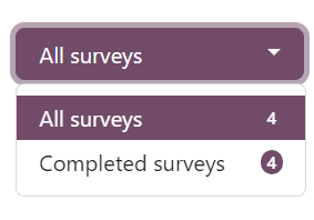
With that drop-down menu open, the number corresponding to each filter option appears to the right of each option.
To the right of that drop-down menu of filter options, is another drop-down menu of filter options that can be used to further customize the results showcased on this page.
That drop-down menu is set to the Passed and Failed option, by default. This option shows the results and responses from all participants who have passed or failed this particular survey.
Note
This second drop-down menu of filter options only appears if the survey being analyzed has a Scoring option configured, or if the Is a Certification feature has been enabled.
When that second drop-down menu of filter options is clicked open, two additional options appear: Passed only and Failed only.
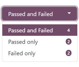
Each option would filter the results below to only show responses from participants who have passed the survey, or who have failed the survey, respectively.
Directly beneath the survey title, there is a Print button. When clicked, the entire results page can be printed.
The Results Overview section is below the survey title, filter option drop-down menus, and Print button.
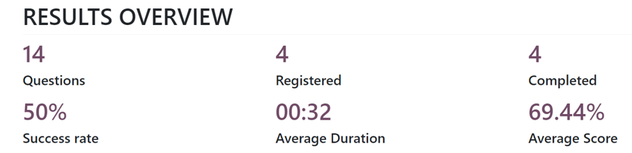
This section of the results page provides a summarized collection of useful survey-related data and metrics for quick analysis.
Question analysis
Directly beneath the Results Overview section is where the results and responses of the survey are found.
Note
The various sections of the survey, if there were any, appear at the top of their corresponding questions on the results page, as well, for added organization.
Every question that was a part of the survey is shown, along with an in-depth breakdown, and visual representation, of how it was answered by participants, beneath the Results Overview section.
Each question is displayed above its corresponding results. To the left of the question is an 👁️ (eye) icon. When clicked, Odoo hides the visual and data-related results and responses. When clicked again, that question’s visual and data-related results re-appear.
To the far-right of the question, there are indicators to see how many participants Responded and how many Skipped the question.
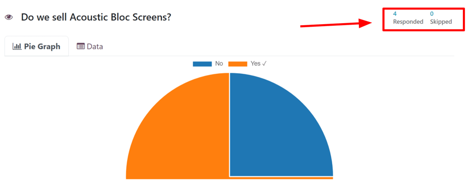
If the question required the participant to enter in their own answer, without any options to choose from, like entering a specific number or date, for example, there is also an indicator to showcase how many users answered the question Correct.
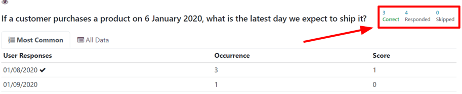
Note
Even if there is no configured correct response for question of this nature, the Correct indicator still appears, although, it displays a 0.
This would occur for opinion-based questions, like When would be a good time to hold another sale?
If there is only one correct response to a multiple choice question, those results and responses are represented by a Pie Graph. The correct answer is indicated by a ✔️ (checkmark) icon next to the correct answer option, in the legend above the graph.
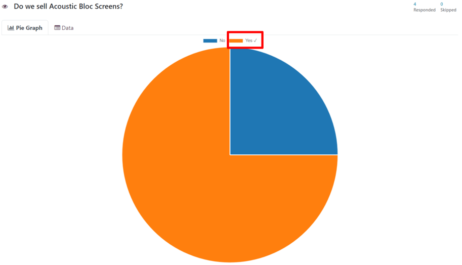
If there are multiple correct answer options (or no correct answers at all) for a multiple choice question, those results and responses are represented by a Bar Graph.
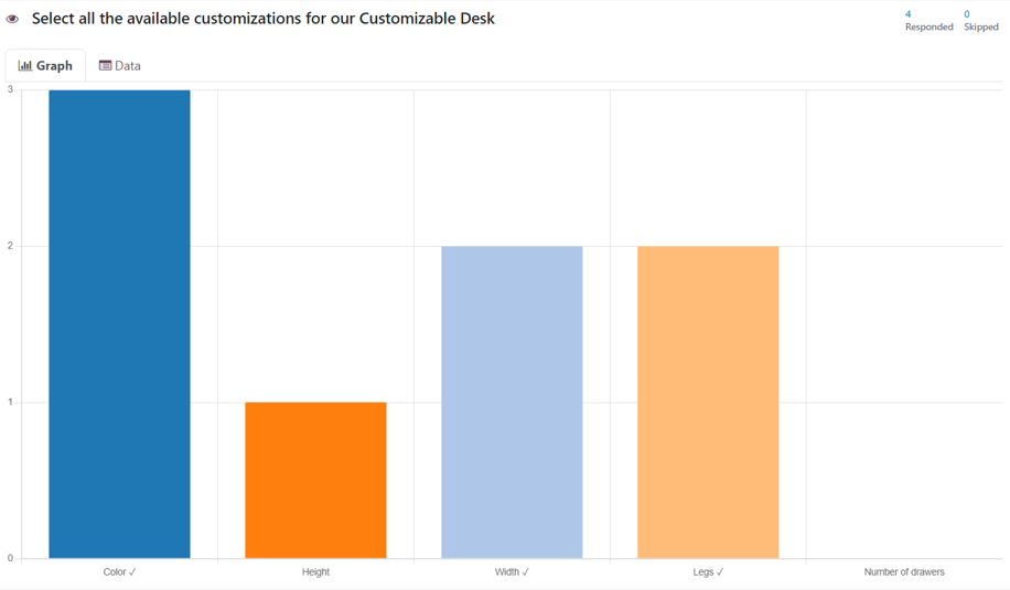
Each multiple choice question has a Graph tab and an Data tab. The graph-related tab is shown by default.
The Data tab shows all the provided Answer options for the question. The User Choice (with percentages and votes) along with the Score of each option.
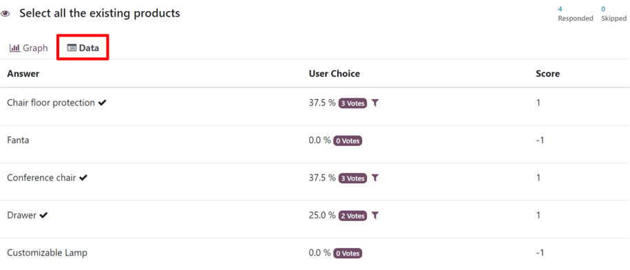
Other question types, wherein there were no answer options for the participant to choose from, there is a Most Common tab and an All Data tab.
The Most Common tab shows the User Responses, the Occurrence, and the Score (if applicable).
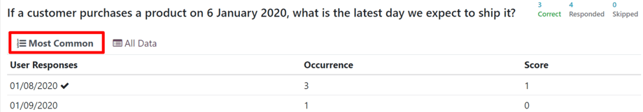
The All Data tab shows a list of all the submitted responses to that particular question.
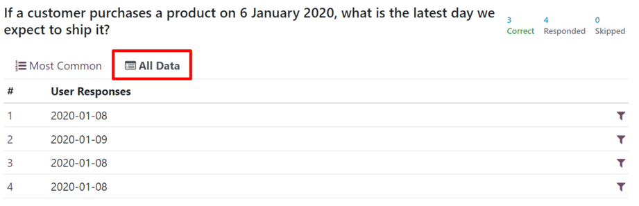
If a question is looking for participants to enter a numerical value as a response, Maximum, Minimum, and Average indicators appear to the far-right of the results tabs.
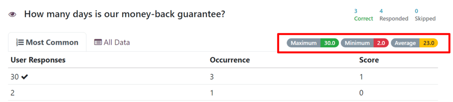
A filter icon is also present either to the right of the User Choice column in a Data tab, or to the far-right of a User Response line in an All Data tab.
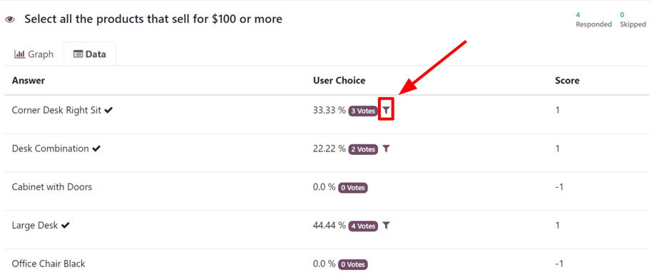
When that filter icon is clicked, Odoo returns the user to the top of the results page, with that chosen filter applied, showing the results of each question for participants who submitted that particular answer for that specific question.
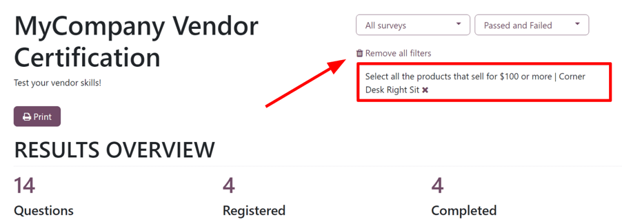
Therefore, showcasing the remaining results for participants who answered that specific question in the same way. To remove that filter, and reveal all the results once again, click Remove all filters or click the ✖️ (X) icon in the filter box at the top of the results page.
Participations
To view a consolidated list of participation results for a specific survey, navigate to Surveys app, select the desired survey from the list, and click the Participations smart button at the top of the survey form.
Doing so reveals a separate Participations page, showcasing the participants for that specific survey, along with a collection of pertinent information related to each one.
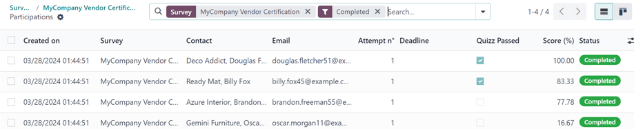
Here, users can view information related to individual participants who took that specific survey. If they desire to see a more detailed breakdown of their various answers and responses, they can click on any participant, and Odoo reveals a separate page showing that participant’s survey details, along with their submitted answers.
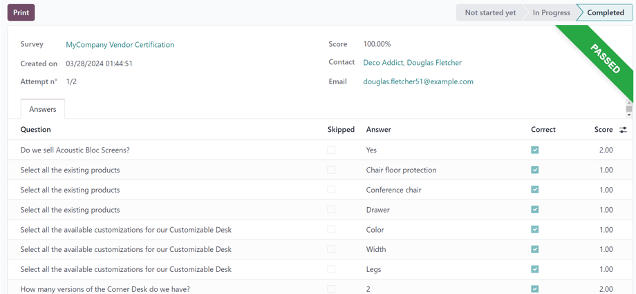
To view a consolidated list of all participants of every survey in the database, navigate to Surveys app ‣ Participations. Here, every survey in the database is shown in a default nested list. Beside each survey title has the number of participants in parenthesis.
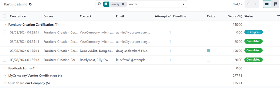
When a survey is un-nested from this list, by clicking the survey title, the corresponding participants, along with their response-related data for that survey, appear on the page.
The Participations page can also be viewed in a Kanban layout, as well.
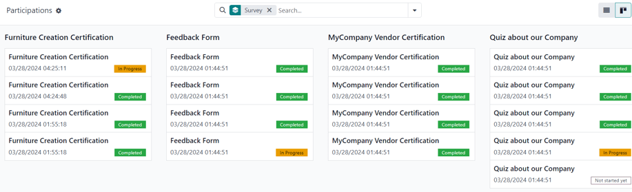
See also
On this page
Get Help
Contact Support Ask the Odoo Community
EN
Odoo 18
Social Marketing
Odoo’s Social Marketing application helps content marketers create and schedule posts, manage various social media accounts, analyze content effectiveness, and engage directly with social media followers in one, centralized location.
See also
Social posts
Discover everything there is to know about how to create and customize social media posts using Odoo.Social campaigns
Learn about all the different campaign and marketing tools this application has to offer.Social media accounts
In order to create social posts and analyze content with Odoo Social Marketing, social media accounts must be added as a stream on the application’s main dashboard.
Note
Be aware that personal profiles cannot be added as a stream. The main use of Odoo Social Marketing is to manage and analyze business accounts on social media platforms.
Warning
Odoo Social Marketing has some limitations in regards to social media accounts. For example, Odoo cannot handle a large quantity of various pages (e.g. ~40 pages) under the same company. The same limitations are present in a multi-company environment because of how the API is constructed.
Warning
In multi-company environments, if every company doesn’t activate a page at once, it will result in a permission error.
For example, if Company 1 is the only company selected from the main Odoo dashboard, and activates Facebook Page 1 and Facebook Page 2, then those pages will be accesible on the Social Marketing dashboard.
However, if on that same database, the user adds Company 2 from the company drop-down menu in the header, and attempts to add those same streams, it results in a permission error.
Social media streams
To add a social media business account as a stream, navigate to Social Marketing app and select the Add A Stream button located in the upper-left corner. Doing so reveals an Add a Stream pop-up window.
In the Add a Stream pop-up window, choose to Link a new account for a business from any of the following popular social media platforms: Facebook, Instagram, LinkedIn, Twitter, and YouTube.
After clicking the desired social media outlet from the Add a Stream pop-up window, Odoo navigates directly to that specific social media outlet’s authorization page, where permission must be granted, in order for Odoo to add that particular social media account as a stream to the Social Marketing application.
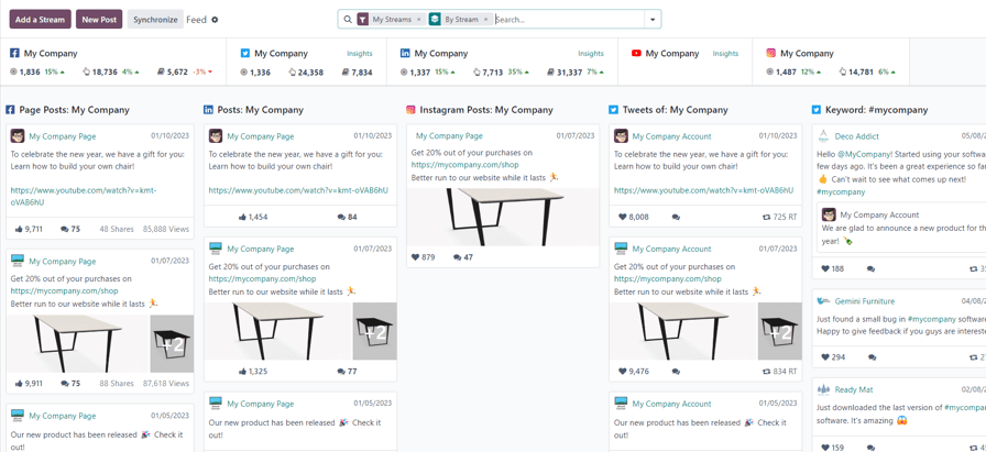
Once permission is granted, Odoo navigates back to the Feed on the main Social Marketing dashboard, and a new column, with that account’s posts, is added. Accounts/streams can be added at any time.
Important
A Facebook page can be added as long as the Facebook account that grants permission is the administrator for the page. It should also be noted that different pages can be added for different streams.
Note
Instagram accounts are added through a Facebook login because it uses the same API. This means, an Instagram account needs to be linked to a Facebook account in order for it to show up as a stream in Odoo.
Social media page
Another way to quickly link social media accounts to Odoo Social Marketing can be done on the Social Media page. To access the Social Media page, navigate to Social Marketing app ‣ Configuration ‣ Social Media.
On the Social Media page there is a collection of all social media options, each complete with a Link account button: Facebook, Instagram, LinkedIn, Twitter, YouTube, and Push Notifications.

Social accounts page
To see a list of all social accounts and websites linked to the database, go to Social Marketing app ‣ Configuration ‣ Social Accounts. This Social Accounts display the Name, the Handle/Short Name, the Social Media platform, who it was Created by, and the Company to which it is associated.
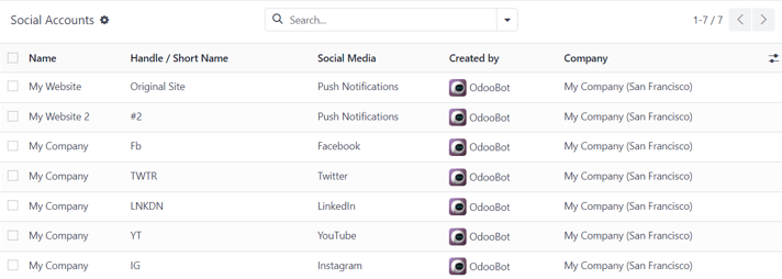
To edit/modify any of the social accounts on this page, simply select the desired account from the list on this page, and proceed to make any adjustments necessary.
Social streams page
To view a separate page with all the social media streams that have been added to the main Social Marketing dashboard, navigate to Social Marketing app ‣ Configuration ‣ Social Streams.
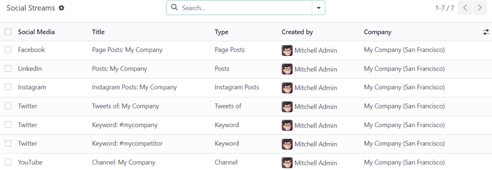
Here, the social stream information is organized in a list with the Social Media, the Title of the stream, the Type of the stream (e.g. Posts, Keyword, etc.), who it was Created by, and the Company to which it is associated.
To modify any stream’s information, simply click the desired stream from the list, and proceed to make any necessary adjustments.
Visitors
To see a complete overview of all the people who have visited the website(s) connected to the database, navigate to Social Marketing app ‣ Visitors.
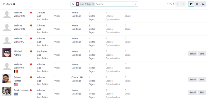
Here, Odoo provides a detailed layout of all the visitors’ pertinent information in a default kanban view. If visitors already have contact information in the database, the option to send them an Email and/or an SMS is available.
This same visitor data can also be viewed as a list or a graph. Those view options are located in the upper-right corner of the Visitors page.
On this page
Get Help
Contact Support Ask the Odoo Community
EN
Odoo 18
Social posts
The Odoo Social Marketing application provides various ways to create posts for any type of social media outlet.
Posts page
To see a complete overview of posts, go to Odoo Social Marketing app ‣ Posts. Here, on the Social Posts page, every post that has been created and posted with Odoo can be seen and accessed.
There are four different view options for the Social Posts page data: kanban, calendar, list, and pivot.
The view options are located in the upper right corner of the Posts page, beneath the search bar.
Kanban viewCalendar viewList viewPivot view
By default, Odoo displays the posts in a kanban view. The information on this page can be sorted even further, via the left sidebar, where all connected social accounts and posts can be quickly seen, accessed, and analyzed.
The kanban view is represented by an inverted bar graph icon in the upper-right corner.
Posts
Clicking on a post from a social media stream reveals a pop-up window, showcasing the content of that specific post, along with all the engagement data related to it (e.g. likes, comments, etc.).
If desired, the user can leave a new comment of the post from the post’s pop-up window, by typing one in the Write a comment… field, and clicking Enter to post that comment.
Create leads from comments
Odoo Social Marketing also provides the ability to create leads directly from social media comments.
To create a lead from a comment left on a social media post, click on the desired post from the dashboard to reveal that post’s specific pop-up window. Then, scroll to the desired comment, and click the three vertical dots icon to the right of that comment.
Doing so reveals a drop-down menu with the option: Create Lead.
Upon clicking Create Lead from the comment’s drop-down menu, a Conver Post to Lead pop-up window appears.
In this pop-up window, select to either: Create a new customer, Link to an existing customer, or Do not link to a customer.
Note
If Link to an existing customer is selected, a new Customer field appears beneath those options, wherein a customer can be chosen to be linked to this lead.
Once the desired selection has been made, click the Convert button at the bottom of the Convert Post to Lead pop-up window. Doing so reveals a fresh lead detail form, where the necessary information can be entered and processed.
Insights
When a social media account stream is added to the Social Marketing dashboard, each stream also displays and links that specific social media platform’s KPIs (if the platform has them).
To get redirected to the statistics and metrics related to any social media account’s KPIs, click on the Insights link, located at the top of each stream.
Note
In a multi-company environment, if not all pages are selected, de-authentication happens.
For example, if the companies have 3 Facebook pages, but only grant access to 1, and try to grant access to another at a later date, they will be de-authenticated, and access to the initial page’s insights/analytics will be lost.
So, be sure to add all pages for all companies in a multi-company environment to avoid this issue. If a page gets de-autenticated, simply remove the stream, and re-establish it.
Create and post social media content
Odoo Social Marketing offers the ability to create and post content for social media accounts directly through the application.
To create content for social media accounts, navigated to the Social Marketing app, and click New Post located in the upper-right corner of the Social Marketing dashboard.

Or, navigate to Social Marketing app ‣ Posts and click the New button.

Either route reveals a blank social media post detail form that can be customized and configured in a number of different ways.
Post detail form
The social media post detail form in Odoo Social Marketing has many different configurable options available.
Company
If working in a multi-company environment, the first field in the Your Post section of the social media post detail form is Company. In this field, select the company that should be connected to this specific social media post.
Post on
If working in a single-company environment, the first field in the Your Post section of the social media post detail form is Post on. In this field, determine which social media outlets (streams) this post is intended to be posted on, and/or which website’s visitors this post should be sent to, via push notification, by checking the box beside the desired option(s).
Odoo automatically provides every available social media account that’s been linked to the database as an option in this section. If a social media account hasn’t been added as a stream to the Social Marketing application, it will not appear as an option on the post template.
Multiple social media outlets (streams) and websites can be selected in the Post on field. At least one option in the Post on field must be selected.
Important
In order for the Push Notification option to appear on the social media post detail form in Odoo Social Marketing, make sure the Enable Web Push Notifications feature is enabled in the Website app.
To do that, navigate to Website app ‣ Configuration ‣ Settings, activate Enable Web Push Notifications, fill out the corresponding fields, and click Save.
Message
Next, there’s the Message field. This is where the main content of the post is created.
In the Message field, type in the desired message for the social post. After typing, click away from the Message field to reveal visual samples of how the post will look on all the previously selected social media accounts (and/or websites, as push notifications).
Tip
Emojis can also be added directly to the text in the Message field. Just click the 🙂 (smiley face) icon, located on the line of the Message field to the far right. Clicking this icon reveals a drop-down menu containing numerous emojis to choose from.
Note
If Twitter is chosen in the Post on field, a character counter appears beneath the Message field.
Attach Images
If images are to be used in the post, click the Attach Images button, in the Attach Images field, located beneath the Message field. When clicked, Odoo reveals a pop-up window. In this pop-up window, select the desired image from the hard drive, and upload it.
After successfully uploading and attaching the desired image, Odoo reveals a new preview of the social media post, complete with the newly-added image, on the right side of the detail form.
Campaign
Next, there is the Campaign field. This non-required field provides the options to attach this post to a specific marketing campaign.
To add this post to a pre-existing campaign, click the empty Campaign field to reveal a drop-down menu, containing all the existing campaigns in the database. Select the desired campaign from this drop-down menu to add this post to that campaign.
To create a new campaign directly from the social media post detail form, start typing the name of the new campaign in the blank Campaign field, and select either Create or Create and edit….
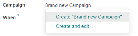
Clicking Create creates the campaign, which can be edited/customized later.
Clicking Create and edit… creates the campaign, and reveals a Create Campaign pop-up form, wherein the Campaign Identifier, Responsible, and Tags can be instantly configured.
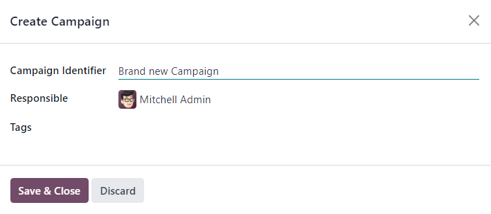
When all the desired settings have been entered, click Save & Close to save the campaign and return to the social media post detail form.
When
Then, in the When field, choose either Send Now to have Odoo publish the post immediately, or Schedule later to have Odoo publish the post at a later date and time.
If Schedule later is selected, a new Scheduled Date field appears. Clicking the empty field reveals a pop-up calendar, in which a future date and time can be designated.
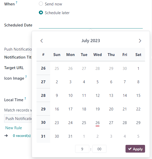
After selecting a desired date and time, click Apply. Then, Odoo will promptly publish the post at that specific date and time on the pre-detemined social media account(s).
Note
If scheduling a post, the Post button at the top of the social media post detail form changes to Schedule. Be sure to click Schedule after completing the social media post detail form.
Doing so, locks in that specific date/time for Odoo to send the post, and it changes the status of the post to Scheduled.
Push Notification Options
If one (or multiple) [Push Notification] options are chosen in the Post on field, a specific Push Notification Options section appears at the bottom of the social media post detail form.
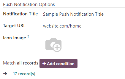
It should be noted that none of these fields are required.
The first field in this section is Notification Title. In this field, there is the option to add a custom title to the push notification that will be sent.
To designate a specific page on the website that should trigger this push notification, enter that page’s URL in the Target URL field. Then, once a visitor reaches that specific page, Odoo will display the push notification.
Below that field is the option to add a custom Icon Image to the push notification. This is an icon that appears beside the push notification.
To upload a new image, click the ✏️ (pencil) icon when hovering over the Icon Image camera icon. Doing so reveals a pop-up window, in which the desired icon image can be located on the hard drive, and subsequently uploaded.
Once that’s complete, Odoo automatically updates the visual preview of how the icon appears on the push notification.
Note
Next, if the post is scheduled to be posted later, there is the option to ensure the post is sent in the visitor’s timezone, by enabling the Local Time option. If enabled, Odoo will send it at the appropriate, pre-determined time, taking the visitor’s location into consideration.
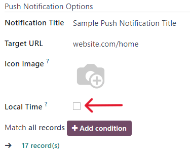
Then, there is the Match all records field. This field provides the ability to target a specific group of recipients in the database, based on certain criteria, and can be applied to match all or any of the rules.
To utilize this field, click the + Add condition button, which reveals an equation-like rule field.
In this equation-like rule field, specifiy the specific criteria Odoo should take into account when sending this post to a particular target audience.
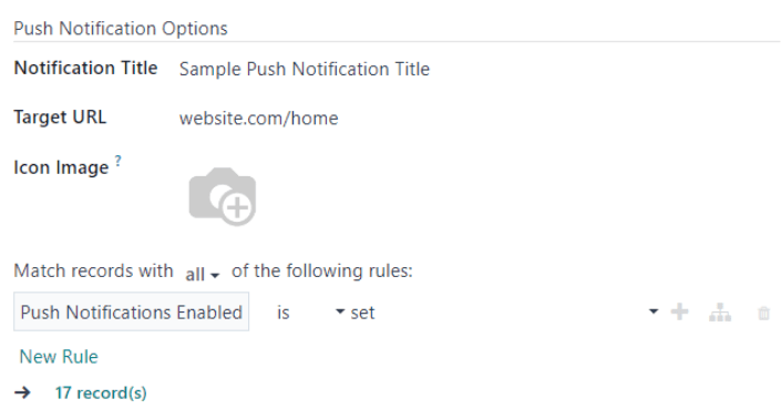
To add an additional rule, click the ➕ (plus sign) icon to the far-right of the rule.
To add a branch (series of additional rules based on the previous rule, to further specify a target audience), click the unique branch icon, located to the right of the ➕ (plus sign) icon.
Lastly, click the 🗑️ (trash can) icon to delete any rule.
The size of the specified target audience of recipients is represented by the number of Records displayed beneath the rules.
See also
On this page
Get Help
Contact Support Ask the Odoo Community
EN
Odoo 18
Social marketing campaigns
Social marketing campaigns help companies connect directly with the marketplace. These campaigns are helpful when introducing a new product to customers, explaining the value of a product or service, or when advertising an upcoming event or product release.
The most effective social marketing campaigns typically involve multiple channels to maximize content distribution, and Odoo’s Social Marketing application acts as a singular control center to monitor, plan, post, track, and analyze all of the various content and content channels within a single dashboard.
Campaigns page
To access a complete overview of all social marketing campaigns, open the Social Marketing application, and click Campaigns from the header menu. Doing so reveals a separate page with every campaign in a default kanban view.
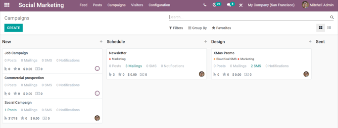
Each stage in the kanban view can be edited, by clicking the gear icon to the left of the + (plus sign) - located to the right of the stage title.
Note
The gear icon only appears when the cursor hovers to the left of the + (plus sign). When the gear icon is clicked, a drop-down menu reveals the options: Fold, Edit Stage, and Delete.
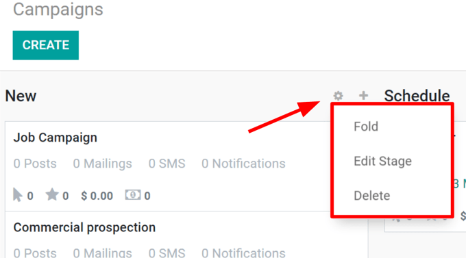
Clicking Fold minimizes that specific stage’s column. The stage column can be restored by clicking the folded version of it on the main Campaigns dashboard in the default kanban view.
Selecting Edit Stage reveals a pop-up window, in which the name and the sequence of the stage can be modified. If changes are made, be sure to click Save.
Clicking Delete removes the stage entirely.
Note
To add a new stage to the pipeline, side-scroll to the right on the Campaigns dashboard, click Add a Column, enter in the desired information, and click Add.
Tip
The same social marketing campaign information on the Campaigns dashboard can also be viewed as a list, by selecting the List option, located under the search bar, in the upper-right corner.
Create social marketing campaigns
First, open the Social Marketing application, and select Campaigns from the header menu.
On the Campaigns dashboard, a new campaign can be created by clicking the quick add + (plus sign) located in the top-right corner of each stage in the pipeline, visible in the kanban view. Campaigns can also be created by clicking Create in the upper-left corner of the Campaigns dashboard.
Both options reveal a new campaign detail window directly on the Campaigns dashboard when clicked.
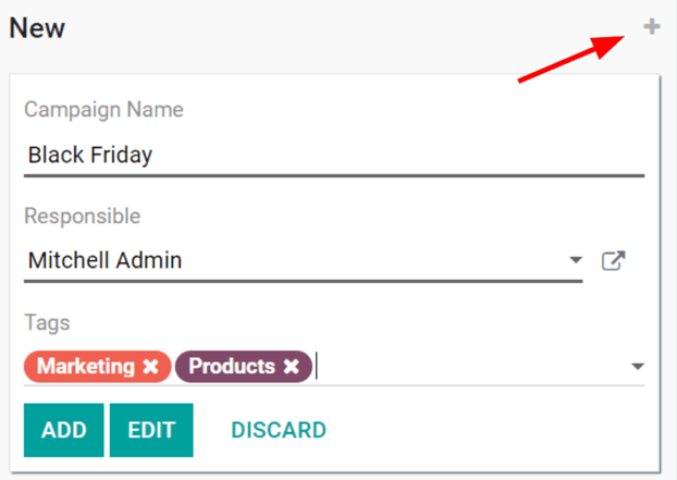
Here, the Campaign Name, Responsible, and Tags can be entered. When all modifications are complete, click Add to add the campaign to the database.
Edit social marketing campaigns
In order to edit a campaign in greater detail, and create/send various forms of communications related to it, the template page for that campaign must be accessed and modified, accordingly. There are multiple ways to access a template page for a campaign.
- After entering the pertinent information in the Quick Add campaign drop-down, click Edit.
- Simply select the desired campaign from the Campaigns dashboard in list or kanban view.
- On the Campaigns dashboard in the kanban view, select the ⋮ (three dots) drop-down menu on the desired campaign, and select Edit.
Any of the above routes will reveal the Campaign Template page for that specific campaign.
Social marketing campaign templates
On a Campaign Template page, numerous elements can be customized/modified, and various forms of communications can be created, modified, and sent or scheduled. Below is a sample of a completed campaign template.

Important
In order for the Send New Mailing option to appear on campaign templates, make sure the Mailing Campaigns feature is enabled in the Email Marketing app. To do that, navigate to Email Marketing ‣ Configuration ‣ Settings, activate Mailing Campaigns, and click Save.
Note
In order for the Send SMS option to appear, the Odoo SMS Marketing application must be installed on the database.
Add content and communications to campaigns
If the proper settings and applications are installed (as instructed above), there are four forms of communication/content options that can be added to campaigns. Each of these options are displayed as buttons in the upper-left corner of the campaign template page.
- Send New Mailing: reveals a blank email template on a separate page, in which the message can be fully customized in a variety of ways.
- Send SMS: reveals a blank SMS template on a separate page, in which a SMS communication can be created and configured.
- Send Social Post: reveals a blank social post template on a separate page, in which a post can be created, and applied to social media accounts that are already connected to the database.
- Push Notification: reveals a similar blank social post template on a separate page, however, the Push Notification options are already pre-selected in the Post on field.
Whichever form of communication is created, once it’s completed, Odoo returns to the Campaign Template page, showcasing that new content in its corresponding tab (e.g. Mailings, SMS, Social Media, and/or Push Notifications).
As content and communications are added to a campaign, tabs for those specific mediums appear, along with a variety of analytical smart buttons (e.g. Revenues, Quotations, Leads, etc.).
These smart buttons, located at the top of the template, display different metrics related to the campaign, and its various communications and content. Clicking any smart button reveals a separate page dedicated to that particular element of the campaign, allowing for quicker, more organized analysis.
Note
The Odoo Social Marketing app is integrated with other Odoo applications, such as Sales, Invoicing, CRM, and Website.
On this page
Get Help
Contact Support Ask the Odoo Community
EN
Odoo 18
Project management
Odoo Project uses the Kanban project management system. This means all projects are broken down into tasks, which are categorized on a whiteboard according to what production phase they are in.
Did you know?
The word Kanban comes from Japanese and refers to the “visual board” management method.
See also
Odoo Tutorials: Kanban Project Management
Configuration
Open the Project app and click Create to start a new project. Enter a Name for your project and click Create Project.
You can customize your existing projects from the dashboard by clicking the drop-down toggle button (⋮) on your project’s card.

This enables a new menu divided into four parts:
- View: see an overview of your project’s components, such as its Tasks, Milestones and Project Updates. Depending on which apps you have activated, more options may be available, such as Documents. All uploaded files can be found under this menu, as well as in the Documents app, under Projects;
- Reporting: analyze your project’s progress and profitability through graphics and statistics;
- Color: make a line of color appear on the left side of the card so that your project is more recognizable;
- Settings: you can change the following:
- the Name of the project;
- the Name of the tasks found under that project;
- the Customer for whom the project is intended;
- the Tags used for filtering;
- the Company responsible for the project;
- the employee designated as Project Manager;
- the Planned Date of the project;
- the total Allocated Hours for that project.
Additionally, you can mark the project as Favorite, allowing you to find it using the My Favorites filter on the Kanban view;
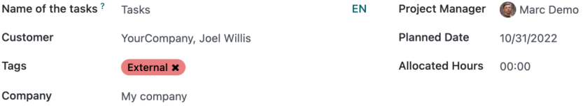
See also
Odoo Tutorials: Customize projects
Further settings are available under the Settings tab. Most of them are only available depending on the activated apps.
Scheduling activities
You can schedule activities (ex. Call, Meeting, etc.) per project by clicking on the clock icon on a project. Doing so opens a list with already scheduled activities and allows planning new activities by clicking + Schedule an activity. On the pop-up window, select the Activity Type, enter a Summary for that activity, a Due Date, and assign it to an employee. According to the Activity Type, you may have additional options available.
Note
If an activity is already scheduled, the icon may change to a phone, group of people, or other.
Top bar
In project management, reviewing the various records and documents related to a project is often necessary. Odoo Project’s top bar provides quick access to these essential resources. You can customize each project’s top bar to match its specific needs.
To set up the top bar for a project, go to the Project app, click the project’s card, then click the top bar (sliders) button. In the bar that appears above the search bar, click the (sliders) button to select the records you want to display, such as timesheets, sales orders, invoices, documents, dashboards, etc.
You can then click the buttons to access the related records without leaving the Project app. To return to your project tasks’ Kanban view, click the Tasks button in the top bar.

Custom top bar buttons
You can also create your own buttons to access more specific views:
- Click an existing top bar button to access the view.
- Customize the view with keywords, filters, and grouping options using the search bar.
- Click the (sliders) button in the top bar and select Save View.
- Edit the default button name if necessary, then enable Shared if you want to share the button with other users.
Get Help
Contact Support Ask the Odoo Community
EN
Odoo 18
Project dashboard
The project dashboard allows you to get a comprehensive overview of your project’s status. It displays information such as the total number of tasks, timesheets, and planned hours linked to the project, as well as detailed information about project milestones and its costs and revenues. Within the project dashboard, you can create Project updates, which allow you to take a snapshot of the project’s status at a certain point in time. As such, it is a crucial tool for effective project management and ensuring that your project stays on track.
Using the project dashboard
To access the project dashboard, open the Project app and navigate to the applicable project. Click the (sliders) icon to add Dashboard to the project’s top bar.
Tip
You can also access the project dashboard by hovering over the desired project’s card, clicking the (vertical ellipsis), and selecting Dashboard.
The left side of the dashboard displays a list of existing project updates, and the right side provides detailed information about records linked to the project, as well as milestones, profitability, and budgets.
Note
The information displayed on the project dashboard varies depending on the applications installed on your database. For example, you will not see information about Timesheets, Planning, or Purchase Orders if the corresponding applications are not installed.
Totals smart buttons
The following smart buttons are displayed on the top right of the project dashboard:
- Tasks: the number of completed (i.e., Done or Canceled tasks) and all tasks, in format completed/all, as well as the entire project’s completion percentage estimation.
- Timesheets: the number of hours or days (depending on the Timesheets app configuration) allocated in the project’s settings. This includes all timesheets, whether or not they have been validated.
- Planned: the number of hours that have been planned for shifts in the Planning app. This includes all planned shifts, including past shifts and shifts that have not yet been published.
- Documents: number of documents in the project’s workspace.
- Burndown Chart: click the smart button to access a report on the status of the project’s tasks over time.
- Timesheets and Planning: click the smart button to access a report on the project’s timesheets and shifts. This allows you to easily compare planned and effective hours of work on the project.
- Additional fields, such as Sales Orders, Sales Order Items, Purchase Orders, and more, represent the number of records linked to the project.
Tip
Use the project dashboard smart buttons to update the project records easily. Click Timesheets to validate timesheets, Planned to create project planning, Documents to view and validate documents, etc.
Milestones
This section is only visible if milestones have been enabled in the Project’s app settings. Click Add Milestone to create a new milestone. Click a milestone in the checklist to edit it, enable its checkbox to mark it as completed, or click the (trash) icon to remove it.
The milestones are displayed in red if they’re past their deadline, or in green if they are ready to be marked as reached (i.e. tasks linked to the milestone that have been marked with done or canceled status).
Profitability
The profitability dashboard provides a breakdown of project costs and revenues, which are impacted by all records linked to the project and its Analytic account.
Note
The profitability report is only displayed for billable projects.
Budgets
If a budget has been set for the project, its status and related details are displayed in this section. Click Add Budget to create a new budget for the project.
Note
Budgets must be enabled in your database’s Accounting application in order for this section to be displayed.
Project updates
Project updates allow you to take a snapshot of the project’s overall status at a given point in time, for example, during a periodic (weekly, bi-weekly, or monthly) review. This allows you to compare specific data points, note any aspects of the project that need improvement, and estimate if the project is on or off track.
To create a new project update, go to the project dashboard, click New, and fill in the following fields:
- Status: Choose between On Track, At Risk, Off Track, On Hold, and Done. Once the status is set, a color-coded dot is displayed on the project’s Kanban card, allowing the project manager to easily identify which projects need attention.
- Progress: Manually input the completion percentage based on the project’s progress.
- Date and Author: These fields are automatically filled in with appropriate information based on the user who created the update and the current date.
- Description: Use this rich-text field to gather notes. Depending on the project configuration (e.g., if the project is billable), this field may be pre-filled with current information on aspects such as profitability, budget, milestones, etc.
On this page
Get Help
Contact Support Ask the Odoo Community
EN
Odoo 18
Project profitability
When handling billable projects, it is essential to determine whether your projects are turning a profit. Measuring project profitability involves keeping track of the costs of resources used to carry out the project, such as employee costs, materials used, purchases, expenses, or after-sales services, and comparing them with the project revenues.
Project profitability is tracked in the project dashboard on all billable projects.
To access the project dashboard, open the Project app and navigate to the applicable project. Click the (sliders) icon to add Dashboard to the project’s top bar.
Tip
You can also access the project dashboard by hovering over the desired project’s card, clicking the (vertical ellipsis), and selecting Dashboard.
The profitability dashboard is on the right side of the project dashboard and displays data for all records linked to the project and its analytic account. It’s divided into two major sections: revenues, which displays a breakdown of income generated by the project, and costs accrued by your company. The same record can be displayed in both sections, e.g., the same timesheet is listed under Revenues with the amount the customer paid for the work and under Costs with the amount of wages paid to the employees.

The amounts displayed in the profitability report are divided into three columns:
- Expected: the amounts expected based on existing sales or purchase orders.
- To invoice (revenues) or To bill (costs): the amounts are moved to this column when the work or goods have been delivered, e.g., a timesheet has been created and/or validated, a delivery order has been marked as done, or the delivered quantity has been manually updated on the sales order.
- Invoiced or Billed: the amounts are moved to this column once an invoice or bill has been confirmed.
Based on the same principle, the revenues section is further divided into Sold, Delivered, and Invoiced columns. Use the (arrow) icon to see a detailed breakdown for each line.
Tip
Use the project’s top bar to easily access and edit records linked to the project’s profitability from the project’s Kanban view.
Important
In order for a record to be displayed on the profitability dashboard, it must be linked to the project and its analytic account.
The following records can be displayed in the profitability dashboard.
Revenues
- Timesheets: revenues from timesheets, broken down according to the Invoicing Policy selected on the product form (e.g., Prepaid/Fixed Price, Based on Timesheets, Based on Milestones).
- Materials: total of sales prices of products sold via sales orders linked to the project.
- Customer invoices: a total of invoices linked to the project.
- Subscriptions: a total of sales prices of subscriptions linked to the project.
- Down payments: a total of down payments linked to the project.
- Expenses: any expenses that have been reinvoiced to the customer.
Costs
- Timesheets: total cost of time tracked by employees via timesheets, based on the employee’s HR settings.
- Purchase Orders: total cost of purchase orders linked to the project. Those could cover goods, materials, or even subcontracted services. This entry only appears once the vendor bill is posted.
- Materials: total cost of products included in stock moves (deliveries and receipts) that have been validated for the project. This section is only displayed if Analytic Costs have been enabled in Inventory ‣ Configuration ‣ Operations Types for applicable operations. This ensures that the product’s cost is tracked during the stock move.
- Expenses: total costs of expenses linked to the project that have been submitted and approved.
- Vendor bills: total costs of vendor bills linked to the project’s analytic account.
- Manufacturing orders: total costs of manufacturing orders linked to the project’s analytic account.
- Other costs: any other costs linked to the project’s analytic account.
On this page
Get Help
Contact Support Ask the Odoo Community
EN
Odoo 18
Task stages and statuses
Task stages
Task stages are displayed as columns in the project’s Kanban view, and allow you to update the progress of its tasks with a drag-and-drop. In most projects, the stages will be akin to New, In progress, Backlog, etc.
By default, task stages are project-specific but can be shared across multiple projects that follow the same workflow.
Creating task stages
Odoo Project doesn’t provide default stages but instead allows you to create custom stages tailored to your specific business needs. You are prompted to do so immediately after creating a new project.
To create a stage, type its name into the Stage… field, then click Add.
Tip
Click See examples to find ideas for stage names applicable to your line of business.
Editing task stages
To edit the task stage, click the (cog) icon next to its name. From there, click one of the following:
- Fold: to hide the task stage and all of the tasks in this stage from the Kanban view.
- Edit:
- Name: to change the name of the stage.
- SMS/Email Template: to automatically send an email or SMS notification to the customer when a task reaches this stage.
- Folded in Kanban: to hide the task stage and all of the tasks in this stage from the Kanban view.
- Projects: to share this task stage between several projects.
- Automations: to create custom rules that trigger automatic actions (e.g., creating activities, adding followers, or sending webhook notifications). Note that this will activate Studio in your database, which may impact your pricing plan.
- Delete: to delete this stage.
- Archive/Unarchive all: to archive or unarchive all of the tasks in this stage.
Task statuses
Task statuses are used to track the status of tasks within the Kanban stage, as well as to close the task when it’s done or canceled. Unlike Kanban stages, they cannot be customized; five task statuses exist in Odoo and are used as follows:
- In Progress: this is the default state of all tasks, meaning that work required for the task to move to the next Kanban stage is ongoing.
- Changes Requested: to highlight that changes, either requested by the customer or internally, are needed before the task is moved to the next Kanban stage.
- Approved: to highlight that the task is ready to be moved to the next stage.
- Canceled: to cancel the task.
- Done: to close the task once it’s been completed.
Note
- The Changes Requested and Approved task statuses are cleared as soon as the task is moved to another Kanban stage. The task status reverts to the default In Progress status so that Changes Requested or Approved status can be applied again once the necessary work has been completed in this Kanban stage.
- The Done and Canceled statuses are independent from the Kanban stage. Once a task is marked as Done or Canceled, it is closed. If needed, it can be reopened by changing its status.
On this page
Get Help
Contact Support Ask the Odoo Community
EN
Odoo 18
Task creation
Tasks in Odoo Project can be created manually or automatically, including from emails or website forms.
Manual task creation
Open the Project app and choose the desired project. Create a new task by doing one of the following:
- Clicking the (plus) button in the upper left corner. This creates a new task in the first stage of your Kanban view.
- Pressing the (plus) button next to the Kanban stage name. This creates a new task in this Kanban stage.
Fill in the Task Title and add one or more Assignees, then click Add.
Task configuration
Click the task to open it. The task form includes the following fields that you can fill in:
- Task Title: title of the task.
- (Star): click the (star) icon to mark the task as high priority. The icon will turn yellow. Click it again to remove the high priority.
- Project: the project that this task belongs to.
- Assignees: the person(s) in charge of handling the work on this task.
- Tags: custom labels allowing to categorize and filter your tasks.
- Customer: the person or company that will be billed for this task. This field only appears in tasks that belong to billable projects.
- Sales Order Item: this can be either the sales order that was used to create this task, or a sales order that was linked to this task manually. This field only appears in tasks linked to billable projects.
- Allocated Time: the amount of time that the work on this task is expected to last, tracked by timesheets.
- Deadline: the expected end date of the task. Once this field is filled in, you can also add a start date to designate the entire time frame of the tasks’ duration.
Tip
- You can also create new tasks by switching to the list or Gantt view and clicking New.
- The following fields can also be edited directly from the Kanban view without opening the individual task: (priority), Allocated hours, Assignees, and task status. You can also color code or Set a Cover image to your task by clicking the (vertical ellipsis).
- You can use the following keyboard shortcuts in the task title to configure new tasks (modify the values in the examples below according to your needs):
- 30h: to allocate 30 hours to the task.
- #tags: to add tags to the task.
- @user: to assign the task to a user.
- !: to star the task as high priority.
For example, if you want to create a task named “Prepare workshop”, allocate 5h hours to it, add the “School” tag, assign it to Audrey and set its priority to High, enter the following task title: Prepare workshop 5h #school @Audrey !
Creating tasks from an email alias
This feature allows for project tasks to be automatically created once an email is delivered to a designated email address.
To configure it, open the Project app, then click the (vertical ellipsis) icon next to the desired project’s name. Select Settings, then open the Settings tab.
Fill in the Create tasks by sending an email to field as follows:
- Section of the alias before the @ symbol: type the name of the email alias, e.g. contact, help, jobs.
- Domain: in most cases, this is filled in by default with your domain.
- Accept Emails From: refine the senders whose emails will create tasks in the project.
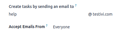
Once configured, the email alias can be seen under the name of your project on the Kanban dashboard.
When an email is sent to the alias, the email is automatically converted into a project task. The following rules apply:
- The email sender is displayed in the Customer field.
- The email subject is displayed in the Task Title field.
- The email body is displayed in the Description field.
- The whole content of the email is additionally displayed in the chatter.
- All the recipients of the email (To/Cc/Bcc) that are Odoo users are automatically added as followers of the task.
Creating tasks from a website form
If you have the Website app installed in your database, you can configure any form on your website to trigger the creation of tasks in a project.
- Go to the website page where you wish to add the the form and add the Form building block.
- In the website editor, edit the following fields:
- Action: select Create a Task.
- Project: choose the project that you want the new tasks to be created in.
- Customize the form.
When the form is submitted, it automatically creates a project task. The task’s content is defined by the form’s corresponding fields.
See also
On this page
Get Help
Contact Support Ask the Odoo Community
EN
Odoo 18
Sub-tasks
When handling project tasks, you can often benefit from splitting the workload into smaller sub-tasks, making it easier to track progress and manage the work.
Odoo’s sub-task feature is particularly useful in some of the following cases:
- The task workload is too big to handle in one record.
- There’s a clear sequence of steps to follow.
- Some parts of the workload fall under the scope of different projects and/or assignees.
The original task to which sub-tasks are linked is referred to as the parent task. The sub-tasks of the parent task are known as child tasks.
Creating sub-tasks
To create a sub-task:
- Open the Project app, then go into your desired project.
- Click the task where you want to add the sub-task, then click the Sub-tasks tab.
- Click Add a line, then fill in the Title.
- Click the (save) icon to save the task manually.
Tip
You can edit several fields of a sub-task directly from the parent task’s sub-task tab without opening the individual sub-task. By default, those are: Title, Priority, Status, and Assignees. Use the (sliders) icon to add or remove fields.
Once the new sub-task is created, the following changes occur in the parent task:
- A smart button displays the total number of sub-tasks, as well as the number of closed (done or canceled) sub-tasks. Click the smart button to access the list of the sub-tasks.
- The Allocated time displays the amount of time allocated to the parent task, as well as time allocated to the sub-tasks. This can be used to ensure that the time allocated to sub-tasks does not exceed time allocated to the parent task.
- The Timesheets tab includes a breakdown of time spent on the parent task as well as sub-tasks.
Click View to open the sub-task you created. The sub-task form is identical to the task form.
Tip
- A smart button allows to navigate back to the Parent task.
- The Sub-tasks tab allows for further creation of sub-tasks.
- Selecting a Project will trigger this sub-task to be displayed in the Kanban view of the selected project.
Get Help
Contact Support Ask the Odoo Community
EN
Odoo 18
Task dependencies
Odoo Project allows you to break down projects into tasks and establish relationships between those tasks to determine the order in which they are executed. Task dependencies ensure that certain tasks begin only after the preceding tasks are completed.
To enable task dependencies in projects, go to Project ‣ Configuration ‣ Settings, enable Task Dependencies, and click Save.
Set task dependencies
Task dependencies can be created from the task form or the project’s Gantt view by linking the successor task (i.e., the task blocked by other tasks) to its predecessor task(s) (i.e., the tasks blocking the successor task).
To create task dependencies from the task form, access the desired task and, in the Blocked by tab, click Add a line. Click View to access the predecessor task. To access the successor tasks from the predecessor task, click the Blocked Tasks smart button.
To create a task dependency from the Gantt view, hover your mouse over the predecessor task, then click one of the dots that appear around it. Drag and drop the dot onto the successor task. An arrow appears, indicating the dependency from the predecessor task to the successor.
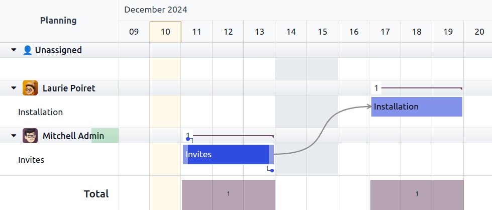
Odoo automatically manages task progress based on their dependency. Successor tasks are assigned the Waiting status and cannot be moved to In Progress until their predecessor task(s) are marked as Approved, Cancelled, or Done.
Remove dependencies
To remove a task dependency, proceed as follows:
- From the task form, go to the Blocked by tab and click the (times) button.
- From the Gantt view, click the red (times) button that appears at the center of the arrow when you hover your mouse over it.
On this page
Get Help
Contact Support Ask the Odoo Community
EN
Odoo 18
Create Timesheets upon Time Off Validation
Odoo automatically timesheets on project/tasks upon time off requests. This allows for better overall control over the validation of timesheets, as it does not leave place for forgetfulness and questions after hours that have not been timesheeted by the employee.
Activate the developer mode, go to Timesheets, and change the Project and Task set by default, if you like.
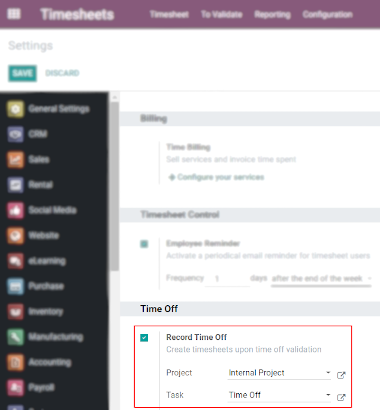
Go to Time Off ‣ Configuration ‣ Time Off Types. Select or create the needed type, and decide if you would like the requests to be validated or not.
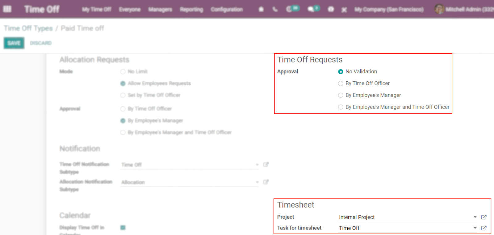
Now, once the employee has requested his time off and the request has been validated (or not, depending on the setting chosen), the time is automatically allocated on Timesheets, under the respective project and task.
On the example below, the user requested Paid Time off from July 13th to 15th.
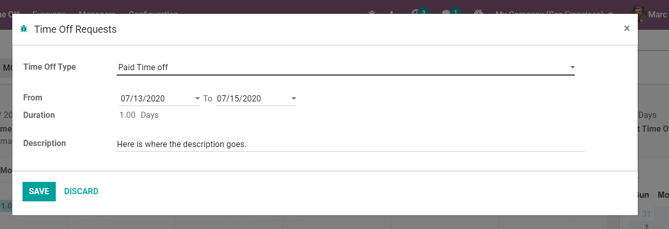
Considering that validation is not required, the requested time off is automatically displayed in Timesheets. If validation is necessary, the time is automatically allocated after the responsible person for validating does it so.
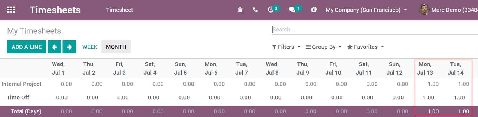
Click on the magnifying glass, hovering over the concerned cell, to access all the aggregated data on that cell (day), and see details regarding the project/task.
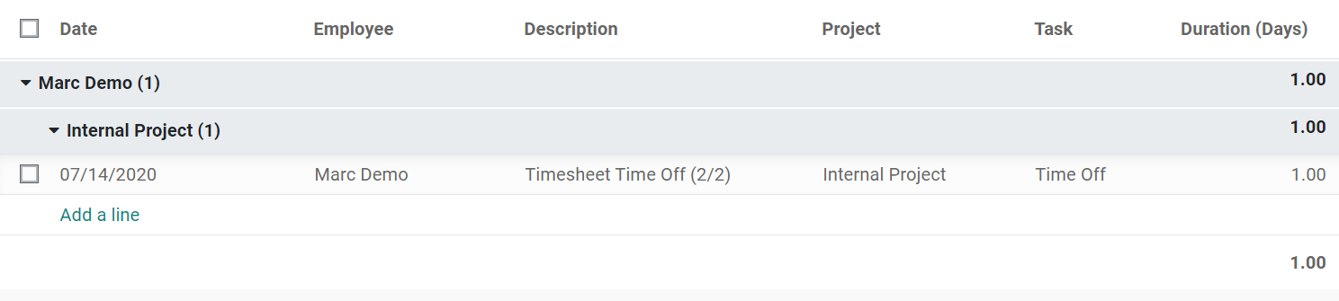
Get Help
Contact Support Ask the Odoo Community
EN
Odoo 18
Planning
Odoo Planning allows you to plan your team’s schedule and manage shifts and resources.
Handling your team’s planning comes with specific requirements that may vary widely depending on your business needs. The following concepts were introduced in Odoo Planning to meet those needs:
Shifts are dispatched to resources, which can be either human (employees) or material (e.g., equipment). The resources are assigned roles, which allows for organization of work within the team.
Once the initial configuration is done, planning shifts can be done manually or automated by using the Auto Plan feature.
An integration between the Planning and Sales apps allows the linking of sold services to roles and shifts in Planning. Additionally, integration with Project allows dedicating shifts, and thus time and resources, to specific projects.
See also
Configuration
Roles
To define the roles your resources perform (e.g., chef, bartender, waiter), go to Planning ‣ Configuration ‣ Roles, then click New, and fill in the Name (e.g., assistant, receptionist, manager). Then, choose the Resources that will perform this role. Resources can be either Employees or Materials.
Note
- If the Sales app is installed in your database, the Services field appears, allowing you to specify which roles are needed to perform services so that the shifts are dispatched to the right person.
- Roles are taken into account when using the Auto Plan feature.
Property fields and roles
Property fields allow you to add custom fields to forms across several Odoo applications. Planning includes the possibility of adding property fields linked to roles to shifts.
To create a property field, switch to the list view from any schedule. From there, click View on the shift that you wish to edit. If the Role field is empty, fill it in with the desired role, then click the cog icon and select Add Properties. Configure the new field according to your needs.
The property field is linked to the role and is included in the shift form of all shifts performed by this role.
Example
Some of the use cases of role property fields include:
- Accreditation: for roles that require a specific permit (e.g., driving license)
- Location: in companies that operate in multiple locations (e.g., shops or restaurants)
- Language: in a multi-lingual environment (e.g., consulting company)
Employees
All employees can be included in the planning and assigned shifts.
To adapt the employee’s planning settings, go to Planning ‣ Configuration ‣ Employees, and choose the employee for whom you want to edit the settings. Then, go to the Work Information tab.
Tip
You can do the same from the Employees app, which is installed by default along with Planning.
Two sections of the employee’s Work Information tab have an impact on Planning: Schedule (namely, the Working Hours field) and Planning.
Working hours
The Working Hours are taken into account when the Allocated Time and its percentage is calculated for shifts. If the Working Hours field is left blank, the employee is considered to be working flexible hours.
To create individual Working Hours, for example, for employees working part-time, click Search more…, then New.
Note
The Working Hours and the Allocated Time in Planning can impact Payroll, if the employee’s contract is configured to generate work entries based on shifts.
See also
Payroll documentation on working schedules
Planning roles
Once an employee has one or more Roles:
- When creating a shift for this employee, only the shift templates from the roles chosen in this field are displayed.
- When a schedule is published, the employee is only notified of open shifts for the roles that are assigned to them.
- When auto-assigning open shifts or planning sales orders, the employee is only assigned shifts for the roles assigned to them.
Additionally, when a Default role is defined:
- When creating a shift for the employee, the default role is automatically selected.
- This role also has precedence over the other roles of the employee when auto-assigning open shifts or planning sales orders.
Note
If the Planning roles fields are left empty, there are no restrictions in the shift templates and open shifts shared with the employee. However, it’s not possible to use the Auto Plan feature for employee with no roles.
Materials
Materials are resources that can be assigned shifts and working hours but are not employees. For example, a construction company could use materials to create shifts for shared machines (e.g., cranes, forklifts).
Similarly to employees, materials can be assigned roles and working time.
Shift templates
To create a shift template, click New on any schedule, then fill in the details of the shift. In order for the shift to be saved as a template, tick Save as Template.
Alternatively, you can go to Planning ‣ Configuration ‣ Shift Templates, then click New. Fill in the Start Hour and Shift Duration. The shift’s End Time is then calculated based on the Working Hours, taking into account working time as well as breaks.
Example
The employee’s working hours are Monday to Friday, 8 am to 5 pm, with a break between 12 and 1 pm.
- Creating a shift template with a start hour of 9 am and a duration of 8 hours will result in the end hour being 5 pm, based on the working hours and the 1-hour break.
- Creating a shift template with a start hour of 10 am and a duration of 10 hours will result in the end hour of 10 am the following day, as the company is closed at 5 pm according to the working hours.
Additionally, for each shift template, you can also configure:
- Role: to link the shift to this specific role.
- Project: to keep track of shifts that are dedicated to work on a project.
Planning shifts
On opening the Planning app, the users see their own schedule. Users with admin roles can also see Schedule by Resource, Role, Project, or Sales Order, as well as reporting and configuration menus.
Note
The schedule is displayed in the Gantt view, which allows you to edit (with a drag and drop), resize, split, and duplicate shifts without having to open them.
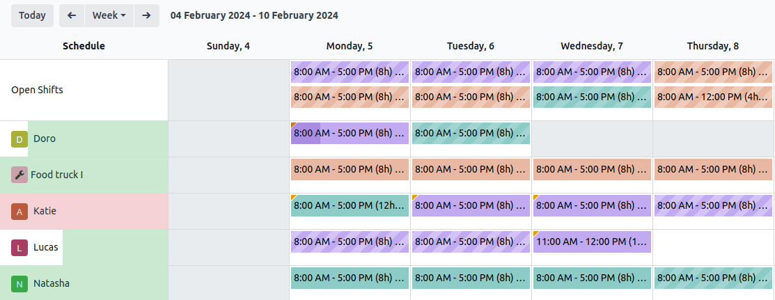
The following visual elements are used on the shifts in the schedules:
- Full color: shifts that are planned and published.
- Diagonal stripes: shifts that are planned but have yet to be published.
- Grayed-out background: employees that are on time off.
- Progress bar: currently ongoing shifts with timesheets linked to them.
- Grayed-out shift: when copying shifts, the copied shifts are shown in full color, whereas previously existing shifts are temporarily greyed out. The color changes back to full color or diagonal stripes on the next refresh of the page or by removing the filter.
Create a shift
To create a shift, go to any schedule, then click New. In the pop-up window that opens, fill in the following details:
- Templates: If there is one or more templates existing in your database, they are displayed in the upper section of the pop-up window. Once selected, a template prefills the shift form accordingly.
- Resource: Resources can be both employees or materials. If this field is left empty, the shift is considered an open shift.
- Role: Select the role that the resource assigned will be performing. This field is used when auto-planning shifts. Once you select a role, the shift templates associated with it are displayed in the upper section of the pop-up window.
- Project: If the Project app is installed in your database, this field allows you to link the project to the shift is available, allowing you to plan and track shifts dedicated to work on the selected project.
- Sales Order Item: If the Sales app is installed in your database, this field allows you to link a sales order to the shift.
- Repeat: Tick the checkbox and configure the Repeat Every field according to your needs. The following rules apply to recurring shifts:
- All fields (e.g., Resource, Role, Project) are copied from the original shift except for the date, which is adjusted according to the Repeat Every field.
- Recurrences are planned but not published.
- By default, planned shifts are created six months in advance, after which they are created gradually. To change the time frame, activate the Developer mode, then go to Planning ‣ Configuration ‣ Settings and edit the Recurring Shifts.
- Save as Template: When this option is ticked, a shift template is created with the same Start and End hours, Allocated time, Role, and Project.
- Additional note sent to the employee: Click on the field to add a note.
- Date: Choose the date and time of your shift. This is the only mandatory field when creating a shift.
- Allocated time: Is calculated based on the date and the employee’s Working Schedule. See more in Shift Templates.
Click Publish & Save to confirm the shift and send the assigned employee their schedule by email.
Note
The draft is visible on the admin planning view and can be identified by diagonal lines. The employee is only notified of the shift once it’s published.
Two kinds of notifications are sent to the employees depending on their account configuration:
- Employees without user accounts are redirected to a dedicated Planning portal.
- Employees with a user account are redirected to the My Planning view in the backend view of Odoo.
Open shifts and auto planning
The Auto Plan button allows you to assign Open shifts (shifts with no resource assigned) and create and assign shifts linked to sales orders or project.
The following features have an impact on auto planning:
- Roles: Open shifts are only assigned to resources (employees or materials) that have the corresponding role assigned. It is not possible to use the Auto Plan feature for employee with no roles.
- Default roles: The default role assigned to a resource is given priority over the other roles they have assigned to them.
- Conflicts: Employees or materials cannot be assigned multiple shifts at the same time.
- Time off: The employees’ time off is taken into account, as well as public holidays.
- Company working hours: Are taken into account when assigning shifts to employees or materials.
- Contracts: Employees without an active contract cannot be assigned shifts.
Click Publish to confirm the schedule and notify the employees of their planning.
Switching shifts and unassignment
Two features are available to allow employees to make changes to their schedule: switching shifts and unassignment.
Note
These features are mutually exclusive. Switching shifts is possible by default and cannot be disabled. However, once the Allow unassignment feature is enabled, it replaces the option to switch shifts.
Switching shifts
Once shifts are planned and published, employees receive an email notification. If an employee wishes to switch a shift, they can click the unwanted shift and click Ask to switch.
The shift remains assigned to the original employee, but in the schedule, a notification informing that the assigned employee would like to switch shifts is visible on the shift.
The shift is then displayed to other employees who share the same role, and if they wish to assign it to themselves, they can click the I take it button.
Note
The following rules apply:
- Only the shifts matching the employee’s roles are displayed as available to them.
- Switching shifts is only available for shifts that are in the future.
Unassignment
To allow employees to unassign themselves from shifts, go to Planning ‣ Configuration ‣ Settings, then tick the checkbox Allow Unassignment. Then, specify the maximum number of days that the employees can unassign themselves before the shift.
Once shifts are planned and published, employees receive an email notification. If shift unassignment is allowed, the employees can click the I am unavailable button, and the shift reverts to an open shift.
Note
The following rules apply:
- Only the shifts matching the employee’s roles are displayed in their schedule.
- Switching shifts is only available for shifts that are in the future.
On this page
Get Help
Contact Support Ask the Odoo Community
EN
Odoo 18
Creating field service tasks
Tasks in Odoo Field Service can be created manually or automatically, including from sales orders or helpdesk tickets.
Manual task creation
To create a new field service task:
- Open the Field service app and go to Field Service ‣ All Tasks ‣ All Tasks.
- Click New.
- Fill in the task title, Customer and any other optional field, then save manually.
Task creation from a sales order
This feature allows for field service tasks to be automatically created from a sales order. When you create a quotation with the service product and confirm it, a task is automatically created in your Field Service project. Click the Tasks smart button to access it from the sales order.
Task creation from a helpdesk ticket
If you have the Helpdesk app installed, you can create field service tasks from a helpdesk ticket.
On this page
Get Help
Contact Support Ask the Odoo Community
EN
Odoo 18
Product management
When field service workers perform tasks on-site, they commonly use products to complete their work. Odoo Field Service allows them to record these products using the product catalog and default warehouse features. Doing so keeps your inventory up-to-date in real-time and automatically adds the products to the invoice.
Product catalog
To activate the product catalog for Field Service, go to Field Service ‣ Configuration ‣ Settings and enable the Time and Material Invoicing feature.
To add products to a task, proceed as follows:
- Go to Field Service and open a task.
- Click the Products smart button.
- Click Add on a product card to add it to your task.
- If needed, adjust the number of products using the - and + buttons.
Going back to your task, the smart button now displays the amount of products you added and the price. You can return to the product catalog at any time to edit the product selection.
Tip
- To create and edit products from Field Service, go to Field Service ‣ Configuration ‣ Products.
- To find your products more easily, use the search bar and filter your products by Product Category and Attributes.
User default warehouse
Setting up a default warehouse can be useful for field technicians who keep a supply on the go in their van or those who always resupply from the same warehouse. It also allows field workers to switch between warehouses from their profiles.
Products in sales orders created during field interventions are always pulled from the default warehouse, keeping the inventory accurate.
See also
Configuration
To set up a user default warehouse, the storage locations feature needs to be activated in the Inventory app. It is also necessary to have more than one warehouse in your database.
You can either set it up for your profile, or for all users.
See also
For your profile
To set up a default warehouse for yourself, click your profile icon in the upper right corner of the screen, then, go to My Profile ‣ Preferences ‣ Default Warehouse. Select the default warehouse from the drop-down menu.
For all users
To set up a default warehouse for a specific user, go to Settings ‣ Users ‣ Manage users, select a user, then go to the Preferences tab. Scroll down to Inventory, and select the default warehouse from the drop-down menu.
Use in field service tasks
Once a default warehouse has been configured for a user, the materials used for a sales order related to a Field Service task are pulled from that specific warehouse. Open the related sales order, go to the Other Info tab, then scroll down to Delivery. The default warehouse is applied correctly.
Once the Field Service task is marked as done, the stock of the default warehouse is automatically updated.
On this page
Get Help
Contact Support Ask the Odoo Community
EN
Odoo 18
Planning an itinerary
By default, Odoo Field Service shows a static map where all task locations for the day are pinned. To make it more useful for the field service workers, it is possible to display an itinerary on the map using MapBox. To do so, enable the Map Routes feature as follows:
- Create or sign in to a MapBox account using the following link: https://www.mapbox.com/.
- Create a token.
- Go to the Access tokens page on Mapbox and copy your token.
- In Odoo, go to the Settings app and scroll down to the Integrations section. Paste your Mapbox access token in the Token field under Map Routes, and click Save.
Displaying your itinerary on a map
Important
For a field service task to be featured on the map, a valid address must be provided for the customer.
To display your tasks on a map, go to Field Service ‣ My Tasks ‣ Map. To create your itinerary, Odoo sorts out your field service tasks based on their Planned Date to show the way from one location to the next.
To open your itinerary on the Google Maps website or app, click View in Google Maps. Google Maps includes your current location as a starting point for your itinerary.
Tip
- By default, the map shows today’s tasks. Remove the Today filter in the search bar to display all tasks. Your tasks are then sorted by date in the left column.
- Click your task in the left column or the map pin to display the task’s details. From there, you can Open the task or click Navigate to to get an itinerary from your current location to this specific task’s location.
Get Help
Contact Support Ask the Odoo Community
EN
Odoo 18
Worksheets
Worksheets help your field service workers perform and report their on-site tasks. They can feature various information, such as instructions, to-do lists, etc. You can also format your worksheet using checkboxes, bullet points, blank fields to fill in, HTML, and add files, images, links, and more.
It is common for businesses to have their workers perform the same type of field service repeatedly. Making custom worksheet templates eliminates the need to recreate the same worksheet each time you plan a similar field service task.
Configuration
To use worksheets in Field Service, go to Field Service ‣ Configuration ‣ Settings, enable the Worksheets feature, and click Save.
Warning
Worksheet templates are designed using Studio. Enabling the Worksheets feature automatically installs the Studio app, which may impact your price plan.
Create a worksheet template
To create your worksheet templates, go to Field Service ‣ Configuration ‣ Worksheet Templates. Click New and give your worksheet template a name. Manually save, then click Design Template to open Studio and customize your worksheet template.
In Studio, drag and drop the desired fields from the left column into your worksheet on the right. To rearrange the fields on the worksheet, drag and drop them in the desired order. Click a field to customize its properties.
When your worksheet template is complete, click Close in the top right corner of the page to leave Studio.
See also
Add a worksheet template to a field service task
Go to your field service task, select a Worksheet Template, and click Save.
By default, the Default Worksheet template is selected. To define another default worksheet template, click the ➔ (Internal link) icon that appears when you hover your mouse over the Project field on the task form.
Then, in the Settings tab, scroll down to the Field service section and select the Worksheet Template you want to set up as default.
Use worksheets on site
To complete the worksheet on site, access the task and click the Worksheet smart button.
Note
- As soon as you save a worksheet, the label of the Worksheet smart button on the task changes to Worksheet Complete instead, even if some fields are left blank.
- Any field defined as Required has to be filled for a worksheet to be saved.
On this page
Get Help
Contact Support Ask the Odoo Community
EN
Odoo 18
Helpdesk
Odoo Helpdesk is a ticket-based customer support application. Multiple teams can be configured and managed in one dashboard, each with their own pipeline for tickets submitted by customers. Pipelines are organized in customizable stages that enable teams to track, prioritize, and solve customer issues quickly and efficiently.
Create a Helpdesk team
To view or modify Helpdesk teams, go to Helpdesk app ‣ Configuration ‣ Helpdesk Teams. To create a new team, click the New button on the top-left of the dashboard.
On the blank Helpdesk team form, enter a Name for the new team. Then, enter a description of the team in the field below the team name, if desired. To change the company this team is assigned to, select it from the Company drop-down menu.
Important
The team description is published on the public facing website form, where customers and portal users submit tickets. The description included in this field should not include any information that is for internal use only.
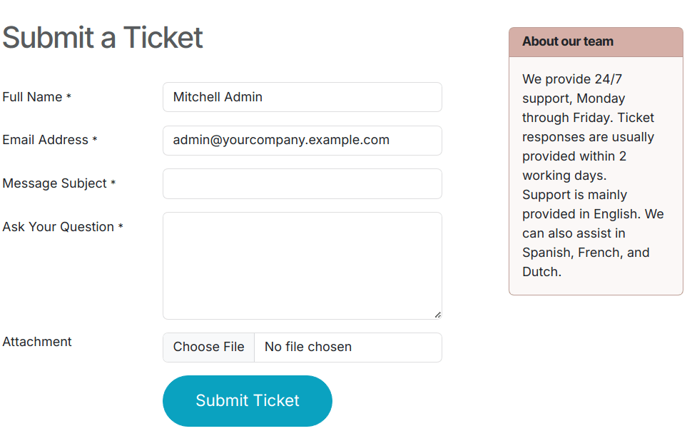
Visibility & Assignment
The Visibility settings alter which internal users and portal users have access to this team and its tickets. The Assignment settings alter how users are assigned to handle each ticket.
Determine team visibility
Under the Visibility section, select one of the following options to determine who can view this team and its tickets:
- Invited internal users (private): Internal users can access the team and the tickets they are following. This access can be modified on each ticket individually by adding or removing the user as a follower. Internal users are considered invited once they are added as followers to an individual ticket, or to the team itself.
- All internal users (company): All internal users can access the team and all of its tickets.
- Invited portal users and all internal users (public): All internal users can access the team and all of its tickets. Portal users can only access the tickets they are following.
Example
A Customer Support team, meant to handle general shipping and product issues, would have the visibility set on Invited portal users and all internal users.
At the same time, a Financial Services team handling tickets related to accounting or tax information would only need to be visible to Invited internal users.
Warning
A team’s visibility can be altered after the initial configuration. However, if the team changes from Invited portal users and all internal users (public) access to either Invited internal users (private) or All internal users (company)-only access, portal users are removed as followers from both the team, and from individual tickets.
Follow all team’s tickets
If a user should be notified about any updates regarding tickets for this team, select their name from the Followers drop-down menu, located in the Follow All Team’s Tickets field. Multiple users can be selected to follow a single team.
Important
External contacts can be selected in the Followers field. If the team’s visibility is set to Invited internal users (private), followers are notified about updates to the team’s tickets, but are not able to view them in the portal.
Automatically assign new tickets
When tickets are received, they need to be assigned to a member of the team. This is done either manually on each individual ticket, or through Automatic Assignment. Check the Automatic Assignment checkbox to enable this feature for the team.
Select one of the following assignment methods, based on how the workload should be allocated across the team:
- Each user is assigned an equal number of tickets: Tickets are assigned to team members based on total ticket count, regardless of the number of open or closed tickets they are currently assigned.
- Each user has an equal number of open tickets: Tickets are assigned to team members based on how many open tickets they are currently assigned.
Note
When Each user is assigned an equal number of tickets is selected, the overall number of tickets assigned to team members is the same, but it does not consider the current workload.
When Each user has an equal number of open tickets is selected, it ensures a balanced workload among team members, as it takes the current number of active tickets into account.
Finally, add the Team Members who are to be assigned tickets for this team. Leave the field empty to include all employees who have the proper assignments and access rights configured in their user account settings.
Important
If an employee has time off scheduled in the Time Off application, they are not assigned tickets during that time. If no employees are available, the system looks ahead until there is a match.
See also
Merge tickets
If duplicate tickets are found in Helpdesk, they can be combined into a single ticket using the merge feature.
Important
The merge feature is only accessible if the Data Cleaning application is installed on the database.
To merge two or more tickets, navigate to Helpdesk app ‣ Tickets ‣ All Tickets. Identify the tickets to be merged, and tick the checkbox at the far-left of each ticket to select them. Then, click the Actions icon, and select Merge from the drop-down menu. Doing so opens a new page where the selected tickets are listed with their Similarity rating. From here, click either Merge to combine the tickets, or DISCARD.
Convert tickets to opportunities
Some tickets may be better handled by the sales team, rather than the support team. In this case, tickets can be converted to opportunities and assigned to a sales team for follow-up.
Important
This feature is only available if the CRM app is installed.
To convert a ticket to an opportunity, first navigate to a ticket, either from a team’s pipeline, or by navigating to Helpdesk app ‣ Tickets and clicking a ticket to open it.
At the top of the ticket, click the Convert to Opportunity button.
Note
If leads are enabled on the CRM app, tickets are converted to leads, and the button reads Convert to Lead.
This opens the Convert to Opportunity pop-up. Fill in or select the following information on the pop-up:
- Customer: Select whether to Create a new customer, Link to an existing customer, or Do not link to a customer. If Link to a customer is chosen, select the appropriate customer name from the Customer drop-down.
- Sales Team: Specify which Sales Team and Salesperson this created opportunity is assigned to.

After completing the form, click Convert to Opportunity. Doing so creates a new opportunity in the CRM app. The original ticket is linked in the chatter of the new opportunity for traceability.
Note
After the ticket is converted to an opportunity, the ticket is archived.
See also
On this page
Get Help
Contact Support Ask the Odoo Community
EN
Odoo 18
Stages
Stages are used to organize the Helpdesk pipeline and track the progress of tickets. Stages are customizable, and can be renamed to fit the needs of each team.
Create or modify stages
Important
Developer mode must be activated to access the stages menu. To activate developer mode, go to Settings app ‣ General Settings ‣ Developer Tools, and click Activate the developer mode.
To view or modify Helpdesk stages, go to Helpdesk app ‣ Configuration ‣ Stages.
The default list view on the Stages page displays the stages currently available in the Helpdesk app. They are listed in the order they appear in the pipeline.
To change the order of the stages, click the (draggable) icon, to the left of the stage name, and drag it to the desired place on the list.
Tip
Change the stage order on the Kanban view of a Helpdesk team’s pipeline by dragging and dropping individual columns.
To create a new stage, click the New button at the top-left of the stage list. Doing so reveals a blank stage form.
Choose a Name for the new stage.
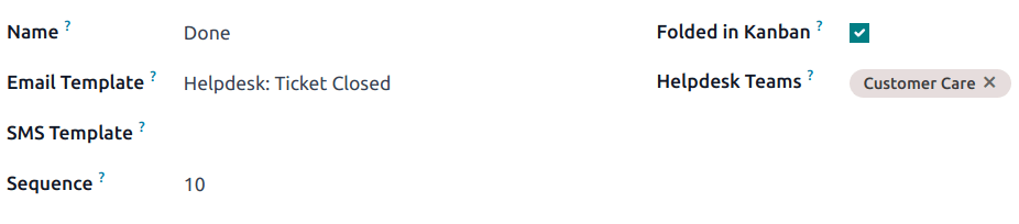
Add email and SMS templates to stages
When an Email Template is added to a stage, a preconfigured email is automatically sent to the customer when a ticket reaches that specific stage in the pipeline. Likewise, adding an SMS Template triggers a preconfigured SMS text message to send to the customer.
Important
SMS text messaging is an In-App Purchase (IAP) service that requires prepaid credits to work. Refer to SMS Pricing FAQ for additional information.
To select an existing email template, select it from the Email Template field. After choosing a template, click on the (right arrow) icon to the right of the field to edit the chosen template.
To create a new template from this form, click the field, and enter a title for the new template. Then, select Create and edit from the drop-down menu that appears, and complete the form details.
Follow the same steps to select, edit, or create an SMS Template.
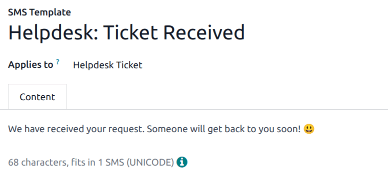
See also
Fold a stage
By default, stages are unfolded in the Kanban view of either tickets dashboard: My Tickets (Helpdesk app ‣ Tickets ‣ My Tickets) or All Tickets (Helpdesk app ‣ Tickets ‣ All Tickets).
Tickets in an unfolded stage are visible in the pipeline under the stage name, and are considered open.
Stages can be configured to be folded in the Kanban view of a tickets page.
The name of the folded stages are still visible, but the tickets in the stage are hidden from view.
To fold a stage, tick the Folded in Kanban checkbox on the Stages form.
Warning
Tickets that reach a folded stage are considered closed. Closing a ticket before the work is completed can result in reporting and communication issues. This setting should only be enabled for stages that are considered closing stages.
Temporarily fold a stage
Stages can be temporarily folded in the Kanban view of the tickets pipeline, as well.
View a specific team’s pipeline by navigating to Helpdesk app, and clicking the team’s Kanban card.
Hover the cursor at the top of the desired stage to fold temporarily, then click the (gear) icon that appears, and select Fold from the drop-down menu.
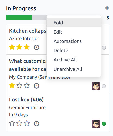
Important
Manually folding a stage from the Kanban view is temporary and does not close the tickets in the stage.
Assign stages to a team
Make a selection in the Helpdesk Teams field on the Stages form. More than one team may be selected, since the same stage can be assigned to multiple teams.
On this page
Get Help
Contact Support Ask the Odoo Community
EN
Odoo 18
Receiving tickets
Odoo’s Helpdesk app offers multiple channels where customers can reach out for assistance, such as email, live chat, and through a website’s submission form. The variety of these contact options provides customers with multiple opportunities to receive support quickly while also allowing the support team to manage multi-channel support tickets from one central location.
Enable channel options to submit tickets
Go to Helpdesk app ‣ Configuration ‣ Helpdesk Teams, and choose an existing team, or click New to create a new team.
On the team’s settings page, scroll down to the Channels and Help Center sections. Enable one or more channels by checking the respective boxes.
Email Alias
The Email Alias setting creates tickets from messages sent to that team’s specified email alias.
Important
The following steps are for Odoo Online and Odoo.sh databases. For On-premise databases, external servers are required for email aliases.
When a new Helpdesk team is created, an email alias is created for it. This alias can be changed on the team’s settings page.
To change a Helpdesk team’s email alias, navigate to Helpdesk app ‣ Configuration ‣ Helpdesk Teams, and click on a team name to open its settings page.
Then, scroll to Channels ‣ Email Alias. In the Alias field, type the desired name for the team’s email alias.
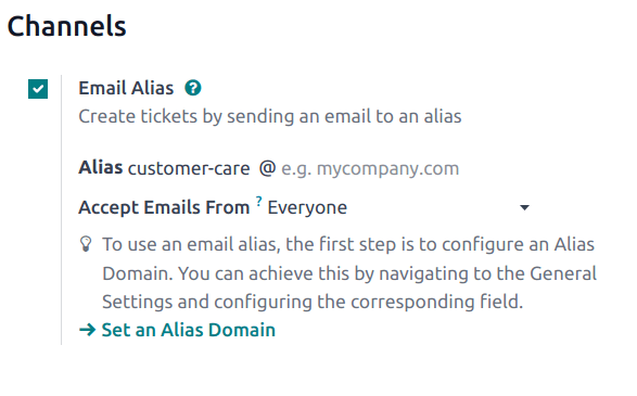
Note
Custom email domains are not required in order to use an email alias, however, they can be configured through the Settings app.
If the database does not have a custom domain already configured, click Set an Alias Domain to be redirected to the Settings page. From there, enable Custom Email Servers.
When an email is received, the subject line becomes the title of a new Helpdesk ticket. The body of the email is also added to the ticket, under the Description tab, and in the ticket’s chatter.
Live Chat
The Live Chat feature lets website visitors connect directly with a support agent or chatbot. Helpdesk tickets can be instantly created during these conversations using the response command /ticket.
To enable Live Chat, navigate to the Helpdesk app ‣ Configuration ‣ Helpdesk Teams list view, select a team, and on the team’s settings page, click the checkbox next to Live Chat, under the Channels section.
Note
If this is the first time Live Chat has been enabled on the database, the page may need to be saved manually and refreshed before any further steps can be taken.
After the Live Chat setting is enabled on a Helpdesk team, a new Live Chat channel is created. Click on Configure Live Chat Channel to update the channel’s settings.
Live Chat channel configuration
On the channel’s settings page, Channel Name can be edited, though, Odoo names the channel to match the Helpdesk team name, by default.
Example
If a Helpdesk team is named Customer Care, a Live Chat channel is created called Customer Care.
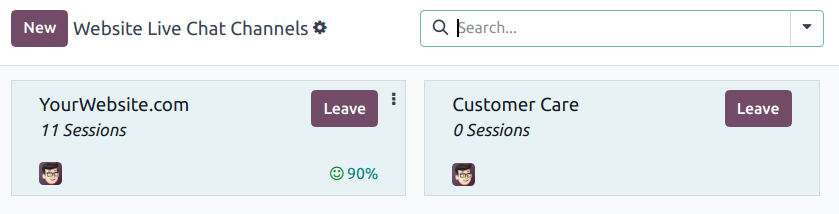
On the channel form, navigate through the tabs to complete the setup.
Operators tab
Operators are the users who act as agents and respond to live chat requests from customers. The user who created the live chat channel is added by default.
To add additional users, click on the Operators tab, then click Add.
Click the checkbox next to the users to be added on the Add: Operators pop-up window that appears, then click Select.
Click New to create new operators, if needed.
When the desired addition is complete, click Save & Close, or Save & New to add multiple new operators.
Danger
Creating a new user can impact the status of an Odoo subscription, as the total number of users in a database counts towards the billing rate. Proceed with caution before creating a new user. If a user already exists, adding them as an operator will not alter the subscription or billing rate for a database.
Additionally, current operators can be edited or removed by clicking on their respective boxes in the Operators tab, and then adjusting their form values on the pop-up form that appears, or by using one of the buttons located at the bottom of the form, such as Remove.
Tip
Users can add themselves as an operator by clicking the Join Channel button on a Live Chat channel.
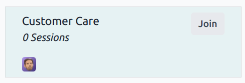
Options tab
The Options tab contains the visual and text settings for the live chat window.
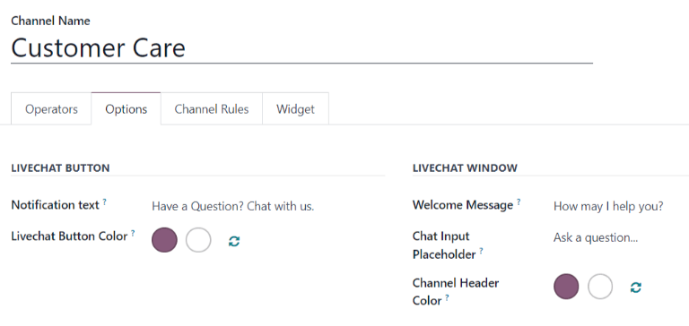
- Notification Text: This field updates the greeting displayed in the text bubble when the live chat button appears on the website.
- Livechat Button Color: This field alters the color of the live chat button as it appears on the website. To change the color, click on a color bubble to open the color selection window, then click and drag the circle along the color gradient. Click out of the selection window once complete. Click the refresh icon to the right of the color bubbles to reset the colors to the default selection.
- Show: The chat button displays on the selected page.
- Show with notification: The chat button is displayed, with the addition of the Notification text from the Options tab.
- Open automatically: The chat button is displayed, and automatically opens the chat window after a designated amount of time. The amount of time is designated in the Open automatically timer field, which appears only when this display option is selected.
- Hide: The chat button is hidden from display on the webpage.
Tip
Color selection, for the button or header, can be made manually, or through RGB, HSL, or HEX code selection. Different options are available, depending on the operating system or browser.
Channel Rules tab
The Channel Rules tab determines when the live chat window opens on the website by logic of when a URL Regex action is triggered (e.g., a page visit).
Tip
A regex, or regular expression, is sometimes referred to as a rational expression. It is a sequence of characters that specifies a match pattern in text. A match is made within the given range of numbers or for the set of characters.
Edit existing rules by selecting them from the Channel Rules tab, or create a new rule by clicking Add a line.
Then, proceed to configure the details for how the rule should apply on the pop-up form that appears.
Choose how the Live Chat Button displays on the webpage.
- Show: The chat button displays on the selected page.
- Show with notification: The chat button is displayed, with the addition of the Notification text from the Options tab.
- Open automatically: The chat button is displayed, and automatically opens the chat window after a designated amount of time. The amount of time is designated in the Open automatically timer field, which appears only when this display option is selected.
- Hide: The chat button is hidden from display on the webpage.
To include a Chatbot on this channel, select it from the drop-down menu. If the chatbot should only be active when no operators are available, check the box labeled Enabled only if no operator.
Note
If a chatbot is added to a live chat channel, a new Chatbots smart button appears on the channel settings form. Click here to create and update the chatbot script.
Each line in the script contains a Message, Step Type, Answers, and conditional Only If logic that applies when certain pre-filled answers are chosen.
To create more steps in the script, click Add a line, and fill out the script steps form, according to the desired logic.
Add the URLs for the pages where the channel should appear in the URL Regex field. Only the path from the root domain is needed, not the full URL.
If this channel should only be available to users in specific countries, add those countries to the Country field. If this field is left blank, the channel is available to all site visitors.
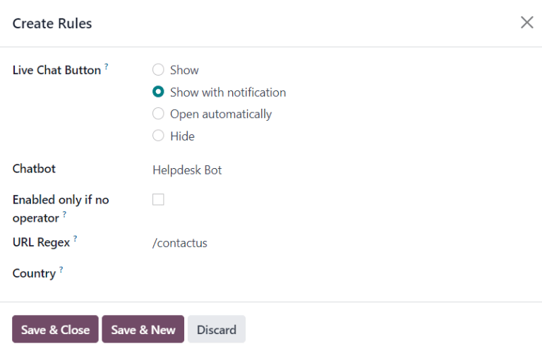
Widget tab
The Widget tab on the live chat channel form offers a website widget that can be added to third-party websites. Additionally, a URL is available, that can provide instant access to a live chat window.
The live chat Widget can be applied to websites created through Odoo by navigating to the Website app ‣ Configuration ‣ Settings ‣ Email & Marketing. Then, scroll to the Live Chat field, and select the channel to add to the site. Click Save to apply.
To add the widget to a website created on a third-party website, click the Copy button next to the first listed code, and paste the code into the <head> tag on the site.
To send a live chat session to a customer or supplier, click the Copy button next to the second listed code, and send the URL via email.
Create a support ticket from a live chat session
Operators who have joined a live chat channel are able to communicate with site visitors in real-time.
During the conversation, an operator can use the shortcut command /ticket to create a ticket without leaving the chat window. The transcript from the conversation is added to the new ticket, under the Description tab.
Tip
Helpdesk tickets can also be created through the WhatsApp app using the same /ticket command.
Website Form
Enabling the Website Form setting adds a new page to the website with a customizable form. A new ticket is created once the required form fields are filled out and submitted.
To activate the website form, navigate to a team’s settings page under Helpdesk app ‣ Configuration ‣ Helpdesk Teams, and selecting the desired team from the list.
Then, locate the Website Form feature, under the Help Center section, and check the box.
If more than one website is active on the database, confirm the correct website is listed in the Website field. If not, select the correct one from the drop-down list.
After the feature is activated, click the Go to Website smart button at the top of the Teams settings page to view and edit the new website form, which is created automatically by Odoo.
Note
After enabling the Website Form setting, the team’s settings page may need to be refreshed before the Go to Website smart button appears.
Additionally, if a Help Center is published, the smart button navigates there first. Simply click the Contact Us button, at the bottom of the forum, to navigate to the ticket submission form.
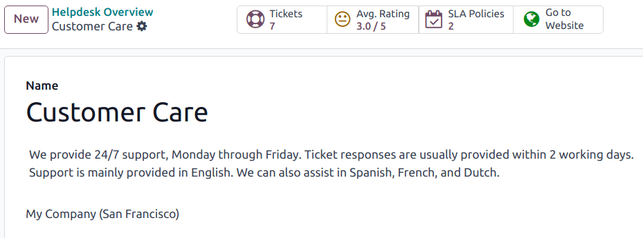
Website ticket form customization
To customize the default ticket submission form, while on the website, click the Edit button in the upper-right corner of the page. This opens the editing sidebar on the right side. Then, click on one of the fields in the form, on the body of the website, to edit it.
To add a new field, go to the Field section of the sidebar, and click + Field.
Click the 🗑️ (trash can) icon to delete the field, if necessary.
Edit the other options for the new field in the sidebar, as desired:
- Type: matches an Odoo model value to the field (e.g. Customer Name).
- Input Type: determine what type of input the field should be, like Text, Email, Telephone, or URL.
- Label: give the form field a label (e.g. Full Name, Email Address, etc.). Also control the label position on the form by using the nested Position options.
- Description: determine whether or not to add an editable line under the input box to provide additional contextual information related to the field.
- Placeholder: add a sample input value.
- Default Value: add common use case values that most customers would find valuable. For example, this can include prompts of information customers should include to make it easier to solve their issue, such as an account number, or product number.
- Required: determine whether or not to mark a field as required, in order for the form to be submitted. Toggle the switch from gray to blue.
- Visibility: allow for absolute or conditional visibility of the field. Nested options, such as, device visibility, appear when certain options are selected.
- Animation: choose whether or not the field should include animation.
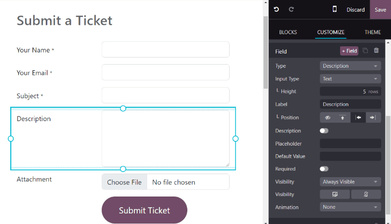
Once the form has been optimized, and is ready for public use, click Save to apply the changes. Then, publish the form by toggling the Unpublished switch to Published at the top of the page, if necessary.
Prioritizing tickets
All tickets include a Priority field. The highest priority tickets appear at the top of the Kanban and list views.
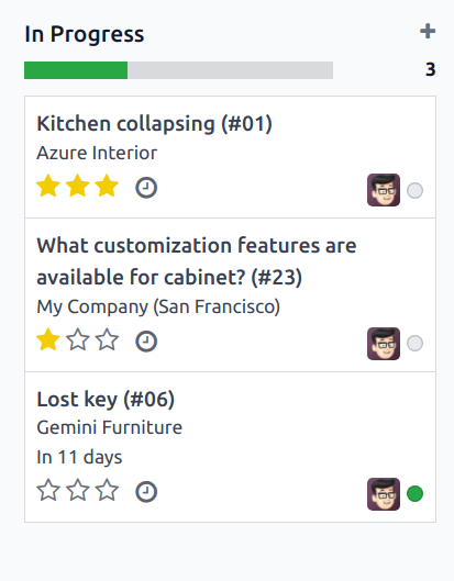
The priority levels are represented by stars:
- 0 stars = Low Priority
- 1 star = Medium Priority
- 2 stars = High Priority
- 3 stars = Urgent
Tickets are set to low priority (0 stars) by default. To change the priority level, select the appropriate number of stars on the Kanban card, or on the ticket.
Warning
As priority levels can be used as criteria for assigning SLAs, changing the priority level of a ticket can alter the SLA deadline.
See also
On this page
Get Help
Contact Support Ask the Odoo Community
EN
Odoo 18
Help Center
Odoo Helpdesk integrates with the Forums, eLearning, and Knowledge apps to create the Help Center. The Help Center is a centralized location where teams and customers can search for and share detailed information about products and services.
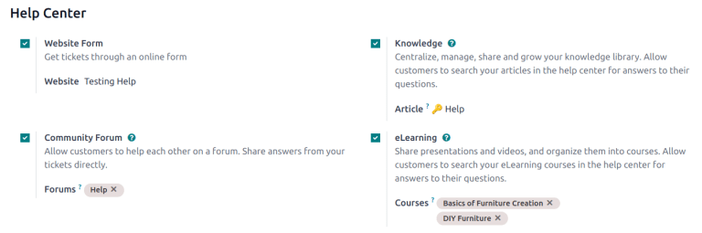
Configuration
To activate any of the Help Center features on a Helpdesk team, go to Helpdesk app ‣ Configuration ‣ Helpdesk Teams and select a team, or create a new one. Verify the Visibility of the team is set to Invited portal users and all internal users (public) in the Visibility & Assignment section.
Additionally, the Website Form option on the Helpdesk team form must be enabled to activate any of the Help Center features. When one or more of the Help Center features is enabled, the Website Form is automatically enabled, as well.
Danger
Since all of the Help Center features require integration with other applications, enabling any of them may result in the installation of additional modules or applications.
Installing a new application on a One-App-Free database will trigger a 15-day trial. At the end of the trial, if a paid subscription has not been added to the database, it will no longer be active or accessible.
See also
Knowledge
Odoo’s Knowledge application is a collaborative library, where users can store, edit, and share information. The Knowledge app can be used to publish user guides and FAQs with customers externally, while also collaborating internally on shared documents.
The Knowledge app is accessible throughout the database by clicking on the Knowledge (bookmark) icon.
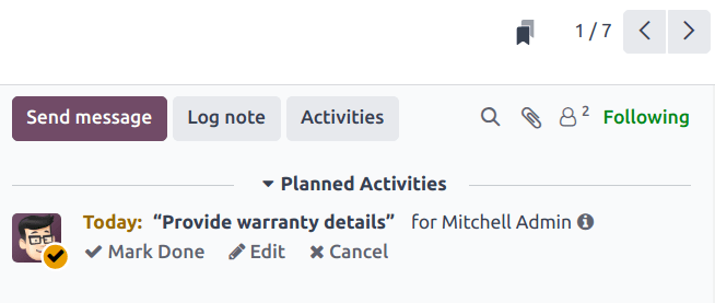
The Knowledge app is represented by the bookmark icon.
Enable Knowledge on a Helpdesk team
To enable the Knowledge feature on a Helpdesk team, go to Helpdesk app ‣ Configuration ‣ Helpdesk Teams and select a team, or create a new one.
When a team has been selected or created, Odoo displays that team’s detail form.
On the team’s detail form, scroll down to the Help Center section. Then, click the box next to Knowledge to activate the Knowledge feature. When clicked, a new field labeled, Article appears.
Clicking the Article field reveals a drop-down menu. At first, there is only one option in the drop-down menu titled Help, which Odoo provides by default. Select Help from the drop-down menu to choose this article.
Tip
To create a new article, go to the Knowledge app, then hover the cursor next to the Workspace section heading, located in the left sidebar. Moving the cursor there reveals a hidden (plus) icon.
Click the (plus) icon to create a new article in the Workspace. Click the Share icon, and slide the Share to Web toggle switch until it reads Article Published. It can then be added to a Helpdesk team.
Once an article has been created and assigned to a Helpdesk team, content can be added and organized through the Knowledge app.
See also
Search articles from a Helpdesk ticket
When members of a Helpdesk team are trying to solve a ticket, they can search through the content in the Knowledge app for more information on the issue.
To search Knowledge articles, open a ticket — either from the Helpdesk app dashboard, or by going to Helpdesk app ‣ Tickets ‣ All Tickets, then select a ticket from the list.
When a ticket is selected, Odoo reveals that ticket’s detail form.
Click the Knowledge (bookmark) icon, located at the top-right of the page, to open a pop-up search window.
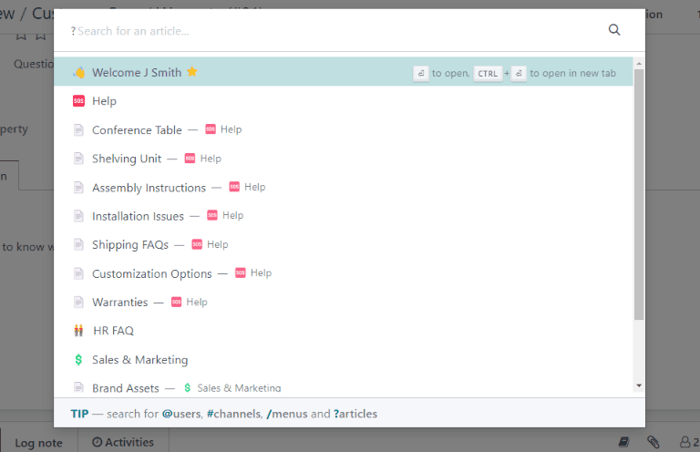
Tip
Knowledge articles can also be searched by pressing Ctrl + K to open the command palette, then typing ?, followed by the name of the desired article.
When Odoo reveals the desired article, click it, or highlight the Article title, and press Enter. This will open the article in the Knowledge application.
To open the article in a new tab, press Ctrl + Enter.
Tip
If a more in-depth search is required, press Alt + B. That reveals a separate page, in which a more detailed search can occur.
Share an article to the Help Center
To make a Knowledge article available to customers and website visitors, it must be published.
Important
Even though the Help article has been enabled on a team, Odoo does not share all the nested articles to the web. Individual articles intended for customers must be published for them to be viewable on the website.
To publish an article, navigate to the desired article, by following the above steps, and click the Share icon. This reveals a menu. Slide the toggle button labeled Share to Web to read Article Published.

Solve tickets with a clipboard box
Clipboard boxes can be added to Knowledge articles to allow content to be reused, copied, sent as messages, or added to the description on a ticket. This allows teams to maintain consistency when answering customer tickets, and minimize the amount of time spent on responding to repeat questions.
Add clipboard boxes to articles
To create a clipboard box, go to Knowledge app ‣ Help. Click on an existing nested article or create a new one by clicking the (plus) icon next to Help.
Type / to open the powerbox, and view a drop-down list of commands. Select or type clipboard. A gray block is then added to the page. Add any necessary content to this block.
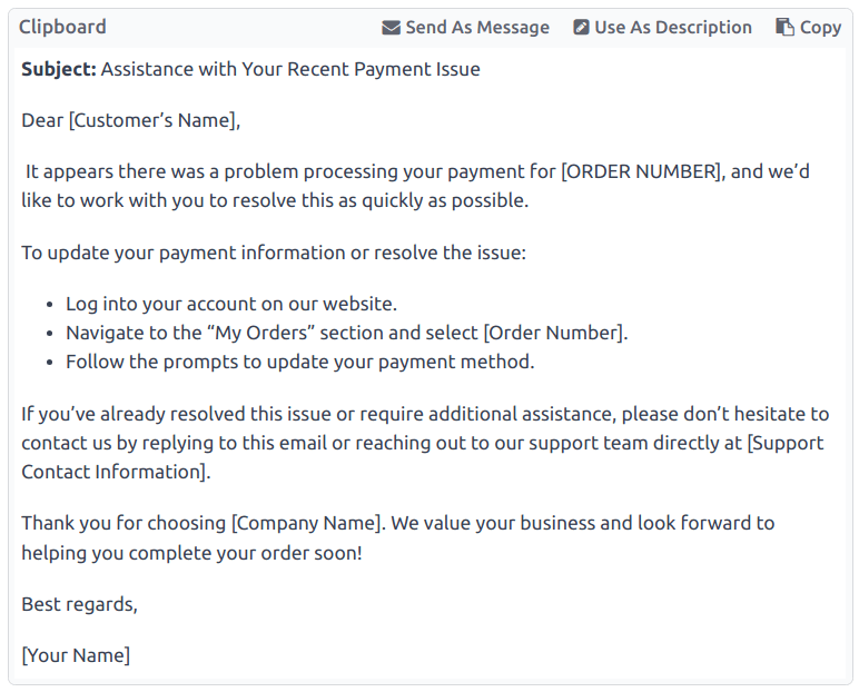
Note
Clipboard boxes only display the Use as description or Send as Message options if they are accessed directly from the Helpdesk.
Use clipboard boxes in tickets
Clipboard boxes can be used to respond directly to a Helpdesk ticket as a message, or to add information to the ticket’s description.
To use clipboard boxes in a Helpdesk ticket, first, open a ticket, either from the Helpdesk dashboard or by going to Helpdesk app ‣ Tickets ‣ All Tickets and selecting a ticket from the list.
Click on the Knowledge (bookmark) icon in the top-right corner. This opens a search window. In this search window, select, or search, for the desired article. Doing so reveals that article page in the Odoo Knowledge application.
To use a clipboard box to respond to a ticket, click Send as message in the upper-right corner of the clipboard box, located in the body of the article.
Doing so opens a Compose Email pop-up window. In this window, select the recipients, make any necessary additions or edits to the clipboard content, then click Send.
Tip
To use a clipboard box to add information to a ticket’s description, click Use as description in the upper-right corner of the clipboard box, located in the body of the article. Doing so does not replace the existing text in a ticket’s description. The content from the clipboard box is added as additional text.
Community Forum
A Community Forum provides a space for customers to answer each other’s questions and share information. By integrating a forum with a Helpdesk team, tickets submitted by customers can be converted to posts and shared.
Enable forums on a Helpdesk team
To enable Community Forums on a Helpdesk team, start by navigating to Helpdesk app ‣ Configuration ‣ Helpdesk Teams and select a team, or create a new one.
Selecting or creating a team reveals that team’s detail form. Scroll down to the Help Center section of features, and enable Community Forum, by checking the box beside it.
When activated, a new field labeled Forums appears beneath.
Click the empty Forums field to reveal a drop-down menu. By default, there is only one option to begin with, labeled Help. That is the option Odoo automatically created when the Community Forums feature was enabled. Select Help from the drop-down menu to enable that forum.
To create a new forum, type a name into the blank Forums field, then click the Create and Edit option. Multiple forums can be selected in this field.
See also
Create a forum post from a Helpdesk ticket
When a Helpdesk team has a Forum enabled, tickets submitted to that team can be converted to forum posts.
To do that, select a ticket, either from a team’s pipeline or from Tickets ‣ All Tickets in the Helpdesk application.
At the top of the ticket detail form, click the Share on Forum button.
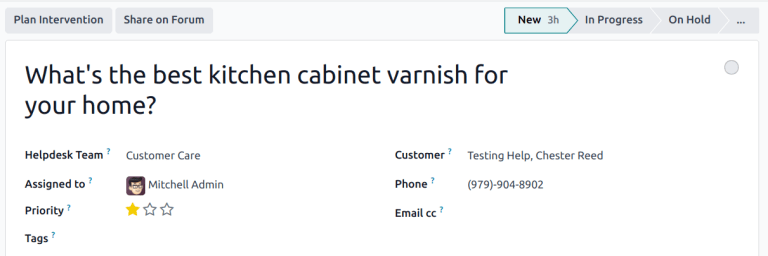
When clicked, a pop-up window appears. Here, the Forum post and Title can be edited to correct any typos, or modified to remove any proprietary or client information.
Tags can also be added to help organize the post in the forum, making it easier for users to locate during a search. When all adjustments have been made, click Create and View Post.
Create a Helpdesk ticket from a forum post
Forum posts submitted by portal users can be converted to Helpdesk tickets.
To create a ticket, navigate to a forum post, and click the (ellipsis) icon. Then, click Create Ticket.

This opens a Create Ticket pop-up. Make any necessary edits to the Create Ticket field. Then, confirm the Helpdesk Team the ticket should be assigned to.
Click Create & View Ticket or Create Ticket.
Note
The original forum post is linked in the chatter on the new ticket.
eLearning
Odoo eLearning courses offer customers additional training and content in the form of videos, presentations, and certifications/quizzes. Providing additional training enables customers to work through issues and find solutions on their own. They can also develop a deeper understanding of the services and products they are using.
Enable eLearning courses on a Helpdesk team
To enable eLearning courses on a Helpdesk team, go to Helpdesk app ‣ Configuration ‣ Helpdesk Teams and select a team, or create a new one.
On the team’s settings page, scroll to the Help Center section, and check the box next to eLearning. A new field appears below, labeled Courses.
Click the empty field next to Courses beneath the eLearning feature to reveal a drop-down menu. Select an available course from the drop-down menu, or type a title into the field, and click Create and edit to create a new course from this page. Multiple courses can be assigned to a single team.
Create an eLearning course
A new eLearning course can be created from the Helpdesk team’s settings page, as in the step above, or from the eLearning app.
To create a course directly through the eLearning application, navigate to eLearning ‣ New. This reveals a blank course template that can be customized and modified as needed.
On the course template page, add a Course Title, and below that, Tags.
Click on the Options tab.
Under Access Rights, select which users are able to view and enroll in the course.
The Show Course To field defines who can access the courses. The Enroll Policy field specifies how they can register for the course.
Under Display, choose the preferred course Type.
Add content to an eLearning course
To add content to a course, click the Content tab and select Add Content. Choose the Content Type from the drop-down menu and upload the file, or paste the link, where instructed. Click Save when finished. Click Add Section to organize the course in sections.
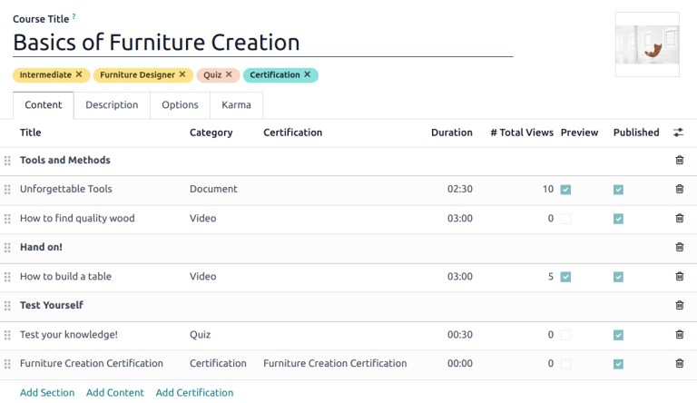
Note
In order to add a certification to a course, go to eLearning ‣ Configuration ‣ Settings, check the box labeled Certifications, and Save to activate the setting.
See also
Publish an eLearning course
To allow customers to enroll in a course, both the course and the contents must be published.
Tip
If the course is published, but the contents of the course are not published, customers can enroll in the course on the website, but they are not able to view any of the course content. Knowing this, it may be beneficial to publish the course first, if the course contents are intended to be released over time, such as classes with a weekly schedule.
To make the entire course available at once, each piece of course content must be published first, then the course can be published.
To publish a course, choose a course from the eLearning dashboard. On the course template page, click the Go to Website smart button.
This will reveal the front end of the course’s web page. At the top of the course web page, move the Unpublished toggle switch to Published.
Publish eLearning course contents from the back-end
To publish eLearning course content from the back-end, choose a course from the eLearning dashboard. On the course template page, click the Published Contents smart button.
Doing so reveals a separate page displaying all the published content related to that course. Remove the default Published filter from the search bar in the upper-right corner, to reveal all the content related to the course - even the non-published content.
Click the (list) icon to switch to list view.
While in list view, there is a checkbox on the far-left of the screen, above the listed courses, to the left of the Title column title. When that checkbox is clicked, all the course contents are selected at once.
With all the course content selected, click any of the boxes in the Is Published column. This reveals a pop-up window, asking for confirmation that all selected records are intended to be published. Click Confirm to automatically publish all course content.
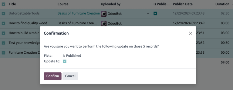
On this page
Get Help
Contact Support Ask the Odoo Community
EN
Odoo 18
Service level agreements (SLA)
A service level agreement (SLA) defines the level of support a customer can expect from a service provider. SLAs provide a timeline that tells customers when they can expect results and keeps the support team on target.
Note
The SLA Policies feature is enabled by default on newly created Helpdesk teams.
To turn off the feature, or edit the working hours, navigate to Helpdesk app ‣ Configuration ‣ Helpdesk Teams. Click on a team to open that team’s configuration page.
From here, scroll to the Performance section. To turn off the SLAs feature for the team, clear the SLA Policies checkbox.
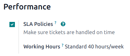
Create a new SLA policy
To create a new policy, go to Helpdesk app ‣ Configuration ‣ SLA Policies, and click New.
Alternatively, go to Helpdesk app ‣ Configuration ‣ Helpdesk Teams, and click on a team. Then, click the SLA Policies smart button at the top of the team’s settings page, and click New.
On the blank SLA policy form, enter a Title and a Description for the new policy, and proceed to fill out the form using the steps below.
Define the criteria for an SLA policy
The Criteria section is used to identify which tickets this policy is applied to.
Fill out the following fields to adjust the selection criteria:
Note
Unless otherwise indicated, multiple selections can be made for each field.
- Helpdesk Team: A policy can only be applied to one team. This field is required.
- Priority: The priority level for a ticket is identified by selecting one, two, or three of the (star) icons, representing the priority level on the Kanban card or on the ticket itself. The SLA is only applied after the priority level has been updated on the ticket to match the SLA criteria. If no selection is made in this field, this policy only applies to tickets marked as Low Priority, meaning those with zero (star) icons.
- Tags: Tags are used to indicate what the ticket is about. Multiple tags can be applied to a single ticket.
- Customers: Individual contacts or companies may be selected in this field.
- Services: This field is available only if a team has the Timesheets app enabled. This allows the ticket to link directly to a specific line on a sales order, which must be indicated on the ticket in the Sales Order Items field.
Example
A support team needs to address urgent issues for VIP customers within one business day.
The new policy, titled 8 Hours to close, is assigned to the VIP Support team. It only applies to tickets that are assigned three (star) icons, which equates to an Urgent priority level.
At the same time, the tickets can be related to multiple issues, so the policy applies to tickets with Repair, Service, or Emergency tags.
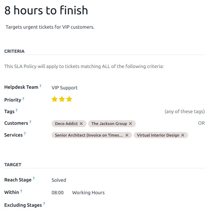
Establish a target for an SLA policy
A target is the stage a ticket needs to reach, and the time allotted to reach that stage, in order to satisfy the SLA policy. Any stage assigned to a team may be selected for the Reach Stage field.
Time spent in stages selected in the Excluding Stages field are not included in the calculation of the SLA deadline.
Example
An SLA titled 8 Hours to Close tracks the working time before a ticket is completed, and would have Solved as the Reach Stage. Simultaneously, an SLA titled 2 Days to Start tracks the working time before work on a ticket has begun, and would have In Progress as the Reach Stage.
Meet SLA deadlines
As soon as it is determined that a ticket fits the criteria of an SLA policy, a deadline is calculated. The deadline is based on the creation date of the ticket, as well as the targeted working hours.
Note
The value indicated next to the Working Hours field of an SLA policy is used to determine the deadline. By default, this is determined by the value set in the Company Working Hours field under Settings app ‣ Employees ‣ Work Organization.
The deadline is then added to the ticket, as well as a tag indicating the name of the SLAs applied.
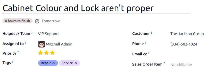
When a ticket satisfies an SLA policy, the SLA tag turns green, and the deadline disappears from view on the ticket.
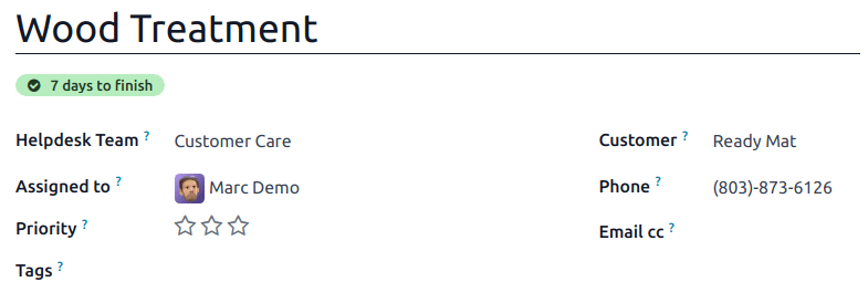
Important
If a ticket fits the criteria for more than one SLA, the earliest occurring deadline is displayed on the ticket. After that deadline has passed, the next deadline is displayed.
If the SLA deadline passes and the ticket has not moved to the Reach Stage, the SLA tag turns red. After the SLA has failed, the red tag stays on the ticket, even after the ticket is moved to the Reach Stage.
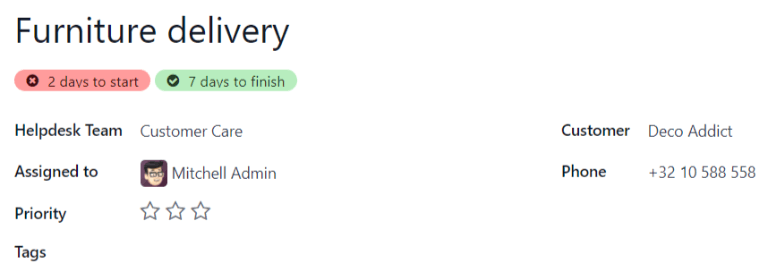
Analyze SLA performance
The SLA Status Analysis report tracks how quickly an SLA is fulfilled, as well as the performance of individual team members. Navigate to the report, and corresponding pivot table, by going to Helpdesk app ‣ Reporting ‣ SLA Status Analysis.
Pivot view
By default, the report displays in a Pivot view. Any SLA policies in the database with tickets that failed to fulfill a policy, are in progress, or have satisfied a policy are listed. By default, they are grouped by team and ticket count.
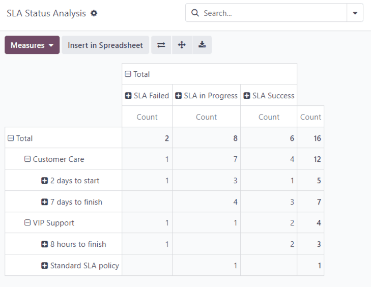
The pivot view aggregates data, which can be manipulated by adding measures and filters.
To change the display, or add additional measurements, click the Measures button to reveal a drop-down menu of reporting criteria, and choose from the options available.
Whenever a measurement is picked, a (check) icon appears in the drop-down menu to indicate that the measurement is included, and a corresponding new column emerges in the pivot table to show the relevant calculations.
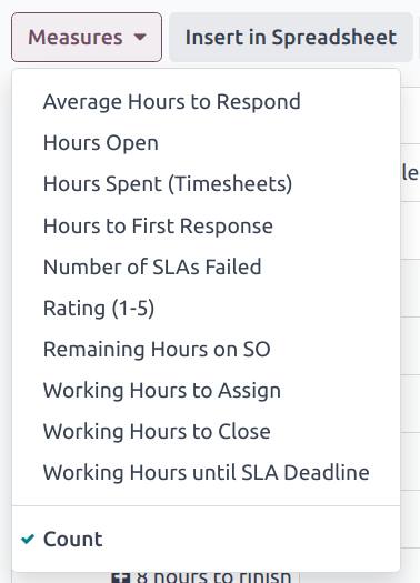
To add a group to a row or column, click the (plus) icon next to the policy name and then select one of the groups. To remove one, click the (minus) icon next to the policy name.
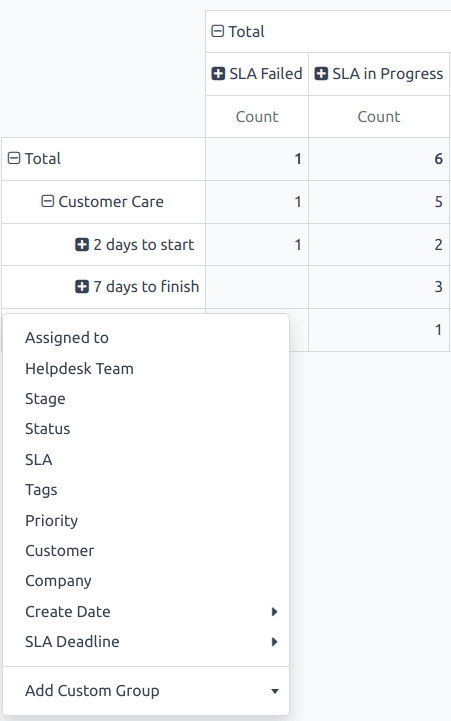
Graph view
Switch to the graph view by selecting the (graph view) icon at the top of the screen. To switch between the different charts, select the related icon at the top of the chart, while in graph view.
Bar ChartLine ChartPie Chart
A bar chart can deal with larger data sets and compare data across several categories.
Tip
Both the bar chart and line chart can utilize the stacked view option. This presents two or more groups of data on top of each other, instead of next to each other, making it easier to compare data. While viewing either a bar chart or line chart, click the (stacked) icon to toggle the stacked view option on or off.
Cohort view
The cohort view is used to track the changes in data over a period of time. To display the SLA Status Analysis report in a cohort view, click the (cohort) icon, next to the other view options.
The cohort view examines the life cycle of data over time.
See also
On this page
Get Help
Contact Support Ask the Odoo Community
EN
Odoo 18
Reporting
Reports in Odoo Helpdesk provide the opportunity to manage employee workloads, identify areas for improvement, and confirm if customer expectations are being met.
Available reports
Details about the reports available in Odoo Helpdesk can be found below. To view the different reports, go to Helpdesk app ‣ Reporting, and select one of the following: Tickets Analysis, SLA Status Analysis, or Customer Ratings.
Tickets Analysis
The Tickets Analysis report (Helpdesk app ‣ Reporting ‣ Tickets Analysis) provides an overview of every customer support ticket in the database.
This report is useful for identifying where teams are spending the most time, and helps determine if there is an uneven workload distribution among the support staff. The default report counts the number of tickets per team and groups them by stage.
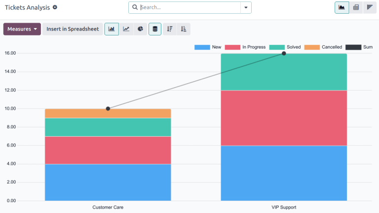
Alternative measures can be selected to track where the most time is spent at different points in the workflow. To change the measures used for the report that is currently displayed, or to add more, click the Measures button, and select one or more options from the drop-down menu:
- Average Hours to Respond: average number of working hours between a message sent from the customer and the response from the support team. This does not include messages sent when the ticket was in a folded stage.
- Hours Open: number of hours between the date the ticket was created and the closed date. If there is no closed date on the ticket, the current date is used. This measure is not specific to working hours.
- Hours Spent (Timesheets): number of Timesheet hours logged on a ticket. This measure is only available if Timesheets are enabled on a team, and the current user has the access rights to view them.
- Hours to First Response: number of working hours between the date the ticket was received and the date on which the first message was sent. This does not include email sent automatically when a ticket reaches a stage.
- Rating (1-5): number out of five to represent customer feedback (Dissatisfied = 1, Okay/Neutral = 3, Satisfied = 5).
- Remaining Hours on SO: hours remaining on a linked sales order.
- Working Hours to Assign: number of working hours between the date the ticket was created and when it was assigned to a team member.
- Working Hours to Close: number of working hours between the date the ticket was created and the date it was closed.
- Working Hours until SLA Deadline: number of working hours remaining to reach the last SLA deadline on a ticket.
- Count: number of tickets in total.
Note
Working hours are calculated based on the default working calendar. To view or change the working calendar, go to the Settings application and select Employees ‣ Company Working Hours.
SLA Status Analysis
The SLA Status Analysis report (Helpdesk app ‣ Reporting ‣ SLA Status Analysis) analyzes the performance of individual SLA (Service Level Agreement) policies.
By default, this report is filtered to show the number of SLAs failed, in progress, and the number that have been successful. The results are grouped by teams.
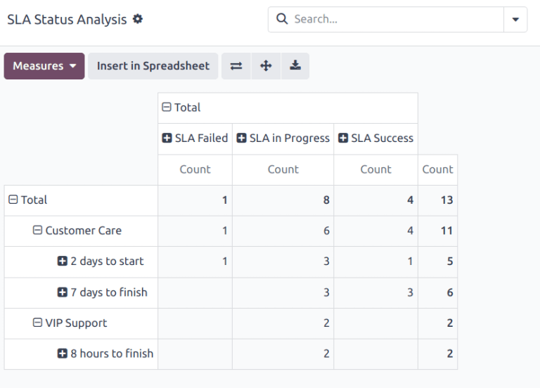
To change the measures used for the report that is currently displayed, or to add more, click the Measures button, and select one or more options from the drop-down menu:
- Average Hours to Respond: average number of working hours between a message sent from the customer and the response from the support team. This does not include messages sent when the ticket was in a folded stage.
- Hours Open: number of hours between the date the ticket was created and the closed date. If there is no closed date on the ticket, the current date is used. This measure is not specific to working hours.
- Hours Spent (Timesheets): number of Timesheet hours logged on a ticket. This measure is only available if Timesheets are enabled on a team, and the current user has the access rights to view them.
- Hours to First Response: number of working hours between the date the ticket was received and the date on which the first message was sent. This does not include email sent automatically when a ticket reaches a stage.
- Number of SLA Failed: number of tickets that have failed at least one SLA.
- Rating (1-5): number value representing customer feedback (Dissatisfied = 1, Okay/Neutral = 3, Satisfied = 5).
- Remaining Hours on SO: hours remaining on a linked sales order.
- Working Hours to Assign: number of working hours between the date the ticket was created and when it was assigned to a team member.
- Working Hours to Close: number of working hours between the date the ticket was created and the date it was closed.
- Working Hours to Reach SLA: number of working hours between the date the ticket was created and the date the SLA was satisfied.
- Count: number of tickets in total.
See also
Service Level Agreements (SLA)
Customer Ratings
The Customer Ratings report (Helpdesk app‣ Reporting ‣ Customer Ratings) displays an overview of the ratings received on individual support tickets, as well as any additional comments submitted with the rating.
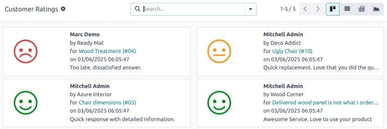
Click on an individual rating to see additional details about the rating submitted by the customer, including a link to the original ticket.
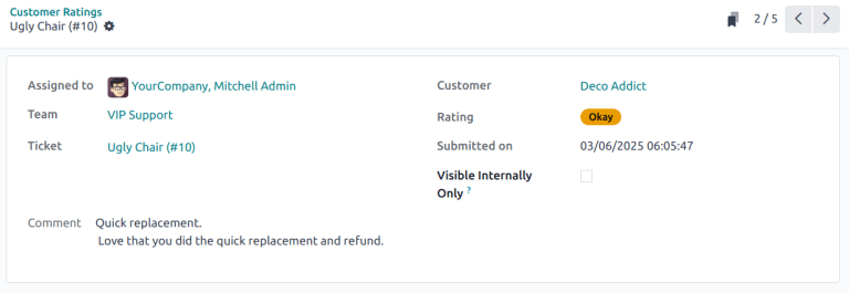
Tip
On the rating’s details page, tick the Visible Internally Only checkbox to hide the rating from public and portal users.
The Customer Ratings report is displayed in a Kanban view by default, but can also be displayed in graph, list, or pivot view.
See also
Use cases
Assessing performance based on customer priority
The Tickets Analysis report can be used to evaluate the time it takes to address high-priority tickets compared to standard ones. This helps ensure that high-priority tickets are resolved promptly, and identifies any discrepancies in response times based on priority.
First, navigate to Helpdesk app ‣ Reporting ‣ Tickets Analysis. Click Measures, then select Working Hours to Close. Click into the search bar, then under Group By, select Priority. Finally, under Filters, select Closed.
Tip
The pivot view is also useful for this version of the report.
Monitoring SLA compliance over time
The SLA Status Analysis report can be used to track SLA compliance trends to identify periods with higher SLA breaches. SLA breaches happen when support teams fail to meet the response or resolution times promised in SLAs, leading to dissatisfied customers, potential financial penalties, and decreased team morale. Identifying these breaches is crucial for tracking real-time performance, uncovering patterns, and addressing root causes—like staffing issues or process inefficiencies.
First, navigate to Helpdesk app ‣ Reporting ‣ SLA Status Analysis. Click the (Graph) icon, then the (Line Chart) icon.
Note
While the SLA Status Analysis report defaults to the pivot view, the line chart view provides a better visual representation for this specific use case.
Click Measures, then select Number of SLAs Failed. Doing so ensures the data on the report shows only information for tickets that failed at least one SLA. Click into the search bar, then under Group By, select SLA Deadline, and select a time frame, either Month, Week, or Day. This option shows when the highest number of tickets with SLAs are failing, allowing the team to identify patterns, and prepare for potential issues.
Tip
The time frame selected for this report may vary depending on a few factors, including the amount of tickets received on a regular basis, the number of SLAs enabled in the database, and the workload of the team. It is worth experimenting to see what option delivers the most insights.
See also
On this page
Get Help
Contact Support Ask the Odoo Community
EN
Odoo 18
Customer ratings
Asking customers to rate the support they received from a Helpdesk team provides an opportunity to gauge team performance and track customer satisfaction. Ratings can be published on the portal, providing customers with a general overview of the team’s performance.
Enable customer ratings on Helpdesk teams
To enable customer ratings on a helpdesk team, navigate to Helpdesk app ‣ Configuration ‣ Helpdesk Teams. Select a team from the list and click on it to open the settings page. Scroll to the Performance section, and tick the Customer Ratings checkbox.
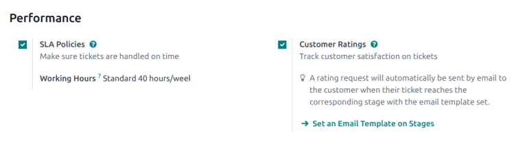
Set a ratings request email template on a stage
To automatically request ratings from customers once their tickets have closed, an email template should be added to the appropriate stage.
After the Customer Ratings setting has been enabled on the team’s settings page, click the Set an Email Template on Stages link. Select a stage from the list, or click New to create a new stage.
Important
Customers should only be asked to rate tickets once an issue has been resolved and their ticket is closed. Therefore, a ratings request email should only be added to a stage that is folded in the Kanban, as tickets in a folded stage are considered closed.
On the stage’s settings page, select the template, Helpdesk: Ticket Rating Request in the Email Template field. This template has been preconfigured with ratings customers can use to provide feedback. To view the template, click the arrow button to the right of the field.
After the template is added to the stage, it automatically sends a message when a ticket is moved to that stage. Customers are then asked to rate the support they received with colored icons.
- Green smiling face - Satisfied
- Yellow neutral face - Okay
- Red frowning face - Dissatisfied
After selecting a rating, customers are taken to a webpage where they can provide specific written feedback to support their rating. The rating is then submitted, and the rating, as well as any additional comments, are added to the chatter on the ticket.
Tip
Customer ratings can also be viewed through the Customer Ratings report. To view this report, go to Helpdesk app ‣ Reporting ‣ Customer Ratings.
See also
Publish ratings on the customer portal
After enabling the Customer Ratings setting, an option to publish ratings on the team’s website appears. Enabling this setting provides portal users with an overview of the ratings the team has received over the last thirty days. Specific written feedback will not be included; only statistics of the team’s performance will be visible.
Important
To display ratings on the customer portal, a team must have their visibility setting set to Invited portal users and all internal users (public). To enable this setting, navigate to Helpdesk app ‣ Configuration ‣ Helpdesk Teams. Select a team from the list and click on it to open the settings page. Scroll to the Visibility & Assignment section, and tick the Invited portal users and all internal users (public) checkbox.
Next, to publish the ratings, go to Helpdesk app‣ Configuration ‣ Helpdesk Teams and select a team. Scroll to Performance and tick the checkbox for Publish this team’s ratings on your website.
To view the ratings for a team, a customer will log into the portal and navigate to one of their tickets. After clicking on the team name in the Managed By field, they will be directed to a page with the team’s ratings over the past thirty days.

See also
Manually hide individual ratings
Individual ratings can be manually hidden from the portal. This allows for specific ratings to be kept out of the performance metrics shared with customers.
To make a rating visible only to internal users, navigate to the page for a rating. This can be done in one of the following ways:
- Go to Helpdesk app ‣ Reporting ‣ Customer Ratings and click on one of the Kanban cards for an individual rating.
- Navigate to Helpdesk app‣ Tickets ‣ All Tickets and remove the Open filter from the search bar. Then filter by Satisfied, Okay and/or Dissatisfied. Select a ticket from the results. Click the Rating smart button.
Once on the rating details page, check the Visible Internally Only box.

See also
On this page
Get Help
Contact Support Ask the Odoo Community
EN
Odoo 18
After-Sales services
After-Sales services can be configured in the Helpdesk application for individual teams. Once enabled, users can issue refunds, generate coupons, process returns, and schedule repairs or field service interventions directly from a ticket.
Set up after-sales services
Start by enabling the after-sales services on a specific Helpdesk team, by going to Helpdesk app ‣ Configuration ‣ Helpdesk Teams and click on the team the services should be applied to. Then, scroll to the After-Sales section on the team’s settings page, and choose which of the following options to enable:
- Refunds: issues credit notes to refund a customer, or adjust the remaining amount due.
- Coupons: offers discounts and free products through an existing coupon program.
- Returns: initiates a product return from a customer through a reverse transfer.
- Repairs: creates repair orders for broken or faulty products.
- Field Service: plans onsite intervention through the Field Service application.
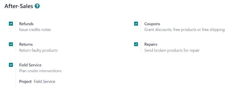
The services that are enabled can vary based on the type of support a team provides.
Danger
Since all the after-sales services in Odoo require integration with other applications, enabling any of them may result in the installation of additional modules or applications. Installing a new application on a One-App-Free database triggers a 15-day trial. At the end of the trial, if a paid subscription has not been added to the database, it will no longer be accessible.
Issue refund with credit note
A credit note is a document issued to a customer informing them that they have been credited a certain amount of money. They can be used to provide a full refund to a customer, or to adjust any remaining amount due. While they are usually created through the Accounting or Invoicing applications, they can be created through a Helpdesk ticket, as well.
Important
Invoices must be posted before a credit note can be generated.
To create a credit note, navigate to a ticket on the Helpdesk app, and click the Refund button in the top-left corner of the ticket form. This opens a Refund pop-up window.
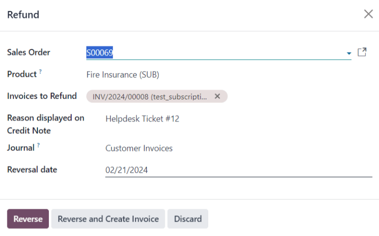
Fill out the fields with the necessary information:
- Sales Order: if a sales order was referenced on the original ticket, it automatically populates in this field.
- Product: the product the ticket is about. If an item is selected in this field, only the sales orders, deliveries, and invoices including this product can be selected.
- Lot/Serial Number: this field is only visible if the Product selected has associated lot or serial numbers.
- Invoices to Refund: this field is required. If no invoices are available in the drop-down, it indicates this customer currently has no posted invoices, or the Product has no related invoices.
- Reason displayed on Credit Note: this field automatically populates with the ticket number, though it can be edited with additional information.
- Journal: the accounting journal where the credit note should be posted. After an invoice is selected, this field defaults to the journal listed on the original invoice, though it can be changed, if necessary.
- Reversal date: when this field is clicked, use the pop-up calendar that appears to select a date for the credit note invoice. This field is required.
After the necessary fields are filled in, click Reverse or Reverse and Create Invoice.
Reverse creates a credit note in a draft state that can be edited before it is posted. This option can be used to provide a partial refund.
Reverse and Create Invoice creates a credit note that is automatically posted as well as an invoice in a draft state. The invoice contains the same information as the original invoice, though this information can be altered.
Once the credit note has been posted, a Credit Notes smart button is added to the Helpdesk ticket.
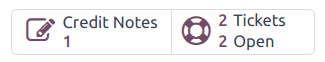
See also
Generate coupons from a ticket
Coupons can be used to alter the price of products or orders. Conditional rules define the usage constraints of a coupon. Coupon Programs are configured in the Sales, Point of Sale, or Website applications.
Important
The eCommerce module must be installed to create coupon codes from the Website.
To generate a coupon, open a Helpdesk ticket and click on the Coupon button in the top-left corner. Select an option from the Coupon Program drop-down menu in the Generate a Coupon pop-up window that appears.
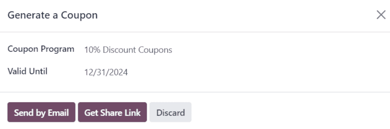
Note
To create a new Coupon Program, navigate to Sales app ‣ Products ‣ Discount & Loyalty and click New. To make the program available to share with Helpdesk customers, the Program Type must be set to Coupons. This generates single-use coupon codes that grant immediate access to rewards and discounts.
Coupon programs can also be created in the Point of Sale or Website applications. Refer to discount and loyalty programs for more information.
Click on the Valid Until field, and use the pop-up calendar to select an expiration date for this coupon code. If this field is left blank, the code does not expire.
Click Send by Email to compose an email to send to the customer with the coupon code.
Click Get Share Link to generate a link to send directly to the customer. Doing so opens a Share Coupons pop-up window. Click the Copy button next to the Share Link field and paste the results to any communication with the customer. When the customer uses the link, the code is automatically applied to their cart.
After a Coupon Code has been generated, a Coupons smart button is added to the top of the ticket; click the smart button to view the coupon code, expiration date, and additional information.
See also
Return products
Returns are completed through reverse transfers, which generate new warehouse operations for the returning products. Click the Return button at the top of a ticket to open the Return pop-up window.
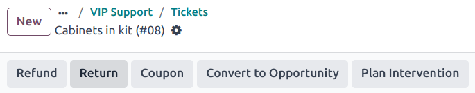
Important
The Return button only appears on a ticket if the customer has a recorded delivery in the database.
Select a Sales Order or Delivery to Return to identify the products that need to be returned.
By default, the quantity matches the validated quantity from the delivery order. Update the Quantity field, if necessary. To remove a line, click the (trash) icon.
Select a Return Location where the items should be directed after the return is completed.
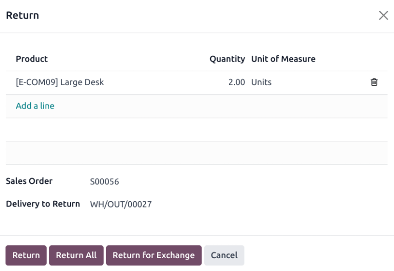
To confirm the return, click Return. This generates a new warehouse operation for the incoming returned products.
To exchange the received item with a new one, click Return for Exchange. Doing so generates a warehouse operation in Odoo to deliver the replacement product.
Use the breadcrumbs to return to the helpdesk ticket. A new Return smart button can now be accessed at the top of the ticket.
See also
Send products for repair from a ticket
If the ticket is related to an issue with a faulty or broken product, a repair order can be created from the Helpdesk ticket, and managed through the Repairs application.
To create a new repair order, open a Helpdesk ticket and click on the Repair button in the top-left corner. This opens a Repair Reference form.
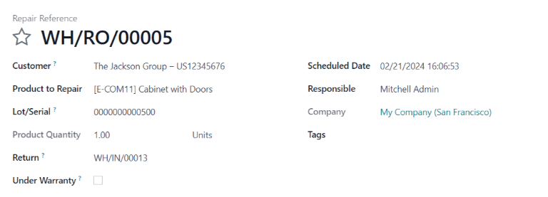
Fill out the fields with the necessary information:
- Customer: this field carries over from the ticket, though a new contact can been selected from the drop-down menu.
- Product to Repair: if a product was specified in the Product field on the ticket, it is added to this field automatically. If not, click into the field to select a product from the drop-down menu.
- Lot/Serial: this field is only visible if the products being repaired are tracked, via lot or serial numbers.
- Return: return order from which the product to be repaired comes from.
- Under Warranty: if this box is checked, the sale price for all products from the repair order are set to zero.
- Scheduled Date: this field defaults to the current date. To select a new date, click into the field and select a date using the drop-down calendar.
- Responsible: assign a user from the drop-down menu to manage the repair.
- Tags: click into this field to assign an existing tag or create a new one. Multiple tags can be assigned.
If parts are required for the repair, they can be added in the Parts tab. Additional information for the internal repair team can be added to the Repair Notes tab.
Once the form is complete, click Confirm Repair. To create, edit, and send a quote for this repair, click Create Quotation.
A Repairs smart button is then added to the ticket, linking to the repair order.
Tip
Once a user creates a repair order from a Helpdesk ticket, they can access it through the ticket’s Repair smart button, or from a link in the chatter, even if they do not have access rights to the Repair application.
Create field service task from a ticket
On-site interventions can be planned from a ticket and managed through the Field Service application. Customers with portal access are able to track the progress of a Field Service task the same as they would a Helpdesk ticket.
Tip
To change the default Field Service project for the team, go to Helpdesk app ‣ Configuration ‣ Helpdesk Teams to select a Team. Scroll to the After-Sales section, and choose a project under Field Service.
To create a new Field Service task, navigate to a Helpdesk ticket. Click Plan Intervention to open the Create a Field Service task pop-up window.
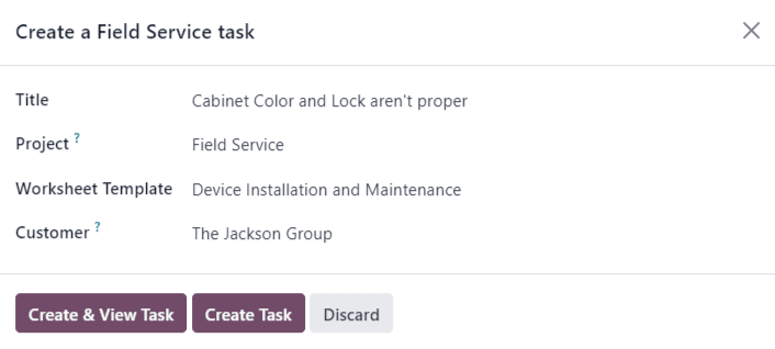
Confirm or update the task Title.
The Project field on the Create a Field Service task pop-up window defaults to the same Field Service project that was identified on the team’s settings page. To change the project for this specific task, select one from the Project field.
If applicable, select a Worksheet Template from the drop-down menu.
Note
Field Service Worksheets are reports that detail the work completed during an on-site task. When work is completed, worksheets are signed by the customer to confirm the job is done and the customer is satisfied.
If the Field Service project assigned to the Helpdesk team has worksheets enabled, and has a default template assigned, that template automatically appears in the Worksheet Template drop-down field. Even so, the field can be edited, and another template can be selected.
If the Field Service project does not have worksheets enabled, the Worksheet Template field does not appear on the Create a Field Service task pop-up window.
Click Create Task or Create & View Task.
After the task is created, a Tasks smart button is added to the ticket, linking the Field Service task to the ticket.
See also
On this page
Get Help
Contact Support Ask the Odoo Community
EN
Odoo 18
Close tickets
After work has been completed on a ticket in the Helpdesk app, there are several ways it can be closed. Manually closing solved tickets keeps the pipeline up to date, while automatically closing inactive tickets prevents unnecessary blocking issues. Allowing customers to close their own tickets minimizes confusion around whether an issue is considered solved or not. This results in increased operational capacity for support teams, and higher customer satisfaction.
Manually close solved tickets
As work on a ticket progresses, it is moved along to the next stage in the pipeline. When the issue is solved, the ticket is moved to a folded stage. This marks the ticket as closed.
To fold a stage, navigate to the Helpdesk dashboard and click on a team to open the pipeline. Hover over a stage’s heading, and then click the (gear) icon that appears in the top-right corner of that stage’s Kanban column.
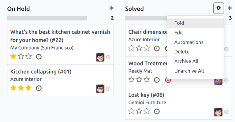
Warning
Clicking the gear icon also displays the option to Fold the stage. This setting folds the stage temporarily to simplify the Kanban view. This does not close the tickets in this stage. It also does not permanently fold the stage. If a stage needs to be folded so the tickets can be marked as closed, continue following the steps below.
From the menu that appears, select Edit. This opens the stage’s settings. Tick the checkbox labeled Folded in Kanban, and then Save & Close to confirm the changes. Now, tickets are closed once they reach this folded stage.

Automatically close inactive tickets
Tickets that are inactive for a set period of time can be automatically closed. At that point, they are moved to a folded stage.
Go to the team’s settings page by going to Helpdesk ‣ Configuration ‣ Helpdesk Teams. Under the Self-Service section, enable Automatic Closing.
If only one of the team’s stages is folded in the Kanban view, it is the default selection in the Move to Stage field. If the team has more than one folded stage, the stage that occurs first in the pipeline is the default for this field. If no stage is folded, the default selection is the last stage in the pipeline.
The After days of inactivity field defaults to 7, but can be adjusted if necessary.
Warning
The After days of inactivity field does not take the working calendar into account when tracking the amount of time a ticket has been inactive.
If only certain stages should be used to track days of inactivity, they can be added to the In Stages field.
Example
A team’s pipeline is created with the following stages:
- New
- In Progress
- Customer Feedback
- Closed
Tickets can linger in the Customer Feedback stage, because once an issue is solved, customers may not respond immediately. At that point, the tickets can be closed automatically. However, tickets in the New and In Progress stages may remain inactive due to assignment or workload issues. Closing these tickets automatically would result in issues going unsolved.
Therefore, the Automatic Closing settings would be configured as below:
- Automatic Closing: checked
- Move to Stage: Solved
- After 7 days of inactivity
- In Stages: Customer Feedback
Allow customers to close their own tickets
Enabling the Closure by Customers setting allows customers to close their own tickets when they determine that their issue has been resolved.
Start by navigating to Helpdesk ‣ Configuration ‣ Helpdesk Teams and select a team. On the team’s settings page, scroll to the Self-Service section and tick the checkbox for Closure by Customers.
After the ticket closing settings are enabled, a Close Ticket button is available for customers when they view their ticket through the customer portal.
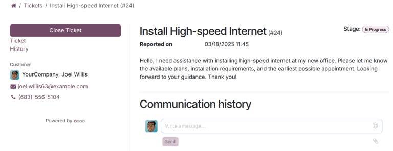
Note
Customers are able to view their tickets by clicking the View the ticket link they receive by email. The link is included in the Request Acknowledgment template, which is added to the first stage of a team by default. This link does not require a customer to have access to the portal to view or respond to their ticket.
Customers with access to the portal are able to view their tickets under My Account ‣ Tickets.
On this page
Get Help
Contact Support Ask the Odoo Community
EN
Odoo 18
Track and bill time
Odoo Helpdesk provides teams with the ability to track the amount of hours spent working on a ticket, and to bill a customer for that time. Through integrations with the Sales, Timesheets, Project and Accounting applications, customers can be charged once the work is completed, or before it has even begun.
Warning
Since the Track & Bill Time features require integration with other applications, enabling them may result in the installation of additional modules or applications.
Installing a new application on a One-App-Free database triggers a 15-day trial. At the end of the trial, if a paid subscription has not been added to the database, it will no longer be active or accessible.
Configure track and bill time features
Before a customer can be invoiced for support services, the Track & Bill Time features must be enabled on each Helpdesk team individually.
Enable track and bill time on a helpdesk team
To view and enable the Track & Bill Time features on a Helpdesk team, first navigate to Helpdesk app ‣ Configuration ‣ Helpdesk Teams. Then, select a team from the list, or create a new one. This reveals a team’s settings page.
On the team’s settings page, scroll to the Track & Bill Time section. Check the boxes labeled Timesheets and Time Billing.
Once the Timesheets box is checked, a new field appears, labeled Project.
Note
If this is the first time this feature has been enabled on this database, the page may need to be manually saved and refreshed before the Project field appears.
The project selected in this field represents where all the timesheets for this team’s tickets are recorded. Click into the Project drop-down menu to select a project.
To create a new project where the timesheets are recorded, click into the Project drop-down menu, type a name for the project, and then click Create from the drop-down menu beneath.
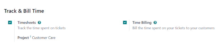
Configure service products
When the Time Billing feature is enabled, a new product is created in the Sales app called Service on Timesheets. This product can be found under Sales app‣ Products ‣ Products. Then, search for Service on Timesheets in the Search… bar. This is the product that is used when invoicing for post-paid support services after they have been completed.
Select Service on Timesheets from the product page. This reveals the product detail form. The product is configured with the Product Type set to Service and the Invoicing Policy set to Based on Timesheets. Make any necessary changes to the product record, such as the Cost or Sales Price.
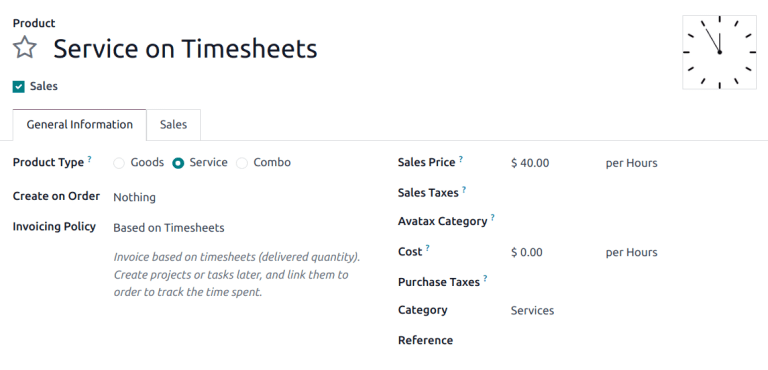
In order to invoice for support services before the work has been completed (also known as prepaid support services), a separate product with a different invoicing policy must be created.
To create a new service product, go to Sales app ‣ Products ‣ Products, and click New. This reveals a blank product detail form.
On the new product form, add a Product Name, and set the Product Type to Service. Then, set the Invoicing Policy to Prepaid/Fixed Price. This means an invoice can be generated and payment can be received for this product before any timesheets entries have been recorded for these services.
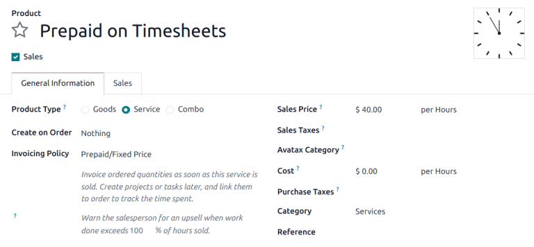
Finally, set the Sales Price, and confirm that the Unit of Measure is set to Hours.
Invoice prepaid support services
When support services are billed on a fixed price, an invoice can be created before any work is completed on the issue. In this case, a service product with the Invoicing Policy set to Prepaid/Fixed Price would be used, just like the section above.
Create a sales order with prepaid product
To invoice a customer for prepaid support services, first create a sales order (SO) with the support services product. To do this, go to Sales app ‣ Orders ‣ Quotations. Then, click New to reveal a blank quotation form.
Then, fill out the quotation form with the customer information.
Go to the Order Lines tab of the quotation and click Add a Product. Then, select the prepaid services product configured in the steps above. Update the Quantity field with the number of hours.
After updating any other necessary information, Confirm the quotation. This converts the quotation into an SO.
Create and send an invoice for prepaid services
Once the SO has been confirmed, click the Create Invoice button. This opens a Create invoices pop-up window.
If no down payment is collected, the Create Invoice type can remain as Regular Invoice. If a down payment is collected, choose between either Down payment (percentage) or Down payment (fixed amount).
When the necessary information has been entered, click Create Draft Invoice.
The invoice can then be sent to the customer for payment.
Create helpdesk ticket for prepaid services
To create a Helpdesk ticket for prepaid services, navigate to Helpdesk and click the Tickets button to reveal a specific team’s pipeline. Click New to create a new ticket.
On the blank ticket form, create a ticket Title, and enter the Customer information.
When the customer name is added, the Sales Order Item field automatically populates with the most recent prepaid sales order item that has time remaining.
Track hours on helpdesk ticket
Time spent working on a Helpdesk ticket is tracked on the Timesheets tab on the specific ticket.
On the ticket detail form, click on the Timesheets tab and click Add a line. Choose an Employee, add a Description of the task, and enter the number of Hours Spent.
As new lines are added to Timesheets tab, the Remaining Hours on SO field, at the bottom-right of the tab, is automatically updated.
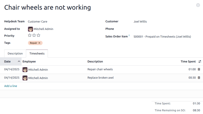
Note
If the number of hours on the Timesheets tab exceeds the number of hours sold, the Remaining Hours of SO turns red.
As hours are added to the Timesheets tab, they are automatically updated in the Delivered field on the SO, as well.
Invoice post-paid support services
When support services are billed based on the amount of time spent on an issue, an invoice cannot be created before the total number of hours required to solve the problem have been entered on a timesheet. In this case, a service product with the Invoicing Policy set to Based on Timesheets would be used, like the one created in the section above.
Create a sales order with a time-tracked product
To invoice a customer for post-paid support services, first create a sales order (SO) with the support services product. To do this, go to Sales app ‣ Orders ‣ Quotations. Then, click New to reveal a blank quotation form.
Fill out the quotation with the customer information.
On the Order Lines tab, click Add a Product. Select the post-paid services product configured in the steps above. After updating any other necessary information, Confirm the quotation.
Important
Unlike with the prepaid services quotation, Odoo does not allow an invoice to be created at this time. That is because no services have been performed; in other words, nothing has been delivered, therefore, there is nothing to invoice.
Create a helpdesk ticket for time-tracked services
To record a Timesheet entry for time-tracker services, go to the Helpdesk app, and select the appropriate team for which these services apply.
If there is already an existing ticket for this issue, select it from the Kanban view. This opens the ticket details form. If there is no existing ticket for this customer issue, click New to create a new ticket and enter the necessary customer information on the blank ticket details form.
After selecting or creating a ticket, go to the Sales Order Item drop-down menu. Select the SO created in the previous step.
Track support hours on a ticket
In order to create an invoice for a product based on timesheets, hours need to be tracked and recorded. At this point, the service is considered delivered. To record hours for this support service, click on the Timesheets tab of the ticket.
Click Add a Line to record a new entry. Select an Employee from the drop-down menu, and record the time spent in the Hours Spent column.
Repeat these steps as needed until all time spent on the issues has been recorded.
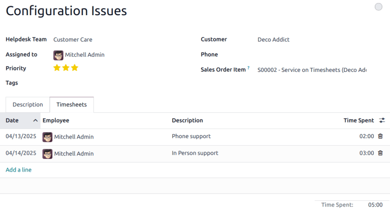
Create an invoice for hours tracked on a ticket
After the customer’s issue has been solved, and it is determined no new timesheet entries need to be made, an invoice can be created, and the customer can be billed.
To do this, return to the SO by clicking on the Sales Order smart button at the top of the ticket.
Before creating the invoice, confirm that the number in the Delivered column matches the total number of Hours Spent listed in the Timesheets tab on the ticket.
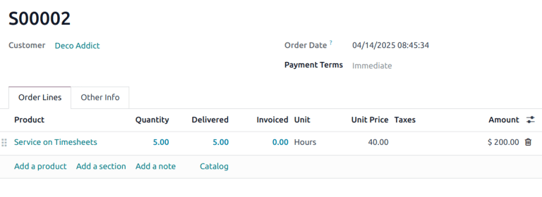
Then, click Create Invoice. This opens a Create invoice(s) pop-up window.
If no down payment is collected, the Create Invoice type can remain as Regular Invoice. If a down payment is collected, choose between either Down payment (percentage) or Down payment (fixed amount).
Important
Use the Timesheets Period field if this invoice should only include timesheets from a certain time period. If this field is left blank, all applicable timesheets that have not yet been invoiced will be included.

When the necessary information has been entered, click Create Draft. The invoice can then be reviewed, edited, and sent to the customer for payment.
See also
On this page
Get Help
Contact Support Ask the Odoo Community
EN
Odoo 18
Documents
Odoo Documents allows you to store, view, and manage files within Odoo.
See also
- Odoo Documents: product page
- Odoo Tutorials: Documents basics [video]
- Odoo Tutorials: Using Documents with your Accounting App [video]
Configuration
By going to Documents ‣ Configuration ‣ Settings, you can enable the centralization of files attached to a specific area of your activity. For example, by ticking Human Resources, your HR documents are automatically available in the HR workspace, while documents related to Payroll are automatically available in the Payroll sub-workspace. You can change the default workspace using the dropdown menu and edit its properties by clicking the (Internal link) icon.

Note
- If you enable the centralization of your accounting files and documents, it is necessary to click on Journals and define each journal independently to allow automatic synchronization.

- If you select a new workspace, existing documents are not moved. Only newly created documents will be found under the new workspace.
Workspaces
Workspaces are hierarchical folders having their own set of tags and actions. Default workspaces exist, but you can create your own by going to Documents ‣ Configuration ‣ Workspaces and clicking New. On the new page, fill in the following information:
- Name
- Parent Workspace: if you want to create a sub-workspace, select its Parent Workspace.
Three tabs are available: Tags, Access Rights, and Description.
Tags
Tags are used within workspaces to add a level of differentiation between documents. They are organized per category, and filters can be used to sort them.
From the Tags tab, click Add a line, create the Tag Category, and Name your tags.
Note
- The tags of a parent workspace apply to the child workspaces automatically;
- Tags can be created and modified by going to Documents ‣ Configuration ‣ Tags;
- Tags can also be created or edited by clicking the (gear) icon on the left panel;
- An email alias can be used to automatically send received documents to a specific workspace based on the tag assigned.
Access rights
To manage your workspace access rights, go to the Access Rights tab. You can add Write Groups that can view, create, and edit the workspace’s documents. You can also add Read Groups that only view the workspace’s documents.
Tip
Enable Own Documents Only to limit Read Groups and Write Groups to the documents of which they are owner.
Description
You can add descriptive information to your workspace by going to the Description tab.
Note
Workspaces can also be created and edited by clicking the (gear) icon on the left panel.
Documents management
When selecting or opening a document, the right panel displays different options, including, for example:
- (Download);
- (Share this selection): a share URL is copied to your clipboard;
- (Replace): select a new file to replace the existing one. Scroll down to the bottom of the right panel to see the History and restore, download, or delete the document;
- (Lock);
- (Split);
- (Open chatter).
To modify the name of your file, edit the Name field. Click the (Move to trash) icon to delete your document.
Note
Items moved to the trash are kept for 30 days in the Trash workspace, after which they are permanently deleted.
A Contact or an Owner can be assigned. You can also modify the related Workspace and add Tags.
Note
- The Contact is a person related to the document who only has read access rights to the document, e.g., an existing supplier in your database;
- The creator of a document is automatically assigned as its Owner and is granted full access rights to it. To replace the owner of a document, select the required user from the dropdown list in the Owner field.
Tip
An employee must be a user and the owner of a document to view it in My Profile.
Different Actions are available at the bottom of the right panel, depending on the workspace where your document is stored.
Split PDF documents
Select the PDF you want to split, and click the (scissors) icon. A new view displays all the pages of the document.
By default, all pages are split when you click Split. To remove a split between two pages, click the (scissors) icon.
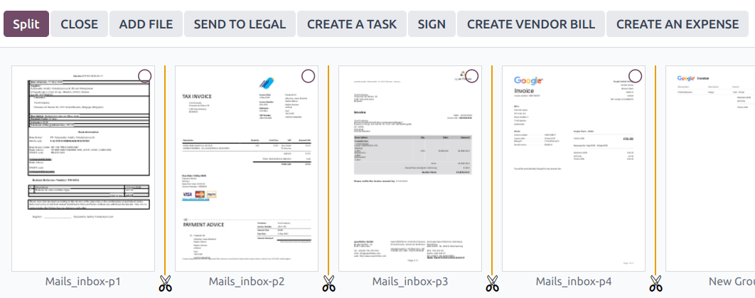
Tip
To merge documents from your dashboard, select them and click the (scissors) icon. Click on the scissors between the two documents and click Split to merge the documents.
Additional features
Select a workspace and click the New button to access additional features:
Upload
You can upload any file (max 64MB per file on Odoo Online) to your Documents app. Select the workspace where you want to upload your file, click the New button, then Upload.
Request
You can request files and organize them as documents to remind users to download them.
Select the workspace where the file should be stored, click the New button, then Request. Add the Document Name and select the person you need it from in the Request To field. You can also fill in the Due Date In, confirm the Workspace the document should belong to, and add Tags and a Message. Then, click Request. A placeholder for the missing document is created in the workspace.
When your document is available, click the placeholder to upload it.
You can see all missing documents by going to the Activity view and the Requested Document column.
Tip
From the Activity view, you can send a reminder email to users from whom you are expecting a document. Go to the Requested Document column and click the (ellipsis) icon, and Document Request: Reminder. Click on a date to see the details of a specific request. You can update it by clicking on the (pen) icon, Preview the content of the reminder email, or Send Now to send a reminder email.

Link
To add a link to your documents dashboard, click Link, enter the URL, and Name it.
Spreadsheet
To create a new spreadsheet, select the workspace where the file should be stored, click the New button, then Spreadsheet. You can create a Blank spreadsheet or select an existing template to use.
Share
You can make a document or a workspace accessible to anyone by sharing a URL.
Share a document
To generate a share link to a document, select the document and click the Share button.
In the pop-up, you can Name the share link, set a validity date by filling in the Valid Until field, and if you own more than one site, select the Website you want so the right domain name is reflected in the URL.
Click Copy Link & Close to copy the URL to your clipboard.
Tip
You can also generate a share URL by selecting the document, going to the right panel, and clicking the (Share this selection) icon.
Share a workspace
You can share a link to a workspace and allow users to Download its content or Download and Upload files to it.
To do so, go to the left column of your dashboard and select the workspace you want to share. You can also choose one or more tags that will be automatically added to the uploaded documents. Then, click the Share button.
In the pop-up, a share URL you can Copy is displayed. You can Name your share link and set a validity date by filling in the Valid Until field. If you own more than one site, select the Website you want so the share link reflects the right domain name.
Note
- The links added to your workspace using the Link option cannot be shared and are, therefore, excluded.
- When tags are applied to a shared workspace, users can exclusively access the documents associated with those tags.
Files upload
Toggle the Allow upload switch to allow users to upload files to your workspace.
Tick the Upload by Email checkbox to enable users to upload documents sent by email in the workspace.
Enter an alias in the Email Alias field. All documents sent to this email address are uploaded to the workspace using the chosen tags.
Note
- You need to have an alias domain set to be able to upload documents by email. If it isn’t existing yet, click Choose or Configure Email Servers and create an alias domain.
- By default, the Document Owner is the person who uploads a file to a workspace, but you can select another user. You can also set a Contact, usually an external person, such as a partner.
- Enable Create a new activity to automatically create an activity when a document is uploaded. Select the Activity type from the dropdown list and set the Due Date In field. You can also add a Summary and a Responsible person assigned to the activity.
Tip
Go to Configuration ‣ Share & Emails to see and manage your share links. Select a line and click Delete to disable the URL. People who have received this link will no longer be able to access the document(s) or workspace.
Workflow actions
Workflow actions help manage documents and overall business operations. These are automated actions that can be created and customized for each workspace. With a single click you can, for example, create, move, sign, add tags to a document, and process bills.
When a document meets the set criteria, these workflow actions appear on the right panel.
Create workflow actions
To update an existing workflow action or create a new one, go to Documents ‣ Configuration ‣ Actions and click New.
Note
An action applies to all sub-workspaces under the Related Workspace you selected.
Set the conditions
Define the Action Name and then set the conditions that trigger the appearance of the action button on the right-side panel when selecting a file.
There are three basic types of conditions you can set:
- Tags: you can use the Contains and Does not contain conditions, meaning the files must have or must not have the tags set here;
- Contact: the files must be associated with the contact set here;
- Owner: the files must be associated with the owner set here.

Tip
If you do not set any conditions, the action button appears for all files inside the selected workspace.
Advanced condition type: domain
Important
It is recommended to have some knowledge of Odoo development to configure Domain filters properly.
The developer mode needs to be activated to enable the Domain Condition type. Once done, click New Rule.
To create a rule, you typically select a field, an operator, and a value. For example, if you want to add a workflow action to all the PDF files inside a workspace, set the field to Mime Type, the operator to contains, and the pdf value.

Click the (Add New Rule) icon and the (Add branch) icon to add conditions and sub-conditions. You can then specify if your rule should match all or any conditions. You can also edit the rule directly using the Code editor.
Configure the actions
Go to the Actions section to set up your action. You can simultaneously:
- Move to Workspace: move the file to any workspace;
- Create: create one of the following items attached to the file in your database:
- Link to record: create a link between a document and a record from a specific model;
- Product template: create a product you can edit directly;
- Task: create a Project task you can edit directly;
- Signature PDF template: create a new Sign template to send out;
- PDF to sign: create a Sign template to sign directly;
- Applicant: create a new HR application you can edit directly;
- Vendor bill: create a vendor bill using OCR and AI to scrape information from the file content;
- Customer invoice: create an invoice using OCR and AI to scrape information from the file;
- Vendor credit note: create a vendor credit note using OCR and AI to scrape information from the file;
- Credit note: create a customer credit note using OCR and AI to scrape information from the file;
- Miscellaneous Operations: create an entry in the Miscellaneous Operations journal;
- Bank Statement: import a bank statement;
- Purchase Receipt: create a vendor receipt;
- Expense: create an HR expense.
- Set Contact: add a contact to the file, or replace an existing contact with a new one;
- Set Owner: add an owner to the file, or replace an existing owner with a new one;
- Set Tags: add, remove, and replace any number of tags.
To set up activities related to your actions, go to the Activities section:
- Activities - Mark all as Done: mark all activities linked to the file as done;
- Activities - Schedule Activity: create a new activity linked to the file as configured in the action. You can choose to set the activity on the document owner.
Digitize documents with AI and optical character recognition (OCR)
Documents available in the Finance workspace can be digitized. Select the document to digitize, click Create Vendor Bill, Create Customer Invoice, or Create Customer Credit Note, and then click Send for Digitization.
See also
AI-powered document digitization
On this page
Get Help
Contact Support Ask the Odoo Community
EN
Odoo 18
Sign
Odoo Sign allows you to send, sign, and approve documents online, using electronic signatures.
An electronic signature shows a person’s agreement to the content of a document. Just like a handwritten signature, the electronic one represents a legal bounding by the terms of the signed document.
With Sign, you can upload any PDF file and add fields to it. These fields can be automatically filled in with the user’s details present in your database.
See also
Validity of electronic signatures
Documents signed via the Sign app are valid electronic signatures in the European Union and the United States of America. They also meet the requirements for electronic signatures in most countries. The legal validity of electronic signatures generated by Odoo depends on your country’s legislation. Companies doing business abroad should also consider other countries’ electronic signature laws.
Important
The below information has no legal value; it is only provided for general informational purposes. As laws governing electronic signatures rapidly evolve, we cannot guarantee that all information is up-to-date. We advise contacting a local attorney for legal advice regarding electronic signature compliance and validity.
European Union
The eIDAS regulation establishes the framework for electronic signatures in the 27 member states of the European Union. It distinguishes three types of electronic signatures:
- Simple electronic signatures
- Advanced electronic signatures
- Qualified electronic signatures
Odoo generates the first type, simple electronic signatures; these signatures are legally valid in the EU, as stated in the eIDAS regulation.
Electronic signatures may not be automatically recognized as valid. You may need to bring supporting evidence of a signature’s validity. While the Sign app provides a simple electronic signature, some supporting evidence is automatically collected during the signature process, such as:
- Email and SMS validation (if enabled)
- Strong identity proof through itsme® (available in Belgium and the Netherlands)
- Timestamped, IP and geographically traceable access logs to the documents and their associated signatures
- Document traceability and inalterability (any alteration made to a signed document is detected by Odoo with the use of cryptographic proofs)
Note
United States of America
The ESIGN Act (Electronic Signatures in Global and National Commerce Act), at the interstate and international levels, and the UETA (Uniform Electronic Transactions Act), at the state level, provide the legal framework for electronic signatures. Note that Illinois and New York have not adopted the UETA, but similar acts instead.
Overall, to be recognized as valid, electronic signatures have to meet five criteria:
- The signer must show a clear intent to sign. For example, using a mouse to draw a signature can show intent. The signer must also have the option to opt out of the electronic document.
- The signer must first express or imply their consent to conduct business electronically.
- The signature must be clearly attributed. In Odoo, metadata, such as the signer’s IP address, is added to the signature, which can be used as supporting evidence.
- The signature must be associated with the signed document, for example, by keeping a record detailing how the signature was captured.
- Electronically signed documents need to be retained and stored by all parties involved; for example, by providing the signer either a fully-executed copy or the possibility to download a copy.
Other countries
- Algeria
- Angola
- Argentina
- Australia
- Azerbaijan
- Bangladesh
- Brazil
- Canada
- Chile
- China
- Colombia
- Dominican Republic
- Ecuador
- Egypt
- Ethiopia
- Guatemala
- Hong Kong
- India
- Indonesia
- Iran
- Iraq
- Israel
- Japan
- Kazakhstan
- Kenya
- Kuwait
- Malaysia
- Mexico
- Morocco
- New Zealand
- Nigeria
- Norway
- Oman
- Pakistan
- Peru
- Philippines
- Qatar
- Russia
- Saudi Arabia
- Singapore
- South Africa
- South Korea
- Switzerland
- Thailand
- Turkey
- Ukraine
- United Arab Emirates
- United Kingdom
- Uzbekistan
- Vietnam
Send a document to sign
One-time signature
You can click Upload a PDF to sign from your dashboard for a one-time signature. Select your document, open it, and drag and drop the required fields in your document. You can modify the role assigned to a field by clicking on it and selecting the one you want.
When ready, click Send, and fill in the required fields. Once sent, your document remains available. Go to Documents ‣ All Documents to see your document and the status of the signatures.
Validity dates and reminders
You can set validity dates on limited-duration agreement documents or send automatic email reminders to obtain signatures on time. From your dashboard, click Send on your document. On the new page, go to the Options section, fill in the Valid Until field, toggle the Reminder switch, and click the value to edit the default number of days between reminders.
Templates
You can create document templates when you have to send the same document several times. From your dashboard, click Upload a PDF template. Select the document and add the required fields. You can modify the role of a field by clicking on it and selecting the one you want.
Click Template Properties to add Tags to your template, define a Signed Document Workspace, add Signed Document Tags, set a Redirect Link that will be available in the signature confirmation message received after the signature, or define Authorized Users if you want to restrict the use of your template to specific authorized users or groups.
Your templates are visible by default on your dashboard. You can click Send to quickly send a document template to a signer or Sign Now if you are ready to sign your document immediately.
Tip
You can create a template from a document that was previously sent. To do so, go to Documents ‣ All Documents. On the document you want to retrieve, click on the the vertical ellipsis (⋮), then Template. Click on the vertical ellipsis (⋮) again, then Restore. Your document now appears on your dashboard next to your other templates.
Roles
Each field in a Sign document is related to a role corresponding to a specific person. When a document is being signed, the person assigned to the role must fill in their assigned fields and sign it.
Roles are available by going to Sign ‣ Configuration ‣ Roles.
It is possible to update existing roles or to create new roles by clicking on New. Choose a Role Name, add an Extra Authentication Step to confirm the identity of the signing person, and if the document can be reassigned to another contact, select Change Authorized for the role. A Color can also be chosen for the role. This color can help understand which roles are responsible for which field when configuring a template.
Secured identification
As the owner of a document, you may request an Extra Authentication Step through SMS verification or via Itsme® (available in Belgium and the Netherlands). Both authentication options require credits. If you do not have any credits left, the authentication steps will be skipped.
See also
SMS verification
Go to Sign ‣ Configuration ‣ Roles. Click in the Extra Authentication Step column for the role, and select Unique Code Via SMS.
Note
Before being able to send SMS Text Messages, you need to register your phone number. To do so, go to Sign ‣ Configuration ‣ Settings and click Buy credits under Authenticate by SMS.
Go to the document to sign, add the field for which the SMS verification is required, for example, the Signature field, and click Send. On the new page, select the customer and click Send.
The person signing the document fills in the Signature field, then Sign, and clicks Validate & Send Completed Document. A Final Validation page pops up where to add their phone number. One-time codes are sent by SMS.
Note
- This feature is enabled by default.
- As soon as the Extra Authentication Step applies to a role, this validation step is requested for any field assigned to this role.
Itsme®
Itsme® authentication can be used to allow signatories to provide their identity using itsme®. This feature is only available in Belgium and the Netherlands.
The feature can be enabled in Sign Settings and applies automatically to the Customer (identified with itsme®) role. To enable it for other roles, go to Sign ‣ Configuration ‣ Roles. Click in the Extra Authentication Step column for the role, and select Via itsme®.
Go to the document that needs to be signed and add the Signature field. Switch to any role configured to use the feature, and click Validate and Send.
Upon signing the document, the signer completes the Signature field and proceeds by clicking on Validate & Send Completed Document, triggering a Final verification page where authentication via itsme® is required.
Signatory hash
Each time someone signs a document, a hash - a unique digital signature of the operation - is generated to ensure traceability, integrity, and inalterability. This process guarantees that any changes made after a signature is affixed can be easily detected, maintaining the document’s authenticity and security throughout its lifecycle.
A visual security frame displaying the beginning of the hash is added to the signatures. Internal users can hide or show it by turning the Frame option on or off when signing the document.
Tags
Tags can be used to categorize and organize documents, allowing users to quickly search for and filter documents based on specific criteria.
You can manage tags by going to Configuration ‣ Tags. To create a tag, click New. On the new line, add the Tag Name and select a Color Index for your tag.
To apply a tag to a document, use the dropdown list available in your document.
Note
You can modify the tags of a signed document by going to Documents ‣ All Documents, clicking the vertical ellipsis (⋮) on your document, then Details, and modifying your Tags.
Sign order
When a document needs to be signed by different parties, the signing order lets you control the order in which your recipients receive it for signature.
After uploading a PDF with at least two signature fields with two different roles and clicking Send, toggle the Specify Signing Order switch and search for the signer’s name or email information to add them. You can decide on the signing order by typing 1 or 2 in the first column.
Each recipient receives the signature request notification only once the previous recipient has completed their action.
Field types
Fields are used in a document to indicate what information must be completed by the signers. You can add fields to your document simply by dragging and dropping them for the left column into your document.
Various field types can be used to sign documents (placeholder, autocompletion, etc.). By configuring your own field types, also known as signature item types, the signing process can be even faster for your customers, partners, and employees.
To create and edit field types, go to Sign ‣ Configuration ‣ Settings ‣ Edit field types.
You can select an existing field by clicking on it, or you can Create a new one. First, edit the Field Name. Then, select a Field Type:
- Signature: users are asked to enter their signature either by drawing it, generating an automatic one based on their name, or uploading a local file (usually an image). Each subsequent Signature field type then reuses the data entered in the first field.
- Initial: users are asked to enter their initials, in a similar way to the Signature field.
- Text: users enter text on a single line.
- Multiline Text: users enter text on multiple lines.
- Checkbox: users can tick a box (e.g., to mark their approval or consent).
- Selection: users choose a single option from a variety of options.
The Auto-fill Partner Field setting is used to automatically fill in a field during the signature process. It uses the value of one of the fields on the contact (res.partner) model of the person signing the document. To do so, enter the contact model field’s technical name.
Tip
To know the technical name of a field, enable developer mode and hover your mouse on the question mark next to the field.
Note
Auto-completed values are suggestions and can be modified as required by the person signing the document.
The size of the fields can also be changed by editing the Default Width and Default Height. Both sizes are defined as a percentage of the full page expressed as a decimal, with 1 equalling the full page’s width or height. By default, the width of new fields you create is set to 15% (0.150) of a full page’s width, while their height is set to 1.5% (0.015) of a full page’s height.
Next, write a Tip. Tips are displayed inside arrows on the left-hand side of the user’s screen during the signing process to help them understand what the step entails (e.g., “Sign here” or “Fill in your birthdate”). You can also use a Placeholder text to be displayed inside the field before it is completed.
On this page
Get Help
Contact Support Ask the Odoo Community
EN
Odoo 18
Spreadsheet
Spreadsheet lets you organize, analyze, and visualize your data in tabular form. Among others, you can:
- Insert and link your Odoo data (pivots, graphs, lists, and menus).
- Use global filters.
- Use formulas and functions.
- Create and use templates.
- Format data.
- Sort and filter data.
Glossary
Some of Spreadsheet’s main UI elements are highlighted and defined below.
- Menu bar
- Top bar
- Formula bar
- Filters button
- Row header
- Column header
- Cell menu
- Bottom bar
Get Help
Contact Support Ask the Odoo Community
EN
Odoo 18
Link Odoo data
You can insert and link several elements from your database in your spreadsheets, namely:
- pivots,
- graphs,
- lists, and
- links to menus (i.e., a clickable link to a view of a specific model).
Before inserting pivots, graphs, or lists, ensure they are tailored to your needs, as some elements are more quickly - or only - configurable in their respective view.
- To insert pivots and graphs, click Insert in spreadsheet from any pivot or graph view.
- To insert lists, click Favorites ‣ Insert list in spreadsheet from any list view.
- To insert links to menus, click Favorites ‣ Link menu in spreadsheet from any view.
In the pop-up box, either create a new spreadsheet by selecting Blank spreadsheet or insert it in an existing one by selecting it and clicking Confirm.
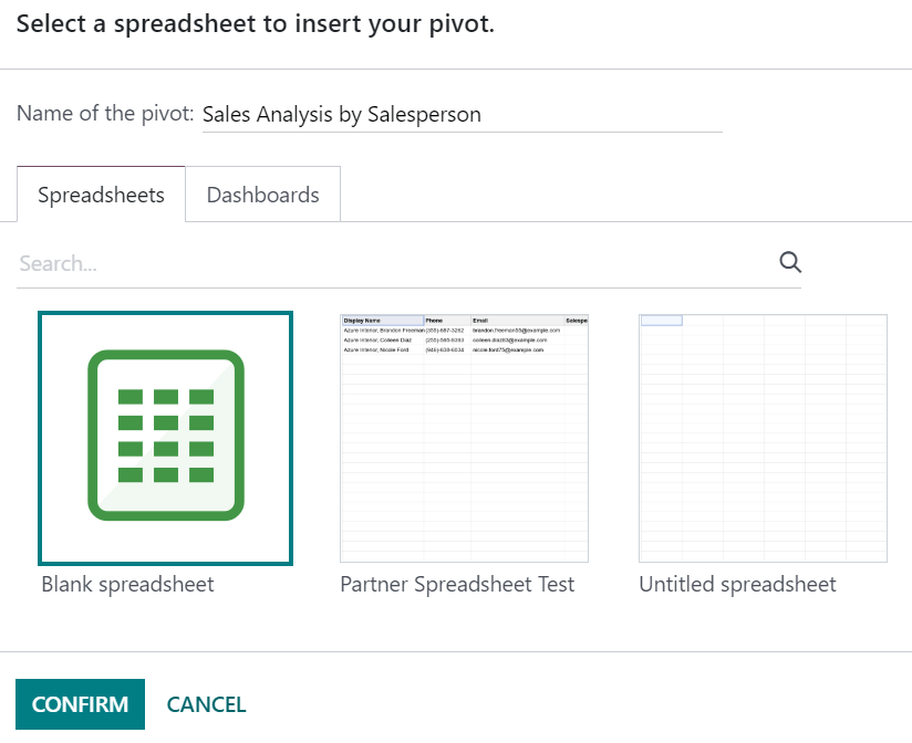
Note
By default, new spreadsheets are saved under the Spreadsheet workspace of the Documents app.
Updating data
Once inserted in a spreadsheet, your data is kept up-to-date, reflecting any changes made to your database. Reopening the spreadsheet reloads the linked data.
Note
To update pivots and lists data without reopening a spreadsheet, go to the menu bar and click Data ‣ Refresh all data.
Pivot data
Using Refresh all data only updates existing pivot cells. If new cells need to be added, go to the menu bar and click Data ‣ Re-insert pivot to fully update the pivot. Alternatively, click Insert pivot, select the pivot, and tick Display missing cells only to preview first the missing data.

To change which records are used by the pivot, right-click on a pivot cell, select See pivot properties, and click Edit domain.
On this page
Get Help
Contact Support Ask the Odoo Community
EN
Odoo 18
Functions
Spreadsheet functions are divided in the following categories:
Note
Formulas containing functions that are not compatible with Excel are replaced by their evaluated result when exporting a spreadsheet.
Array
Name and arguments | Description or link |
|---|---|
ARRAY.CONSTRAIN(input_range, rows, columns) | Returns a result array constrained to a specific width and height (not compatible with Excel) |
CHOOSECOLS(array, col_num, [col_num2, …]) | |
CHOOSEROWS(array, row_num, [row_num2, …]) | |
EXPAND(array, rows, [columns], [pad_with]) | |
FLATTEN(range, [range2, …]) | Flattens all the values from one or more ranges into a single column (not compatible with Excel) |
FREQUENCY(data, classes) | |
HSTACK(range1, [range2, …]) | |
MDETERM(square_matrix) | |
MINVERSE(square_matrix) | |
MMULT(matrix1, matrix2) | |
SUMPRODUCT(range1, [range2, …]) | |
SUMX2MY2(array_x, array_y) | |
SUMX2PY2(array_x, array_y) | |
SUMXMY2(array_x, array_y) | |
TOCOL(array, [ignore], [scan_by_column]) | |
TOROW(array, [ignore], [scan_by_column]) | |
TRANSPOSE(range) | |
VSTACK(range1, [range2, …]) | |
WRAPCOLS(range, wrap_count, [pad_with]) | |
WRAPROWS(range, wrap_count, [pad_with]) |
Database
Name and arguments | Description or link |
|---|---|
DAVERAGE(database, field, criteria) | |
DCOUNT(database, field, criteria) | |
DCOUNTA(database, field, criteria) | |
DGET(database, field, criteria) | |
DMAX(database, field, criteria) | |
DMIN(database, field, criteria) | |
DPRODUCT(database, field, criteria) | |
DSTDEV(database, field, criteria) | |
DSTDEVP(database, field, criteria) | |
DSUM(database, field, criteria) | |
DVAR(database, field, criteria) | |
DVARP(database, field, criteria) |
Date
Name and arguments | Description or link |
|---|---|
DATE(year, month, day) | |
DATEDIF(start_date, end_date, unit) | |
DATEVALUE(date_string) | |
DAY(date) | |
DAYS(end_date, start_date) | |
DAYS360(start_date, end_date, [method]) | |
EDATE(start_date, months) | |
EOMONTH(start_date, months) | |
HOUR(time) | |
ISOWEEKNUM(date) | |
MINUTE(time) | |
MONTH(date) | |
NETWORKDAYS(start_date, end_date, [holidays]) | |
NETWORKDAYS.INTL(start_date, end_date, [weekend], [holidays]) | |
NOW() | |
SECOND(time) | |
TIME(hour, minute, second) | |
TIMEVALUE(time_string) | |
TODAY() | |
WEEKDAY(date, [type]) | |
WEEKNUM(date, [type]) | |
WORKDAY(start_date, num_days, [holidays]) | |
WORKDAY.INTL(start_date, num_days, [weekend], [holidays]) | |
YEAR(date) | |
YEARFRAC(start_date, end_date, [day_count_convention]) | Exact number of years between two dates (not compatible with Excel) |
MONTH.START(date) | First day of the month preceding a date (not compatible with Excel) |
MONTH.END(date) | Last day of the month following a date (not compatible with Excel) |
QUARTER(date) | Quarter of the year a specific date falls in (not compatible with Excel) |
QUARTER.START(date) | First day of the quarter of the year a specific date falls in (not compatible with Excel) |
QUARTER.END(date) | Last day of the quarter of the year a specific date falls in (not compatible with Excel) |
YEAR.START(date) | First day of the year a specific date falls in (not compatible with Excel) |
YEAR.END(date) | Last day of the year a specific date falls in (not compatible with Excel) |
Engineering
Name and arguments | Description or link |
|---|---|
DELTA(number1, [number2]) |
Filter
Name and arguments | Description or link |
|---|---|
FILTER(range, condition1, [condition2, …]) | |
UNIQUE(range, [by_column], [exactly_once]) |
Financial
Name and arguments | Description or link |
|---|---|
ACCRINTM(issue, maturity, rate, redemption, [day_count_convention]) | |
AMORLINC(cost, purchase_date, first_period_end, salvage, period, rate, [day_count_convention]) | |
COUPDAYS(settlement, maturity, frequency, [day_count_convention]) | |
COUPDAYBS(settlement, maturity, frequency, [day_count_convention]) | |
COUPDAYSNC(settlement, maturity, frequency, [day_count_convention]) | |
COUPNCD(settlement, maturity, frequency, [day_count_convention]) | |
COUPNUM(settlement, maturity, frequency, [day_count_convention]) | |
COUPPCD(settlement, maturity, frequency, [day_count_convention]) | |
CUMIPMT(rate, number_of_periods, present_value, first_period, last_period, [end_or_beginning]) | |
CUMPRINC(rate, number_of_periods, present_value, first_period, last_period, [end_or_beginning]) | |
DB(cost, salvage, life, period, [month]) | |
DDB(cost, salvage, life, period, [factor]) | |
DISC(settlement, maturity, price, redemption, [day_count_convention]) | |
DOLLARDE(fractional_price, unit) | |
DOLLARFR(decimal_price, unit) | |
DURATION(settlement, maturity, rate, yield, frequency, [day_count_convention]) | |
EFFECT(nominal_rate, periods_per_year) | |
FV(rate, number_of_periods, payment_amount, [present_value], [end_or_beginning]) | |
FVSCHEDULE(principal, rate_schedule) | |
INTRATE(settlement, maturity, investment, redemption, [day_count_convention]) | |
IPMT(rate, period, number_of_periods, present_value, [future_value], [end_or_beginning]) | |
IRR(cashflow_amounts, [rate_guess]) | |
ISPMT(rate, period, number_of_periods, present_value) | |
MDURATION(settlement, maturity, rate, yield, frequency, [day_count_convention]) | |
MIRR(cashflow_amounts, financing_rate, reinvestment_return_rate) | |
NOMINAL(effective_rate, periods_per_year) | |
NPER(rate, payment_amount, present_value, [future_value], [end_or_beginning]) | |
NPV(discount, cashflow1, [cashflow2, …]) | |
PDURATION(rate, present_value, future_value) | |
PMT(rate, number_of_periods, present_value, [future_value], [end_or_beginning]) | |
PPMT(rate, period, number_of_periods, present_value, [future_value], [end_or_beginning]) | |
PV(rate, number_of_periods, payment_amount, [future_value], [end_or_beginning]) | |
PRICE(settlement, maturity, rate, yield, redemption, frequency, [day_count_convention]) | |
PRICEDISC(settlement, maturity, discount, redemption, [day_count_convention]) | |
PRICEMAT(settlement, maturity, issue, rate, yield, [day_count_convention]) | |
RATE(number_of_periods, payment_per_period, present_value, [future_value], [end_or_beginning], [rate_guess]) | |
RECEIVED(settlement, maturity, investment, discount, [day_count_convention]) | |
RRI(number_of_periods, present_value, future_value) | |
SLN(cost, salvage, life) | |
SYD(cost, salvage, life, period) | |
TBILLPRICE(settlement, maturity, discount) | |
TBILLEQ(settlement, maturity, discount) | |
TBILLYIELD(settlement, maturity, price) | |
VDB(cost, salvage, life, start, end, [factor], [no_switch]) | |
XIRR(cashflow_amounts, cashflow_dates, [rate_guess]) | |
XNPV(discount, cashflow_amounts, cashflow_dates) | |
YIELD(settlement, maturity, rate, price, redemption, frequency, [day_count_convention]) | |
YIELDDISC(settlement, maturity, price, redemption, [day_count_convention]) | |
YIELDMAT(settlement, maturity, issue, rate, price, [day_count_convention]) |
Info
Name and arguments | Description or link |
|---|---|
CELL(info_type, reference) | |
ISERR(value) | |
ISERROR(value) | |
ISLOGICAL(value) | |
ISNA(value) | |
ISNONTEXT(value) | |
ISNUMBER(value) | |
ISTEXT(value) | |
ISBLANK(value) | |
NA() |
Logical
Name and arguments | Description or link |
|---|---|
AND(logical_expression1, [logical_expression2, …]) | |
FALSE() | |
IF(logical_expression, value_if_true, [value_if_false]) | |
IFERROR(value, [value_if_error]) | |
IFNA(value, [value_if_error]) | |
IFS(condition1, value1, [condition2, …], [value2, …]) | |
NOT(logical_expression) | |
OR(logical_expression1, [logical_expression2, …]) | |
TRUE() | |
XOR(logical_expression1, [logical_expression2, …]) |
Lookup
Name and arguments | Description or link |
|---|---|
ADDRESS(row, column, [absolute_relative_mode], [use_a1_notation], [sheet]) | |
COLUMN([cell_reference]) | |
COLUMNS(range) | |
HLOOKUP(search_key, range, index, [is_sorted]) | |
INDEX(reference, row, column) | |
INDIRECT(reference, [use_a1_notation]) | |
LOOKUP(search_key, search_array, [result_range]) | |
MATCH(search_key, range, [search_type]) | |
PIVOT(pivot_id, measure_name, [domain_field_name, …], [domain_value, …]) | Get the value from a pivot (not compatible with Excel) |
PIVOT.HEADER(pivot_id, [domain_field_name, …], [domain_value, …]) | Get the header of a pivot (not compatible with Excel) |
PIVOT.TABLE(pivot_id, [row_count], [include_total], [include_column_titles]) | Get a pivot table (not compatible with Excel) |
ROW([cell_reference]) | |
ROWS(range) | |
VLOOKUP(search_key, range, index, [is_sorted]) | |
XLOOKUP(search_key, lookup_range, return_range, [if_not_found], [match_mode], [search_mode]) |
Math
Name and arguments | Description or link |
|---|---|
ABS(value) | |
ACOS(value) | |
ACOSH(value) | |
ACOT(value) | |
ACOTH(value) | |
ASIN(value) | |
ASINH(value) | |
ATAN(value) | |
ATAN2(x, y) | |
ATANH(value) | |
CEILING(value, [factor]) | |
CEILING.MATH(number, [significance], [mode]) | |
CEILING.PRECISE(number, [significance]) | |
COS(angle) | |
COSH(value) | |
COT(angle) | |
COTH(value) | |
COUNTBLANK(value1, [value2, …]) | |
COUNTIF(range, criterion) | |
COUNTIFS(criteria_range1, criterion1, [criteria_range2, …], [criterion2, …]) | |
COUNTUNIQUE(value1, [value2, …]) | Counts number of unique values in a range (not compatible with Excel) |
COUNTUNIQUEIFS(range, criteria_range1, criterion1, [criteria_range2, …], [criterion2, …]) | Counts number of unique values in a range, filtered by a set of criteria (not compatible with Excel) |
CSC(angle) | |
CSCH(value) | |
DECIMAL(value, base) | |
DEGREES(angle) | |
EXP(value) | |
FLOOR(value, [factor]) | |
FLOOR.MATH(number, [significance], [mode]) | |
FLOOR.PRECISE(number, [significance]) | |
INT(value) | |
ISEVEN(value) | |
ISO.CEILING(number, [significance]) | |
ISODD(value) | |
LN(value) | |
MOD(dividend, divisor) | |
MUNIT(dimension) | |
ODD(value) | |
PI() | |
POWER(base, exponent) | |
PRODUCT(factor1, [factor2, …]) | |
RAND() | |
RANDARRAY([rows], [columns], [min], [max], [whole_number]) | |
RANDBETWEEN(low, high) | |
ROUND(value, [places]) | |
ROUNDDOWN(value, [places]) | |
ROUNDUP(value, [places]) | |
SEC(angle) | |
SECH(value) | |
SIN(angle) | |
SINH(value) | |
SQRT(value) | |
SUM(value1, [value2, …]) | |
SUMIF(criteria_range, criterion, [sum_range]) | |
SUMIFS(sum_range, criteria_range1, criterion1, [criteria_range2, …], [criterion2, …]) | |
TAN(angle) | |
TANH(value) | |
TRUNC(value, [places]) |
Misc
Name and arguments | Description or link |
|---|---|
FORMAT.LARGE.NUMBER(value, [unit]) | Apply a large number format (not compatible with Excel) |
Odoo
Name and arguments | Description or link |
|---|---|
ODOO.CREDIT(account_codes, date_range, [offset], [company_id], [include_unposted]) | Get the total credit for the specified account(s) and period (not compatible with Excel) |
ODOO.DEBIT(account_codes, date_range, [offset], [company_id], [include_unposted]) | Get the total debit for the specified account(s) and period (not compatible with Excel) |
ODOO.BALANCE(account_codes, date_range, [offset], [company_id], [include_unposted]) | Get the total balance for the specified account(s) and period (not compatible with Excel) |
ODOO.FISCALYEAR.START(day, [company_id]) | Returns the starting date of the fiscal year encompassing the provided date (not compatible with Excel) |
ODOO.FISCALYEAR.END(day, [company_id]) | Returns the ending date of the fiscal year encompassing the provided date (not compatible with Excel) |
ODOO.ACCOUNT.GROUP(type) | Returns the account ids of a given group (not compatible with Excel) |
ODOO.CURRENCY.RATE(currency_from, currency_to, [date]) | This function takes in two currency codes as arguments, and returns the exchange rate from the first currency to the second as float (not compatible with Excel) |
ODOO.LIST(list_id, index, field_name) | Get the value from a list (not compatible with Excel) |
ODOO.LIST.HEADER(list_id, field_name) | Get the header of a list (not compatible with Excel) |
ODOO.FILTER.VALUE(filter_name) | Return the current value of a spreadsheet filter (not compatible with Excel) |
Operators
Name and arguments | Description or link |
|---|---|
ADD(value1, value2) | Sum of two numbers (not compatible with Excel) |
CONCAT(value1, value2) | |
DIVIDE(dividend, divisor) | One number divided by another (not compatible with Excel) |
EQ(value1, value2) | Equal (not compatible with Excel) |
GT(value1, value2) | Strictly greater than (not compatible with Excel) |
GTE(value1, value2) | Greater than or equal to (not compatible with Excel) |
LT(value1, value2) | Less than (not compatible with Excel) |
LTE(value1, value2) | Less than or equal to (not compatible with Excel) |
MINUS(value1, value2) | Difference of two numbers (not compatible with Excel) |
MULTIPLY(factor1, factor2) | Product of two numbers (not compatible with Excel) |
NE(value1, value2) | Not equal (not compatible with Excel) |
POW(base, exponent) | A number raised to a power (not compatible with Excel) |
UMINUS(value) | A number with the sign reversed (not compatible with Excel) |
UNARY.PERCENT(percentage) | Value interpreted as a percentage (not compatible with Excel) |
UPLUS(value) | A specified number, unchanged (not compatible with Excel) |
Statistical
Name and arguments | Description or link |
|---|---|
AVEDEV(value1, [value2, …]) | |
AVERAGE(value1, [value2, …]) | |
AVERAGE.WEIGHTED(values, weights, [additional_values, …], [additional_weights, …]) | Weighted average (not compatible with Excel) |
AVERAGEA(value1, [value2, …]) | |
AVERAGEIF(criteria_range, criterion, [average_range]) | |
AVERAGEIFS(average_range, criteria_range1, criterion1, [criteria_range2, …], [criterion2, …]) | |
CORREL(data_y, data_x) | |
COUNT(value1, [value2, …]) | |
COUNTA(value1, [value2, …]) | |
COVAR(data_y, data_x) | |
COVARIANCE.P(data_y, data_x) | |
COVARIANCE.S(data_y, data_x) | |
FORECAST(x, data_y, data_x) | |
GROWTH(known_data_y, [known_data_x], [new_data_x], [b]) | Fits points to exponential growth trend (not compatible with Excel) |
INTERCEPT(data_y, data_x) | |
LARGE(data, n) | |
LINEST(data_y, [data_x], [calculate_b], [verbose]) | |
LOGEST(data_y, [data_x], [calculate_b], [verbose]) | |
MATTHEWS(data_x, data_y) | Compute the Matthews correlation coefficient of a dataset (not compatible with Excel) |
MAX(value1, [value2, …]) | |
MAXA(value1, [value2, …]) | |
MAXIFS(range, criteria_range1, criterion1, [criteria_range2, …], [criterion2, …]) | |
MEDIAN(value1, [value2, …]) | |
MIN(value1, [value2, …]) | |
MINA(value1, [value2, …]) | |
MINIFS(range, criteria_range1, criterion1, [criteria_range2, …], [criterion2, …]) | |
PEARSON(data_y, data_x) | |
PERCENTILE(data, percentile) | |
PERCENTILE.EXC(data, percentile) | |
PERCENTILE.INC(data, percentile) | |
POLYFIT.COEFFS(data_y, data_x, order, [intercept]) | Compute the coefficients of polynomial regression of the dataset (not compatible with Excel) |
POLYFIT.FORECAST(x, data_y, data_x, order, [intercept]) | Predict value by computing a polynomial regression of the dataset (not compatible with Excel) |
QUARTILE(data, quartile_number) | |
QUARTILE.EXC(data, quartile_number) | |
QUARTILE.INC(data, quartile_number) | |
RANK(value, data, [is_ascending]) | |
RSQ(data_y, data_x) | |
SMALL(data, n) | |
SLOPE(data_y, data_x) | |
SPEARMAN(data_y, data_x) | Compute the Spearman rank correlation coefficient of a dataset (not compatible with Excel) |
STDEV(value1, [value2, …]) | |
STDEV.P(value1, [value2, …]) | |
STDEV.S(value1, [value2, …]) | |
STDEVA(value1, [value2, …]) | |
STDEVP(value1, [value2, …]) | |
STDEVPA(value1, [value2, …]) | |
STEYX(data_y, data_x) | |
TREND(known_data_y, [known_data_x], [new_data_x], [b]) | Fits points to linear trend derived via least-squares (not compatible with Excel) |
VAR(value1, [value2, …]) | |
VAR.P(value1, [value2, …]) | |
VAR.S(value1, [value2, …]) | |
VARA(value1, [value2, …]) | |
VARP(value1, [value2, …]) | |
VARPA(value1, [value2, …]) |
Text
Name and arguments | Description or link |
|---|---|
CHAR(table_number) | |
CLEAN(text) | |
CONCATENATE(string1, [string2, …]) | |
EXACT(string1, string2) | |
FIND(search_for, text_to_search, [starting_at]) | |
JOIN(delimiter, value_or_array1, [value_or_array2, …]) | Concatenates elements of arrays with delimiter (not compatible with Excel) |
LEFT(text, [number_of_characters]) | |
LEN(text) | |
LOWER(text) | |
MID(text, starting_at, extract_length) | |
PROPER(text_to_capitalize) | |
REPLACE(text, position, length, new_text) | |
RIGHT(text, [number_of_characters]) | |
SEARCH(search_for, text_to_search, [starting_at]) | |
SPLIT(text, delimiter, [split_by_each], [remove_empty_text]) | |
SUBSTITUTE(text_to_search, search_for, replace_with, [occurrence_number]) | |
TEXT(number, format) | |
TEXTJOIN(delimiter, ignore_empty, text1, [text2, …]) | |
TRIM(text) | |
UPPER(text) |
Web
Name and arguments | Description or link |
|---|---|
HYPERLINK(url, [link_label]) |
On this page
Get Help
Contact Support Ask the Odoo Community
EN
Odoo 18
Templates
Spreadsheet templates allow you to quickly create spreadsheets without starting from scratch. For example, you could create a template for a monthly budget report or a quarterly sales commission report.
Note
Templates are available to all users on the database.
Create a template
Any spreadsheet can be saved as a template. Open the relevant spreadsheet or create a new one. From the menu bar, click File ‣ Save as template. Modify the default Template Name if needed and click Confirm.
Important
Once a spreadsheet is saved as a template, any further changes to the open spreadsheet are saved only in that spreadsheet. To make changes to the template, you need to edit the template.
You can also create a template by making a copy of an existing template and editing it.
Use templates
To create a new spreadsheet using a template, open the Documents app and click New ‣ Spreadsheet. Select the relevant template and click Create.
Alternatively, go to Documents ‣ Configuration ‣ Spreadsheet Templates then, on the line of the relevant template, click New spreadsheet.
Note
By default, the new spreadsheet inherits the name of the template, which is shown at the top of the screen. To rename the spreadsheet, click the name and edit it.
Manage and edit templates
Manage templates by going to Documents ‣ Configuration ‣ Spreadsheet Templates. Remove the My Templates filter to view all templates in the database.
Various actions are possible:
- Copy an existing template by clicking Make a copy at the right of the screen. The new template appears at the bottom of the list. Click the Name to edit it.
- Edit an existing template (including one you just copied) by clicking Edit, then making the required changes. Modifications are automatically saved.
- Delete a template by ticking the checkbox next to it, clicking Actions, then Delete.
Tip
Use the download button under the Spreadsheet file column to export a template in JSON format. The file can be imported into another database.
On this page
Get Help
Contact Support Ask the Odoo Community
EN
Odoo 18
Global filters
Create dynamic views of inserted data, by mapping data source fields to global filters in the Odoo Spreadsheets app.
Note
The global filters are represented by the (global filter) icon, and enable data that was inserted via a pivot table, list, or chart to be filtered. Global filters differ from the sort and filter feature for cell ranges represented by the (filter) icon.
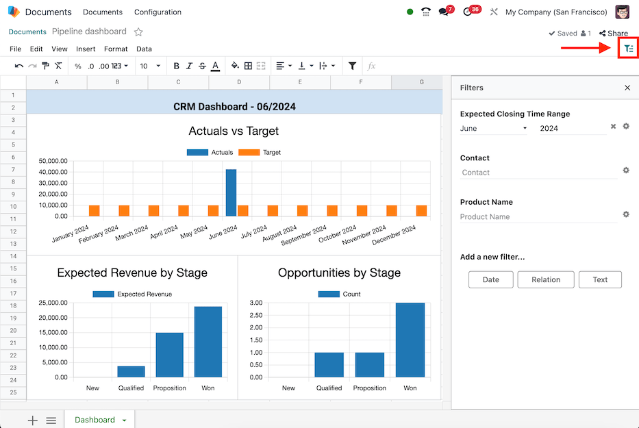
Add filters
Navigate to the Documents app and click on the desired spreadsheet, then open the (global filter) filter menu.
Create a new filter by selecting one of the buttons under the Add a new filter… section:
- Date: filter dates by matching data source date fields to a time range (e.g., Month / Quarter, Relative Period, or From / To).
- Relation: filter records by matching data source fields to fields in a related model (e.g., Lead/Opportunity, Sales Order, or Event Registration).
- Text: filter text by matching data source text fields to a string of text (e.g., Restrict values to a range and/or provide a Default value).
Note
Only filters that are able to be applied to the fields in the data source are shown.
Date
The Date global filter enables the filtering of data sources by a specific time range, to automatically filter on the current period, or to offset the time range relative to the period.
With the (global filter) menu open, select the Date button to create a new date filter. The Filter properties menu displays the following fields for configuration below.
First, enter a name for the new date filter in the Label field.
Then, select one of the three period options in the Time range field:
- Month / Quarter: enables a drop-down menu of specific months and quarters of a year (i.e., Q1, Q2, January, etc.).
- Relative Period: enables a drop-down menu of specific moving time frames (i.e., Year to Date, Last 7 Days, Last 30 Days, etc.).
- From / To: enables Date from… and Date to… date selection fields to define a specific time range (e.g., 06/05/2024 to 06/27/2024).
Optionally, set a Default value for the Time range.
Note
The Default value field only appears for Month / Quarter or Relative Period ranges.
If the Month / Quarter range is selected, tick the Automatically filter on the current period checkbox to define the default period of either Month, Quarter, or Year.
Next, configure the Field matching for each data source. To do so, expand the section by clicking on the Field matching heading, to reveal a list of the data sources in the spreadsheet where each data source has two fields for matching:
- Date field: select a date field from the data source model to apply the time range to.
- Period offset: (optionally) select an offset that shifts the time range by a relative period.
The options available are: Previous, Before Previous, Next, After Next.
Lastly, once all the information is entered on the form, click the Save button. If any of the data source fields do not match the data type of date (or datetime), an error is shown stating Some required fields are not valid.
Example
Consider a Period offset of Next when using the Month / Quarter range to apply the filter to the next period relative to the set time range.
With this configuration, selecting January 2024 as the date, filters data as February 2024; where the selected month is offset to the next month.
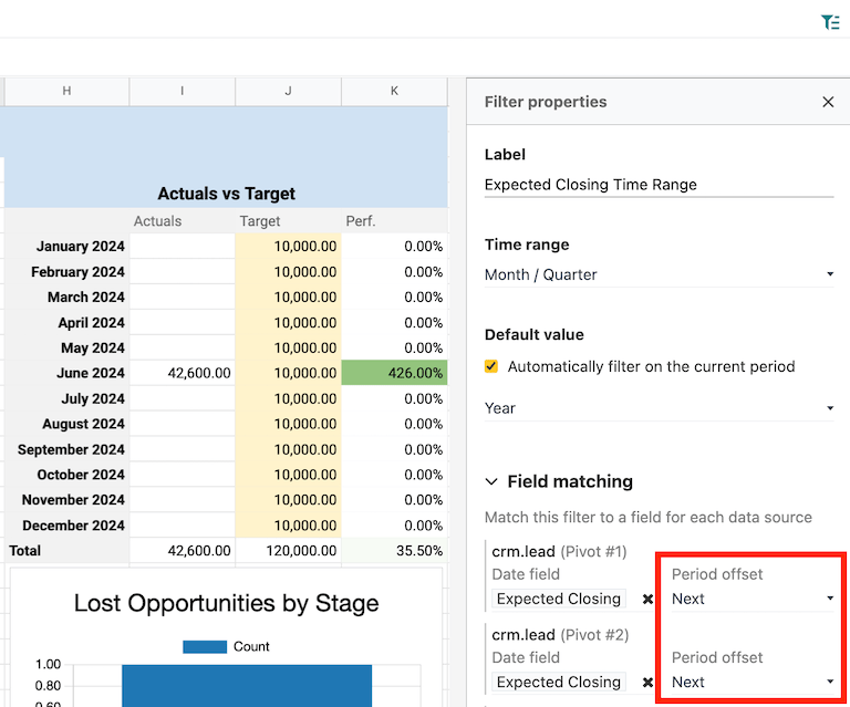
Relation
The Relation global filter enables the filtering of records in data sources by selecting a field from a related model.
With the (global filter) menu open, select the Relation button to create a new relation filter. The Filter properties menu displays the following fields for configuration.
First, enter a name for the new relation filter in the Label field.
Then, select or search for a model from the Related model field.
Once a model is selected, the Default value and Field matching fields appear.
Optionally, set a Default value for the Related model. The available options are records of the model.
Next, configure the Field matching for each data source. To do so, expand the section by clicking on the Field matching heading, to reveal a list of the data sources in the spreadsheet where each data source has a field for matching.
Select a field from the data source model from which to apply the relation filter.
Lastly, once all the information is entered on the form, click the Save button. If any of the data source fields do not match the data type of the related model, an error is shown stating Some required fields are not valid.
Example
Consider a Relation filter with the Related model set as Contact. The Field matching CRM lead (crm.lead) pivot data sources are set to Customer.
With this configuration, selecting a customer record filters the pivot table to only leads that are related to the selected customer record.
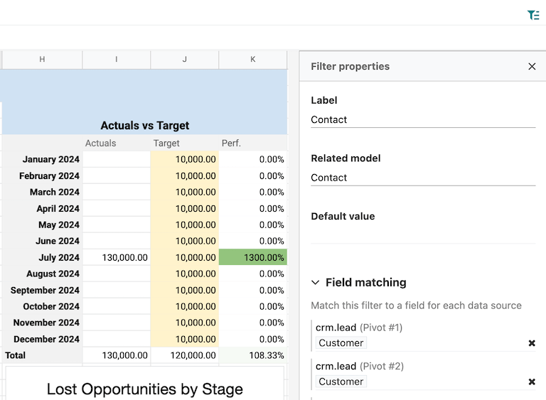
Text
The Text global filter enables the filtering of text by matching data source text fields to a string of text or to a range of predefined values.
With the (global filter) menu open, select the Text button to create a new text filter. The Filter properties menu displays the following fields for configuration.
First, enter a name for the new text filter in the Label field.
Then, choose whether or not to Restrict values to a range by ticking the checkbox. Doing so, reveals a field to input a range within the spreadsheet. Either type in or select the range.
Next, configure the Field matching for each data source. To do so, expand the section by clicking on the Field matching heading, to reveal a list of the data sources in the spreadsheet where each data source has a field for matching.
Select a field from the data source model from which to apply the text filter.
Lastly, once all the information is entered on the form, click the Save button. If any of the data source fields do not match the data type of the related model, an error is shown stating Some required fields are not valid.
Example
Consider a text filter with the range A2:A6 added to the Restrict values to a range field. The spreadsheet has five different product names listed as values in the cells of column A, rows 2 though 6.
With the above configuration, a pivot table of products can be filtered by product name by selecting one of the 5 predefined values available in the text filter.
Furthermore, if the values in the range A2:A6 are added dynamically– the text filter becomes dynamic as well.
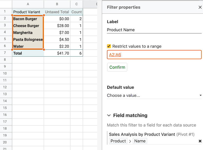
Manage filters
Open the (global filter) filter menu by navigating to the Documents app and clicking on the desired spreadsheet.
Existing global filters appear under the Filters section. Filters can be used individually, or at the same time.
Tip
The order of existing filters can be changed by hovering over a filter and using the (drag handle) icon to change the position.
To reset a filter with set values back to default, click on the (clear) icon next to the value in the filter.
To edit an existing filter, select the (gear) icon to open the filter’s Filter properties menu. From here, edits can be made or the filter can be deleted by clicking the Remove button.
On this page
Get Help
Contact Support Ask the Odoo Community